


目录
1.翻书效果(CSS)
<!DOCTYPE html>
<html lang="en">
<head>
    <meta charset="UTF-8">
    <title>纯css3实现翻书效果</title>
    <link href="reset.css" rel="stylesheet" type="text/css">
    <style>
        body {
            background-color: #000;
        }
        .perspective {
            margin-top: 100px;
            perspective: 800px;
            transform-style: preserve-3d;
        }
        .book-wrap {
            width: 300px;
            height: 300px;
            position: relative;
            margin: 0 auto;
            transform: rotateX(0deg);
            transform-style: preserve-3d;
        }
        .page {
            width: 100%;
            height: 100%;
            position: absolute;
            left: 0;
            top: 0;
            font-size: 30px;
            display: flex;
            justify-content: center;
            align-items: center;
            transform-origin: left;
            border: 1px solid #1976D2;
        }
        .book-cover {
            background-color: #1976D2;
            color: #ffffff;
            animation: roll 6s ease 0s 2 alternate;
        }
        .book-content {
            background-color: #fff;
            color: #33363C;
        }
        .book-content1{
            animation: roll 3s ease 3s 2 alternate;
        }
        .book-content2 {
            animation: roll 4s ease 2s 2 alternate;
        }
        .book-content3 {
            animation: roll 5s ease 1s 2 alternate;
        }
        @keyframes roll {
            from {transform: rotateY(0)}
            to {transform: rotateY(-180deg)}
        }
    </style>
</head>
<body>

<div class="perspective">
    <div class="book-wrap">
        <div class="page book-content">end</div>
        <div class="page book-content book-content1">第三页</div>
        <div class="page book-content book-content2">第二页</div>
        <div class="page book-content book-content3">第一页</div>
        <div class="page book-cover">封面</div>
    </div>
</div>
</body>
</html>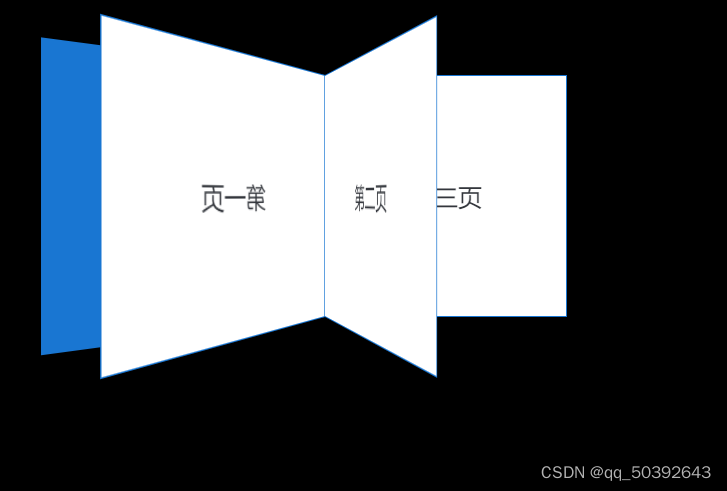
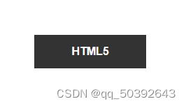
2、幽灵按钮
<!DOCTYPE html>
<html lang="en">
<head>
    <meta charset="UTF-8">
    <meta http-equiv="X-UA-Compatible" content="IE=edge">
    <meta name="viewport" content="width=device-width, initial-scale=1.0">
    <title>Document</title>
    <style>
        * {
    margin: 0;
	padding: 0;
}

.backimg {
	width: 100%;
	height: 100%;
	min-height: 600px;
	position: absolute;
	top: 0;
	right: 0;
	bottom: 0;
	left: 0;
	overflow: hidden;
	z-index: -1;
}

.backimg img {
	width: 100%;
	height: 100%;
}

.btnBox {
	position: absolute;
	width: 100%;
}

.btn {
	width: 200px;
	height: 60px;
	margin: 450px 200px 0 70%;
	background-color: rgba(0,0,0,.8);
	text-align: center;
	position: relative;
}

.btn a {
	display: block;
	text-decoration: none;
	color: #FFFFFF;
	font: bold 20px arial;
	line-height: 60px;
	height: 60px;
}

.btn-border-top, .btn-border-bottom {
	height: 5px;
	background-color: #FFFFFF;
	position: absolute;
	width: 0%;
	transition: .4s;
}

.btn-top-left, .btn-bottom-right {
	height: 0;
	background-color: #FFFFFF;
	position: absolute;
	width: 5px;
	transition: .4s;
}

.btn-border-top {
	right: 0;
	top: 0;
}

.btn-border-bottom {
	left: 0;
	bottom: 0;
}

.btn-top-left {
	left: 0;
	top: 0;
}

.btn-bottom-right {
	right: 0;
	bottom: 0;
}

.btn:hover .btn-border-top {
	width: 100%;
}

.btn:hover .btn-border-bottom {
	width: 100%;
}

.btn:hover .btn-top-left {
	height: 58px;
}

.btn:hover .btn-bottom-right {
	height: 58px;
}

.btn:hover {
	background-color: rgba(0,0,0,0);
}

.btn:hover a {
	color: #FFFFFF;
	text-decoration: none;
}

    </style>
</head>
<body>
    <div class="btnBox">
           <div class="btn">
            <div class="btn-border-top"></div>
            <div class="btn-top-left"></div>
            <a href="#">HTML5</a>
            <div class="btn-bottom-right"></div>
            <div class="btn-border-bottom"></div>
        </div>
    </div>

   <!-- <div>HTML5</div>
   <div>CSS3</div>
   <div>Javascript</div> -->
</body>
</html>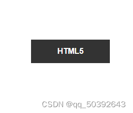


 175
175


 被折叠的 条评论
为什么被折叠?
被折叠的 条评论
为什么被折叠?
 到【灌水乐园】发言


