


本文章属于学习笔记,在https://www.freecodecamp.org/chinese/learn/2022/responsive-web-design/中练习
二、 CSS
样式,新建一个文件.css,该文件不含有style标签
<style>.
h1,h2,p{
text-align:center;设置h1,h2和p元素文本居中
}
body{
background-color:red;设置背景色
background-image:url(网址);设置背景图片
}
/注释/
#menu{
水平居中,可以把页边距看成是元素周围看不见的空间
margin-left:auto;
margin-right:auto;
font-family:字体1,字体2 ; 设置字体,字体2是后备字体在初始值找不到或无法使用时使用
font-style:itialic;斜体
font-size:20px;字体大小
}
.item(class的值) p(嵌套的){
display:inline-block;使元素更像是内联元素,但只占用了其内容的宽度
要讲他们分开需要在p对应的类选择器中设置width为小于50%,或者删除p中间的换行
width:300px;设置html中div的id为menu的宽慰300px
margin:10px auto;第一个是表示上下,第二个表示左右
}
hr{
height:10px;改变分隔符的高度
border-color:yellow;边框颜色
}
当链接被实际访问时链接的颜色为灰色
a:visited{
color:gry;
}
鼠标悬停在链接上时
a:hover{
color:brown;
}
当链接被实际点击时
a:active{
}
.flavor,.dessert{
两个选择器共用一个规则
各种padding(设置全部)属性给菜单在内容和侧面之间留一个空间
例如:
padding-left,padding-right,padding-top,padding-bottom
border-width
边框宽度默认为1px
max-width:最大宽度
}
width:80%;使其成为父物体的80%
.menu变成了一个类选择器—》
1、链接css文件
<link rel="stylesheet" href="样式文件名.css">自闭合
为了使页面样式在移动端看起来与桌面或笔记本电脑上相似,需要添加一个带有特殊content属性的meta元素
<meta name="viewport" content="width=device-width, initial-scale=1.0">
2、用于设计布局
<div id="menu">
  #menu
</div>
很多元素都可以添加class属性
通常包含多个具有相关信息的元素
<article class=" " class=""> </article>是该元素中的嵌套元素的通用样式
可以将多个类加入到元素中,用空格分开,但是第一个类可能会对第二个类覆盖
<hr>分隔符,没有结束标签
Stylies.css
body {
  background-image: url(https://cdn.freecodecamp.org/curriculum/css-cafe/beans.jpg);
  font-family: sans-serif;
  padding: 20px;
}

h1 {
  font-size: 40px;
  margin-top: 0;
  margin-bottom: 15px;
}

h2 {
  font-size: 30px;
}

.established {
  font-style: italic;
}

h1, h2, p {
  text-align: center;
}

.menu {
  width: 80%;
  background-color: burlywood;
  margin-left: auto;
  margin-right: auto;
  padding: 20px;
  max-width: 500px;
}

img {
  display: block;
  margin-left: auto;
  margin-right: auto;
}

hr {
  height: 2px;
  background-color: brown;
  border-color: brown;
}

.bottom-line {
  margin-top: 25px;
}

h1, h2 {
  font-family: Impact, serif;
}

.item p {
  display: inline-block;
  margin-top: 5px;
  margin-bottom: 5px;
  font-size: 18px;
}

.flavor, .dessert {
  text-align: left;
  width: 75%;
}

.price {
  text-align: right;
  width: 25%;
}

/* FOOTER */

footer {
  font-size: 14px;
}

.address {
  margin-bottom: 5px;
}

a {
  color: black;
}

a:visited {
  color: black;
}

a:hover {
  color: brown;
}

a:active {
  color: brown;
}
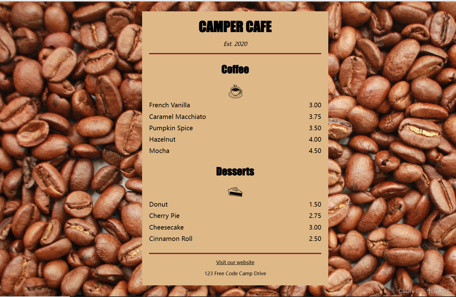
<!DOCTYPE html>
<html lang="en">
  <head>
    <meta charset="utf-8" />
    <meta name="viewport" content="width=device-width, initial-scale=1.0" />
    <title>Cafe Menu</title>
    <link href="styles.css" rel="stylesheet"/>
  </head>
  <body>
    <div class="menu">
      <main>
        <h1>CAMPER CAFE</h1>
        <p class="established">Est. 2020</p>
        <hr>
        <section>
          <h2>Coffee</h2>
          <img src="https://cdn.freecodecamp.org/curriculum/css-cafe/coffee.jpg" alt="coffee icon"/>
          <article class="item">
            <p class="flavor">French Vanilla</p><p class="price">3.00</p>
          </article>
          <article class="item">
            <p class="flavor">Caramel Macchiato</p><p class="price">3.75</p>
          </article>
          <article class="item">
            <p class="flavor">Pumpkin Spice</p><p class="price">3.50</p>
          </article>
          <article class="item">
            <p class="flavor">Hazelnut</p><p class="price">4.00</p>
          </article>
          <article class="item">
            <p class="flavor">Mocha</p><p class="price">4.50</p>
          </article>
        </section>
        <section>
          <h2>Desserts</h2>
          <img src="https://cdn.freecodecamp.org/curriculum/css-cafe/pie.jpg" alt="pie icon"/>
          <article class="item">
            <p class="dessert">Donut</p><p class="price">1.50</p>
          </article>
          <article class="item">
            <p class="dessert">Cherry Pie</p><p class="price">2.75</p>
          </article>
          <article class="item">
            <p class="dessert">Cheesecake</p><p class="price">3.00</p>
          </article>
          <article class="item">
            <p class="dessert">Cinnamon Roll</p><p class="price">2.50</p>
          </article>
        </section>
      </main>
      <hr class="bottom-line">
      <footer>
        <p>
          <a href="https://www.freecodecamp.org" target="_blank">Visit our website</a>
        </p>
        <p class="address">123 Free Code Camp Drive</p>
      </footer>
    </div>
  </body>
</html>


 4488
4488


 被折叠的 条评论
为什么被折叠?
被折叠的 条评论
为什么被折叠?
 到【灌水乐园】发言


