<!-- 容器必须要有高度,宽度可选-->
<div id="main" style="height: 400px"></div>
<script src="./echarts-5.3.3.js"></script>
<script>
// (图表挂载的对象, 主题样式, 渲染方式)
var myChart = echarts.init(document.getElementById("main"), null, {
renderer: 'svg'
});
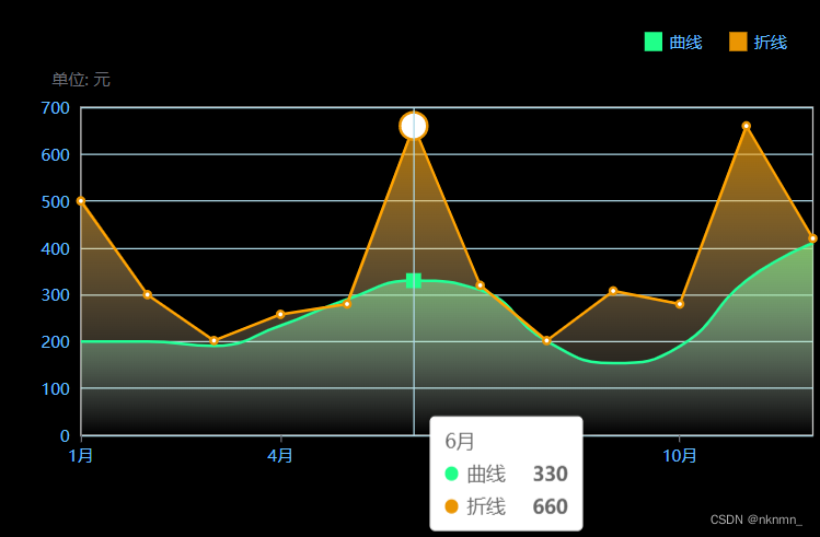
var option = {
backgroundColor: "rbg(40,46,72)",
grid: { // 网格
show: true,
left: "5%",
right: "1%",
top: "20%",
bottom: "15%",
containLabel: true, // grid 区域是否包含坐标轴的刻度标签
},
legend: { // 图例
top: 20,
right: 20,
itemGap: 20,
itemWidth: 13,
itemHeigth: 12,
textStyle: {
color: "#64BCFF",
},
icon: "rect", // 图例样式为矩形
},
tooltip: { // 注释标签
trigger: "axis", // 触发类型
// 'item' 数据项图形触发,主要在散点图,饼图等无类目轴的图表中使用
// 'axis' 坐标轴触发,主要在柱状图,折线图等会使用类目轴的图表中使用
axisPointer: { // 坐标轴指示器配置项
type: "line",
lineStyle: {
color: "#20FF89",
},
},
},
xAxis: [
{
type: "category",
axisLine: {
show: false,
},
axisLabel: {
color: "#64BCFF",
interval: 2 // x轴的label 以2为间隔显示
},
boundaryGap: false, // x轴第一列的数据挨着y轴
data: [
"1月","2月","3月","4月","5月","6月","7月","8月","9月","10月","11月","12月",
],
},
],
yAxis: [
{
name: "单位: 元",
type: "value",
axisLabel: {
show: true,
color: "#64BCFF",
},
splitLine: {
show: true,
lineStyle: {
color: 'lightblue'
}
}
},
],
series: [
{
name: "曲线",
type: "line",
smooth: true, // 平滑显示
symbolSize: 10, // 标记节点的大小
showSymbol: false, // 显示item节点
itemStyle: {
color: "#20FF89",
},
symbol:'rect', // 节点的形状
areaStyle: {
color: new echarts.graphic.LinearGradient(
0,
0,
0,
1,
[
{
offset: 0,
color: "#20FF89",
},
{
offset: 1,
color: "rgba(255, 255, 255, 0)",
},
],
false
),
},
data: [200, 200, 191, 234, 290, 330, 310, 201, 154, 190, 330, 410],
},
{
name: "折线",
type: "line",
symbolSize: 5,
showSymbol: true,
itemStyle: {
color: "#EA9502",
},
emphasis: {
scale: 4 // 是否开启 hover 在拐点标志上的放大效果
},
areaStyle: {
color: {
type: "linear",
x: 0,
y: 0,
x2: 0,
y2: 1,
colorStops: [
{
offset: 0,
color: "#EA9502",
},
{
offset: 1,
color: "rgba(255, 255, 255, 0)",
},
],
},
},
data: [500, 300, 202, 258, 280, 660, 320, 202, 308, 280, 660, 420],
},
],
};
myChart.setOption(option);
</script>


 被折叠的 条评论
为什么被折叠?
被折叠的 条评论
为什么被折叠?
 到【灌水乐园】发言


