


 本文介绍了如何在项目中自定义Element-UI的$confirm组件,包括交换取消和确定按钮的布局,以及创建自定义样式,以满足特定的UI需求。
$confirm的自定义使用
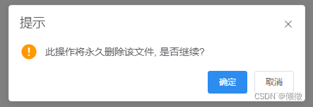
在项目开发过程中,经常会遇到需要修改ui库中默认样式的情况。就比如说使用element-ui的$confirm弹出框时,它的默认样式如下:

但我们需要的是
 这样一个布局样式,这时我们就需要对默认样式进行一个自定义修改,会利用消息框的自定义类名
customClass,话不多说,直接进入正题~
交换取消和确定按钮
// js
this.$confirm('此操作将永久删除该文件, 是否继续?', '提示', {
confirmButtonText: '确定',
cancelButtonText: '取消',
customClass:'demo1',
type: 'warning'
}).then(() => {
this.$message({
type: 'success',
message: '删除成功!'
});
}).catch(() => {
this.$message({
type: 'info',
message: '已取消删除'
});
});
// 样式
// 注意:样式不能放在 scoped 中
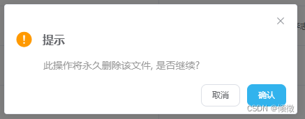
.delmo1 {
.el-message-box__btns {
.el-button:nth-child(1) {
float:right;
}
.el-button:nth-child(2) {
margin-right:10px;
background-color:#2d8cf0;
border-color:#2d8cf0;
}
}
}
修改后的结果如下:
自定义布局
const foo = this.$createElement
this.$confirm('', {

  message:h('div',null, [
    foo('i',{ class:'el-icon-question',style:'color:#f90;font-size:30px;' }),
    // 样式1
    foo('span',{ class: 'el-confirm-span'}, '提示'),
    // 样式2
    foo('p',{ style:'margin:10px 0 0 40px;color: #999999;' },'此操作将永久删除该文件, 是否继续?')
  ]),
  confirmButtonText: '确定',
  cancelButtonText: '取消',
  customClass:'demo2',
  closeOnClickModal:false,
  closeOnPressEscape:false,
})
  .then(() => {
    this.$message({
      type: 'success',
      message: '删除成功!'
    });
  })
  .catch(() => {
    this.$message({
      type: 'info',
      message: '已取消删除'
    });
  });

// 样式1
.el-confirm-span {
  margin-left: 10px;
  font-size: 16px;
  line-height: 30px;
  font-weight: 600;
  vertical-align: top;
}
类名是方便自定义样式,当然这里的样式也是最好不要放到scope中,下面是修改后的结果:


 扫一扫
扫一扫


 1578
1578

 被折叠的 条评论
为什么被折叠?
被折叠的 条评论
为什么被折叠?
 到【灌水乐园】发言


