


float 和 position
一.浮动(float)
1.什么是浮动
float属性用于创建浮动框,将其移到一边,直到左边缘或右边缘触及包含块或另一个浮动框的边缘。
语法:
选择器 {float 属性值;}
属性值:
none   元素不浮动(默认值)
left   元素向左浮动
right  元素向右浮动
样例:
默认值(相当于标准流)
<!DOCTYPE html>
<html lang="en">

<head>
    <meta charset="UTF-8">
    <meta http-equiv="X-UA-Compatible" content="IE=edge">
    <meta name="viewport" content="width=device-width, initial-scale=1.0">
    <title>float and position</title>
</head>
<style>
    div {
        width: 70px;
        height: 80px;
    }

    .box1 {
        background-color: blue;
        float: none;
    }

    .box2 {
        background-color: red;
        float: none;
    }
</style>

<body>
    <div class="box1"></div>
    <div class="box2"></div>
</body>

</html>

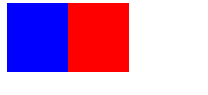
left
<!DOCTYPE html>
<html lang="en">

<head>
    <meta charset="UTF-8">
    <meta http-equiv="X-UA-Compatible" content="IE=edge">
    <meta name="viewport" content="width=device-width, initial-scale=1.0">
    <title>float and position</title>
</head>
<style>
    div {
        width: 70px;
        height: 80px;
    }

    .box1 {
        background-color: blue;
        float: left;
    }

    .box2 {
        background-color: red;
        float: left;
    }
</style>

<body>
    <div class="box1"></div>
    <div class="box2"></div>
</body>

</html>
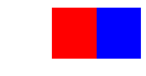
right
<!DOCTYPE html>
<html lang="en">

<head>
    <meta charset="UTF-8">
    <meta http-equiv="X-UA-Compatible" content="IE=edge">
    <meta name="viewport" content="width=device-width, initial-scale=1.0">
    <title>float and position</title>
</head>
<style>
    div {
        width: 70px;
        height: 80px;
    }

    .box1 {
        background-color: blue;
        float: right;
    }

    .box2 {
        background-color: red;
        float: right;
    }
</style>

<body>
    <div class="box1"></div>
    <div class="box2"></div>
</body>

</html>
2.浮动特性
- 浮动元素会脱离标准流
- 浮动的元素会一行内显示并且元素顶部对齐
- 浮动的元素会具有行内块元素的特性
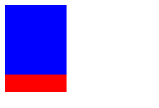
浮动的盒子不再保留原先的位置(设置了浮动的盒子漂浮在普通流的上面,不占位置,脱标)
<!DOCTYPE html>
<html lang="en">

<head>
    <meta charset="UTF-8">
    <meta http-equiv="X-UA-Compatible" content="IE=edge">
    <meta name="viewport" content="width=device-width, initial-scale=1.0">
    <title>float and position</title>
</head>
<style>
    div {
        width: 70px;
        height: 80px;
    }

    .box1 {
        background-color: blue;
        float: left;
    }

    .box2 {
        background-color: red;
        float: none;
        height: 100px;
    }
</style>

<body>
    <div class="box1"></div>
    <div class="box2"></div>
</body>

</html>
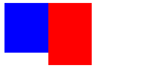
如果多个盒子都设置了浮动,则它们会按照属性值一行内显示并且顶端对齐排列(如果盒子宽度大于父盒子会重启一行继续排列)
<!DOCTYPE html>
<html lang="en">

<head>
    <meta charset="UTF-8">
    <meta http-equiv="X-UA-Compatible" content="IE=edge">
    <meta name="viewport" content="width=device-width, initial-scale=1.0">
    <title>float and position</title>
</head>
<style>
    div {
        width: 70px;
        height: 80px;
    }

    .box1 {
        background-color: blue;
        float: left;
    }

    .box2 {
        background-color: red;
        float: left;
        height: 100px;
    }
</style>

<body>
    <div class="box1"></div>
    <div class="box2"></div>
</body>

</html>
浮动元素具有行内块元素的特性
例子:给span标签加入float,从而给行内元素设置宽高
<!DOCTYPE html>
<html lang="en">

<head>
    <meta charset="UTF-8">
    <meta http-equiv="X-UA-Compatible" content="IE=edge">
    <meta name="viewport" content="width=device-width, initial-scale=1.0">
    <title>float and position</title>
</head>
<style>
    .span1 {
        background-color: pink;
        float: left;
        width: 70px;
        height: 100px;
    }

    .box2 {
        background-color: red;
        float: left;
        height: 100px;
        width: 60px;
    }
</style>

<body>
    <span class="span1">1</span>
    <span class="box2">2</span>
</body>

</html>
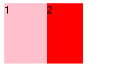
浮动元素经常搭配标准流父级搭配
<!DOCTYPE html>
<html lang="en">

<head>
    <meta charset="UTF-8">
    <meta http-equiv="X-UA-Compatible" content="IE=edge">
    <meta name="viewport" content="width=device-width, initial-scale=1.0">
    <title>float and position</title>
</head>
<style>
    * {
        margin: 0;
        padding: 0;
    }

    .box0 {
        margin: 200px auto;
        width: 600px;
        height: 400px;
        background-color: pink;
    }

    .box1 {
        background-color: rgb(137, 238, 154);
        float: left;
        width: 70px;
        height: 100px;
    }

    .box2 {
        background-color: red;
        float: right;
        height: 100px;
        width: 60px;
    }
</style>

<body>
    <div class="box0">
        <div class="box1">1</div>
        <div class="box2">2</div>
    </div>
</body>

</html>

3.清除浮动
1.为什么要清除浮动
由于父级盒子很多的情况下,不方便给高度,但是盒子浮动又不占有位置,最后父级盒子高度为0时,就会影响下面的标准流盒子
<!DOCTYPE html>
<html lang="en">

<head>
    <meta charset="UTF-8">
    <meta http-equiv="X-UA-Compatible" content="IE=edge">
    <meta name="viewport" content="width=device-width, initial-scale=1.0">
    <title>float and position</title>
</head>
<style>
    * {
        margin: 0;
        padding: 0;
    }

    .box0 {
        border: 1px dotted black;
        width: 600px;
    }

    .box1 {
        background-color: rgb(137, 238, 154);
        float: left;
        width: 70px;
        height: 100px;
    }

    .box2 {
        background-color: red;
        float: left;
        height: 120px;
        width: 60px;
    }
</style>

<body>
    <div class="box0">
        <div class="box1">1</div>
        <div class="box2">2</div>
    </div>
    <div style="width: 800px; height: 200px;background-color: pink;"></div>
</body>

</html>

2.清除浮动本质
清除浮动本质是清除浮动元素脱离标准流造成的影响
3.清除浮动策略
闭合浮动,只让浮动在父盒子内部影响不影响父盒子外边的元素
4.清除浮动方法
1.额外标签法也称隔墙法,是w3c推荐的用法
<!DOCTYPE html>//在最后一个子元素后面加入块级元素,块级元素中的类中加入clear:both;
<html lang="en">//优点是通俗易懂,书写方便;缺点是添加许多无意义的标签,结构化较差

<head>
    <meta charset="UTF-8">
    <meta http-equiv="X-UA-Compatible" content="IE=edge">
    <meta name="viewport" content="width=device-width, initial-scale=1.0">
    <title>float and position</title>
</head>
<style>
    * {
        margin: 0;
        padding: 0;
    }

    .box0 {
        border: 1px dotted black;
        width: 600px;
    }

    .box1 {
        background-color: rgb(137, 238, 154);
        float: left;
        width: 70px;
        height: 100px;
    }

    .box2 {
        background-color: red;
        float: left;
        height: 120px;
        width: 60px;
    }

    .clear {
        clear: both;
    }
</style>

<body>
    <div class="box0">
        <div class="box1">1</div>
        <div class="box2">2</div>
        <div class="clear"></div>
    </div>
    <div style="width: 800px; height: 200px;background-color: pink;"></div>
</body>

</html>

2.父级添加overflow属性
<!DOCTYPE html>
<html lang="en">

<head>
    <meta charset="UTF-8">
    <meta http-equiv="X-UA-Compatible" content="IE=edge">
    <meta name="viewport" content="width=device-width, initial-scale=1.0">
    <title>float and position</title>
</head>
<style>
    * {
        margin: 0;
        padding: 0;
    }

    .box0 {
        /* 清除浮动 */
        overflow: hidden;
        border: 1px dotted black;
        width: 600px;
    }

    .box1 {
        background-color: rgb(137, 238, 154);
        float: left;
        width: 70px;
        height: 100px;
    }

    .box2 {
        background-color: red;
        float: left;
        height: 120px;
        width: 60px;
    }
</style>

<body>
    <div class="box0">
        <div class="box1">1</div>
        <div class="box2">2</div>
    </div>
    <div style="width: 800px; height: 200px;background-color: pink;"></div>
</body>

</html>

3.父级添加after伪元素
<!DOCTYPE html>
<html lang="en">

<head>
    <meta charset="UTF-8">
    <meta http-equiv="X-UA-Compatible" content="IE=edge">
    <meta name="viewport" content="width=device-width, initial-scale=1.0">
    <title>float and position</title>
</head>
<style>
    * {
        margin: 0;
        padding: 0;
    }

    .clearfix:after {
        content: "";
        display: block;
        height: 0;
        clear: both;
        visibility: hidden;
    }

    .clearfix {
        /*IE6、7 专有*/
        *zoom: 1;
    }

    .box0 {
        border: 1px dotted black;
        width: 600px;
    }

    .box1 {
        background-color: rgb(137, 238, 154);
        float: left;
        width: 70px;
        height: 100px;
    }

    .box2 {
        background-color: red;
        float: left;
        height: 120px;
        width: 60px;
    }
</style>

<body>
    <div class="box0 clearfix">
        <div class="box1">1</div>
        <div class="box2">2</div>
    </div>
    <div style="width: 800px; height: 200px;background-color: pink;"></div>
</body>

</html>

4.父级添加双伪元素
<!DOCTYPE html>
<html lang="en">

<head>
    <meta charset="UTF-8">
    <meta http-equiv="X-UA-Compatible" content="IE=edge">
    <meta name="viewport" content="width=device-width, initial-scale=1.0">
    <title>float and position</title>
</head>
<style>
    * {
        margin: 0;
        padding: 0;
    }

    .clearfix:before,
    .clearfix:after {
        content: "";
        display: table;
    }

    .clearfix:after {
        clear: both;
    }

    .clearfix {
        /*IE6、7 专有*/
        *zoom: 1;
    }

    .box0 {
        border: 1px dotted black;
        width: 600px;
    }

    .box1 {
        background-color: rgb(137, 238, 154);
        float: left;
        width: 70px;
        height: 100px;
    }

    .box2 {
        background-color: red;
        float: left;
        height: 120px;
        width: 60px;
    }
</style>

<body>
    <div class="box0 clearfix">
        <div class="box1">1</div>
        <div class="box2">2</div>
    </div>
    <div style="width: 800px; height: 200px;background-color: pink;"></div>
</body>

</html>

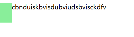
4.浮动和文字
浮动的盒子会压住下面标准流的盒子,但不会压住里面的文字
<!DOCTYPE html>
<html lang="en">

<head>
    <meta charset="UTF-8">
    <meta http-equiv="X-UA-Compatible" content="IE=edge">
    <meta name="viewport" content="width=device-width, initial-scale=1.0">
    <title>float and position</title>
</head>
<style>
    * {
        margin: 0;
        padding: 0;
    }

    .box1 {
        background-color: rgb(137, 238, 154);
        float: left;
        width: 30px;
        height: 50px;
    }
</style>

<body>
    <di>
        <div class="box1"></div>
        <p>cbnduiskbvisdubviudsbvisckdfv</p>
        </div>
</body>

</html>
二.定位(position)
1.什么是定位
定位:将盒子定在某一个位置,所以定位也是在摆放盒子,按照定位的方式移动盒子
定位=定位模式+边偏移
定位模式用于指定一个元素在文档中的定位方式。边偏移决定了该元素的最终位置
2.定位模式
定位模式决定元素的定位方式,它通过CSS的position属性来设置,其值可以分为四个:static、relative、absolute、fixed

1.静态定位
静态定位是元素的默认定位方式,无定位的意思
语法:
选择器{ position:static; }
(1)静态定位按照标准流特性摆放位置,它没有边偏移
(2)静态定位在布局时很少用到
2.相对定位(relative)
相对定位 是元素在移动位置的时候,是相对于它原来的位置来说的
语法:
选择器 {position:relative; }
特点:
(1).移动位置的时候参照点是自己原来的位置
(2).不脱标,继续保留原来位置
实例:
(1)没有加相对定位
代码:
<!DOCTYPE html>//
<html lang="en">

<head>
    <meta charset="UTF-8">
    <meta http-equiv="X-UA-Compatible" content="IE=edge">
    <meta name="viewport" content="width=device-width, initial-scale=1.0">
    <title>Position</title>
    <style>
        .box1 {
            width: 200px;
            height: 150px;
            background-color: skyblue;
        }

        .box2 {
            width: 200px;
            height: 250px;
            background-color: yellow;
        }
    </style>
</head>

<body>
    <div class="box1">1</div>
    <div class="box2">2</div>
</body>

</html>
效果:

(2)加相对定位
代码:
<!DOCTYPE html>
<html lang="en">

<head>
    <meta charset="UTF-8">
    <meta http-equiv="X-UA-Compatible" content="IE=edge">
    <meta name="viewport" content="width=device-width, initial-scale=1.0">
    <title>Position</title>
    <style>
        .box1 {
            position: relative;
            top: 200px;
            left: 100px;
            width: 200px;
            height: 150px;
            background-color: skyblue;
        }

        .box2 {
            width: 200px;
            height: 250px;
            background-color: yellow;
        }
    </style>
</head>

<body>
    <div class="box1">1</div>
    <div class="box2">2</div>
</body>

</html>
效果:

3.绝对定位(absolute)
绝对定位 是元素在移动位置的时候,是相对于它祖先元素来说的
语法:
选择器 {position:absolute;}
特点:
(1).如果没有祖先元素或者祖先元素没有定位,则以浏览器为准定位
(2).如果父元素有定位(相对、绝对、固定定位),则以最近一级的有定位祖先元素为参考点移动位置
(3).绝对定位不再占有原来的位置(脱标)
子绝父相:
父元素添加相对定位固定位置,子元素添加绝对定位移动
实例:
<!DOCTYPE html>
<html lang="en">

<head>
    <meta charset="UTF-8">
    <meta http-equiv="X-UA-Compatible" content="IE=edge">
    <meta name="viewport" content="width=device-width, initial-scale=1.0">
    <title>Position</title>
    <style>
        .box1 {
            position: relative;
            top: 200px;
            left: 100px;
            width: 600px;
            height: 400px;
            background-color: skyblue;
        }

        .box2 {
            position: absolute;
            top: 20px;
            left: 40px;
            width: 60px;
            height: 50px;
            background-color: yellow;
        }
    </style>
</head>

<body>
    <div class="box1">
        <div class="box2">2</div>
    </div>
</body>

</html>
效果:

4.固定定位(fixed)
固定定位 是元素固定于浏览器可视区的位置。主要使用场景:可以在浏览器页面滚动时元素的位置不会改变
语法:
选择器 {position:fixed;}
特点:
(1).以浏览器的可视窗口为参照点移动元素
*跟父元素没有任何关系
*不随滚动条滚动
<!DOCTYPE html>//代码示范
<html lang="en">

<head>
    <meta charset="UTF-8">
    <meta http-equiv="X-UA-Compatible" content="IE=edge">
    <meta name="viewport" content="width=device-width, initial-scale=1.0">
    <title>Position</title>
    <style>
        .box1 {
            position: fixed;
            top: 200px;
            right: 100px;
            width: 20px;
            height: 30px;
            background-color: skyblue;
        }
    </style>
</head>

<body>
   			<p>示范</p>
    		<p>示范</p>
    		<p>示1范</p>
  		 	<p>示2范</p>
    		<p>示3范</p>
   			<p>示5范</p>
   		 	<p>示6范</p>
   		 	<p>示4范</p>
    		<p>示55范</p>
    		<p>示范8</p>
   		 	<p>示15范</p>
   			<p>示1范</p>
            <p>示5范</p>
            <p>示9范</p>
            <p>示h范</p>
            <p>示n范</p>
            <p>示d范</p>
            <p>示s范</p>
            <p>示范</p>
            <p>示g范</p>
            <p>示f范</p>
            <p>示h范</p>
            <p>示n范</p>
            <p>示c范</p>
            <p>示s范</p>
            <p>示j范</p>
            <p>示u范</p>
            <p>示w范</p>
            <p>示x范</p>
            <p>示m范</p>
            <p>示x范</p>
            <p>示a范</p>
            <p>示e范</p>
            <p>示j范</p>
            <p>示k范</p>
            <p>示n范</p>
            <p>示c范</p>
            <p>示s范</p>
            <p>示w范</p>
            <p>示j范</p>
            <p>示v范</p>
            <p>示x范</p>
            <p>示范</p>
            <p>示a范</p>
            <p>示e范</p>
            <p>示t范</p>
            <p>示范</p>
            <p>示b范</p>
            <p>示范</p>
            <p>示c范</p>
            <p>示f范</p>
            <p>示h范</p>
            <p>示h范</p>
            <p>示j范</p>
            <p>示j范</p>
            <p>示d范</p>
            <p>示a范</p>
            <p>示d范</p>
            <p>示v范</p>
            <p>示b范</p>
            <p>示j范</p>
            <p>示y范</p>
            <p>示r范</p>
            <p>示d范</p>
            <p>示范</p>
            <p>示范</p>
            <p>示范</p>
            <p>示范</p>
            <p>示范</p>
            <p>示范</p>
            <p>示范</p>
            <p>示范</p>
            <p>示范</p>
            <p>示范</p>
            <p>示范</p>
            <p>示范</p>
            <p>示范</p>
            <p>示范</p>
            <p>示范</p>
            <p>示范</p>
            <p>示范</p>
            <p>示范</p>
            <p>示范</p>
            <p>示范</p>
            <p>示范</p>
            <p>示范</p>
            <p>示范</p>
            <p>示范</p>
            <p>示范</p>
            <p>示范</p>
            <div class="box1">
                1
            </div>
</body>

</html>
(2).固定定位不再占有原来的位置
5.粘性定位
粘性定位 可以被认为是相对定位和固定定位的混合
语法:
选择器 {position:sticky;top:50px;}
特点:
(1).以浏览器的可视窗口为参照点移动元素
(1).粘性定位占有原先的位置
(3).必须加top、left、right、bottom其中一个才有效
注:跟页面滚动搭配使用,兼容性较差,IE不支持
<!DOCTYPE html>
<html lang="en">

<head>
    <meta charset="UTF-8">
    <meta http-equiv="X-UA-Compatible" content="IE=edge">
    <meta name="viewport" content="width=device-width, initial-scale=1.0">
    <title>Position</title>
    <style>
        body {
            height: 3000px;
        }

        .box1 {
            position: sticky;
            top: 100px;
            margin: 200px auto;
            width: 600px;
            height: 400px;
            background-color: skyblue;
        }
    </style>
</head>

<body>
    <div class="box1">
        实例
    </div>
</body>

</html>
3.边偏移
边偏移就是定位的盒子移动到最终位置。有top、bottom、left和right四个属性

4.定位的叠放顺序
在使用定位布局时,可能会出现盒子重叠的情况。此时,可以使用z-index来控制盒子的前后次序
语法:
选择器{z-index:1;}
- 数值可以是正整数、负整数或0,默认是auto,数值越大,盒子越靠上
<!DOCTYPE html>
<html lang="en">

<head>
    <meta charset="UTF-8">
    <meta http-equiv="X-UA-Compatible" content="IE=edge">
    <meta name="viewport" content="width=device-width, initial-scale=1.0">
    <title>Position</title>
    <style>
        .box1 {
            position: absolute;
            top: 0;
            left: 0;
            z-index: 1;
            width: 150px;
            height: 100px;
            background-color: skyblue;
        }

        .box2 {
            position: absolute;
            top: 50px;
            left: 70px;
            z-index: 0;
            width: 150px;
            height: 100px;
            background-color: palegreen;
        }

        .box3 {
            position: absolute;
            top: 80px;
            left: 100px;
            z-index: -1;
            width: 150px;
            height: 100px;
            background-color: yellow;
        }
    </style>
</head>

<body>
    <div class="box1">
    </div>
    <div class="box2"></div>
    <div class="box3"></div>
</body>

</html>

- 如果属性值相同,则按照书写顺序,后来居上
<!DOCTYPE html>
<html lang="en">

<head>
    <meta charset="UTF-8">
    <meta http-equiv="X-UA-Compatible" content="IE=edge">
    <meta name="viewport" content="width=device-width, initial-scale=1.0">
    <title>Position</title>
    <style>
        .box1 {
            position: absolute;
            top: 0;
            left: 0;
            z-index: 1;
            width: 150px;
            height: 100px;
            background-color: skyblue;
        }

        .box2 {
            position: absolute;
            top: 50px;
            left: 70px;
            z-index: 1;
            width: 150px;
            height: 100px;
            background-color: palegreen;
        }

        .box3 {
            position: absolute;
            top: 80px;
            left: 100px;
            z-index: 1;
            width: 150px;
            height: 100px;
            background-color: yellow;
        }
    </style>
</head>

<body>
    <div class="box1">
    </div>
    <div class="box2"></div>
    <div class="box3"></div>
</body>

</html>

- 数字后面不能加单位
- 只有定位的盒子才有z-index属性
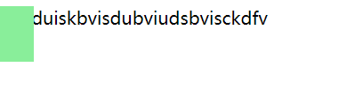
5.定位和文字
使用了绝对定位(固定定位)的盒子会完全压住盒子,包括文字
<!DOCTYPE html>
<html lang="en">

<head>
    <meta charset="UTF-8">
    <meta http-equiv="X-UA-Compatible" content="IE=edge">
    <meta name="viewport" content="width=device-width, initial-scale=1.0">
    <title>position</title>
</head>
<style>
    * {
        margin: 0;
        padding: 0;
    }

    .box1 {
        position: absolute;
        left: 0;
        background-color: rgb(137, 238, 154);
        width: 30px;
        height: 50px;
    }
</style>

<body>
    <di>
        <div class="box1"></div>
        <p>cbnduiskbvisdubviudsbvisckdfv</p>
        </div>
</body>

</html>
6.定位的拓展


声明:
部分图片来源黑马程序员pink老师(如有侵权,请联系删除)
链接:web网课


 被折叠的 条评论
为什么被折叠?
被折叠的 条评论
为什么被折叠?
 到【灌水乐园】发言


