


一、CSS简介
HTML 用于撰写页面的内容,而 CSS 将决定这些内容该如何在屏幕上呈现,如整个页面的布局,元素的位置、距离、颜色、大小、是否显示、是否浮动、透明度等等。
二、CSS语法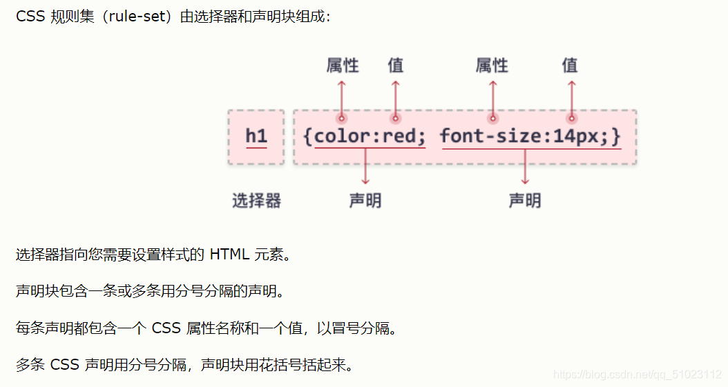
三、CSS怎样生效(VS code)
(一)外部样式
1、新建.html文件
<!DOCTYPE html>
<html>
<head>
  <meta charset="utf-8">
  <!-- 注意下面这个语句,将导入外部的 m.css 样式表文件 -->
  <link rel="stylesheet" type="text/css" href="m.css">
  <title>页面标题</title>
</head>
<body>
  <h1>我有颜色了</h1>
  <hr>
  <p class="xianlu">但依旧不够美</p>
</body>
</html>
2、在同一目录新建m.css文件
body {
    background-color: linen;
    text-align: center;
  }
  h1 {
    color: red;
  }
  .xianlu{
    margin-top: 100px;
    color: chocolate;
    font-size: 50px;
  }
3、打开网页,显示效果

(二)内部样式
跟上述例子一样的效果,只是在
<head>元素中引入了<style>标签。
1、再新建.html文件,直接输入
<!DOCTYPE html>
<html>
<head>
  <meta charset="utf-8">
  <title>页面标题</title>
  <style>
    body {
      background-color: linen;
      text-align: center;
    }
    h1 {
      color: red;
    }
    .xianlu {
      margin-top: 100px;
      color: chocolate;
      font-size: 50px;
    }
  </style>
</head>
<body>
  <h1>我是美丽的</h1>
  <hr>
  <p class="xianlu">但还是不够美</p>
</body>
</html>
2、显示效果:

(三)内联样式
直接把样式规则直接写到要应用的元素中。
<h2 style="color:green;">我带了绿帽子</h2>
显示效果:

四、尺寸和颜色
(一)颜色
<!-- 颜色名称 -->
<h3 style="background-color:Tomato;">番茄</h3>
<h3 style="background-color:Orange;">橘子</h3>
<h3 style="background-color:DodgerBlue;">蓝色</h3>
<h3 style="background-color:MediumSeaGreen;">绿色</h3>
<h3 style="background-color:Gray;">灰色</h3>
<hr>
<!-- 颜色值,3个字节分别代表RGB(Red,Green,Blue)的0~255的值 -->
<h3 style="background-color:#ff0000;">#ff0000</h3>
<h3 style="background-color:#0000ff;">#0000ff</h3>
<h3 style="background-color:#3cb371;">#3cb371</h3>
<!-- 文本颜色 -->
<h3 style="color:Tomato;">你好,世界!</h3>
<p style="color:DodgerBlue;">Just do it!</p>
显示效果:

(二)尺寸
外联样式:
.html文档body中,
<div class="example-1"> 世界太大</div>
<div class="example-2">我想去看看!</div>
别忘了head中,引用函数:
<link rel="stylesheet" type="text/css" href="m.css">
m.css中:
.example-1 {
    width: 100%;
    height: 100px;
    background-color: rgb(111, 25, 209);
    text-align: center;
  }
  .example-2 {
    height: 100px;
    width: 50%;
    background-color: rgb(226, 23, 33);
    text-align: center;
  }
显示效果:

注意:设置text-align属性为left, center, right即可对齐
五、边框模型
由内容 content, 内边距 padding, 边框 border, 外边距 margin构成的。
html中:
<div class="box1">我住在边框里</div>
<div class="box2">我渴望出去</div>
m.css中:
.box1 {
    height: 100px;
    width: 200px;
    background-color:#8454dd;
    color: aliceblue;
    border: 10px solid red;
    padding: 25px;
    margin: 25px;
  }
  .box2 {
    height: 100px;
    width: 200px;
    background-color:#004d61;
    color: aliceblue;
    border: 10px solid blue;
    padding: 25px;
    margin: 25px;
  }
显示效果:

审查元素:

六、边距、边框
(一)边框:
html:
<p class="example-3">我是红色直角边框.</p>
<p class="example-4">我是蓝色底部边框</p>
<p class="example-5">我有灰色圆边框</p>
<p class="example-6">我的紫色在左边缘</p>
m.css:
.example-3 {
    border: 1px dotted rgb(212, 23, 23); /* 上下左右都相同 */
  }
  .example-4 {
    border-bottom: 1px solid blue; /* 只设置底部边框 */
  }
  .example-5 {
    border: 1px solid grey;
    border-radius: 15px; /* 边框圆角 */
  }
  .example-6 {
    border-left: 5px solid purple;
  }
显示效果:

(二)边距
分为如下形式:
padding: 20px; /* 上下左右都相同 */
padding-top: 20px;
padding-bottom: 100px;
padding-right: 50px;
padding-left: 80px;
padding: 25px 50px 75px 100px; /* 简写形式,按上,右,下,左顺序设置 */
padding: 25px 10px; /* 简写形式,上下为25px,左右为10px */
七、定位
定位属性分为静态、相对、固定、绝对。
1、static
静态定位(position: static;)这是元素的默认定位方式,不管有没有设置,都是按照先后顺序正常布局。
2、relative
相对定位(position: relative;)把元素相对于静态位置进行偏移。
html:
<div class="example-relative">大家快看我是偏移的位置!</div>
<div>大家快看我是正常位置!</div>
m.css:
.example-relative {
    position: relative;
    left: 60px;
    top: 40px;
    background-color: rgb(173, 241, 241);
  }
对比效果:

3、fixed
固定定位(position: fixed;)使元素固定不动以及位置仍由top, bottom, left, right属性来确定
html:
<div class="example-fixed">我是不动的,不信你滑动看看!</div>
css:
.example-fixed {
    position: fixed;
    bottom: 40px;
    right: 10px;
    padding: 6px 24px;
    border-radius: 4px;
    color: #fff;
    background-color: #9d0f0f;
    cursor: pointer;
    box-shadow: 0 3px 3px 0 rgba(0,0,0,0.3), 0 1px 5px 0 rgba(0,0,0,0.12), 0 3px 1px -2px rgba(0,0,0,0.2);
  }
显示效果:

4、absolute
绝对定位(position: absolute;)使元素相对于其最近的定位属性(非static)的父元素进行偏移。如果其所有父元素都没有设置定位属性,那就相对于<body>这个父元素。
html:
<div class="example-relative">这是父元素,带有 relative 定位属性
  <div class="example-absolute">
    这是子元素,带有 absolute 定位属性
  </div>
</div>
css:
 .example-relative {
    position: relative;
    width: 400px;
    height: 200px;
    border: 3px solid rgb(87, 33, 173);
  }
  .example-absolute {
    position: absolute;
    top: 80px;
    right: 5px;
    width: 200px;
    height: 100px;
    border: 3px solid rgb(218, 73, 16);
  }
显示效果:

八、溢出元素处理
当元素超出指定区域时,用overflow属性来处理这部分元素。
溢出的几种属性:
1、visible 默认值,溢出部分在区域外面显示
2、hidden 裁剪溢出部分且不可见
3、scroll 裁剪溢出部分,但提供上下和左右滚动条供显示
4、auto 裁剪溢出部分,视情况提供滚动条
下面用scroll验证:
html:
<div class="example-overflow-scroll-y">
  一沙一世界,<br>
  一花一天堂;<br>
  无限手中握,<br>
  永恒一瞬间!<br>
   一叶绽放一追寻,<br>
   一花盛开一世界,<br>
   一生相思为一人。 <br>
   古道少人行,<br>
   忧来谁共语 <br>
   清音俗世流, <br>
   纷争几时休, <br>
   谁能破名利, <br>
   太虚任遨游。<br>
</div>
css:
.example-overflow-scroll-y {
    width: 200px;
    height: 100px;
    background-color: #eee;
    overflow-y: scroll;
  }
显示效果:

九、元素浮动
float属性让某元素水平方向上向左或右进行移动
html:
<img src="2222.jpg" class="example-float-right" alt="">
  <p>猫是我大利子时的玩伴,是我的挚友,我不知觉们妈成成猫的往作么如子,孤独骄傲,拨撩人生。
    可去我下种年叫地心看也将为得有养猫了,我年叫地心看怎么养,也养不出我逝去的挚友们。</p>
css:
.example-float-right {
    float: right;
    width: 100px;
    height: 100px;
  }
显示效果:

从左排序:
html:
<img src="1111.jpg" class="example-float-left" alt="">
<img src="2222.jpg" class="example-float-left" alt="">
<img src="3333.jpg" class="example-float-left" alt="">
<img src="4444.jpg" class="example-float-left" alt="">
css:
.example-float-left {
    float: left;
    width: 100px;
    height: 100px;
显示效果:

如果要元素后面的元素在其下方显示,可使用clear: both样式来进行清除。
显示效果:


十、元素的不透明度
可以用opacity对元素(图片)设置不透明度。 值在[0.0~1.0]之间,值越低,不透明度越高.
html:
<html>
<head>
  <style>
    img {
      width: 25%;
      border-radius: 10px;
      float: left;
      margin: 10px;
    }
    .opacity-2 {
      opacity: 0.2;
    }
    .opacity-5 {
      opacity: 0.5;
    }
    .opacity-10 {
      opacity: 1;
    }
  </style>
</head>
<body>
  <img class="opacity-2" src="https://mdbootstrap.com/img/Photos/Others/images/81.jpg">
  <img class="opacity-5" src="https://mdbootstrap.com/img/Photos/Others/images/81.jpg">
  <img class="opacity-10" src="https://mdbootstrap.com/img/Photos/Others/images/81.jpg">
</body>
</html>
显示效果:

十一、组合选择
通过选择器可以进行组合,以得到简洁精确的选择。
(一)后代选择器
.xixi p 代表div元素内有所有.xixi的这种元素。
html:
<html>
<head>
  <style>
    .xixi p {
      background-color: rgb(0, 255, 98);
    }
  </style>
</head>
<body>
  <div class="xixi">
    <p>Hold infinity in the palm of your hand. and eternity in an hour.</p>
    <p>for short, do not remember every detail, every mood.</p>
    <span>
        <p>When a cigarette falls in love with a match,it is destined to be hurt.
        </p>
    </span>
  </div>
  <p>No man or woman is worth your tears, and the one who is, won’t make you cry.</p>
  <p>Everytime you come to mind, i realize i'm smiling. </p>
</body>
</html>
显示效果:

(二)直接后代选择器
以>作为分隔
html:
<html>
<head>
  <style>
    .xixi > p {
      background-color: rgb(190, 42, 61);
    }
  </style>
</head>
<body>
  <div class="xixi">
    <p>my heart is wherever you are.</p>
    <p>god helps those who help themselves.</p>
    <span>
        <p>thank you for standing behind me</p>
    </span>
  </div>
  <p>look into my eyes - you will see what you mean to me.</p>
  <p>all or nothing, now or never.</p>
</body>
</html>
显示效果:

由于第三句的的上一级元素是span,所以即使在xixi元素内,也不显示.xixi的颜色。
十二、伪类、伪元素
伪类或伪元素用于定义元素的某种特定形态位置等。
语法如下:
selector:pseudo-class/pseudo-element {
  property:value;
}
例如:
p:first-line{color:blue;}   /* 段落的第一行显示蓝色 */
p:first-letter{font-size: xx-large;}   /* 段落的第一个字超大 */

h1:before { content:url(smiley.gif); } /* 在每个一级标题前插入该图片 */
h1:after { content:url(smiley.gif); } /* 在每个一级标题后插入该图片 */


 759
759

 被折叠的 条评论
为什么被折叠?
被折叠的 条评论
为什么被折叠?
 到【灌水乐园】发言


