


1.1页面展示
1.鼠标未移入状态

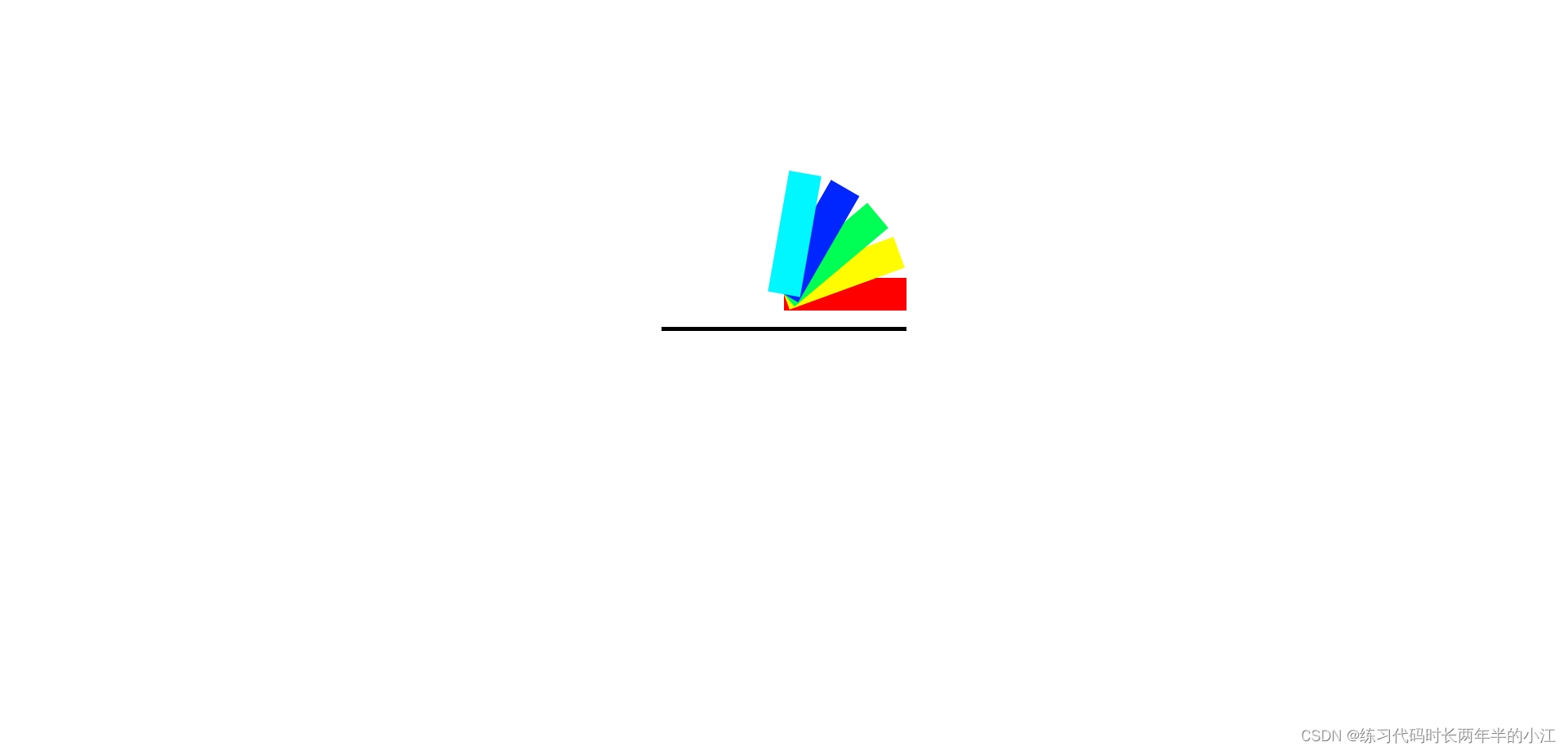
3.鼠标全移入状态
注意:动画状态,可自行使用代码实验
1.2 代码展示
<!DOCTYPE html>
<html lang="en">
<head>
    <meta charset="UTF-8">
    <meta name="viewport" content="width=device-width, initial-scale=1.0">
    <title>Document</title>
    <style>
        .box{
            width: 300px;
            height: 300px;
            border-bottom: 5px solid black;
            margin: 100px auto;
            position: relative;
        }
        .box div{
            width: 40px;
            height: 150px;
            position: absolute;
            top: 110px;
            left: 130px;
            transition: 1s;
            transform-origin: center bottom;
        }
        .box:hover div:nth-child(1){
            background-color: red;
            transform: rotate(90deg);
        }
        .box:hover div:nth-child(2){
            background-color: rgb(255, 251, 0);
            transform: rotate(70deg);
        }
        .box:hover div:nth-child(3){
            background-color: rgb(0, 255, 85);
            transform: rotate(50deg);
        }
        .box:hover div:nth-child(4){
            background-color: rgb(0, 38, 255);
            transform: rotate(30deg);
        }
        .box:hover div:nth-child(5){
            background-color: rgb(0, 247, 255);
            transform: rotate(10deg);
        }
    </style>
</head>
<body>
    <div class="box">
        <div></div>
        <div></div>
        <div></div>
        <div></div>
        <div></div>
    </div>
</body>
</html>


 1292
1292


 被折叠的 条评论
为什么被折叠?
被折叠的 条评论
为什么被折叠?
 到【灌水乐园】发言


