50 天学习 50 个项目 - HTMLCSS and JavaScript
day02-progress-steps(进度条)
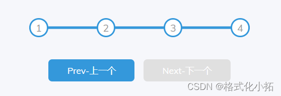
效果
index.html
<!DOCTYPE html>
<html lang="en">
<head>
<meta charset="UTF-8">
<meta name="viewport" content="width=device-width, initial-scale=1.0">
<title>Progress Steps</title>
<link rel="stylesheet" href="style.css">
</head>
<body>
<div class="container">
<div class="progress-container">
<div class="progress" id="progress"></div>
<div class="circle active">1</div>
<div class="circle">2</div>
<div class="circle">3</div>
<div class="circle">4</div>
</div>
<button class="btn" id="prev" disabled>Prev-上一个</button>
<button class="btn" id="next">Next-下一个</button>
</div>
<script src="script.js"></script>
</body>
</html>
style.css
@import url('https://fonts.googleapis.com/css?family=Muli&display=swap');
:root {
--line-border-fill: #3498db;
--line-border-empty: #e0e0e0;
}
* {
box-sizing: border-box;
}
body {
background-color: #f6f7fb;
font-family: 'Muli', sans-serif;
display: flex;
align-items: center;
justify-content: center;
height: 100vh;
overflow: hidden;
margin: 0;
}
.container {
text-align: center;
}
.progress-container {
display: flex;
justify-content: space-between;
position: relative;
margin-bottom: 30px;
max-width: 100%;
width: 350px;
}
.progress-container::before {
content: '';
background-color: var(--line-border-empty);
position: absolute;
top: 50%;
left: 0;
transform: translateY(-50%);
height: 4px;
width: 100%;
z-index: -1;
}
.progress {
background-color: var(--line-border-fill);
position: absolute;
top: 50%;
left: 0;
transform: translateY(-50%);
height: 4px;
width: 0%;
z-index: -1;
transition: 0.5s ease;
}
.circle {
background-color: #fff;
color: #999;
border-radius: 50%;
height: 30px;
width: 30px;
display: flex;
align-items: center;
justify-content: center;
border: 3px solid var(--line-border-empty);
transition: 0.5s ease;
}
.circle.active {
border-color: var(--line-border-fill);
}
.btn {
background-color: var(--line-border-fill);
color: #fff;
border: 0;
border-radius: 6px;
cursor: pointer;
font-family: inherit;
padding: 8px 30px;
margin: 5px;
font-size: 14px;
}
.btn:active {
transform: scale(0.98);
}
.btn:focus {
outline: 0;
}
.btn:disabled {
background-color: var(--line-border-empty);
cursor: not-allowed;
}
script.js
const progress = document.querySelector("#progress");
const prev = document.getElementById('prev');
const next = document.getElementById('next');
const circles = document.querySelectorAll('.circle');
let currentActive = 1;
next.addEventListener('click', () => {
currentActive++;
if (currentActive > circles.length) {
currentActive = circles.length;
}
circles.forEach((circle, index) => {
if (index < currentActive) {
circle.classList.add('active');
} else {
circle.classList.remove('active');
}
})
const actives = document.querySelectorAll('.active');
progress.style.width = (actives.length - 1) / (circles.length - 1) * 100 + '%';
if (currentActive === 1) {
prev.disabled = true;
} else if (currentActive === circles.length) {
next.disabled = true;
} else {
prev.disabled = false;
next.disabled = false;
}
})
prev.addEventListener('click', () => {
currentActive--;
if (currentActive < 1) {
currentActive = 1;
}
circles.forEach((circle, index) => {
if (index < currentActive) {
circle.classList.add('active');
} else {
circle.classList.remove('active');
}
})
const actives = document.querySelectorAll('.active');
progress.style.width = (actives.length - 1) / (circles.length - 1) * 100 + '%';
if (currentActive === 1) {
prev.disabled = true;
} else if (currentActive === circles.length) {
next.disabled = true;
} else {
prev.disabled = false;
next.disabled = false;
}
})


 1174
1174

 被折叠的 条评论
为什么被折叠?
被折叠的 条评论
为什么被折叠?
 到【灌水乐园】发言


