


Canvas and CanvasObject 画布和画布对象
In Fyne a is the area which an application is drawn within. Each window has a canvas which you can access with but usually you will find functions on that avoid accessing the canvas.Canvas Window.Canvas() Window
在fyne在canvas是一个在应用程序中绘画的区域,每一个窗口都有一个你可以通过Window.Canvas() 访问的canvas 但是通常你都会使用其他函数从而避免直接访问这个canvas
Everything that can be drawn in Fyne is a type of . The example here opens a new window and then shows different types of primitive graphical element by setting the content of the window canvas. There are many ways that each type of object can be customised as shown with the text and circle examples.CanvasObject
在fyne中每一个可以绘制的都属于CanvasObject 类型,这里实例打开一个新窗口,然后通过设置窗口canvas的内容去显示不同的类型的图形事件元素。像文本和圆形例子他们通过很多种方法自定义每种类型的对象
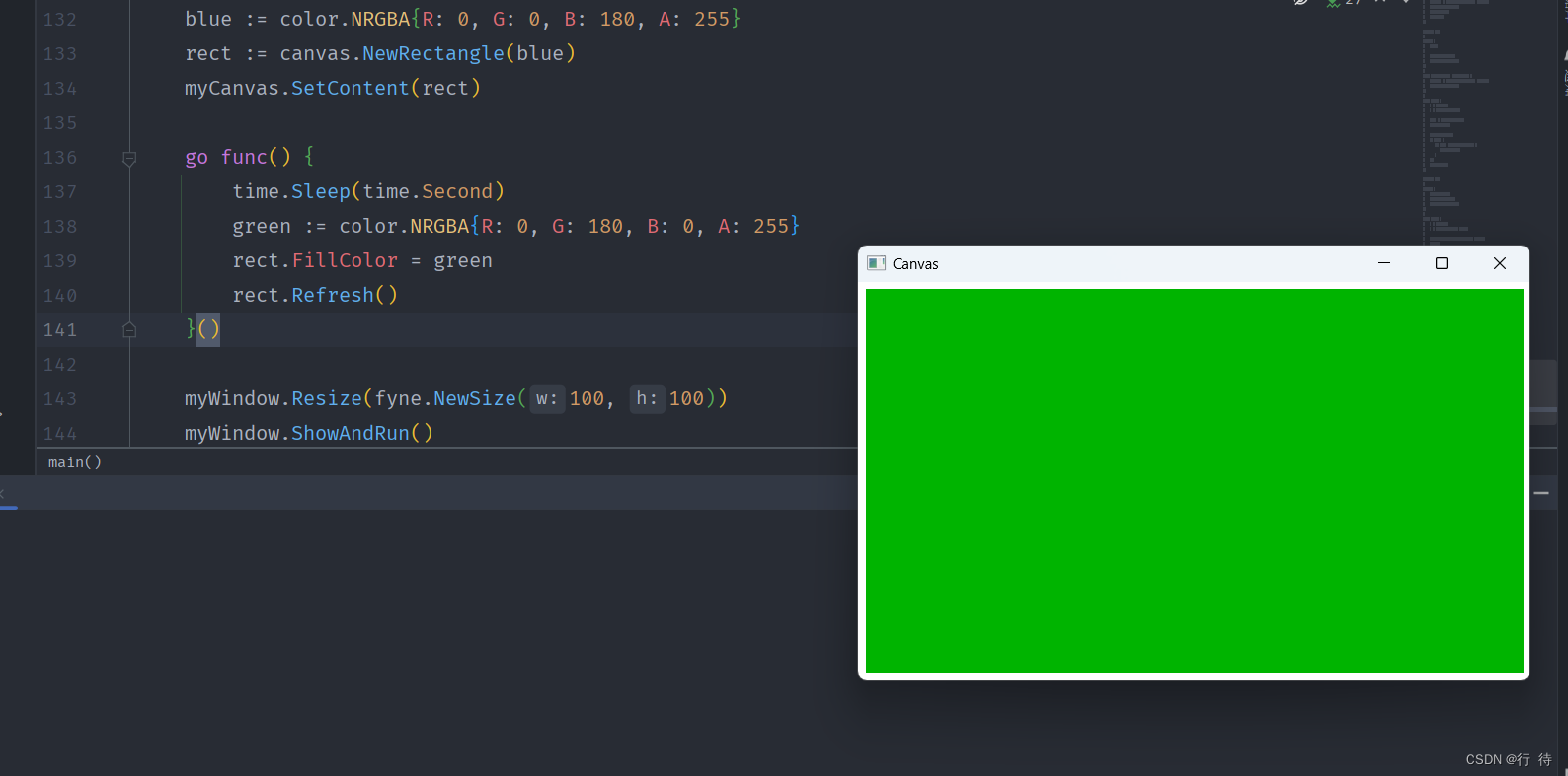
As well as changing the content shown using it is possible to change the content that is currently visible. If, for example, you change the of a rectangle you can request a refresh of this existing component using .Canvas.SetContent() FillColour rect.Refresh()
除了使用Canvas.SetContent()修改显示的内容外也可以修改当前可见的东西 例如修改 fillcolour 矩形的颜色,你可以使用rect.Refresh()刷新这个组件
package main


import (

   "fyne.io/fyne/v2"

   "fyne.io/fyne/v2/app"

   "fyne.io/fyne/v2/canvas"

   "image/color"

   "time"

)


func main() {

   myApp := app.New()

   myWindow := myApp.NewWindow("Canvas")

   myCanvas := myWindow.Canvas()


   blue := color.NRGBA{R: 0, G: 0, B: 180, A: 255}

   rect := canvas.NewRectangle(blue)

   myCanvas.SetContent(rect)


   go func() {

      time.Sleep(time.Second)

      green := color.NRGBA{R: 0, G: 180, B: 0, A: 255}

      rect.FillColor = green

      rect.Refresh()

   }()


   myWindow.Resize(fyne.NewSize(100, 100))

   myWindow.ShowAndRun()

}
Widget 部件
A is a special type of canvas object that has interactive elements associated with it. In widgets the logic is separate from the way that it looks (also called the ).fyne.Widget WidgetRenderer
fyne.Widget 是一个特殊的canvas对象,他具有与之关联的交互元素,在widget中,逻辑和外观是相互分开的,也被叫做(WidgetRenderer)
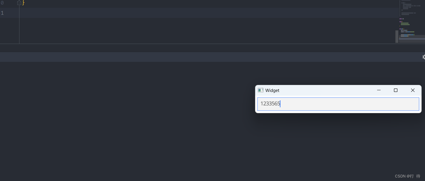
Widgets are also types of and so we can set the content of our window to a single widget. See how we create a new and set it as the content of the window in this example.CanvasObject widget.Entry
widget 小部件也是一种 CanvasObject 所以我们可以将窗口设置为一个单个的widget部件,下面这个例子展示如何创建一个新的widget.Entry并且设置他的内容
package main


import (

"fyne.io/fyne/v2/app"

"fyne.io/fyne/v2/widget"

)


func main() {

myApp := app.New()

myWindow := myApp.NewWindow("Widget")


myWindow.SetContent(widget.NewEntry())

myWindow.ShowAndRun()

}
Container and Layouts 容器和布局
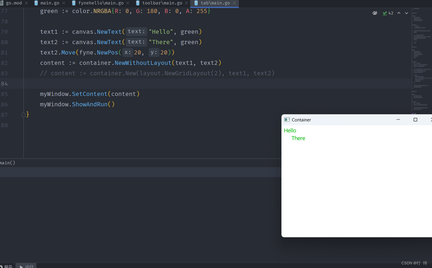
In the previous example we saw how to set a to the content of a , but it is not very useful to only show one visual element. To show more than one item we use the type.CanvasObject Canvas Container
在前面的实例中,我们看到如果设置CanvasObject的canvas内容,但是显示一个视觉元素这些并不是很有用,为了显示更多的东西我们使用container 对象
As the also is a fyne.Container, we can set it to be the content of a fyne.CanvasObject. In this example we create 3 text objects and then place them in a container using the function. As there is no layout set we can move the elements around like you see with .fyne.Container fyne.CanvasObject fyne.Canvas container.NewWithoutLayout() text2.Move()
由于fyne.container 也是一个fyne.canvasobject,我们就可以将其设置为fyne.canvas的内容,在本例中我们创建3个文本对象,然后将他们放置在NewWithoutLayout() 函数创建的容器中。他们没有布局,我们可以用text.move()移动元素。就像你看到的那样。
package main


import (

"image/color"


"fyne.io/fyne/v2"

"fyne.io/fyne/v2/app"

"fyne.io/fyne/v2/canvas"

"fyne.io/fyne/v2/container"

//"fyne.io/fyne/v2/layout"

)


func main() {

myApp := app.New()

myWindow := myApp.NewWindow("Container")

green := color.NRGBA{R: 0, G: 180, B: 0, A: 255}


text1 := canvas.NewText("Hello", green)

text2 := canvas.NewText("There", green)

text2.Move(fyne.NewPos(20, 20))

content := container.NewWithoutLayout(text1, text2)

// content := container.New(layout.NewGridLayout(2), text1, text2)


myWindow.SetContent(content)

myWindow.ShowAndRun()

}
A implements a method for organising items within a container. By uncommenting the line in this example you alter the container to use a grid layout with 2 columns. Run this code and try resizing the window to see how the layout automatically configures the contents of the window. Notice also that the manual position of is ignored by the layout code.fyne.Layout container.New() text2
fyne.layout 实现了一种在容器内部组织项目的方法,通过取消注释container.New()此示例中的行,您可以更改容器以使用具有 2 列的网格布局。运行此代码并尝试调整窗口大小以查看布局如何自动配置窗口的内容。另请注意,text2 布局代码忽略了手动位置。
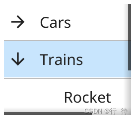
To see more you can check out the Layout list.
Widget List 部件列表
Standard Widgets (in widget package) 标准小部件包
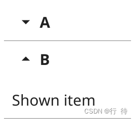
Accordion 手风琴
Accordion displays a list of AccordionItems. Each item is represented by a button that reveals a detailed view when tapped.
Accordion 显示 AccordionItems 列表。每个项目都由一个按钮表示,点击该按钮会显示详细视图。
Button 按钮
Button widget has a text label and icon, both are optional.
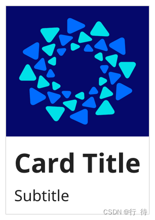
Card 卡片
Card widget groups elements with a header and subheader, all are optional.
Check 复选框
Check widget has a text label and a checked (or unchecked) icon.
Entry 输入框
Entry widget allows simple text to be input when focused.


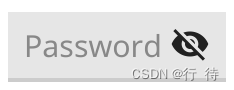
PasswordEntry 密码输入框
widget hides text input and adds a button to display the text.
FileIcon 文件图标
FileIcon provides helpful standard icons for various types of file. It displays the type of file as an indicator icon and shows the extension of the file type.
文件图标 控件 为各类文件提供有用的标准图标,他将文件类型显示为指示器图标并显示文件类型的扩展名。

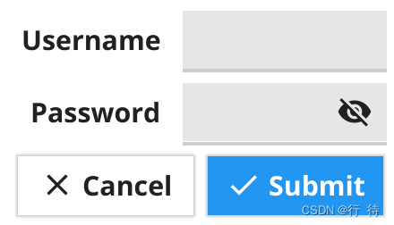
Form 表单控件
Form widget is two column grid where each row has a label and a widget (usually an input). The last row of the grid will contain the appropriate form control buttons if any should be shown.
表单控件时两列的网格,其中每一行都有一个标签和一个小部件(通常是一个输入) 最后一行将包含适当的表单控制按钮
Hyperlink 超链接
Hyperlink widget is a text component with appropriate padding and layout. When clicked, the URL opens in your default web browser.
超链接控件 是具有适当填充和布局的文本组件,单击后,url 将在你默认的web 浏览器中打开
Icon 图标
Icon widget is a basic image component that load’s its resource to match the theme.

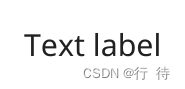
Label 标签
Label widget is a label component with appropriate padding and layout.
Progress bar 进度条
ProgressBar widget creates a horizontal panel that indicates progress.
ProgressBarInfinite 无限进度条
widget creates a horizontal panel that indicates waiting indefinitely An infinite progress bar loops 0% -> 100% repeatedly until Stop() is called.
创建一个无限进度条的控件一直在0-100 之间反复,直到调用stop() 函数为止
RadioGroup 单选组
RadioGroup widget has a list of text labels and radio check icons next to each.
Select 下拉选择栏
Select widget has a list of options, with the current one shown, and triggers an event function when clicked.
下拉选择栏部件有一个选项列表,显示当前列表,并在单击时触发函数

SelectEntry 下拉选择框可输入选择
Select entry widget adds an editable component to the select widget. Users can select an option or enter their own value.
小部件将可编辑组件添加到选择框小组件,用户可以选择一个值或者输入自己的值

Separator 分割线
Separator widget shows a dividing line between other elements.
Slider 滑块控件
Slider if a widget that can slide between two fixed values.
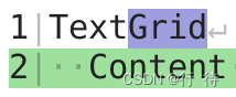
TextGrid 文本网格
TextGrid is a monospaced grid of characters. This is designed to be used by a text editor, code preview or terminal emulator.
文本网格控件是一个等宽的字符网格,旨在提供文本编辑器,代码预览和终端仿真器使用
Toolbar 工具栏
Toolbar widget creates a horizontal list of tool buttons.
Collection Widgets (in widget package) 集成部件
Collection widgets provide advanced caching functionality to provide high performance rendering of massive data. This does lead to a more complex constructor, but is a good balance for the outcome it enables. Each of these widgets uses a series of callbacks, the minimum set is defined by their constructor function, which includes the data size, the creation of template items that can be re-used and finally the function that applies data to a widget as it is about to be added to the display.
集成控件提供高级缓存的功能,以实现海量数据的高性能呈现,这导致了很多复杂构造函数,但是对于他可以实现的结果来说是一个很好的平衡,每一个小部件都使用一系列的回调函数,最小的集合是通过他们析构函数构建的包括了数据大小,可重复使用的模板,数据应用与部件的函数
List 列表
List provides a high performance vertical scroll of many sub-items.
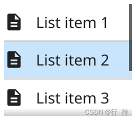
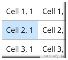
Table 表格
Table provides a high performance scrolled two dimensional display of many sub-items.
Tree 树
Tree provides a high performance vertical scroll of items that can be expanded to reveal child elements..
Container Widgets (in container package) 容器部件(container 包)
Container widgets are like regular containers but they provide some additional functionality.
AppTabs 应用选项卡
AppTabs widget allows switching visible content from a list of TabItems. Each item is represented by a button at the top of the widget.
AppTabs 小部件允许从 TabItems 列表切换可见内容。每个项目都由小部件顶部的按钮表示。
Scroll 滚动器
ScrollContainer defines a container that is smaller than the Content.
ScrollContainer 定义了一个小于 Content 的容器

Split 分割器
SplitContainer defines a container whose size is split between two children.
Layout List 布局列表
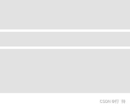
Horizontal Box (HBox) 水平布局
Horizontal Box arranges items in a horizontal row. Every element will have the same height (the height of the tallest item in the container) and objects will be left-aligned at their minimum width.
水平盒子将项目排列在水平方向上,每个项目都有相同的高度,(容器中最高的项目) 并且 对象将在器最小宽度处左对齐。

Vertical Box (VBox) 垂直盒子
Vertical Box arranges items in a vertical column. Every element will have the same width (the width of the widest item in the container) and objects will be top-aligned at their minimum height.
垂直盒子将项目排列在垂直排列中,每个元素具有相同的宽度,(容器中最宽的宽度),并且对象将在器最小高度处顶部对齐
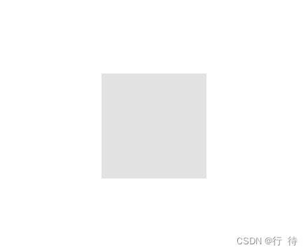
Center 居中
Center layout positions all container elements in the center of the container. Every object will be set to it’s minimum size.
居中布局 将 所有容器元素放置在容器中心,每个对象都将设置最小尺寸
Form 表单布局
Form layout arranges items in pairs where the first column is at minimum width. This is normally useful for labelling elements in a form, where the label is in the first column and the item it describes is in the second. You should always add an even number of elements to a form layout.
表单布局,将项目成对排列,其中一列的宽度最小,这对于在表单中标记元素通常是很有用的,其中标签位于第一列,而他的描述项目位于第二列。你应该始终像表单中添加偶数个元素
Grid 网格布局
Grid layout arranges items equally in the available space. A number of columns is specified, with objects being positioned horizontally until the number of columns is reached at which point a new row is started. All objects have the same size, that is width divided by column total and the height will be total height divided by the number of rows required. Minus padding.
网格布局可以在空间中平均排列项目,指定列数,对象水平放置,直到达到列数,此时换行开始,所有对象具有相同的大小,即宽度除以总列,高度除以总行,减去填充
GridWrap 网格环绕
GridWrap layout arranges all items to flow along a row, wrapping to a new row if there is insufficient space. All objects will be set to the same size, which is the size passed to the layout. This layout may not respect item MinSize to manage this uniform layout. Often used in file managers or image thumbnail lists.
GridWrap 布局将所有项目排列成一行,如果空间不足,则换行到新行。所有对象都将设置为相同的大小,即传递给布局的大小。此布局可能不尊重项目 MinSize 来管理此统一布局。通常用于文件管理器或图像缩略图列表。
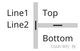
Border 边框布局
Border layout supports positioning of items at the outside of available space. The border is passed pointers to the objects for (top, left, bottom, right). All items in the container that are not positioned on a border will fill the remaining space.
边框布局支持将项目定位在可用空间之外。边框被传递给(上、左、下、右)对象的指针。容器中未定位在边框上的所有项目将填充剩余空间
Max 最大
Max layout positions all container elements to fill the available space. The objects will all be full-sized and drawn in the order they were added to the container (last-most is on top).
最大布局定位所有容器元素以填充可用空间。这些对象都将是全尺寸的,并按照它们添加到容器中的顺序绘制(最后一个在顶部)。

Padded 填充
Padded layout positions all container elements to fill the available space but with a small padding around the outside. The size of the padding is theme specific. The objects will all be drawn in the order they were added to the container (last-most is on top).
填充布局定位所有容器元素以填充可用空间,但在外部有一个小填充。填充的大小是特定于主题的。所有对象都将按照它们添加到容器中的顺序绘制(最后一个在顶部)。

Combining Layouts 组合布局
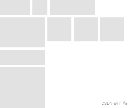
It is possible to build up more complex application structures by using multiple layouts. Multiple containers that each have their own layout can be nested to create complete user interface arrangements using only the standard layouts listed above. For example a horizontal box for a header, a vertical box for a left side file panel and a grid wrap layout in the content area - all inside a container using a border layout can build the result illustrated below.
可以嵌套多个容器,每个容器都有自己的布局,以仅使用上面列出的标准布局创建完整的用户界面排列。例如标题的水平框,左侧文件面板的垂直框和内容区域中的网格环绕布局 - 使用边框布局的所有容器内都可以构建如下所示的结果。
Dialog List 对话框列表
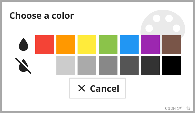
Color
Allow users to pick a colour from a standard set (or any color in advanced mode).
Confirm
Ask for conformation of an action.

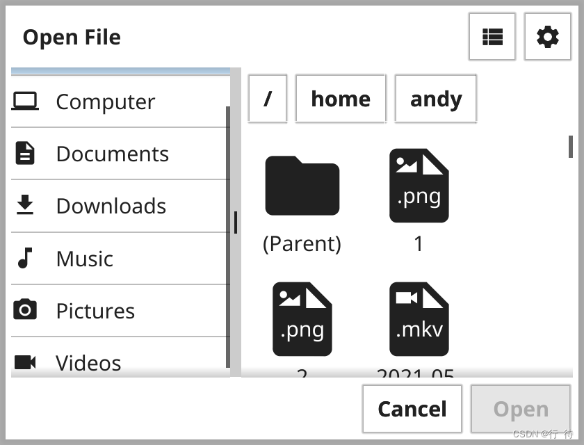
FileOpen
Present this to ask user to choose a file to use inside the app. The actual dialog displayed will depend on the current operating system.
展示此内容以要求用户选择要在应用内使用的文件。实际显示的对话框取决于当前的操作系统。
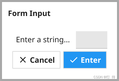
Form
Get various input elements in a dialog, with validation.
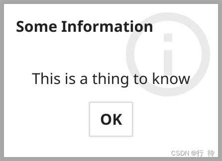
Information
A simple way to present some information to the app user.
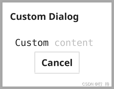
Custom 通用
Present any content inside a dialog container.
Adding Shortcuts to an App 向应用程序添加快捷方式
Shortcuts are common tasks that can be triggered by keyboard combinations or context menus. Shortcuts, much like keyboard events, can be attached to a focused element or registered on the Canvas to always be available in a Window.
快捷键是可由键盘组合或上下文菜单触发的常见任务。快捷键与键盘事件非常相似,可以附加到焦点元素或在画布上注册,以始终在窗口中可用
Registering with a Canvas 使用canvas 注册
There are many standard shortcuts defined (such as fyne.ShortcutCopy) which are connected to standard keyboard shortcuts and right-click menus. The first step to adding a new Shortcut is to define the shortcut. For most uses this will be a keyboard triggered shortcut, which is a desktop extension. To do this we use desktop.CustomShortcut, for example to use the Tab key and Control modifier you might do the following:
定义了许多标准快捷键(例如fyne.ShortcutCopy),它们连接到标准键盘快捷键和右键菜单。第一步添加Shortcut是定义快捷方式。对于大多数用途,这将是一个键盘触发的快捷方式,它是一个桌面扩展。为此,我们使用desktop.CustomShortcut,例如使用 Tab 键和 Control 修饰符,您可以执行以下操作:
ctrlTab    := &desktop.CustomShortcut{KeyName: fyne.KeyTab, Modifier: fyne.KeyModifierControl}

ctrlAltTab := &desktop.CustomShortcut{KeyName: fyne.KeyTab, Modifier: fyne.KeyModifierControl | fyne.KeyModifierAlt}
Notice that this shortcut can be re-used so you could attach it to menus or other items as well. For this example we want it to be always available, so we register it with our window’s Canvas as follows:
请注意,此快捷方式可以重复使用,因此您也可以将其附加到菜单或其他项目。对于此示例,我们希望它始终可用,因此我们将其注册到我们的窗口 Canvas 中,如下所示
ctrlTab := &desktop.CustomShortcut{KeyName: fyne.KeyTab, Modifier: fyne.KeyModifierControl}

w.Canvas().AddShortcut(ctrlTab, func(shortcut fyne.Shortcut) {

log.Println("We tapped Ctrl+Tab")

})

w.Canvas().AddShortcut(ctrlAltTab, func(shortcut fyne.Shortcut) {

log.Println("We tapped Ctrl+Alt+Tab")

})
As you can see there are two parts to registering a shortcut in this way - passing the shortcut definition and also a callback function. If the user types the keyboard shortcut then the function will be called and the output printed.
如您所见,以这种方式注册快捷方式有两个部分 - 传递快捷方式定义和回调函数。如果用户键入键盘快捷键,则将调用该函数并打印输出。
Adding shortcuts to an Entry 输入框(Entry)添加快捷方式
It can also be helpful to have a shortcut apply only when the current item is focused. This approach can be used for any focusable widget, and is managed by extending that widget and adding a TypedShortcut handler. This is much like adding key handlers, except the value passed in will be a fyne.Shortcut.
仅在当前项目获得焦点时应用快捷方式也很有帮助。这种方法可用于任何可聚焦的小部件,并通过扩展该小部件并添加
TypedShortcut处理程序来管理。这很像添加键处理程序,除了传入的值将是fyne.Shortcut.
type myEntry struct {

widget.Entry

}


func (m *myEntry) TypedShortcut(s fyne.Shortcut) {

if _, ok := s.(*desktop.CustomShortcut); !ok {

m.Entry.TypedShortcut(s)

return

}


log.Println("Shortcut typed:", s)

}
From the excerpt above you can see how a TypedShortcut handler might be implemented. Inside this function you should check whether the shortcut is of the custom type used earlier. If the shortcut is a standard one it’s a good idea to call the original shortcut handler (if the widget had one). With those checks done you can compare the shortcut with the various types you are handling (if there are multiple).
TypedShortcut处理程序。在此函数中,您应该检查快捷方式是否属于之前使用的自定义类型。如果快捷方式是标准快捷方式,最好调用原始快捷方式处理程序(如果小部件有一个)。完成这些检查后,您可以将快捷方式与您正在处理的各种类型(如果有多个)进行比较。
Using the Preferences API 使用[Preferences] API
Storing user configurations and values is a common task for application developers, but implementing it across multiple platforms can be tedious and time-consuming. To make it easier, Fyne has an API for storing values on the filesystem in a clean and understandable way while the complex parts are handled for you.
Lets start with the setup of the API. It is part of the Preferences interface where storage and loading functions exist for values of Bool, Float, Int and String. They each consist of three different functions, one for loading, one loading with a fallback value and lastly, one for storing values. An example of the three functions and their behaviour can be seen below for the String type:
存储用户配置和值是应用程序开发人员的一项常见任务,但跨多个平台实现它可能是乏味且耗时的。为了使它更容易,Fyne 有一个 API 用于在文件系统上以一种清晰易懂的方式存储值,同时为您处理复杂的部分。
让我们从 API 的设置开始。它是Preferences接口的一部分,其中存在 Bool、Float、Int 和 String 值的存储和加载函数。它们每个都包含三个不同的功能,一个用于加载,一个用于加载备用值,最后一个用于存储值。下面是 String 类型的三个函数及其行为的示例:
// String looks up a string value for the key 字符串查找键的字符串值

String(key string) string

// StringWithFallback looks up a string value and returns the given fallback if not found StringWithFallback

//查找一个字符串值,如果未找到,则返回给定的回退

StringWithFallback(key, fallback string) string

// SetString saves a string value for the given key     SetString 为给定键保存字符串值

SetString(key string, value string)
These functions can be accessed through the created application variable and calling the Preferences() method on. Please note that it is necessary to create the apps with a unique ID (usually like a reversed url). This means that the application will need to be created using app.NewWithID() to have its own place to store values. It can roughly be used like the example below:
Preferences()方法来访问。请注意,必须创建具有唯一 ID 的应用程序(通常像反向 url)。这意味着需要使用创建应用程序
app.NewWithID()来拥有自己的位置来存储值。它大致可以像下面的例子一样使用:
a := app.NewWithID("com.example.tutorial.preferences")

[...]

a.Preferences().SetBool("Boolean", true)

number := a.Preferences().IntWithFallback("ApplicationLuckyNumber", 21)

expression := a.Preferences().String("RegularExpression")

[...]
To show this, we are going to build a simple little app that always closes after a set amount of time. This timeout should be user changeable and applied on the next start of the application.
Let us start by creating a variable called timeout that will be used to store time in the form of time.Duration.
var timeout time.DurationThen we could create a select widget to let the user select the timeout from a couple pre-defined strings and then multiplying the timeout by the number of seconds that the string relates to. Lastly, the "AppTimeout" key is used to set the string value to the selected one.
为了展示这一点,我们将构建一个简单的小应用程序,它总是在设定的时间后关闭。此超时应该是用户可更改的,并在应用程序的下一次启动时应用。
让我们首先创建一个名为的变量,该变量timeout将用于以 的形式存储时间time.Duration
timeoutSelector := widget.NewSelect([]string{"10 seconds", "30 seconds", "1 minute"}, func(selected string) {

    switch selected {

    case "10 seconds":

        timeout = 10 * time.Second

    case "30 seconds":

        timeout = 30 * time.Second

    case "1 minute":

        timeout = time.Minute

    }


    a.Preferences().SetString("AppTimeout", selected)

})
Now we want to grab the set value and if none exists, we want to have a fallback that sets the timeout to the shortest one possible to save the user time when waiting. This can be done by setting the selected value of timeoutSelector to the loaded value or the fallback if that happens to be the case. By doing it this way, the code inside the select widget will run for that specific value.
现在我们想要获取设置的值,如果不存在,我们想要一个后备,将超时设置为尽可能短的时间,以节省用户等待时的时间。这可以通过将 timeoutSelector的选定值设置
为加载的值或在这种情况下的回退来完成。通过这样做,选择小部件内的代码将为该特定值运行。
timeoutSelector.SetSelected(a.Preferences().StringWithFallback("AppTimeout", "10 seconds"))The last part will just be to have a function that starts in a separate goroutine and tells the application to quit after the selected timeout.
最后一部分将只是拥有一个在单独的 goroutine 中启动的函数,并告诉应用程序在选定的超时后退出。
go func() {

    time.Sleep(timeout)

    a.Quit()

}()
In the end, the resulting code should look something like this:
package main


import (

    "time"


    "fyne.io/fyne/v2/app"

    "fyne.io/fyne/v2/widget"

)


func main() {

    a := app.NewWithID("com.example.tutorial.preferences")

    w := a.NewWindow("Timeout")


    var timeout time.Duration


    timeoutSelector := widget.NewSelect([]string{"10 seconds", "30 seconds", "1 minute"}, func(selected string) {

        switch selected {

        case "10 seconds":

            timeout = 10 * time.Second

        case "30 seconds":

            timeout = 30 * time.Second

        case "1 minute":

            timeout = time.Minute

        }


        a.Preferences().SetString("AppTimeout", selected)

    })


    timeoutSelector.SetSelected(a.Preferences().StringWithFallback("AppTimeout", "10 seconds"))


    go func() {

        time.Sleep(timeout)

        a.Quit()

    }()


    w.SetContent(timeoutSelector)

    w.ShowAndRun()

}
System Tray Menu 系统托盘菜单
Adding a System Tray menu 增加系统托盘
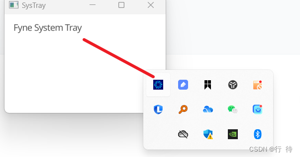
Since the v2.2.0 release Fyne has built in support for a system tray menu. This feature displays an icon on macOS, Windows and Linux computers and when tapped will pop out a menu as specified by the app.
自从fyne 2.2.0版本后就支持创建系统托盘,此功能在macos, windows 和linux 中显示为一个图标点击时将弹出应用程序指定的菜单。
As this is a desktop specific feature we must first do a runtime check that the app is running in desktop mode. To do this, and get a reference to the desktop features, we do a Go type assertion:
由于这是特定与桌面的功能,因此我们必须首先进行运行时检查运行程序是否在桌面模式下运行,为此,获取对桌面功能的引用,我们执行go 类型断言:
if desk, ok := a.(desktop.App); ok {

...

}
If the ok variable is true then we can set up a menu using the standard Fyne menu API that you might have used in Window.SetMainMenu before.
如果 ok 变量为 true,那么我们可以使用标准 Fyne 菜单 API 设置菜单,您之前可能在 Window.SetMainMenu 中使用过该 API。
m := fyne.NewMenu("MyApp",

fyne.NewMenuItem("Show", func() {

log.Println("Tapped show")

}))

desk.SetSystemTrayMenu(m)
With this code added to the setup of your application you can run the app and see that it shows a Fyne icon in the system tray. When you tap it a menu will appear containing “Show” and “Quit”.
The default icon is the Fyne logo, you can either fix this using app metadata or by setting the app icon in App.SetIcon or for system tray directly using desk.SetSystemTrayIcon
将此代码添加到应用程序的设置中后,您可以运行该应用程序,并看到它在系统托盘中显示 Fyne 图标。当您点击它时,将出现一个包含“显示”和“退出”的菜单。
默认图标是 Fyne 徽标,您可以使用应用程序元数据或通过在 App.SetIcon 中设置应用程序图标来解决此问题,或者直接使用桌面用于系统托盘。设置系统托盘图标
Manage window lifecycle
By default a Fyne app will exit when you close all windows and this may not be what you want with a system tray app. To override the behaviour you can use the Window.SetCloseIntercept feature to override what happens when a window is closed. In the example below we hide the window instead of closing it by calling Window.Hide(). Add this before you show the window for the first time.
默认情况下,当您关闭所有窗口时,Fyne 应用程序将退出,这可能不是您想要的系统托盘应用程序。要覆盖该行为,您可以使用 Window.SetCloseIntercept 功能来覆盖窗口关闭时发生的情况。在下面的示例中,我们隐藏窗口,而不是通过调用 Window.Hide() 来关闭它。在首次显示窗口之前添加此项。
w.SetCloseIntercept(func() {

w.Hide()

})
The benefit of hiding a window is that you can simply show it again using Window.Show() which is much more efficient than creating a new window if the same content is needed a second time. We update the menu created earlier to show the window that was hidden above.
隐藏窗口的好处是,您可以简单地使用 Window.Show() 再次显示它,如果第二次需要相同的内容,这比创建新窗口要高效得多。我们更新之前创建的菜单以显示上面隐藏的窗口。
fyne.NewMenuItem("Show", func() {

w.Show()

}))That’s all there is to setting up a system tray menu with Fyne! The complete code for this tutorial is as follows.
这就是使用 Fyne 设置系统托盘菜单的全部内容!本教程的完整代码如下所示。
package main


import (

"fyne.io/fyne/v2"

"fyne.io/fyne/v2/app"

"fyne.io/fyne/v2/driver/desktop"

"fyne.io/fyne/v2/widget"

)


func main() {

a := app.New()

w := a.NewWindow("SysTray")


if desk, ok := a.(desktop.App); ok {

m := fyne.NewMenu("MyApp",

fyne.NewMenuItem("Show", func() {

w.Show()

}))

desk.SetSystemTrayMenu(m)

}


w.SetContent(widget.NewLabel("Fyne System Tray"))

w.SetCloseIntercept(func() {

w.Hide()

})

w.ShowAndRun()

}
Data Binding 数据绑定
Data binding was introduced in Fyne v2.0.0 and makes it easier to connect many widgets to a data source that will update over time. the package has many helpful bindings that can manage most standard types that will be used in an application. A data binding can be managed using the binding API (for example ) or it can be connected to an external item of data like ().data/bindingNewStringBindInt(*int)
Fyne v2.0.0 中引入了数据绑定,使将许多小部件连接到将随时间更新的数据源变得更加容易。该data/binding包有许多有用的绑定,可以管理将在应用程序中使用的大多数标准类型。可以使用绑定 API(例如NewString)来管理数据绑定,也可以将其连接到外部数据项,例如 (`BindInt(*int))。
Widgets that support binding typically have a constructor to set up the binding when creating the widget. You can also call and to manage the data of an existing widget. The following example shows how you can manage a data item that is bound to a simple widget....WithDataBind()Unbind()StringLabel
支持绑定的小部件通常有一个...WithData构造函数来在创建小部件时设置绑定。您还可以调用Bind()和 Unbind()管理现有小部件的数据。以下示例显示了如何管理String绑定到简单Label小部件的数据项。
package main
import (
"time"
"fyne.io/fyne/v2/app"
"fyne.io/fyne/v2/data/binding"
"fyne.io/fyne/v2/widget"
)
func main() {
a := app.New()
w := a.NewWindow("Hello")
str := binding.NewString()
go func() {
dots := "....."
for i := 5; i >= 0; i-- {
str.Set("Count down" + dots[:i])
time.Sleep(time.Second)
}
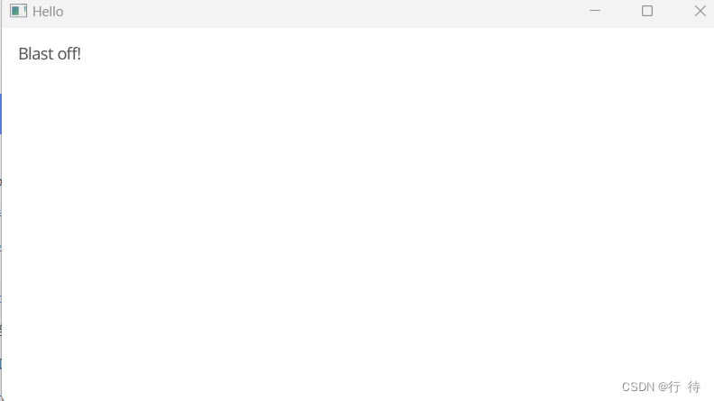
str.Set("Blast off!")
}()
w.SetContent(widget.NewLabelWithData(str))
w.ShowAndRun()
}You can find out more in the data binding section of this site.

Fyne will typically configure your application appropriately for the target platform by selecting the driver and configuration. The following build tags are supported and can help in your development. For example if you wish to simulate a mobile application whilst running on a desktop computer you could use the following command:
Fyne 通常会通过选择驱动程序和配置来为目标平台适当地配置您的应用程序。支持以下构建标签,它们可以帮助您的开发。例如,如果您希望在台式计算机上运行时模拟移动应用程序,您可以使用以下命令:


 1万+
1万+


 被折叠的 条评论
为什么被折叠?
被折叠的 条评论
为什么被折叠?
 到【灌水乐园】发言


