


 本文详细介绍了如何使用Python的Cartopy库绘制华南地区的降水量分布图。首先介绍了Cartopy的基本概念,如创建画布和绘图区,以及地图投影方式。接着,通过实例展示了创建地图、设置投影、填充颜色、绘制等值线、添加刻度和标题的步骤。最后,给出了完整的代码示例,包括加载数据、设置地图边界、绘制底图、填充降水量误差以及显示图形的过程。
参考链接:
基础知识理解:
摸鱼的气象&Python:绘图基础和地图投影_哔哩哔哩_bilibili
对应代码:摸鱼的气象&Python - Heywhale.com
《气py:Python气象资料处理与可视化》李开元、豆京华
Cartopy 系列:从入门到放弃 - 炸鸡人博客 (zhajiman.github.io)
画图实例:
(29条消息) 小白学习cartopy画地图的第一天(中国行政区域图,含南海)_野生的气象小流星的博客-CSDN博客_cartopy绘制中国省份图
(29条消息) 小白学习cartopy气象画地图的第二天(中国区域,陆地温度分布图)_野生的气象小流星的博客-CSDN博客_cartopy 气象
最终效果图如下:
目录
1.cartopy简介
cartopy是一个为地理空间数据处理而设计的python包,用于生成地图和其他地理空间数据分析。本身不具有可视化功能,但可以为Matplotlib提供地理坐标系的转换,实现气象专业图形的绘制。
2.画图流程及常用函数
2.1.创建画布、绘画区(figure、axes)
import matplotlib.pyplot as plt
Figure:画布
Figure(figsize=None, dpi=None, facecolor=None, edgecolor=None, linewidth=0.0)
图像尺寸、像素点、背景颜色、边框颜色、边框宽度
import matplotlib.pyplot as plt

fig=plt.figure(figsize=(4,3),dpi=200,facecolor='blue',edgecolor='black',linewidth=2)

plt.show()
Axes:绘图区
figure对象有两种方法建立axes: plt.figure().add_axes()、 plt.figure().add_subplot()
其中,add_subplots属于axes的特殊情况
1).add_axes
import matplotlib.pyplot as plt
fig = plt.figure()
ax = fig.add_axes((0,0,3,2))#以(0,0)点为左下的起点坐标,选择一个长为3,宽为2的绘图区
plt.show()
2).add_subplot
import matplotlib.pyplot as plt
fig = plt.figure()
ax = add_subplot(2,2,1)
plt.show()
3).GeoAxes:地图投影,把坐标投影为地理坐标
import matplotlib.pyplot as plt
import cartopy.crs as ccrs
fig = plt.figure()
ax = fig.add_axes([0,0,3,2],projection = ccrs.PlateCarree())
plt.show()
2.2 画地图
投影方式
有很多,最常用等距圆柱投影,对数据没有变形
可参考:摸鱼的气象&Python:绘图基础和地图投影_哔哩哔哩_bilibili
1).等距圆柱投影 ccrs.PlateCarree(central_longitude=0.0)
2).正形兰伯特投影 ccrs.LambertConformal( central_longitude=-96.0, central_latitude=39.0,
standard_parallels=None, cutoff=-30,)
中心经度、中心维度、区间(内部数据为等比例投影)、截止纬度
填色(contour、contourf)
matplotlib.axes.Axes.contour:绘制等值线
matplotlib.axes.Axes.contourf:给等值线填色
ax.contourf(lon.lat,z,levels,cmap,transform,zorder)
levels:整数n或数组,n:画n条线,数组:按数组值画等值线
cmap:当color未被指定时,使用自己指定的cmap或官方默认的colormap方案。
fig = plt.figure(figsize=(12,8))
proj = ccrs.PlateCarree(central_longitude=180)
ax = fig.add_axes([0.1, 0.1, 0.8, 0.6],projection = proj)
c1 = ax.contour(lon,lat,z,levels=np.arange(5400,6000,50),
 cmap=plt.cm.bwr,transform=ccrs.PlateCarree())

c2 = ax.contourf(lon,lat,z,levels=np.arange(5400,6000,50),
extend='max' ,cmap=plt.cm.bwr,
transform=ccrs.PlateCarree(),zorder=0)
增加(刻度线、标题)等
可参考:摸鱼的气象&Python:几个必不可少的地理绘图函数_哔哩哔哩_bilibili
import cartopy.crs as ccrs
import cartopy.mpl.ticker as cticker
import matplotlib.pyplot as plt
fig = plt.figure(figsize=(12,8))
proj = ccrs.PlateCarree(central_longitude=180)
ax = fig.add_axes([0.1, 0.1, 0.8, 0.6],projection = proj)
ax.set_xticks(np.arange(leftlon,rightlon+60,60), crs=ccrs.PlateCarree())
ax.set_yticks(np.arange(lowerlat,upperlat+30,30), crs=ccrs.PlateCarree())
lon_formatter = cticker.LongitudeFormatter()
lat_formatter = cticker.LatitudeFormatter()
ax.xaxis.set_major_formatter(lon_formatter)
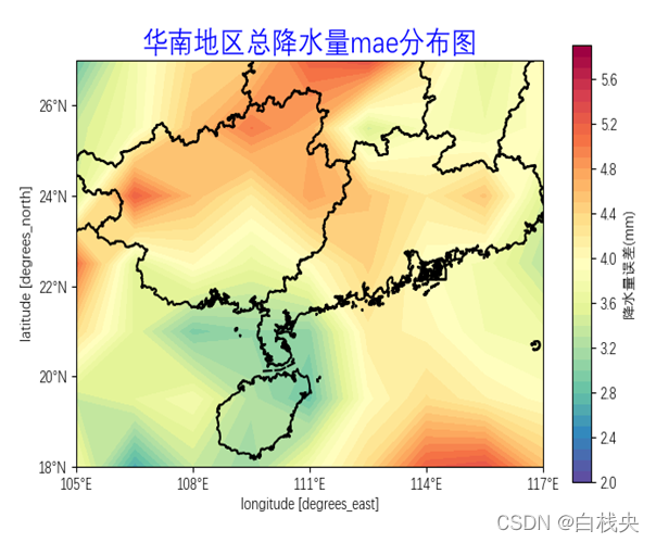
ax.yaxis.set_major_formatter(lat_formatter)3.画图实例:华南地区降水量mae分布图
导入库
#参考链接:
# https://blog.csdn.net/weixin_42372313/article/details/113665724?spm=1001.2014.3001.5502
# https://zhajiman.github.io/post/cartopy_introduction/#%E7%AE%80%E4%BB%8B

import numpy as np
import matplotlib.pyplot as plt
import cartopy.crs as ccrs
from cartopy.mpl.ticker import LatitudeFormatter, LongitudeFormatter
一、加载数据mae、中国地图文件
plt.rcParams["font.sans-serif"] = ["DengXian"]  # 用来正常显示中文标签
plt.rc('axes', unicode_minus=False)  # 解决负号显示问题

# 加载mae mae(step,latitude,longitude),取超前0天对应的mae
correlation = mae.sel(step = '0 days')
lon = mae.longitude
lat = mae.latitude

#画地图底图(网址是:*https://gmt-china.org/data/*下载里面的CN-border-La.dat)
## 这一步是读取CN - border - La.da文件,目的是读取里面每个点的经纬度,用于给底图加上行政边界

 with open('CN-border-La.dat') as src:
        context = src.read()
        blocks = [cnt for cnt in context.split('>') if len(cnt) > 0]
        borders = [np.fromstring(block, dtype=float, sep=' ') for block in blocks]
二、画图
#1、创建画布
fig = plt.figure(figsize=[8, 8])#画布
ax = plt.axes(projection=ccrs.PlateCarree())#ax:绘图区,projection:投影方式为PlateCarree


#2、画底图

# 这里就用到了当时上面文件里面的坐标点了,其实就是用点画线,
# line[0::2]就是X,line[1::2]就是Y,就是用xy画平面图,一组是经度,一组是纬度。

 for line in borders:
        ax.plot(line[0::2], line[1::2], '-', lw=1.5, color='k',transform=ccrs.Geodetic())


# 咱们画出来的是世界地图,这个来框处要显示的区域
xmin, xmax = lon.min(), lon.max()
ymin, ymax = lat.min(), lat.max()
ax.set_extent([xmin, xmax, ymin,ymax],crs=ccrs.PlateCarree())


#3、画图填色
#使用contourf进行填色,下面先设置它的参数

#设置色标
import math
t_max = math.ceil(correlation.max().values)
t_min = math.floor(correlation.min().values)
n = (t_max - t_min)/10
cbar_kwargs = {
    'orientation': 'vertical',
    'label': '降水量误差(mm)',
    'shrink': 0.8,
    'ticks': np.arange(t_min, t_max, n),
    'pad': 0.05,
    'shrink': 0.65
}

# 设置画数据的精度,这里设置了从数据的最小值到最大值,按0.1mm画降水量
levels = np.arange(t_min, t_max, 0.1)

# 本质上是一个画等值线并填色的函数,被cartopy封装了一下,参数的含义可以去查#matplotlib.pyplot.contourf
# 参数含义:levels设置等值线密度,cmap颜色,cbar_kwargs色标,transform变换
correlation.plot.contourf(ax=ax, levels=levels, cmap='Spectral_r',
                        cbar_kwargs=cbar_kwargs, transform=ccrs.PlateCarree())


#4、画经纬度(即网格线)、刻度线、标题
#设置x、y刻度
#以5°为间隔计算x、y坐标刻度值,使用PlateCarree投影方式换算坐标,得到x、y的地理坐标
ax.set_xticks(
    np.arange(xmin, xmax + 1, np.round((xmax + 1 - xmin) / 5)),
    crs=ccrs.PlateCarree(),
)
ax.set_yticks(
    np.arange(ymin, ymax + 1, np.round((ymax + 1 - ymin) / 5)),
    crs=ccrs.PlateCarree(),
)

# 设置刻度格式为经纬度格式
ax.xaxis.set_major_formatter(LongitudeFormatter())
ax.yaxis.set_major_formatter(LatitudeFormatter())


#设置标题
ax.set_title('华南地区总降水量mae分布图', color='blue', fontsize=20)
三、显示图形
plt.show()
四、完整代码
#参考链接:
# https://blog.csdn.net/weixin_42372313/article/details/113665724?spm=1001.2014.3001.5502
# https://zhajiman.github.io/post/cartopy_introduction/#%E7%AE%80%E4%BB%8B

import xarray as xr
import numpy as np
import matplotlib.pyplot as plt
import cartopy.crs as ccrs
from cartopy.mpl.ticker import LatitudeFormatter, LongitudeFormatter

class Error:
    def __init__(self,y_pred2,y_obs):
        self.y_pred2 = y_pred2
        self.y_obs = y_obs

    def Rmse(self):
        '''
        计算订正值与真实值之间的rmse
        :param self.y_pred2: 二次预测值(订正)
        :param self.y_obs: 观测值
        :return: rmse(i,j,l)、rmse_mean(l)
        '''
        err = self.y_pred2 - self.y_obs
        err = err**2
        err = err.mean(dim = 'time')
        rmse = err**0.5
        rmse_mean = rmse.mean(dim=['latitude','longitude'])
        return rmse,rmse_mean

    def Mae(self):
        '''
        计算订正值与真实值之间的rmse
        :param self.y_pred2: 二次预测值(订正)
        :param self.y_obs: 观测值
        :return: mae(i,j,l)、mae_mean(l)
        '''
        err = self.y_pred2 - self.y_obs
        err = abs(err)
        mae = err.mean(dim = 'time')
        mae_mean = mae.mean(dim=['latitude','longitude'])
        return mae,mae_mean

    def Tcc(self):
        obs = self.y_obs - self.y_obs.mean("step")
        pred = self.y_pred2 - self.y_pred2.mean("step")

        cov = (obs * pred).sum("step")
        var_var = np.sqrt((obs ** 2).sum("step") * (pred ** 2).sum("step"))
        tcc = cov / var_var
        tcc_mean = tcc.mean('time')
        return tcc,tcc_mean

    def Acc(self):
        self.y_obs = self.y_obs.stack(pos=("latitude", "longitude"))  # 拉成一个维度
        self.y_pred2 = self.y_pred2.stack(pos=("latitude", "longitude"))  # 拉成一个维度
        obs = self.y_obs - self.y_obs.mean("pos")
        pred = self.y_pred2 - self.y_pred2.mean("pos")

        cov = (obs * pred).sum("pos", skipna=True)
        var_var = np.sqrt((obs ** 2).sum("pos", skipna=True) * (pred ** 2).sum("pos", skipna=True))
        acc = cov / var_var
        acc_mean = acc.mean('time')
        return acc,acc_mean

plt.rcParams["font.sans-serif"] = ["DengXian"]  # 用来正常显示中文标签
plt.rc('axes', unicode_minus=False)  # 解决负号显示问题

if __name__ == '__main__':
    # 一、加载数据mae、中国地图文件
    path2 = '/home/gyy/gyy-project/model_set/pred2/source_pred2.nc'  # y_pred2
    path1 = '/home/gyy/gyy-project/model_set/pred2/source_test.nc'  # y_obs
    path0 = '/home/gyy/gyy-project/model_set/pred2/x_mean49.nc'  # y_pred1
    y_pred2 = xr.open_dataarray(path2)
    y_obs = xr.open_dataarray(path1)
    err = Error(y_pred2,y_obs)
    mae,mae_mean = err.Mae()

    # 加载mae mae(step,latitude,longitude),取超前0天对应的mae
    correlation = mae.sel(step='0 days')
    lon = mae.longitude
    lat = mae.latitude

    # 画地图底图(网址是:*https://gmt-china.org/data/*下载里面的CN-border-La.dat)
    ## 这一步是读取CN - border - La.da文件,目的是读取里面每个点的经纬度,用于给底图加上行政边界

    with open('CN-border-La.dat') as src:
        context = src.read()
        blocks = [cnt for cnt in context.split('>') if len(cnt) > 0]
        borders = [np.fromstring(block, dtype=float, sep=' ') for block in blocks]

    # 二、画图
    # 1、创建画布
    fig = plt.figure(figsize=[8, 8])  # 画布
    ax = plt.axes(projection=ccrs.PlateCarree())  # ax:绘图区,projection:投影方式为PlateCarree

    # 2、画底图

    # 这里就用到了当时上面文件里面的坐标点了,其实就是用点画线,
    # line[0::2]就是X,line[1::2]就是Y,就是用xy画平面图,一组是经度,一组是纬度。

    for line in borders:
        ax.plot(line[0::2], line[1::2], '-', lw=1.5, color='k', transform=ccrs.Geodetic())

    # 咱们画出来的是世界地图,这个来框处要显示的区域
    xmin, xmax = lon.min(), lon.max()
    ymin, ymax = lat.min(), lat.max()
    ax.set_extent([xmin, xmax, ymin, ymax], crs=ccrs.PlateCarree())

    # 3、画图填色
    # 使用contourf进行填色,下面先设置它的参数

    # 设置色标
    import math

    t_max = math.ceil(correlation.max().values)
    t_min = math.floor(correlation.min().values)
    n = (t_max - t_min) / 10
    cbar_kwargs = {
        'orientation': 'vertical',
        'label': '降水量误差(mm)',
        'shrink': 0.8,
        'ticks': np.arange(t_min, t_max, n),
        'pad': 0.05,
        'shrink': 0.65
    }

    # 设置画数据的精度,这里设置了从数据的最小值到最大值,按0.1mm画降水量
    levels = np.arange(t_min, t_max, 0.1)

    # 本质上是一个画等值线并填色的函数,被cartopy封装了一下,参数的含义可以去查#matplotlib.pyplot.contourf
    # 参数含义:levels设置等值线密度,cmap颜色,cbar_kwargs色标,transform变换
    correlation.plot.contourf(ax=ax, levels=levels, cmap='Spectral_r',
                              cbar_kwargs=cbar_kwargs, transform=ccrs.PlateCarree())

    # 4、画经纬度(即网格线)、刻度线、标题
    # 设置x、y刻度
    # 以5°为间隔计算x、y坐标刻度值,使用PlateCarree投影方式换算坐标,得到x、y的地理坐标
    ax.set_xticks(
        np.arange(xmin, xmax + 1, np.round((xmax + 1 - xmin) / 5)),
        crs=ccrs.PlateCarree(),
    )
    ax.set_yticks(
        np.arange(ymin, ymax + 1, np.round((ymax + 1 - ymin) / 5)),
        crs=ccrs.PlateCarree(),
    )

    # 设置刻度格式为经纬度格式
    ax.xaxis.set_major_formatter(LongitudeFormatter())
    ax.yaxis.set_major_formatter(LatitudeFormatter())

    # 设置标题
    ax.set_title('华南地区总降水量mae分布图', color='blue', fontsize=20)

    # 三、显示图形
    plt.show()


 被折叠的 条评论
为什么被折叠?
被折叠的 条评论
为什么被折叠?
 到【灌水乐园】发言


