


都2023年,前端页面的按钮你还只是会简单的加个颜色,改个边框吗?这可不太符合我们的精彩世界,这里博主给大家分享一些精美的按钮特效,无毒,直接就可以食用,分享不易,记得三连噢;
目录
1、360度旋转按钮

<!DOCTYPE html>
<html lang="en">
<head>
<meta charset="UTF-8">
<meta name="viewport" content="width=device-width, initial-scale=1.0">
<title>Document</title>
<style>
.banner {
width: 234px;
height: 34px;
border-radius: 34px;
position: absolute;
top: 400px;
left: 200px;
}
.banner a {
display: inline-block;
width: 30px;
height: 30px;
line-height: 30px;
border-radius: 50%;
border: 2px solid #a18cd1;
position: absolute;
left: 0px;
top: 0px;
background: #fbc2eb;
color: #fff;
text-align: center;
text-decoration: none;
cursor: pointer;
z-index: 2;
}
.banner a:hover+span {
transform: rotate(360deg);
opacity: 1;
}
.banner span {
display: inline-block;
width: auto;
padding: 0 20px;
height: 34px;
line-height: 34px;
background: #a18cd1;
border-radius: 34px;
text-align: center;
position: absolute;
color: #fff;
text-indent: 25px;
opacity: 0;
transform-origin: 8% center;
transition: all 1s;
}
</style>
</head>
<body>
<div class="banner">
<a href="#">wo</a>
<span>这是我的世界</span>
</div>
</body>
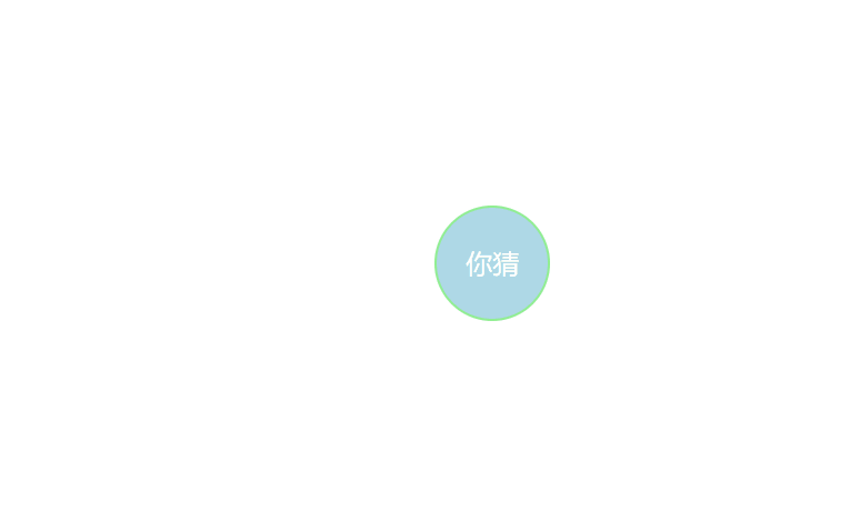
</html>2、旋转按钮
<!DOCTYPE html>
<html lang="en">

<head>
    <meta charset="UTF-8">
    <meta name="viewport" content="width=device-width, initial-scale=1.0">
    <title>Document</title>
    <style>
        .wrapper {
            width: 100px;
            height: 100px;
            background: lightblue;
            border-radius: 50%;
            border: 2px solid lightgreen;
            position: absolute;
            top: 200px;
            left: 400px;
            cursor: pointer;
        }

        .wrapper:after {
            content: '你猜';
            display: inline-block;
            width: 100px;
            height: 100px;
            line-height: 100px;
            border-radius: 50%;
            text-align: center;
            color: #fff;
            font-size: 24px;
        }

        .wrapper:hover .round {
            transform: scale(1);
            opacity: 1;
            animation: rotating 6s 1.2s linear infinite alternate;
        }

        @keyframes rotating {
            0% {
                -webkit-transform: rotate(0deg);
            }

            100% {
                -webkit-transform: rotate(180deg);
            }
        }

        .round {
            width: 240px;
            height: 240px;
            border: 2px solid lightgreen;
            border-radius: 50%;
            position: absolute;
            top: -70px;
            left: -70px;
            transition: all 1s;
            transform: scale(0.35);
            opacity: 0;
        }

        .round span {
            width: 40px;
            height: 40px;
            line-height: 40px;
            display: inline-block;
            border-radius: 50%;
            background: lightblue;
            border: 2px solid lightgreen;
            color: #fff;
            text-align: center;
            position: absolute;
        }

        .round span:nth-child(1) {
            right: -22px;
            top: 50%;
            margin-top: -22px;
        }

        .round span:nth-child(2) {
            left: -22px;
            top: 50%;
            margin-top: -22px;
        }

        .round span:nth-child(3) {
            left: 50%;
            bottom: -22px;
            margin-left: -22px;
        }

        .round span:nth-child(4) {
            left: 50%;
            top: -22px;
            margin-left: -22px;
        }
    </style>
</head>

<body>
    <div class="wrapper">
        <div class="round">
            <span>东邪</span>
            <span>西毒</span>
            <span>南乞</span>
            <span>北丐</span>
        </div>
    </div>

</body>

</html>
3、 jQuery 实现萤火虫效果

<!DOCTYPE html>
<html lang="en">
<head>
    <meta charset="UTF-8">
    <meta name="viewport" content="width=device-width, initial-scale=1.0">
    <meta http-equiv="X-UA-Compatible" content="ie=edge">
    <script src="https://cdn.bootcss.com/jquery/3.4.1/jquery.min.js"></script>
    <title>萤火虫动态按钮</title>
</head>
<style>
    @font-face {
        font-family: 'firefly';
        src: url(ZCOOLKuaiLe-Regular.ttf);
    }
    * {
        padding: 0;
        margin: 0;
    }
    body {
        height: 100vh;
        background: url(yh.bmp) no-repeat;
        background-size: cover;
    }
    ul {
        list-style: none;
    }
    button {
        outline: none;
        border: none;
    }
    .firefly {
        width: 180px;
        height: 60px;
        position: absolute;
        top: 50%;
        left: 50%;
        transform: translate(-50%, -50%);
        background: linear-gradient(to right, #6EB46E 10%, #55B455);
        border-radius: 40px;
        opacity: .88;
        cursor: pointer;
        transition: 1s;
    }
    .firefly:hover {
        box-shadow: 0 0 10px #B4FFB4;
    }
    .firefly p {
        line-height: 60px;
        font-size: 22px;
        color: #F5DD8F;
        font-family: firefly;
        opacity: .88;
    }
    .lightning {
        width: 95%;
        height: 80%;
        position: absolute;
        top: 50%;
        left: 50%;
        transform: translate(-50%, -50%);
        border-radius: 40px;
        transition: .8s;
        overflow: hidden;
    }
    .firefly:hover .lightning {
        box-shadow: 0 0 4px #B4FFB4 inset;
    }
    .lightning ul {
        opacity: 0;
        transition: .8s;
    }
    .firefly:hover ul {
        opacity: .8;
    }
    .lightning ul li {
        width: 5px;
        height: 5px;
        background-color: #91FA91;
        position: absolute;
        bottom: 10%;
        border-radius: 50%;
        opacity: .6;
        animation: fireflymove infinite linear;
    }
    @keyframes fireflymove {
        100% {
            bottom: 100%;
        }
    }
</style>
<body>
    <button class="firefly">
        <p>萤火虫</p>
        <div class="lightning">
            <ul>
                <li></li>
                <li></li>
                <li></li>
                <li></li>
                <li></li>
                <li></li>
                <li></li>
                <li></li>
            </ul>
        </div>
    </button>
</body>
<script>
    var lgh = $('.lightning li').length;
    console.log(lgh)

    $('.lightning li').each(function(i) {
        $(this).css({
            left: i * (100/lgh) + '%',
            bottom: randomNum(-20, 10) + '%',
            animationDuration: randomNum(1, 5) + 's'
        });
    });

    function randomNum(max, min) {
        var num = Math.floor(Math.random() * (max-min+1) + min);
        return num;
    }

</script>
</html>
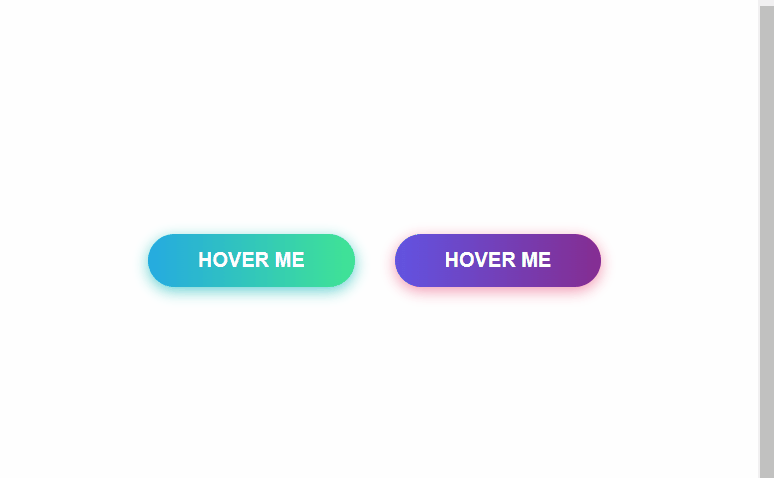
4、 冰冻按钮
<!DOCTYPE html>
<html lang="en">

<head>
  <meta charset="UTF-8">
  <meta name="viewport" content="width=device-width, initial-scale=1.0">
  <title>Document</title>
  <style>
    #frozen-btn {
      display: flex;
      align-items: center;
      justify-content: center;
      height: 100vh;
    }

    button {
      border: 0;
      margin: 20px;
      text-transform: uppercase;
      font-size: 20px;
      font-weight: bold;
      padding: 15px 50px;
      border-radius: 50px;
      color: white;
      outline: none;
      position: relative;
    }

    button:before {
      content: '';
      display: block;
      background: linear-gradient(to left, rgba(255, 255, 255, 0) 50%, rgba(255, 255, 255, 0.4) 50%);
      background-size: 210% 100%;
      background-position: right bottom;
      height: 100%;
      width: 100%;
      position: absolute;
      top: 0;
      bottom: 0;
      right: 0;
      left: 0;
      border-radius: 50px;
      transition: all 1s;
      -webkit-transition: all 1s;
    }

    .green {
      background-image: linear-gradient(to right, #25aae1, #40e495);
      box-shadow: 0 4px 15px 0 rgba(49, 196, 190, 0.75);
    }

    .purple {
      background-image: linear-gradient(to right, #6253e1, #852D91);
      box-shadow: 0 4px 15px 0 rgba(236, 116, 149, 0.75);
    }

    .purple:hover:before {
      background-position: left bottom;
    }

    .green:hover:before {
      background-position: left bottom;
    }
  </style>
</head>

<body>
  <div id="frozen-btn">
    <button class="green">Hover me</button>
    <button class="purple">Hover me</button>
  </div>

</body>

</html>5、加载按钮

<!DOCTYPE html>
<html lang="en">

<head>
  <meta charset="UTF-8">
  <meta name="viewport" content="width=device-width, initial-scale=1.0">
  <title>Document</title>
  <style>
    #loading-btn {
      display: flex;
      align-items: center;
      justify-content: center;
      height: 100vh;
    }

    button {
      background: transparent;
      border: 0;
      border-radius: 0;
      text-transform: uppercase;
      font-weight: bold;
      font-size: 20px;
      padding: 15px 50px;
      position: relative;
    }

    button:before {
      transition: all 0.8s cubic-bezier(0.7, -0.5, 0.2, 2);
      content: '';
      width: 1%;
      height: 100%;
      background: #ff5964;
      position: absolute;
      top: 0;
      left: 0;
    }

    button span {
      mix-blend-mode: darken;
    }

    button:hover:before {
      background: #ff5964;
      width: 100%;
    }
  </style>
</head>

<body>
  <div id="loading-btn">
    <button><span>Hover me</span></button>
  </div>
</body>

</html>
6、圆形加载按钮

<!DOCTYPE html>
<html lang="en">

<head>
  <meta charset="UTF-8">
  <meta name="viewport" content="width=device-width, initial-scale=1.0">
  <title>Document</title>
  <style>
    #circle-btn {
      display: flex;
      align-items: center;
      justify-content: center;
      height: 100vh;
    }

    .btn-container {
      position: relative;
    }

    button {
      border: 0;
      border-radius: 50px;
      color: white;
      background: #5f55af;
      padding: 15px 20px 16px 60px;
      text-transform: uppercase;
      background: linear-gradient(to right, #f72585 50%, #5f55af 50%);
      background-size: 200% 100%;
      background-position: right bottom;
      transition: all 2s ease;
    }

    svg {
      background: #f72585;
      padding: 7.2px;
      border-radius: 50%;
      position: absolute;
      left: -1px;
      top: 0px;
    }

    button:hover {
      background-position: left bottom;
    }
  </style>
</head>

<body>
  <div id="circle-btn">
    <div class="btn-container">
      <svg t="1599631662798" class="icon" viewBox="0 0 1024 1024" version="1.1" xmlns="http://www.w3.org/2000/svg" p-id="2421" width="32" height="32"><path d="M1010.80577 455.530292a29.72694 29.72694 0 0 1 0 42.037895L758.668226 749.785575a29.714963 29.714963 0 0 1-42.017934-42.027914l252.137544-252.227369a29.720951 29.720951 0 0 1 42.017934 0zM758.668226 203.312904l252.137544 252.217388a29.717957 29.717957 0 0 1-42.017934 42.037895l-252.137544-252.207407a29.721949 29.721949 0 0 1 42.017934-42.047876zM27.945419 447.20655h955.693411a20.460039 20.460039 0 0 1 20.460039 20.460039v18.254347a20.460039 20.460039 0 0 1-20.460039 20.460039H27.945419A20.460039 20.460039 0 0 1 7.48538 485.920936v-18.254347a20.460039 20.460039 0 0 1 20.460039-20.460039z" fill="#ffffff" p-id="2422"></path></svg>
      <button>Hover me</button>
    </div>
  </div>

</body>

</html>
7、按钮点击波纹效果

<!DOCTYPE html>
<html>

<head>
  <meta charset="utf-8" />
  <title></title>
  <style type="text/css">
    * {
      margin: 0;
      padding: 0;
    }

    .container {
      width: 300px;
      height: 300px;
      margin: 50px auto;
      /* background-color: rgba(204, 204, 204, .6); */
      position: relative;
    }

    .btn {
      display: inline-block;
      width: 100px;
      height: 35px;
      border-radius: 24px;
      position: absolute;
      top: 50%;
      left: 50%;
      transform: translate(-50%, -50%);
      border: none;
      outline: none;
      cursor: pointer;
      box-shadow: 0 10px 10px rgba(0, 0, 0, .3);
    }

    .ripple-effect {
      display: inline-block;
      position: relative;
      overflow: hidden;
      cursor: pointer;
      vertical-align: middle;
      -webkit-user-select: none;
      -moz-user-select: none;
      -ms-user-select: none;
      user-select: none;
      z-index: 1;
    }

    .ripple-effect .ripple {
      display: block;
      position: absolute;
      border-radius: 100%;
      /*设置背景为彩虹渐变,可以换成其他颜色*/
      background: linear-gradient(45deg,
          rgba(255, 0, 0, .5),
          rgba(255, 255, 0, .5),
          rgba(0, 255, 255, .5),
          rgba(0, 0, 255, .5));
      -webkit-transform: scale(0);
      transform: scale(0);
      pointer-events: none;
    }

    .ripple-effect .animated {
      -webkit-animation: ripple 0.6s linear;
      animation: ripple 0.6s linear;
    }

    @keyframes ripple {
      100% {
        opacity: 0;
        -webkit-transform: scale(2.5);
        transform: scale(2.5);
      }
    }
  </style>
</head>

<body>
  <div class="container">
    <button class="btn ripple-effect">Click
      <span class="ripple"></span>
    </button>
  </div>
</body>
<script type="text/javascript">
  window.onload = function () {
    function ripple() {
      var btn = document.querySelector(".btn");
      var ripple = document.querySelector(".ripple");
      btn.onclick = function (event) {
        this.children[0].classList.add("animated");
        var size;
        //计算点击的波纹的最大值,并设置为宽高
        size = Math.max(this.offsetWidth, this.offsetHeight);
        ripple.style.width = size + "px";
        ripple.style.height = size + "px";
        //设置鼠标点击的位置为中心点,在这个中心点向四周散开的效果
        ripple.style.top = -(this.offsetHeight - event.offsetY) + "px";
        ripple.style.left = -(this.offsetWidth / 2 - event.offsetX) + "px";
        setTimeout(function () {
          btn.children[0].classList.remove("animated");
        }, 800)
      }
    }
    ripple();
  }
</script>

</html>
8、流光按钮
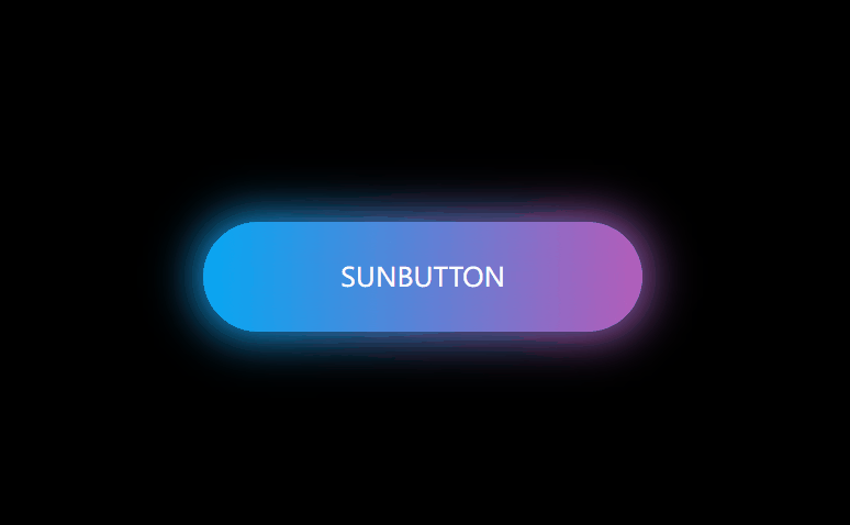
<!DOCTYPE html>
<html lang="en">

<head>
  <meta charset="UTF-8">
  <meta name="viewport" content="width=device-width, initial-scale=1.0">
  <title>Document</title>
  <style>
    * {
      margin: 0;
      padding: 0;
    }

    body {
      background: #000;
    }

    a {
      text-decoration: none;
      position: absolute;
      left: 50%;
      top: 50%;
      /* 居中 */
      transform: translate(-50%, -50%);
      font-size: 24px;
      background: linear-gradient(90deg, #03a9f4, #f441a5, #ffeb3b, #03a9f4);
      background-size: 400%;
      width: 400px;
      height: 100px;
      color: #fff;
      line-height: 100px;
      text-align: center;
      text-transform: uppercase;
      border-radius: 50px;
      z-index: 1;
    }

    a::before {
      content: "";
      position: absolute;
      left: -5px;
      right: -5px;
      top: -5px;
      bottom: -5px;
      background: linear-gradient(90deg, #03a9f4, #f441a5, #ffeb3b, #03a9f4);
      background-size: 400%;
      border-radius: 50px;
      filter: blur(20px);
      z-index: -1;
    }

    a:hover::before {
      animation: sun 8s infinite;
    }

    a:hover {
      animation: sun 8s infinite;
    }

    @keyframes sun {
      100% {
        background-position: -400% 0;
      }
    }
  </style>
</head>

<body>
  <a href="javascript:;">sunbutton</a>
</body>

</html>9、边框按钮

<!DOCTYPE html>
<html lang="en">

<head>
  <meta charset="UTF-8">
  <meta name="viewport" content="width=device-width, initial-scale=1.0">
  <title>Document</title>
  <style>
    #draw-border {
      display: flex;
      align-items: center;
      justify-content: center;
      height: 100vh;
    }

    button {
      border: 0;
      background: none;
      text-transform: uppercase;
      color: #4361ee;
      font-weight: bold;
      position: relative;
      outline: none;
      padding: 10px 20px;
      box-sizing: border-box;
    }

    button::before,
    button::after {
      box-sizing: inherit;
      position: absolute;
      content: '';
      border: 2px solid transparent;
      width: 0;
      height: 0;
    }

    button::after {
      bottom: 0;
      right: 0;
    }

    button::before {
      top: 0;
      left: 0;
    }

    button:hover::before,
    button:hover::after {
      width: 100%;
      height: 100%;
    }

    button:hover::before {
      border-top-color: #4361ee;
      border-right-color: #4361ee;
      transition: width 0.3s ease-out, height 0.3s ease-out 0.3s;
    }

    button:hover::after {
      border-bottom-color: #4361ee;
      border-left-color: #4361ee;
      transition: border-color 0s ease-out 0.6s, width 0.3s ease-out 0.6s, height 0.3s ease-out 1s;
    }
  </style>
</head>

<body>
  <div id="draw-border">
    <button>Hover me</button>
  </div>
</body>
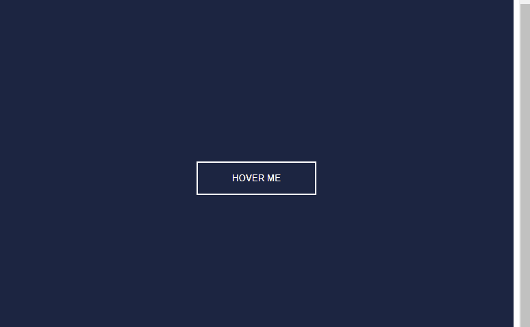
</html>10、闪亮按钮
<!DOCTYPE html>
<html lang="en">

<head>
  <meta charset="UTF-8">
  <meta name="viewport" content="width=device-width, initial-scale=1.0">
  <title>Document</title>
  <style>
    #shiny-shadow {
      display: flex;
      align-items: center;
      justify-content: center;
      height: 100vh;
      background: #1c2541;
    }

    button {
      border: 2px solid white;
      background: transparent;
      text-transform: uppercase;
      color: white;
      padding: 15px 50px;
      outline: none;
      overflow: hidden;
      position: relative;
    }

    span {
      z-index: 20;
    }

    button:after {
      content: '';
      display: block;
      position: absolute;
      top: -36px;
      left: -100px;
      background: white;
      width: 50px;
      height: 125px;
      opacity: 20%;
      transform: rotate(-45deg);
    }

    button:hover:after {
      left: 120%;
      transition: all 600ms cubic-bezier(0.3, 1, 0.2, 1);
      -webkit-transition: all 600ms cubic-bezier(0.3, 1, 0.2, 1);
    }
  </style>
</head>

<body>
  <div id="shiny-shadow">
    <button><span>Hover me</span></button>
  </div>
</body>
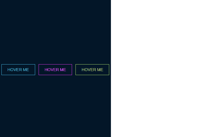
</html>11、霓虹按钮
<!DOCTYPE html>
<html lang="en">

<head>
  <meta charset="UTF-8">
  <meta name="viewport" content="width=device-width, initial-scale=1.0">
  <title>Document</title>
  <style>
    #neon-btn {
      display: flex;
      align-items: center;
      justify-content: space-around;
      background: #031628;
      width: 50%;
      height: 500px;
    }

    .btn {
      border: 1px solid;
      background-color: transparent;
      text-transform: uppercase;
      font-size: 14px;
      padding: 10px 20px;
      font-weight: 300;
    }

    .one {
      color: #4cc9f0;
    }

    .two {
      color: #f038ff;
    }

    .three {
      color: #b9e769;
    }

    .btn:hover {
      color: white;
      border: 0;
    }

    .one:hover {
      background-color: #4cc9f0;
      -webkit-box-shadow: 10px 10px 99px 6px rgba(76, 201, 240, 1);
      -moz-box-shadow: 10px 10px 99px 6px rgba(76, 201, 240, 1);
      box-shadow: 10px 10px 99px 6px rgba(76, 201, 240, 1);
      transition: all ease-in 0.5s;
    }

    .two:hover {
      background-color: #f038ff;
      -webkit-box-shadow: 10px 10px 99px 6px rgba(240, 56, 255, 1);
      -moz-box-shadow: 10px 10px 99px 6px rgba(240, 56, 255, 1);
      box-shadow: 10px 10px 99px 6px rgba(240, 56, 255, 1);
      transition: all ease-in 0.5s;
    }

    .three:hover {
      background-color: #b9e769;
      -webkit-box-shadow: 10px 10px 99px 6px rgba(185, 231, 105, 1);
      -moz-box-shadow: 10px 10px 99px 6px rgba(185, 231, 105, 1);
      box-shadow: 10px 10px 99px 6px rgba(185, 231, 105, 1);
      transition: all ease-in 0.5s;
    }
  </style>
</head>

<body>
  <div id="neon-btn">
    <button class="btn one">Hover me</button>
    <button class="btn two">Hover me</button>
    <button class="btn three">Hover me</button>
  </div>
</body>

</html>


 1354
1354


 被折叠的 条评论
为什么被折叠?
被折叠的 条评论
为什么被折叠?
 到【灌水乐园】发言


