


元素显示类型
| 块元素 | 行内元素 | 行内块元素 |
| 1.块状元素在网页中就是以块的形式显示,所谓块状就是元素显示为矩形区域。 2.默认情况下,块状元素都会占据一行;默认情况下,块状元素会按顺序自上而下排列。 3.块状元素都可以定义自己的高度和宽度。 4.块状元素一般都作为其他元素的容器,它可以容纳其他内联元素或其他块状元素,我们可以把这个容器比喻为盒子。 | 1.内联元素的表示形式是始终以行内逐个进行显示。--横着排 2.内联元素没有自己的形状,不能定义他的宽和高,它显示的高度宽度只能根据它所包含的内容的高度宽度来确定,他的最小内容单元也会呈现矩形形状。 3.内联元素也会遵循盒模型的基本规则,但是对于margin,padding个别属性值不生效 | 内联块状元素就是同时具备内联元素,块状元素的特点 |
| 例如: div p ul li ol dl dt dd h1-h6 | 例如:a b em i span strong | 例如:img input等 |
1.块元素
块元素
默认就有的属性
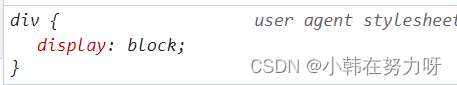
- display:block;
- display:list-item;
实例:
<head>
    <meta charset="UTF-8">
    <meta http-equiv="X-UA-Compatible" content="IE=edge">
    <meta name="viewport" content="width=device-width, initial-scale=1.0">
    <title>Document</title>
    <style>
        /* 块元素
        都会在浏览器页面检查中发现此属性即代表是块状元素
       display:block;
       display:list-item;
       p标签可以放文本,不能放块级元素
     */
        div {
            width: 100px;
            height: 100px;
            background-color: pink;
            ;
        }
    </style>
</head>

<body>
    <div>
        今天是2022.9.29
    </div>
    <ul>
        <li>1</li>
        <li>2</li>
    </ul>
    <p>段落</p>
    <dl>
        <dt>图片</dt>
        <dd>文字</dd>
    </dl>

</body>
样式:

2.行内元素
display:inline;
实例:
<head>
    <meta charset="UTF-8">
    <meta http-equiv="X-UA-Compatible" content="IE=edge">
    <meta name="viewport" content="width=device-width, initial-scale=1.0">
    <title>Document</title>
    <style>
        /* 行内元素
           不可以设置宽和高
           默认属性 display:inline; */
        span {
            width: 200px;
            height: 100px;
            background-color: aquamarine;
        }
    </style>
</head>

<body>
    <span>一行</span>
    <a href="http://www.baidu.com">百度</a>
    <b>粗体文本</b>
    <strong>加粗标签</strong>
    <em>斜体强调文本内容</em>

</body>
样式:

3.行内块元素
display:inline-block;
实例:
<head>
    <meta charset="UTF-8">
    <meta http-equiv="X-UA-Compatible" content="IE=edge">
    <meta name="viewport" content="width=device-width, initial-scale=1.0">
    <title>Document</title>
    <style>
        /* 行内块元素
           即可以与其他元素在一行显示,也可以设置其大小
           默认属性--display:inline-block;*/
        img {
            width: 100px;
            height: 100px;
        }
    </style>
</head>

<body>
    <span>后面是一张图片</span>
    <img src="../image/cat1.jpg">
    <span>这是一个输入框</span>
    <input type="text">
</body>
样式:

4.盒子模型
实例:
<head>
<meta charset="UTF-8">
<meta http-equiv="X-UA-Compatible" content="IE=edge">
<meta name="viewport" content="width=device-width, initial-scale=1.0">
<title>Document</title>
<style>
/* 盒子模型
div什么属性都可以设置
span左右边距有效,上下边距无效
img 也都有效 */
.div1 {
height: 100px;
width: 100px;
background-color: pink;
padding: 10px;
margin: 10px;
border: 1px solid red;
}
span {
background-color: aqua;
padding: 10px;
margin: 10px;
border: 1px solid green;
}
img {
height: 100px;
width: 100px;
padding: 10px;
margin: 10px;
border: 1px solid red;
}
</style>
</head>
<body>
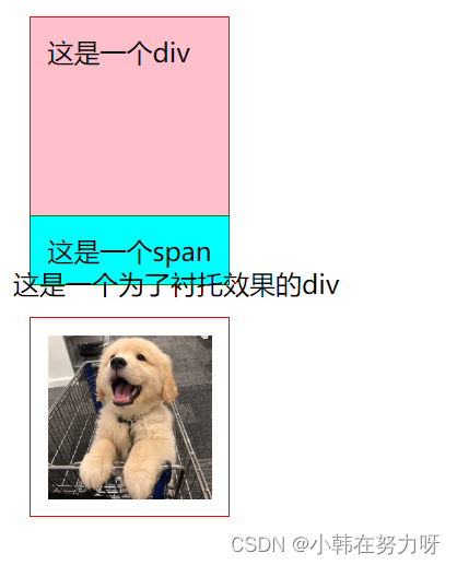
<div class="div1">
这是一个div
</div>
<span>
这是一个span
</span>
<div>这是一个为了衬托效果的div</div>
<img src="../image/dog1.jpg">
</body>
样式:
元素类型的转换
元素之间的转换即将行内元素转变为块元素等等,也就是将每个元素具有的默认元素进行元素类型的转换,即改变display的取值。
方法:
- display:block/inline-block/inline
- 绝对定位 position:absloute;
- 悬浮 float:left/right;
实例:
<head>
<meta charset="UTF-8">
<meta http-equiv="X-UA-Compatible" content="IE=edge">
<meta name="viewport" content="width=device-width, initial-scale=1.0">
<title>Document</title>
<style>
/* 元素类型的转换
即把每个元素中的默认样式进行转换 */
div {
/* 将块元素转变为行内元素 */
display: inline;
}
span {
/* 将行内元素转换为行内块元素 */
display: inline-block;
width: 100px;
height: 100px;
background-color: pink;
}
img {
/* 将行内块元素转变块元素 */
display: block;
}
</style>
</head>
<body>
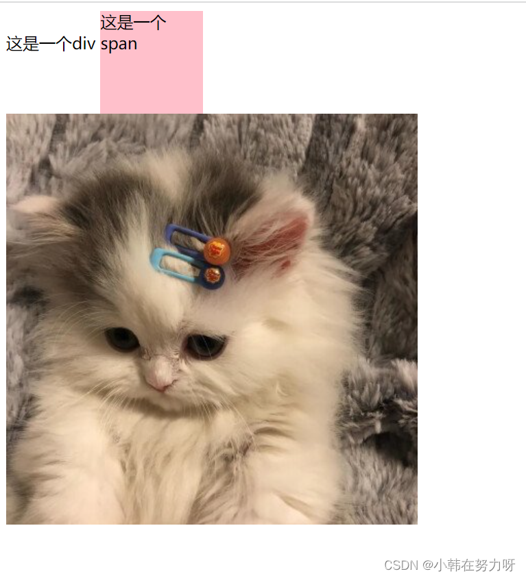
<div>
这是一个div
</div>
<span>这是一个span</span>
<img src="../image/cat1.jpg">
</body>样式:
隐藏属性
display:none;
一般用于菜单的制作,在想要隐藏的部分加入此属性。
实例:
<head>
    <meta charset="UTF-8">
    <meta http-equiv="X-UA-Compatible" content="IE=edge">
    <meta name="viewport" content="width=device-width, initial-scale=1.0">
    <title>Document</title>
    <style>
        ul {
            /* 将此部分隐藏 */
            display: none;
        }

        div:hover ul {
            /* 让其在鼠标悬浮在div上时进行显示 */
            display: block;
        }
    </style>
</head>

<body>
    <div>
        一级列表
        <ul>
            <li>二级列表</li>
            <li>二级列表</li>
            <li>二级列表</li>
        </ul>
    </div>
</body>
样式:
menu
定位
定位---position
| 个数 | 书写语法 | 说明 | 文档流 | 偏移位置时候的参照物 |
| 1 | position:static; | 默认值 | 默认 | 默认 |
| 2 | position:absolute; | 绝对定位 | 脱离 | a. 当没有父元素或者父元素没有定位,参照物是浏览器窗口的第一屏 b.有父元素且父元素有定位u,父元素 |
| 3 | position:relative; | 相对定位 | 不脱离 | 自己的初始位置 |
| 4 | position:fixd; | 固定定位 | 脱离 | 浏览器的当前窗口 |
| 5 | position:sticky; | 粘性定位 | 可以做吸顶效果,粘性定位是css3.0新增加的,兼容不好 |
1.静态定位
position:static; 默认
设置top,left 等没用。
实例:
<head>
    <meta charset="UTF-8">
    <meta http-equiv="X-UA-Compatible" content="IE=edge">
    <meta name="viewport" content="width=device-width, initial-scale=1.0">
    <title>Document</title>
    <style>
        * {
            margin: 0px;
            padding: 0px;
        }

        div {
            background-color: aqua;
            width: 100px;
            height: 100px;
            /* 静态定位 */
            position: static;
            /* top等值都没用
               top:距离上面的距离
               left:距离左边的距离
                right:距离右边的距离
                bottom:距离下面的距离;*/
            top: 200px;
            left: 200px;
        }
    </style>
</head>

<body>
    <div>嘻嘻嘻</div>
</body>
样式:

2.相对定位
position:relative;
即使位置发生了移动,但初始位置不会被占用。其位置的移动是相对于自己的初始位置进行移动。
实例:
<head>
    <meta charset="UTF-8">
    <meta http-equiv="X-UA-Compatible" content="IE=edge">
    <meta name="viewport" content="width=device-width, initial-scale=1.0">
    <title>Document</title>
    <style>
        * {
            margin: 0px;
            padding: 0px;
        }

        div {
            width: 100px;
            height: 100px;
        }

        .box {
            background-color: azure;
        }

        .box1 {
            background-color: aqua;
            /* 静态定位--是相对于自己的初始位置进行位置的移动
               其可以设置负值*/
            position: relative;
            top: 80px;
            left: 20px;
        }

        .box2 {
            background-color: aquamarine;
        }
    </style>
</head>

<body>
    <div class="box">
        端午节
    </div>
    <div class="box1">
        中秋节
    </div>
    <div class="box2">
        国庆节
    </div>
</body>
样式:
before: after:
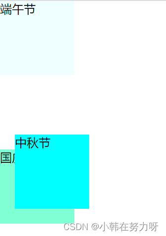
3.绝对定位
position:absolute;
有父子盒子的时候,父盒子设置为相对定位,子盒子设置为绝对定位。
实例:
<head>
    <meta charset="UTF-8">
    <meta http-equiv="X-UA-Compatible" content="IE=edge">
    <meta name="viewport" content="width=device-width, initial-scale=1.0">
    <title>Document</title>
    <style>
        * {
            margin: 0px;
            padding: 0px;
        }

        div {
            width: 100px;
            height: 100px;
        }

        .box1 {
            background-color: aqua;
        }

        .box2 {
            background-color: aquamarine;
            /* 绝对定位---没有父盒子的时候,是相对于浏览器页面进行位置的移动 */
            position: absolute;
            left: 200px;
            top: 0px;
        }

        .father {
            width: 200px;
            height: 200px;
            background-color: pink;

        }

        .son {
            /* 当父盒子没有定位时,子盒子还是相对于页面进行定位 */
            background-color: red;
            position: absolute;
            top: 80px;
            left: 100px;
        }

        .father1 {
            width: 200px;
            height: 200px;
            background-color: orange;
            /* 父盒子有定位 一般情况下父盒子为相对定位,子盒子为绝对定位 */
            position: relative;

        }

        .son1 {
            /* 当父盒子有定位时,子盒子相对于父盒子进行定位 */
            background-color: red;
            position: absolute;
            top: 80px;
            left: 100px;
        }
    </style>
</head>

<body>
    <div class="box1"></div>
    <div class="box2"></div>
    <div class="father">
        <div class="son"></div>
    </div>
    <div class="father1">
        <div class="son1"></div>
    </div>
</body>
样式:

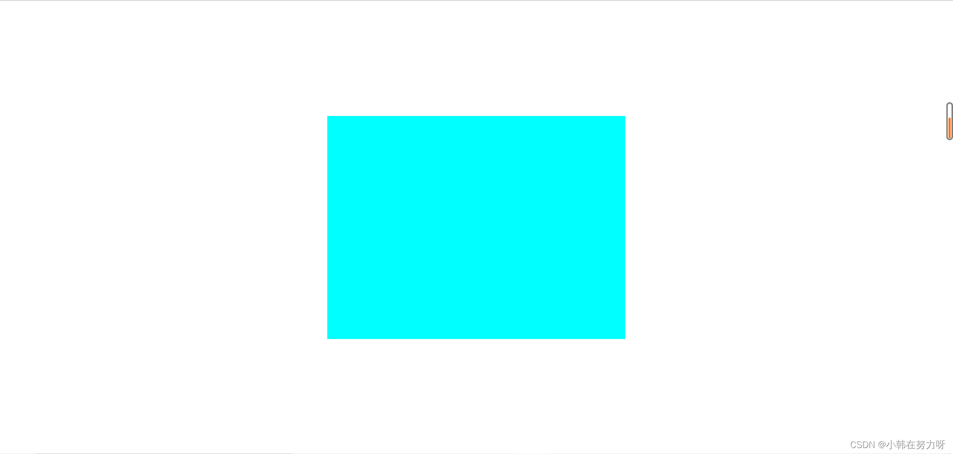
4.固定定位
position:fixed;
即使有滚动条也在当前位置不变。
实例:
<head>
    <meta charset="UTF-8">
    <meta http-equiv="X-UA-Compatible" content="IE=edge">
    <meta name="viewport" content="width=device-width, initial-scale=1.0">
    <title>Document</title>
    <style>
        .box1 {
            width: 1000px;
            height: 2000px;
            background-color: pink;
        }

        .box2 {
            width: 100px;
            height: 100px;
            background-color: red;
            position: fixed;
            top: 200px;
            left: 900px;
        }
    </style>
</head>

<body>
    <div class="box1">
        <div class="box2">
            一个小广告
        </div>
    </div>
</body>
样式:
固定定位
5.粘性定位
position:sticky;
实例:
<head>
    <meta charset="UTF-8">
    <meta http-equiv="X-UA-Compatible" content="IE=edge">
    <meta name="viewport" content="width=device-width, initial-scale=1.0">
    <title>Document</title>
    <style>
        .box1 {
            width: 1000px;
            height: 2000px;
            background-color: pink;
        }

        .box2 {
            width: 100px;
            height: 100px;
            background-color: red;
            position: fixed;
            top: 200px;
            left: 900px;
        }
    </style>
</head>

<body>
    <div class="box1">
        <div class="box2">
            一个小广告
        </div>
    </div>
</body>
样式:
粘性定位
6.定位里的层级
- z-index:1; 设置层级的属性
z-index数值越大,层级越高。可以取负值。
当两个盒子设置定位后发生了覆盖,则用z-index属性来调整想让哪一个盒子在上面。
- 相对定位里的层级
可以随意给其中任何一个盒子赋予z-index属性,值越大则显示在上面。当不赋予z-index属性的时候盒子的覆盖是后来者居上。
实例
<head>
    <meta charset="UTF-8">
    <meta http-equiv="X-UA-Compatible" content="IE=edge">
    <meta name="viewport" content="width=device-width, initial-scale=1.0">
    <title>Document</title>
    <style>
        div {
            width: 200px;
            height: 200px;
        }

        .box1 {
            background-color: aqua;
            position: relative;
            top: 100px;
            left: 100px;
            z-index: 10;
        }

        .box2 {
            background-color: aquamarine;
            /*当两个盒子都设置了相对定位是,后来者居上 */
            position: relative;
            /* 解决办法 给此盒子加入层级属性 */
            /* z-index: 10; */
        }

    </style>
</head>

<body>
    <!-- 相对定位 -->
    <div class="box1"></div>
    <div class="box2"></div>
样式:
before: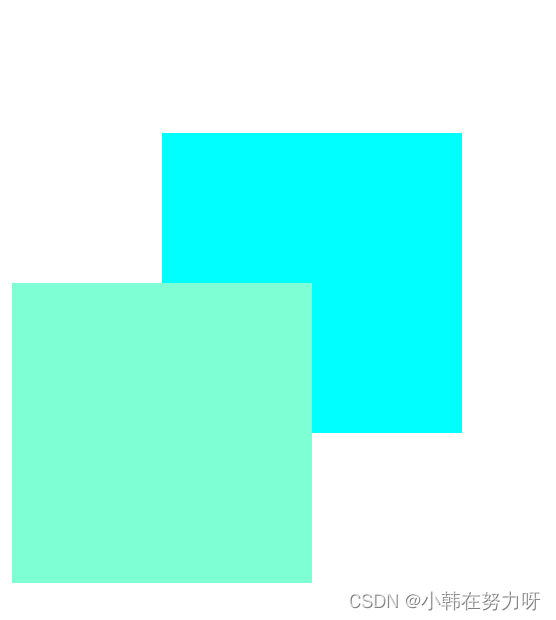 after:
- 绝对定位里的层级
1.父子关系
子盒子正常情况下会显示在父盒子的上面,只要给子盒子增加z-index的属性,其值设置为负值即可让父盒子在上面显示。
实例:
<head>
    <meta charset="UTF-8">
    <meta http-equiv="X-UA-Compatible" content="IE=edge">
    <meta name="viewport" content="width=device-width, initial-scale=1.0">
    <title>Document</title>
    <style>
        /* 父子关系的绝对定位的层级关系 */
        .father {
            width: 200px;
            height: 200px;
            background-color: aqua;
            position: relative;
            top: 10px;
            left: 10px;
        }
        .son {
            width: 100px;
            height: 100px;
            background-color: aquamarine;
            position: absolute;
            top: 10px;
            left: 10px;
            /* 让父盒子完全显示出来
                给子盒子加z-index的负值*/
            /* z-index: -1; */
        }
    </style>
</head>

<body>
    <!-- 绝对定位--父子关系 -->
    <div class="father">
        <div class="son"></div>
    </div>
    <!-- 兄弟关系 与相对定位一样 -->

</body>
样式:
before: after:
2.兄弟关系
与相对定位的层级关系一样,后来者居上。
7.定位控制元素水平垂直居中
- 盒子在浏览器页面中水平垂直居中
第一步:将盒子进行绝对定位,上左各移动整个页面的50%
第二步: 给盒子设置margin值上左各设置其长宽的一半。注意此时应该取负值。
实例:
<head>
    <meta charset="UTF-8">
    <meta http-equiv="X-UA-Compatible" content="IE=edge">
    <meta name="viewport" content="width=device-width, initial-scale=1.0">
    <title>Document</title>
    <style>
        * {
            margin: 0px;
            padding: 0px;
        }

        /* 实现盒子在浏览器页面中的居中 */
        .box {
            width: 400px;
            height: 300px;
            background-color: aqua;
            /* 首先让盒子距离浏览器页面靠上靠左的一半 */
            position: absolute;
            left: 50%;
            top: 50%;
            /* 让盒子的margin值向左向上调整自身长和宽的一般 注意要取负值 */
            margin-left: -200px;
            margin-top: -150px;
        }
    </style>
</head>

<body>
    <!-- 让盒子在浏览器页面中居中 -->
    <div class="box"></div>
</body>
样式:
- 子盒子在父盒子中水平垂直居中
第一步:给父盒子设置相对定位,子盒子设置绝对定位。
第二步:给子盒子设置距上距左各占百分之50的值,即让子盒子在距离父盒子长一半,宽一半处显示。
第三步:给子盒子设置margin值,左上各占自身盒子长和宽的一半,注意此时的值应取负值。
实例:
<head>
    <meta charset="UTF-8">
    <meta http-equiv="X-UA-Compatible" content="IE=edge">
    <meta name="viewport" content="width=device-width, initial-scale=1.0">
    <title>Document</title>
    <style>
        * {
            margin: 0px;
            padding: 0px;
        }

        /* 实现子盒子在父盒子中水平垂直居中 */
        .father {
            width: 500px;
            height: 500px;
            background-color: pink;
            position: relative;
            margin: 0 auto;
        }

        .son {
            width: 200px;
            height: 200px;
            background-color: orange;
            position: absolute;
            top: 50%;
            left: 50%;
            margin-top: -100px;
            margin-left: -100px;

        }
    </style>
</head>

<body>
    <!-- 让子盒子在父盒子页面水平垂直居中 -->
    <div class="father">
        <div class="son"></div>
    </div>
</body>
样式:

浮动与定位的区别
浮动:半脱离,当上一个盒子浮动起来,下一个盒子会被覆盖,但是盒子上的文字依旧可以完整的显示出来,即文字环绕的效果。
定位:全脱离,当两个盒子之间发生覆盖的时候,文字同样会被覆盖,不会产生文字环绕效果。
注意:相对定位盒子初始位置不会被占用哦
实例:
<head>
    <meta charset="UTF-8">
    <meta http-equiv="X-UA-Compatible" content="IE=edge">
    <meta name="viewport" content="width=device-width, initial-scale=1.0">
    <title>Document</title>
    <style>
        .box1 {
            width: 100px;
            height: 100px;
            background-color: pink;
            /* 使其浮动起来 */
            /* float: left; */
            /* 相对定位 */
            /* position: relative; */
            /* 绝对定位 */
            position: absolute;
        }

        .box2 {
            width: 200px;
            height: 200px;
            background-color: orange;
        }
    </style>
</head>

<body>
    <div class="box1"></div>
    <div class="box2">
        日本某推友总结说香蕉又甜又便宜又好吃却很健康,可以说是水果之王的香蕉吃多了也会致死的,具体的致死量为480根,如果一口气吃480根香蕉可能会因为钾摄入过量而导致四肢麻木和心律不齐。
    </div>
样式:
float:  relative:
 absolute:
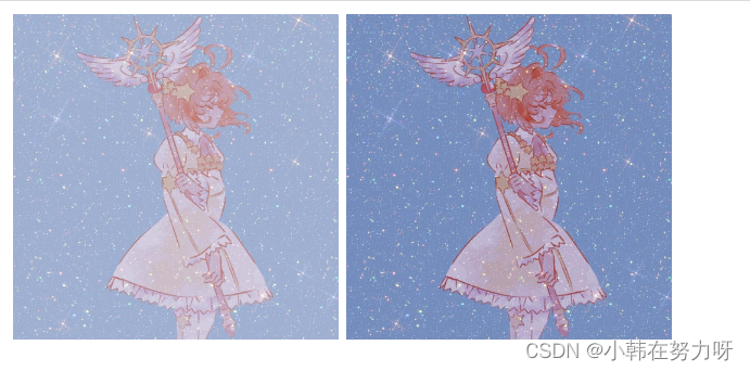
半透明属性
opcity:0.7;----半透明属性
实例:
<head>
    <meta charset="UTF-8">
    <meta http-equiv="X-UA-Compatible" content="IE=edge">
    <meta name="viewport" content="width=device-width, initial-scale=1.0">
    <title>Document</title>
    <style>
        .img1 {
            width: 200px;
            height: 200px;
            opacity: 0.7;
        }

        .img2 {
            width: 200px;
            height: 200px;
        }
    </style>
</head>

<body>
    <img class="img1" src="image/xiaoying.jpeg">
    <img class="img2" src="image/xiaoying.jpeg">
</body>
样式:
透明属性
transparent; 透明属性
可在背景颜色,文本颜色,边框颜色中使用
实例:
<head>
    <meta charset="UTF-8">
    <meta http-equiv="X-UA-Compatible" content="IE=edge">
    <meta name="viewport" content="width=device-width, initial-scale=1.0">
    <title>Document</title>
    <style>
        /* 透明属性
           在背景颜色,文本颜色中使用
           在边框颜色中使用 */
        .box {
            width: 200px;
            height: 200px;
            background-color: aqua;
        }

        .box1 {
            width: 100px;
            height: 100px;
            background-color: antiquewhite;
            color: brown;
            border: 1px solid red;
        }

        .box1:hover {
            background-color: transparent;
            color: transparent;
            border: 1px solid transparent;
        }
    </style>
</head>

<body>
    <div class="box">
        <div class="box1">
            哈哈哈哈
        </div>
    </div>
</body>
样式:
透明属性
三角形案例
导航里下拉菜单的三角形时写出来的哦
实例:
<head>
    <meta charset="UTF-8">
    <meta http-equiv="X-UA-Compatible" content="IE=edge">
    <meta name="viewport" content="width=device-width, initial-scale=1.0">
    <title>Document</title>
    <style>
        div {
            width: 100px;
            height: 40px;
            background-color: rgb(109, 171, 241);
            line-height: 40px;
            text-indent: 20px;
        }

        .span1 {
            color: white;
        }

        .span2 {
            /* 要将其高度和宽度设置为0 */
            width: 0px;
            height: 0px;
            display: inline-block;
            /* 把其他三个边框设置为透明 */
            border: 8px solid rgba(0, 0, 0, 0);
            border-top: 8px solid rgb(136, 116, 222);
            /* 对三角形进行定位 */
            position: relative;
            top: 4px;
        }

        div:hover .span2 {
            /* 鼠标悬停时变为上三角形 */
            width: 0px;
            height: 0px;
            display: inline-block;
            border: 8px solid rgba(0, 0, 0, 0);
            border-bottom: 8px solid rgb(136, 116, 222);
            position: relative;
            top: -4px;
        }
    </style>
</head>

<body>
    <div>
        <span class="span1">导航</span>
        <span class="span2"></span>
    </div>
</body>
样式:
导航三角形
锚点
- 作用:进行页面不同区域的跳转。
- 应用:
第一步:给跳转到的盒子加入自己的id <div id="锚点名字"> </div>。
第二步:在总的导航处用a标签链接 <a href="#锚点名字">。
实例:
<head>
    <meta charset="UTF-8">
    <meta http-equiv="X-UA-Compatible" content="IE=edge">
    <meta name="viewport" content="width=device-width, initial-scale=1.0">
    <title>Document</title>
    <style>
        * {
            margin: 0px;
            padding: 0px;
            text-decoration: none;

        }

        ul {
            width: 50px;
            background-color: white;
            position: fixed;
            top: 20px;
            right: 10px;
            list-style: none;
        }

        li {
            width: 50px;
            height: 50px;
            border: 1px solid #ccc;
            font-size: 12px;
            text-align: center;
            line-height: 50px;
        }

        a {
            color: rgb(62, 60, 60);
        }

        div {
            width: 800px;
            height: 300px;
            border-bottom: 1px solid #ccc;
            border-right: 1px solid #ccc;
        }
    </style>
</head>

<body>
    <ul>
        <li><a href="#a">京东秒杀</a></li>
        <li><a href="#b">双十一</a></li>
        <li><a href="#c">特色优先</a></li>
        <li><a href="#d">频道广场</a></li>
        <li><a href="#e">为你推荐</a></li>
        <li><a href="#f">客服</a></li>
        <li><a href="#g">反馈</a></li>
    </ul>
    <div id="a">
        京东秒杀
    </div>
    <div id="b">
        双十一
    </div>
    <div id="c">
        特色优先
    </div>
    <div id="d">
        频道广场
    </div>
    <div id="e">
        为你推荐
    </div>
    <div id="f">
        客服
    </div>
    <div id="g">
        反馈
    </div>
</body>
样式:
锚点
精灵图
CSS Sprites的原理(图片整合技术) (css精灵图)/雪碧图
- 将套行背景图片,按钮背景图片等有规则的合并成一张背景图,即将多张图片合为一张整图,然后用background-position来实现背景图片的定位技术。
- 优势:
1.通过图片整合来减少对服务器的请求次数,从而提高页面的加载速度
2.通过整合图片来减少图片的体积
实例:
<head>
    <meta charset="UTF-8">
    <meta http-equiv="X-UA-Compatible" content="IE=edge">
    <meta name="viewport" content="width=device-width, initial-scale=1.0">
    <title>Document</title>
    <style>
        div {
            width: 103px;
            height: 32px;
            float: left;
            margin: 10px;
            background-color: pink;
            background-image: url("image/精灵图.png");
        }

        /* 将小图片移动到大图片的左上角处 即大多数取负值 */
        .box1 {
            background-position: -205px -111px;
        }

        .box2 {
            background-position: -205px -74px;
        }

        .box3 {
            background-position: -205px -37px;
        }
    </style>
</head>

<body>
    <div class="box1"></div>
    <div class="box2"></div>
    <div class="box3"></div>
</body>
样式:
自适应
1.宽高自适应
- 自适应:网页布局中经常要定义元素的宽和高,但很多时候我们希望元素的大小能够根据窗口或者子元素自动调整,这就是自适。
- 宽度自适应和高度自适应
1.宽度自适应
元素宽度的默认值为auto; 通常使用在导航栏,通栏布局
2.高度自适应
元素高度的默认值为{height:auto;}
实例:
<head>
<meta charset="UTF-8">
<meta http-equiv="X-UA-Compatible" content="IE=edge">
<meta name="viewport" content="width=device-width, initial-scale=1.0">
<title>Document</title>
<style>
* {
margin: 0px;
padding: 0px;
}
.box1 {
/* 宽度自适应
1.盒子中不设置宽度
2.width:auto;
一般应用于导航栏 通栏布局
min-width最小宽度
max-width最大宽度*/
/* min-width: 300px; */
/* max-width: 300px; */
height: 100px;
background-color: pink;
}
.box2 {
width: 100%;
background-color: aqua;
height: 100px;
}
.box3 {
/* 高度自适应
1.盒子中不设置高度
内容自动撑起高度
min-height:最小高度
max-height:最大高度 */
width: 100%;
background-color: aquamarine;
}
.box4 {
width: 100%;
background-color: azure;
height: 100px;
}
</style>
</head>
<body>
<!-- 宽度自适应 -->
<div class="box1"></div>
<!-- 高度自适应 -->
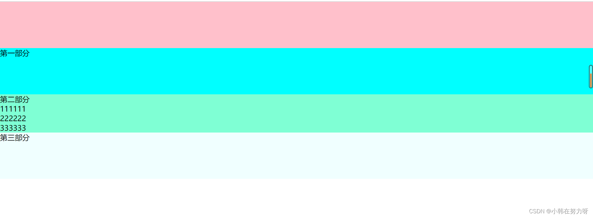
<div class="box2">第一部分</div>
<div class="box3">
第二部分
<ul>
<li>111111</li>
<li>222222</li>
<li>333333</li>
</ul>
</div>
<div class="box4">
第三部分
</div>
</body>样式:
2.浮动元素的高度自适应
父元素不写高度时,子元素写了浮动之后,父元素会发生高度塌陷。
方法1:给父元素添加声明 overflow:hidden; 缺点---会隐藏溢出的元素
方法2:在浮动元素下方添加空块元素,并给该元素添加声明---clear:both; height:0;overflow:hidden; 缺点---不利于代码可读性,且降低了浏览器性能。
方法3:万能清除浮动法---应用到伪元素
选择符:after{
context:"";
clear:both;
display:block;
width:0;
height:0px;
/* visibility 隐藏; 把context内容隐藏*/
visibility:hidden;}
实例:
3.窗口自适应
盒子根据窗口的大小进行改变
设置方法:html,body{height:100%;}
实例:
<head>
    <meta charset="UTF-8">
    <meta http-equiv="X-UA-Compatible" content="IE=edge">
    <meta name="viewport" content="width=device-width, initial-scale=1.0">
    <title>Document</title>
    <style>
        .box {
            height: 100%;
            width: 100%;
            background-color: pink;
            ;

        }

        html,
        body {
            /* 相对于浏览器窗口的100% */
            height: 100%;
        }

        .son1 {
            height: 50%;
            background-color: red;
        }

        .son2 {
            height: 50%;
            background-color: orange;
        }
    </style>
</head>

<body>
    <div class="box">
        <div class="son1"></div>
        <div class="son2"></div>
    </div>
</body>
样式:

伪元素--选择器
1) :after---于content属性一起使用,定义在对象后的内容
例:div:after{content:url(cat.jpg);}
div:after{content:"文本内容";}
2) :before---于content属性一起使用,定义在对象前的内容
例:div:before{content:url(cat.jpg);}
div:before{content:"在其前放内容";}
3) :first-letter ---定义对象内第一个字符的样式
4) :first-line ---定义对象内第一行文本的样式
实例:
<head>
    <meta charset="UTF-8">
    <meta http-equiv="X-UA-Compatible" content="IE=edge">
    <meta name="viewport" content="width=device-width, initial-scale=1.0">
    <title>Document</title>
    <style>
        div::first-line {
            background-color: aqua;
            font-size: 26px;
            color: pink;
        }

        div::first-letter {
            color: black;
            font-size: 30px;
        }

        div::before {
            content: "aaaaa";

        }

        div::after {
            content: url(image/1.png);
        }
    </style>
</head>

<body>
    <div>
        美疾控中心在一篇声明中表示,从10月20日开始,美国各州和地方卫生部门只须于每个星期三报告新增新冠病例和死亡病例数。“此举是为了增加灵活性,减轻各州和地方政府的报告负担。”美疾控中心一些关于新冠的线上服务工具也将于10月逐步关闭。
    </div>
</body>
样式:

布局
1.两栏布局
即页面左侧一行导航,页面右上侧一行导航。即左侧固定,右侧自适应。
calc() 函数:用于动态计算长度值---引入知识点
最注意的是,运算符前后都需要保留一个空格,例:width:calc(100% - 10px);
1)任何长度值都可以使用calc()函数进行计算;
2)支持“+” “-” “*” “/”的运算;
3)calc()函数使用标准的数学运算优先级准则。
方法1:让左侧的浮动,高度自适应。右侧的设置相应左侧宽度的margin-left的值。
实例:
<head>
    <meta charset="UTF-8">
    <meta http-equiv="X-UA-Compatible" content="IE=edge">
    <meta name="viewport" content="width=device-width, initial-scale=1.0">
    <title>Document</title>
    <style>
        * {
            margin: 0px;
            padding: 0px;
        }

        html,
        body {
            height: 100%;
        }

        .box1 {
            height: 100%;
            width: 200px;
            background-color: pink;
            float: left;
        }

        .box2 {
            /* 不要设置宽度 */
            height: 100%;
            background-color: red;
            margin-left: 200px;
        }
    </style>
</head>

<body>
    <div class="box1"></div>
    <div class="box2"></div>
</body>
方法2:利用calc() 函数。
实例:
<head>
    <meta charset="UTF-8">
    <meta http-equiv="X-UA-Compatible" content="IE=edge">
    <meta name="viewport" content="width=device-width, initial-scale=1.0">
    <title>Document</title>
    <style>
        * {
            margin: 0px;
            padding: 0px;
        }

        html,
        body {
            height: 100%;
        }

        .box1 {
            height: 100%;
            width: 200px;
            background-color: pink;
            float: left;
        }

        .box2 {
            /* 不要设置宽度 */
            height: 100%;
            width: calc(100% - 200px);
            background-color: red;
            float: left;
        }
    </style>
</head>

<body>
    <div class="box1"></div>
    <div class="box2"></div>
</body>
总体样式:
两栏布局
3.三栏布局
左中右三部分,中间部分可根据窗口大小进行调节。
上中下三部分,中间部分可根据窗口大小进行调节。
与两栏布局相似,也是同样两种方法。
实例:
<head>
    <meta charset="UTF-8">
    <meta http-equiv="X-UA-Compatible" content="IE=edge">
    <meta name="viewport" content="width=device-width, initial-scale=1.0">
    <title>Document</title>
    <style>
        /* 左侧固定,右侧固定,中间自适应 */
        * {
            margin: 0px;
            padding: 0px;
        }

        html,
        body {
            height: 100%;
        }

        .left,
        .right {
            width: 200px;
            height: 100%;
            background-color: aqua;
        }

        .left {
            float: left;
        }

        .right {
            float: right;
        }

        .center {
            /* 第一种方法 */
            /* height: 100%;
            margin-left: 200px;
            margin-right: 200px;
            background-color: aquamarine; */
            /* 第二种方法 */
            height: 100%;
            width: calc(100% - 400px);
            background-color: blue;
        }
    </style>
</head>

<body>
    <!-- 让左右两侧先浮动起来 中间则会上去 -->
    <div class="left"></div>
    <div class="right"></div>
    <div class="center"></div>
</body>
样式:
三栏布局


 1358
1358


 被折叠的 条评论
为什么被折叠?
被折叠的 条评论
为什么被折叠?
 到【灌水乐园】发言


