


前言
《css 揭秘》这本书以案例的形式,介绍了 47 个网页设计经典难题的解决方案,我在学习之余将其一一记录下来,方便回顾,本文介绍前 19个案例效果及代码。
在线预览 play.csssecrets.io
1-半透明边框
难题
当你用 rgba() 或者 hsla() ,写了一个半透明的颜色,给到容器边框时候,你会发现,没有半透明效果,这是因为默认情况下,背景色会填充到边框区域,导致边框的半透明效果失效,当把 border 样式设置为 dashed 时候,你会很直观的发现这一点。
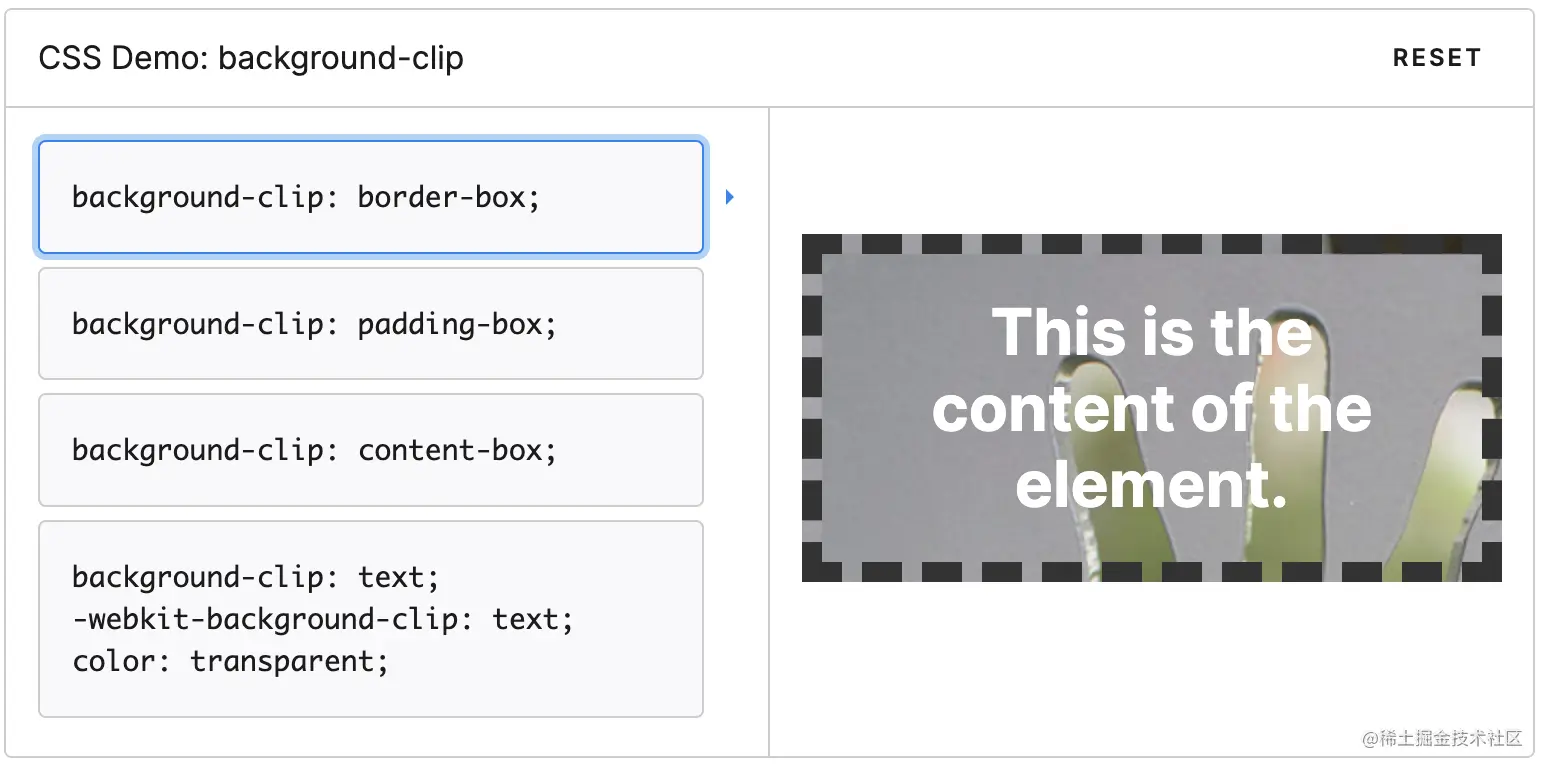
方案
使用 background-clip 属性调整上面的默认效果,这个属性的默认值为 border-box,此时背景会被元素的border 给遮盖,它还可以配置 padding-box || content-box, 此时浏览器将以内边距或内容区外沿来渲染。 修改后,border 的半透明效果就生效了。 
拓展
background-clip 还有个 text 属性,很有意思,当设置为text 后,背景会被裁剪成文字的前景色。 
2-多重边框
难题
使用 border 来生成单一的边框很容易,但是若想生成多重边框就做不到了,通常需要使用各种 hack 例如使用多个元素来模拟实现。
方案1: box-shadow
一个正值的扩张半径加上两个为零的偏移量以及为零的模糊值,得到的“投影”其实就是一条实线;再结合 box-shadow 的逗号分隔语法,来创建任意数量的投影。
1.投影行为跟边框不完全一致
2.生成的边框默认出现在元素外圈,可以加上 inset 关键字来使投影绘制在元素的内圈,注意预留足够的内边距来腾出足够的间隙
方案2 : outline
如果只需要两层边框,可以在常规边框的基础上,增加 outline(描边)属性来产生外层的边框,特点是比较灵活。
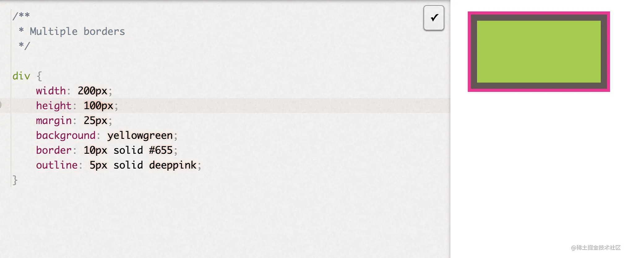
总结
这两种方案都可以实现多重边框的效果,但是outline 只适用于双层边框的场景,如果需要更多层边框,可以用 box-shadow 来实现,另外这两种方案都有一个潜在的缺陷,采用时一定要在不同的浏览器中测试好最终效果。
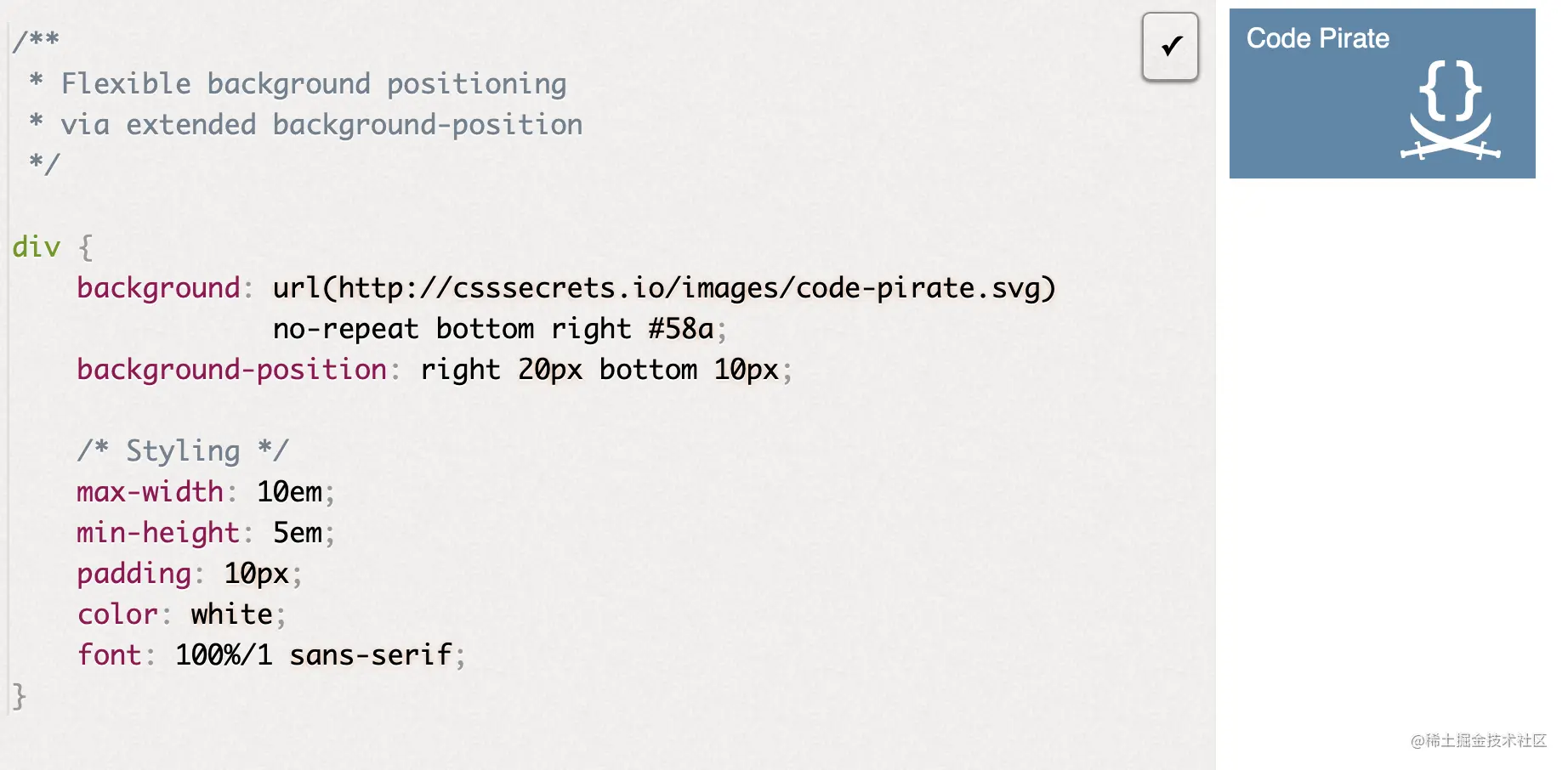
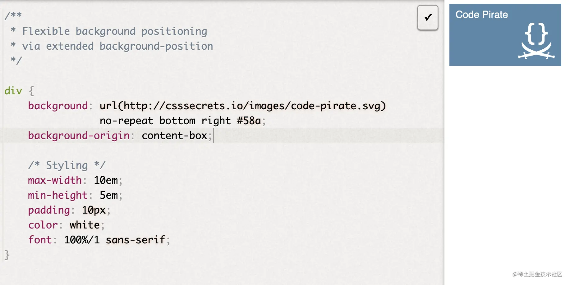
3-灵活的背景定位
难题
想要的效果:使背景图片针对某个角进行准确的偏移定位?
方案1 background-position
方案2 background-origin
这种方案的优点是,当内边距改变时,其会自动进行位置偏移更新,不用重新声明新的偏移量。
方案3 calc()
calc() 也可以结合 background-position 进行准确的计算偏移量,达到同样的效果。注意 calc() 函数内部的 - 和 + 运算符两侧需要各加一个空白符,否则会解析错误。
background-position: calc(100% - 20px) calc(100% - 10px);
4-边框内圆角
想要的效果如下,只显示内部圆角,外部仍然为矩角 
方案1双元素叠加
使用双 div 元素叠加来实现
<div class="parent"><div class="child"></div>
</div>

.parent {margin: 100px auto;width: 400px;height: 200px;background: #655;padding: 0.8em;
}

.child {height: 170px;background: tan;padding: 1em;border-radius: 0.8em;
}
方案2 单元素
这种方案在书中提到是个 hack, 果然我写这篇文章的时候,验证了谷歌浏览器中 outline 的样式会跟着border-radius 走,所以这个方案基本已经失效了。
div {outline: .6em solid #655;box-shadow: 0 0 0 .4em #655; /* todo calculate max of this */max-width: 10em;border-radius: .8em;padding: 1em;margin: 1em;background: tan;font: 100%/1.5 sans-serif;
}
5-条纹背景

介绍
传统方案都是用 svg 或者图片来解决,这里直接使用 css 来创建条纹图案
// 水平条纹效果
background: linear-gradient(#fb3 50%, #58a 50%);
background-size: 100% 30px;

// 垂直条纹效果
background: linear-gradient(to right, #fb3 50%, #58a 0);
background-size: 30px 100%;

// 斜向条纹
background: linear-gradient(45deg, #fb3 50%, #58a 0);
background-size: 30px 30px;

// 同色系条纹
background: repeating-linear-gradient(30deg, #79b, #79b 15px, #58a 0, #58a 30px);
background: #58a;

// 同色系条纹 重构
background: repeating-linear-gradient(30deg, hsla(0, 0%, 100%, .1),hsla(0, 0%, 100%, .1) 15px,transparent 0,transparent 30px);
background: #58a;
6-复杂的背景图案
桌布图案

 /**
 * Checkerboard
 */

background: #eee;
background-image:
	linear-gradient(45deg, rgba(0,0,0,.25) 25%, transparent 0, transparent 75%, rgba(0,0,0,.25) 0),
	linear-gradient(45deg, rgba(0,0,0,.25) 25%, transparent 0, transparent 75%, rgba(0,0,0,.25) 0);
background-position: 0 0, 15px 15px;
background-size: 30px 30px;

min-height: 100%;

/**
 * Polka dot
 */

background: #655;
background-image: radial-gradient(tan 20%, transparent 0),radial-gradient(tan 20%, transparent 0);
background-size: 30px 30px;
background-position: 0 0, 15px 15px;
棋盘
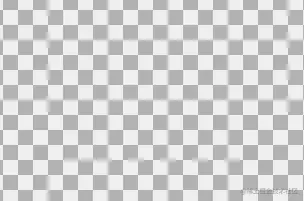
/**
 * Checkerboard
 */

background: #eee;
background-image:
	linear-gradient(45deg, rgba(0,0,0,.25) 25%, transparent 0, transparent 75%, rgba(0,0,0,.25) 0),
	linear-gradient(45deg, rgba(0,0,0,.25) 25%, transparent 0, transparent 75%, rgba(0,0,0,.25) 0);
background-position: 0 0, 15px 15px;
background-size: 30px 30px;

min-height: 100%;

/**
 * Checkerboard with SVG
 */

background: #eee url('data:image/svg+xml,\<svg xmlns="http://www.w3.org/2000/svg" width="100" height="100" fill-opacity=".25" >\<rect x="50" width="50" height="50" />\<rect y="50" width="50" height="50" />\</svg>');
background-size: 30px 30px;
角向渐变
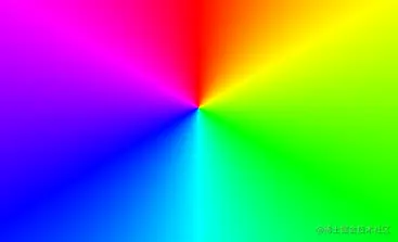
/**
 * Conic gradients test
 * PASS if green gradient, FAIL if red.
 */

background: red;
background: conic-gradient(limegreen, green, limegreen);
min-height: 100%;
7-伪随机背景
难点:重复的平铺图案虽然美观,但是不太自然,下面介绍增加随机性背景的方法 
 /**
 * Pseudorandom stripes
 */

background: hsl(20, 40%, 90%);
background-image:
	linear-gradient(90deg, #fb3 11px, transparent 0),
	linear-gradient(90deg, #ab4 23px, transparent 0),
	linear-gradient(90deg, #655 23px, transparent 0);
background-size: 83px 100%, 61px 100%, 41px 100%;
8-连续的图像边框
难点:通常这种效果是借助双 Dom 来实现,一个作为背景图,一个作为内容;我们的改进方案是基于一个元素来实现的。
/**
 * Basic border-image demo
 */

div {
	border: 40px solid transparent;
	border-image: 33.334% url('data:image/svg+xml,<svg xmlns="http:%2F%2Fwww.w3.org%2F2000%2Fsvg" width="30" height="30"> \
	<circle cx="5" cy="5" r="5" fill="%23ab4"%2F><circle cx="15" cy="5" r="5" fill=" %23655"%2F> \
	<circle cx="25" cy="5" r="5" fill="%23e07"%2F><circle cx="5" cy="15" r="5" fill=" %23655"%2F> \
	<circle cx="15" cy="15" r="5" fill="hsl(15, 25%, 75%)"%2F> \
	<circle cx="25" cy="15" r="5" fill=" %23655"%2F><circle cx="5" cy="25" r="5" fill="%23fb3"%2F> \
	<circle cx="15" cy="25" r="5" fill=" %23655"%2F><circle cx="25" cy="25" r="5" fill="%2358a"%2F><%2Fsvg>');
	padding: 1em;
	max-width: 20em;
	font: 130%/1.6 Baskerville, Palatino, serif;
}

div:nth-child(2) {
	margin-top: 1em;
	border-image-repeat: round;
}
利用上面的条纹背景
/**
 * Vintage envelope themed border
 */

div {padding: 1em;border: 1em solid transparent;background: linear-gradient(white, white) padding-box,repeating-linear-gradient(-45deg, red 0, red 12.5%, transparent 0, transparent 25%, #58a 0, #58a 37.5%, transparent 0, transparent 50%) 0 / 6em 6em;max-width: 20em;font: 100%/1.6 Baskerville, Palatino, serif;
}
9-自适应的椭圆
难点:border-radius 其实可以单独指定水平和垂直半径,用斜杠(/)分隔这两个值即可。利用这个特性可以创建椭圆圆角。
椭圆
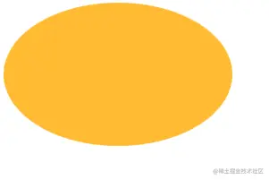
/**
 * Flexible ellipse
 */

div {width: 20em;height: 10em;background: #fb3;border-radius: 50%;
}
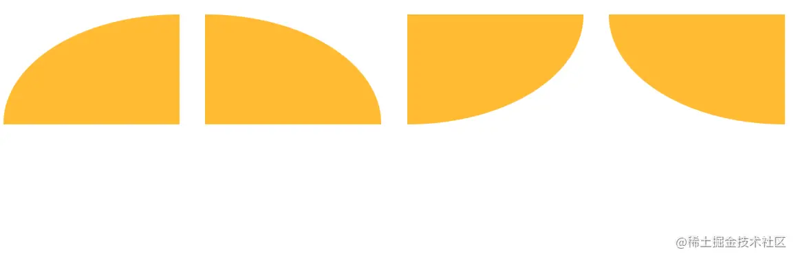
半椭圆
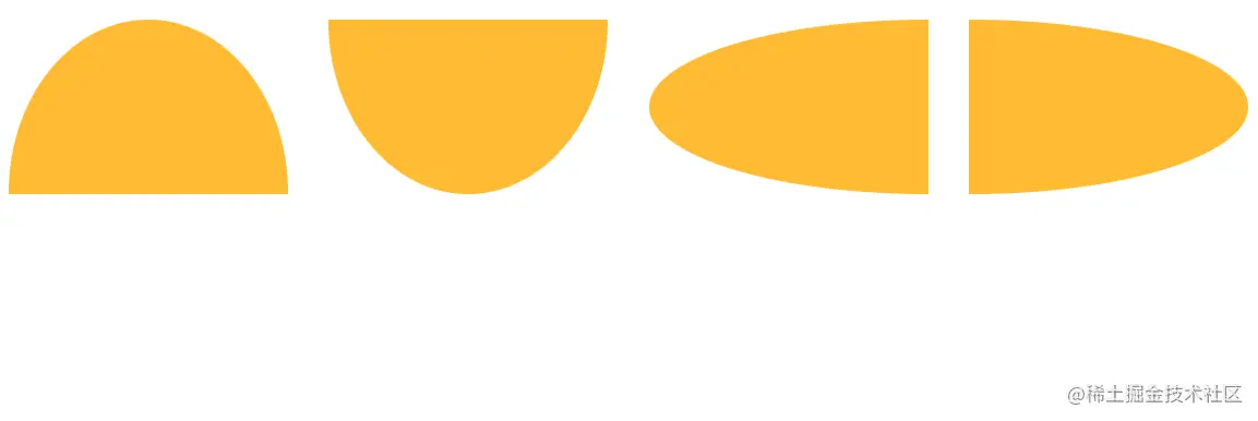
/**
 * Flexible half ellipse
 */

div {display: inline-block;width: 16em;height: 10em;margin: 1em;background: #fb3;border-radius: 50% / 100% 100% 0 0;
}

div:nth-of-type(2) { border-radius: 50% / 0 0 100% 100%; }
div:nth-of-type(3) { border-radius: 100% 0 0 100% / 50%; }
div:nth-of-type(4) { border-radius: 0 100% 100% 0 / 50%; }
四分之一椭圆
 /**
 * Flexible quarter ellipse
 */

div {display: inline-block;width: 16em;height: 10em;margin: 1em;background: #fb3;border-radius: 100% 0 0 0;
}

div:nth-of-type(2) { border-radius: 0 100% 0 0; }
div:nth-of-type(3) { border-radius: 0 0 100% 0; }
div:nth-of-type(4) { border-radius: 0 0 0 100%; }
10-平行四边形
背景知识: 基本的 css 变形 transform: skewx()

潜套元素方案
可以解决文字变形的问题
/**
 * Parallelograms — with extra HTML element
 */

<a href="#yolo" class="button"><div>Click me</div></a>
<button class="button"><div>Click me</div></button>
.button { transform: skewX(45deg); }
.button > div { transform: skewX(-45deg); }

.button {display: inline-block;padding: .5em 1em;border: 0; margin: .5em;background: #58a;color: white;text-transform: uppercase;text-decoration: none;font: bold 200%/1 sans-serif;
}
伪元素方案
/**
 * Parallelograms — with pseudoelements
 */

<a href="#yolo" class="button"><div>Click me</div></a>
<button class="button"><div>Click me</div></button>

.button {position: relative;display: inline-block;padding: .5em 1em;border: 0; margin: .5em;background: transparent;color: white;text-transform: uppercase;text-decoration: none;font: bold 200%/1 sans-serif;
}

.button::before {content: ''; /* To generate the box */position: absolute;top: 0; right: 0; bottom: 0; left: 0;z-index: -1;background: #58a;transform: skew(45deg);
}
11-菱形图片
介绍两种使用 css 制作菱形图片的方案,相对于设计师提供裁切好的图片,更加灵活 
基于变形的方案
/**
 * Diamond images — via transforms
 */
<div class="diamond"><img src="http://placekitten.com/200/300" />
</div>

.diamond {width: 250px;height: 250px;transform: rotate(45deg);overflow: hidden;margin: 100px;
}

.diamond img {max-width: 100%;transform: rotate(-45deg) scale(1.42);z-index: -1;position: relative;
}
裁切路径方案
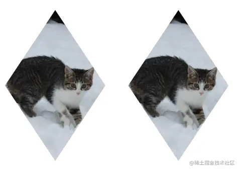
/**
 * Diamond images — via clip-path
 */

img {max-width: 250px;margin: 20px;-webkit-clip-path: polygon(50% 0, 100% 50%, 50% 100%, 0 50%);clip-path: polygon(50% 0, 100% 50%, 50% 100%, 0 50%);transition: 1s;
}

img:hover {-webkit-clip-path: polygon(0 0, 100% 0, 100% 100%, 0 100%);clip-path: polygon(0 0, 100% 0, 100% 100%, 0 100%);
}
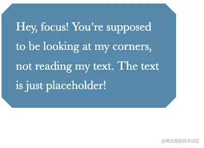
12-切角效果
背景知识:css 渐变,background-size,‘条纹背景’
切角是一种流行的设计风格,使用css 制作切角可以实现更加灵活和多样的颜色效果
渐变方案
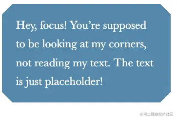
<div>Hey, focus! You’re er!</div>

/**
 * Beveled corners — with gradients
 */

div {background: #58a;background: linear-gradient(135deg, transparent 15px, #58a 0) top left,linear-gradient(-135deg, transparent 15px, #58a 0) top right,linear-gradient(-45deg, transparent 15px, #58a 0) bottom right,linear-gradient(45deg, transparent 15px, #58a 0) bottom left;background-size: 50% 50%;background-repeat: no-repeat;padding: 1em 1.2em;max-width: 12em;color: white;font: 150%/1.6 Baskerville, Palatino, serif;
}
弧形切角
渐变技巧的一个变种 
/**
 * Scoop corners
 */

div {background: #58a;background:	radial-gradient(circle at top left, transparent 15px, #58a 0) top left,
	radial-gradient(circle at top right, transparent 15px, #58a 0) top right,
	radial-gradient(circle at bottom right, transparent 15px, #58a 0) bottom right,
	radial-gradient(circle at bottom left, transparent 15px, #58a 0) bottom left;
background-size: 50% 50%;
background-repeat: no-repeat;

padding: 1em 1.2em;
max-width: 12em;
color: white;
font: 130%/1.6 Baskerville, Palatino, serif;
}
内联 SVG 与 border-image 方案
/**
 * Beveled corners — with border-image and an inline SVG
 */

div {border: 21px solid transparent;border-image: 1 url('data:image/svg+xml,\<svg xmlns="http://www.w3.org/2000/svg" width="3" height="3" fill="%2358a">\<polygon points="0,1 1,0 2,0 3,1 3,2 2,3 1,3 0,2" />\</svg>');background: #58a;background-clip: padding-box;padding: .2em .3em;max-width: 12em;color: white;font: 150%/1.6 Baskerville, Palatino, serif;
}
裁切路径方案
/**
 * Beveled corners — with clip-path
 */

div {background: #58a;-webkit-clip-path: polygon(20px 0, calc(100% - 20px) 0, 100% 20px, 100% calc(100% - 20px),calc(100% - 20px) 100%,20px 100%, 0 calc(100% - 20px), 0 20px);clip-path:polygon(20px 0, calc(100% - 20px) 0, 100% 20px, 100% calc(100% - 20px),calc(100% - 20px) 100%,20px 100%, 0 calc(100% - 20px), 0 20px);padding: 1em 1.2em;max-width: 12em;color: white;font: 150%/1.6 Baskerville, Palatino, serif;
}
13-梯形标签页
背景知识:基本的3D变形,“平行四边形”
方案1: 伪元素制作两条斜边,border 制作上下平行边 方案2: 3D 旋转,普通的3D 旋转会有副作用比如 文字的变形
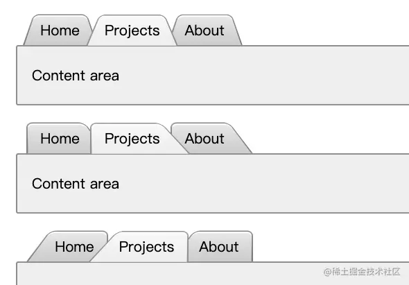
 <!-- This HTML is invalid and just for demo purposes. Don't use multiple main elements! -->

<nav><a href="#">Home</a><a href="#" class="selected">Projects</a><a href="#">About</a>
</nav>
<main>Content area
</main>

<nav class="left"><a href="#">Home</a><a href="#" class="selected">Projects</a><a href="#">About</a>
</nav>
<main>Content area
</main>

<nav class="right"><a href="#">Home</a><a href="#" class="selected">Projects</a><a href="#">About</a>
</nav>
<main>Content area
</main>

/**
 * Trapezoid tabs
 */

body {padding: 40px;font: 130%/2 Frutiger LT Std, sans-serif;
}

nav {position: relative;z-index: 1;padding-left: 1em;
}

nav > a {position: relative;display: inline-block;padding: .3em 1em 0;color: inherit;text-decoration: none;margin: 0 -.3em;
}

nav > a::before,
main {border: .1em solid rgba(0,0,0,.4);
}

nav a::before {content: ''; /* To generate the box */position: absolute;top: 0; right: 0; bottom: 0; left: 0;z-index: -1;border-bottom: none;border-radius: .5em .5em 0 0;background: #ccc linear-gradient(hsla(0,0%,100%,.6), hsla(0,0%,100%,0));box-shadow: 0 .15em white inset;transform: scale(1.1, 1.3) perspective(.5em) rotateX(5deg);transform-origin: bottom;
}

nav a.selected { z-index: 2;}

nav a.selected::before {background-color: #eee;margin-bottom: -.08em;
}

main {display: block;margin-bottom: 1em;background: #eee;padding: 1em;border-radius: .15em;
}

nav.left > a::before {transform: scale(1.2, 1.3) perspective(.5em) rotateX(5deg);transform-origin: bottom left;
}

nav.right { padding-left: 2em; }

nav.right > a::before {transform: scale(1.2, 1.3) perspective(.5em) rotateX(5deg);transform-origin: bottom right;
}
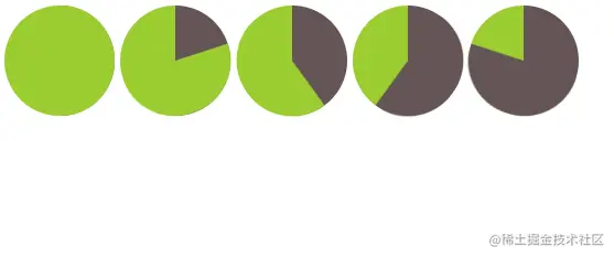
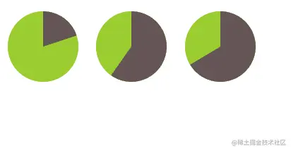
14-简单的饼图 
基于transtorm 和 animation
/**
 * Animated pie chart
 */

.pie {width: 100px; height: 100px;border-radius: 50%;background: yellowgreen;background-image: linear-gradient(to right, transparent 50%, currentColor 0);color: #655;
}

.pie::before {content: '';display: block;margin-left: 50%;height: 100%;border-radius: 0 100% 100% 0 / 50%;background-color: inherit;transform-origin: left;animation: spin 3s linear infinite, bg 6s step-end infinite;
}

@keyframes spin {to { transform: rotate(.5turn); }
}
@keyframes bg {50% { background: currentColor; }
}
/**
 * Static pie charts
 */

.pie {display: inline-block;position: relative;width: 100px;line-height: 100px;border-radius: 50%;background: yellowgreen;background-image: linear-gradient(to right, transparent 50%, #655 0);color: transparent;text-align: center;
}

@keyframes spin {to { transform: rotate(.5turn); }
}
@keyframes bg {50% { background: #655; }
}

.pie::before {content: '';position: absolute;top: 0; left: 50%;width: 50%; height: 100%;border-radius: 0 100% 100% 0 / 50%;background-color: inherit;transform-origin: left;animation: spin 50s linear infinite, bg 100s step-end infinite;animation-play-state: paused;animation-delay: inherit;
}
SVG 方案
/**
 * Pie charts — with SVG
 */

.pie {width: 100px;height: 100px;display: inline-block;margin: 10px;transform: rotate(-90deg);
}

svg {background: yellowgreen;border-radius: 50%;
}

circle {fill: yellowgreen;stroke: #655;stroke-width: 32;
}

@keyframes grow { to { stroke-dasharray: 100 100 } }

.pie.animated circle {animation: grow 2s infinite linear;
}
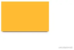
15-单侧投影
单侧投影
/**
 * One-sided shadow
 */

div {width: 1.6in;height: 1in;background: #fb3;box-shadow: 0 5px 4px -4px black;
}
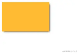
邻边投影
/**
 * One-sided shadow
 */

div {width: 1.6in;height: 1in;background: #fb3;box-shadow: 3px 3px 6px -3px black;
}
双侧投影

/**
 * One-sided shadow
 */

div {width: 1.6in;height: 1in;background: #fb3;box-shadow: 5px 0 5px -5px black, -5px 0 5px -5px black;
}
16-不规则投影
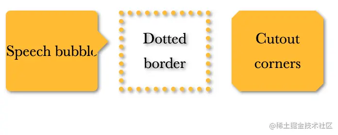
<div class="speech">Speech bubble</div>
<div class="dotted">Dotted border</div>
<div class="cutout">Cutout corners</div>

/**
 * Irregular drop-shadows
 */

div {position: relative;display: inline-flex;flex-direction: column;justify-content: center;vertical-align: bottom;box-sizing: border-box;width: 5.9em;height: 5.2em;margin: .6em;background: #fb3;/*box-shadow: .1em .1em .3em rgba(0,0,0,.5);*/-webkit-filter: drop-shadow(.1em .1em .1em rgba(0,0,0,.5));filter: drop-shadow(.1em .1em .1em rgba(0,0,0,.5));font: 200%/1.6 Baskerville, Palatino, serif;text-align: center;
}

.speech {border-radius: .3em;
}

.speech::before {content: '';position: absolute;top: 1em;right: -.7em;width: 0;height: 0;border: 1em solid transparent;border-left-color: #fb3;border-right-width: 0;
}

.dotted {background: transparent;border: .3em dotted #fb3;
}

.cutout {border: .5em solid #58a;border-image: 1 url('data:image/svg+xml,\ <svg xmlns="http://www.w3.org/2000/svg"\ width="3" height="3" fill="%23fb3">\ <polygon points="0,1 1,0 2,0 3,1 3,2 2,3 1,3 0,2"/>\</svg>');background-clip: padding-box;
}
17-染色效果
基于滤镜的方案
/**
 * Color tinting — with filters
 */

img {max-width: 640px;transition: 1s filter, 1s -webkit-filter;-webkit-filter: sepia() saturate(4) hue-rotate(295deg);filter: sepia() saturate(4) hue-rotate(295deg);
}

img:hover,
img:focus {-webkit-filter: none;filter: none;
}
基于混合模式的方案
/**
 * Color tinting — with blending modes
 */

.tinted-image {width: 300px; height: 440px;background-size: cover;background-color: hsl(335, 100%, 50%);background-blend-mode: luminosity;transition: .5s background-color;
}

.tinted-image:hover {background-color: transparent;
}
18-毛玻璃效果
背景知识:PGBA/HSLA 颜色 , filter: blur()
/**
 * Frosted glass effect
 */

body {min-height: 100vh;box-sizing: border-box;margin: 0;padding-top: calc(50vh - 6em);font: 150%/1.6 Baskerville, Palatino, serif;
}

body, main::before {
	background: url("http://placekitten.com/200/300") 0 / cover fixed;
}

main {position: relative;margin: 0 auto;padding: 1em;max-width: 23em;background: hsla(0,0%,100%,.25) border-box;overflow: hidden;border-radius: .3em;box-shadow: 0 0 0 1px hsla(0,0%,100%,.3) inset,0 .5em 1em rgba(0, 0, 0, 0.6);text-shadow: 0 1px 1px hsla(0,0%,100%,.3);
}

main::before {content: '';position: absolute;top: 0; right: 0; bottom: 0; left: 0;margin: -30px;z-index: -1;-webkit-filter: blur(20px);filter: blur(20px);
}

blockquote { font-style: italic }
blockquote cite { font-style: normal; }
19-折角效果
背景知识: css 变形, css 渐变, “切角效果”
45度折角的解决方案
/**
 * Folded corner effect
 */

div {width: 12em;background: #58a; /* Fallback */background:linear-gradient(to left bottom, transparent 50%, rgba(0,0,0,.4) 0) 100% 0 no-repeat,linear-gradient(-135deg, transparent 1.5em, #58a 0);background-size: 2em 2em, auto;padding: 2em;color: white;font: 100%/1.6 Baskerville, Palatino, serif;
}
其他角度的解决方案
/**
 * Folded corner effect — at an angle
 */

div {position: relative;width: 12em;background: #58a; /* Fallback */background: linear-gradient(-150deg, transparent 1.5em, #58a 0);padding: 2em;color: white;font: 100%/1.6 Baskerville, Palatino, serif;border-radius: .5em;
}

div::before {content: '';position: absolute;top: 0; right: 0;width: 1.73em; height: 3em;background: linear-gradient(to left bottom, transparent 50%, rgba(0,0,0,.2) 0, rgba(0,0,0,.4)) 100% 0 no-repeat;transform: translateY(-1.3em) rotate(-30deg);transform-origin: bottom right;border-bottom-left-radius: .5em;box-shadow: -.2em .2em .3em -.1em rgba(0,0,0,.15)
}
总结
本文整理了《css揭秘中》19个有趣的css 技巧案例,下文将继续整理剩下的 28 个。
最后,整理了一套《前端大厂面试宝典》,包含了HTML、CSS、JavaScript、HTTP、TCP协议、浏览器、VUE、React、数据结构和算法,一共201道面试题,并对每个问题作出了回答和解析。

有需要的小伙伴,可以点击文末卡片领取这份文档,无偿分享
部分文档展示:


文章篇幅有限,后面的内容就不一一展示了
有需要的小伙伴,可以点下方卡片免费领取


 525
525

 被折叠的 条评论
为什么被折叠?
被折叠的 条评论
为什么被折叠?
 到【灌水乐园】发言


