


文章目录
前言
一、图形配置项属性查看
1.W3school
2.echarts 官方配置手册
二、常见问题(一直在更新中)
1.移除Echarts 饼图默认文字描边效果
问题描述:
echarts的扇形图,标签会出现加粗的情况,是这种饼状图自带的效果,那该怎么去除呢???
option = {

      series: [
          label:{

          // 设置一下  颜色就能去除这种效果
            color:"#fff"
          }
         ]
    };
三、配置想解析
1.ECharts配置title
option = {

	title: {

	   text: '薛之谦演唱会',
	   subtext: '0707',
	   left: 'center'
	 },
  }
详细解析:
title:{

    //1.标题居中
    //left的值为'left', 'center', 'right'
    left:'center',
    //默认为10

    //2.主副标题之间的间距
    itemGap:20,
    //3.标题文本样式
     text:'标题文本',
     textStyle:{

        //文字颜色
        color:'#ccc',
        //字体风格,'normal','italic','oblique'
        fontStyle:'normal',
        //字体粗细 'normal','bold','bolder','lighter',100 | 200 | 300 | 400...
        fontWeight:'bold',
        //字体系列
        fontFamily:'sans-serif',
        //字体大小
     fontSize:18
    }
    //4.副标题
    subtext:'副标题',
  //5.副标题文本样式
  subtextStyle:{

	//6.副标题样式(请参考 “3.” )
	},
   //7.grid组件离容器左侧的距离。
   // left 的值可以是像 20 这样的具体像素值,可以是像 '20%' 这样相对于容器高宽的百分比,也
   //可以是 'left', 'center', 'right'。
   //如果 left 的值为'left', 'center', 'right',组件会根据相应的位置自动对齐。
   //left:'center'
}
2.文字大小调整
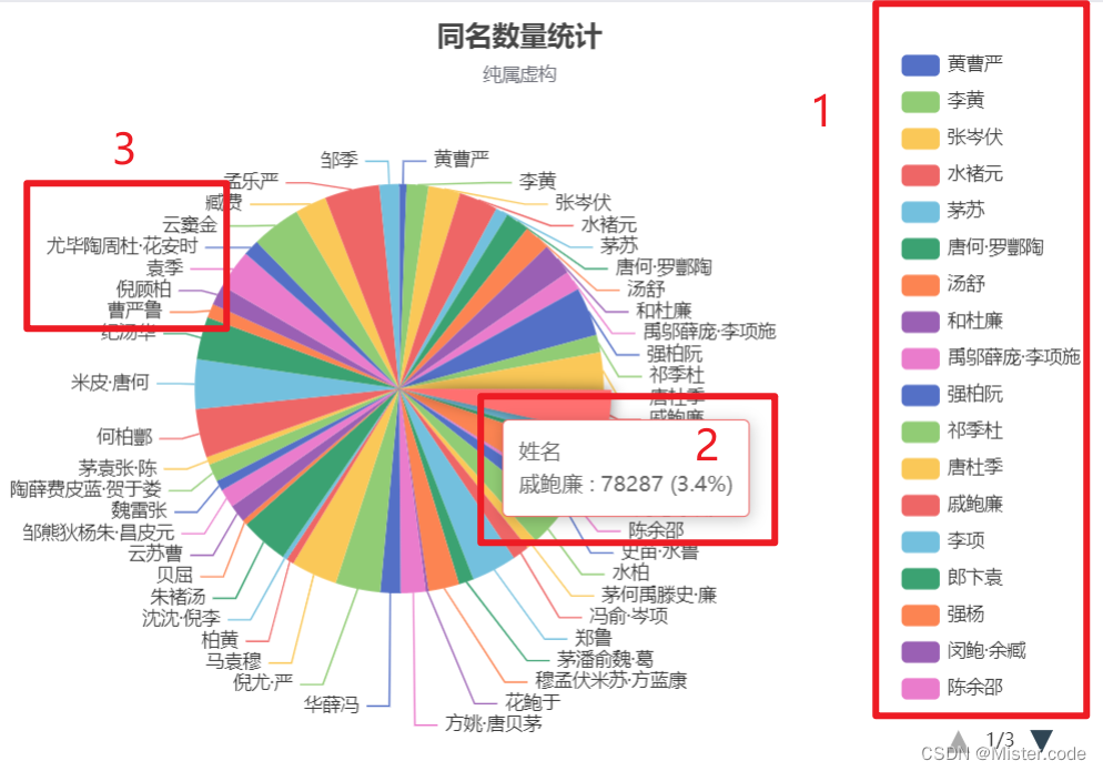
图中‘1’的文字大小调整在 ‘legend’对象下的‘textStyle’ 属性里
图中‘2’的文字大小调整在 ‘tooltip’对象下的‘textStyle’ 属性里
图中‘3’的文字大小调整在 ‘series’对象下的‘label’ 属性里
{

    "title": {

        "text": "",
        "subtext": "",
        "x": "center",
        "y": "center"
    },
    "tooltip": {

        "trigger": "item",
        //
        "formatter": "{a} <br\/>{b} : {c}%",
        "textStyle": {

            "fontSize": 18
        }
    },
    "legend": {

        "orient": "vertical",
        "left": "left",
        "data": ["", "使用场景", "活动", "适用人群", "品牌", "款式", "物流", "价格", "功能", "服务", "质量"],
        "textStyle": {

            "fontSize": 18
        }
    },
    "toolbox": {

        "feature": {

            "dataView": {

                "show": true,
                "readOnly": false
            },
            "saveAsImage": {

                "show": true
            }
        }
    },
    "series": [{

        "name": "",
        "type": "pie",
        "radius": ["0%", "100%"],
        "data": [{

            "name": "使用场景",
            "value": 0.23
        }, {

            "name": "活动",
            "value": 0.44
        }, {

            "name": "适用人群",
            "value": 0.83
        }, {

            "name": "品牌",
            "value": 1.09
        }, {

            "name": "款式",
            "value": 4.56
        }, {

            "name": "物流",
            "value": 7.56
        }, {

            "name": "价格",
            "value": 7.62
        }, {

            "name": "功能",
            "value": 17.03
        }, {

            "name": "服务",
            "value": 20.03
        }, {

            "name": "质量",
            "value": 40.6
        }],
        "label": {

            "normal": {

                "show": true,
                "textStyle": {

                    "fontSize": 18 }
            },
            "emphasis": {

                "show": true
            }
        },
        "lableLine": {

            "normal": {

                "show": true
            },
            "emphasis": {

                "show": true
            }
        }
    }]
}
3.图例的属性(位置,内容,颜色…)
结构
option = {

	legend: {


	 },
  }
源码分析:
legend: {

         orient: 'vertical',
         // 图例位置
         x: 'right',
         y: 'bottom',
         //图例文字的样式
         textStyle: {

             color: '#0b2b5e',
             fontSize: 12
         },
         // 图例的文字
         data: ['在线', '离线']
     },
详细版:
legend: {

    show: true,    // 是否显示图例
    type: 'category',    // 'plain':普通图例。缺省就是普通图例; 'scroll':可滚动翻页的图例。当图例数量较多时可以使用
    z: 2,     // 组件的所有图形的z值。控制图形的前后顺序。z值小的图形会被z值大的图形覆盖。
    top: 'auto'     // 距离容器侧边距离
    bottom: 'auto'     // 距离容器侧边距离
    left: 'auto',     // 距离容器侧边距离
    right: 'auto',     // 距离容器侧边距离
    width: 'auto',      // 图例组件的宽度。默认自适应
    height: 'auto',      // 图例组件的高度。默认自适应
    orient: 'horizontal',      // 图例列表的布局朝向; horizontal; vertical
    align: 'auto',     // 图例标记和文本的对齐。默认自动
    padding: 5,     // 图例内边距,单位px,默认各方向内边距为5,接受数组分别设定上右下左边距
    itemGap: 10,     // 图例每项之间的间隔。横向布局时为水平间隔,纵向布局时为纵向间隔
    itemWidth: 25,     // 图例标记的图形宽度
    itemHeight: 14,      // 图例标记的图形高度// 使用字符串模板,模板变量为图例名称 {name}
    formatter: function (name) {
        // 使用回调函数
        return 'Legend ' + name;
    },
    inactiveColor: '#ccc',      // 图例关闭时的颜色
    textStyle: {

        color: '#FFF',     // 文字的颜色
        fontStyle:
最低0.47元/天 解锁文章


 被折叠的 条评论
为什么被折叠?
被折叠的 条评论
为什么被折叠?
 到【灌水乐园】发言


