


要添加3D效果,要给父元素添加透视:
perspective: 300px;数字表示透视距离,越小透视越明显
3D移动
transform: translate3d(0,100px,100px);分布表示在x轴 y轴 z轴的3d移动,z轴正方形指向坐在电脑前的人
3D旋转
transform: rotateX(60deg);正负方向判断可以采用左手准则:大拇指指向轴的正方向,手指弯曲方向是正度数的方向
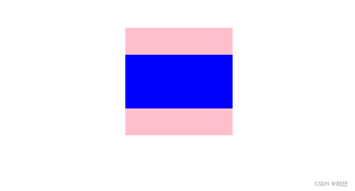
对于这样的案例:
首先将红蓝两个一模一样的盒子叠在一起
<!DOCTYPE html>
<html lang="en">
<head>
<meta charset="UTF-8">
<meta http-equiv="X-UA-Compatible" content="IE=edge">
<meta name="viewport" content="width=device-width, initial-scale=1.0">
<title>Document</title>
<style>
.box{
position: relative;
width: 200px;height: 200px;
margin: 100px auto;
}
.box div{
position: absolute;
height: 200px;
width: 200px;
background-color: pink;
}
.box div:last-child{
background-color: blue;
}
</style>
</head>
<body>
<div class="box">
<div></div>
<div></div>
</div>
</body>
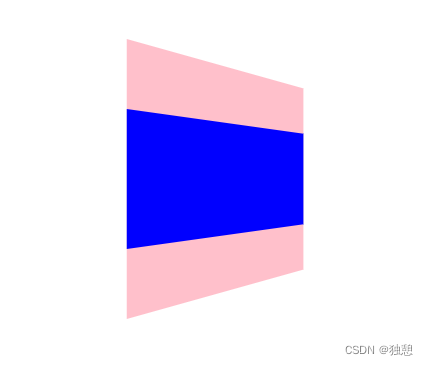
</html>为了增加3D效果,给父盒子添加perspective:
        body{
            perspective: 300px;

        }
给蓝色盒子增加旋转:
        .box div:last-child{
            background-color: blue;
            transform: rotateX(60deg);
        }
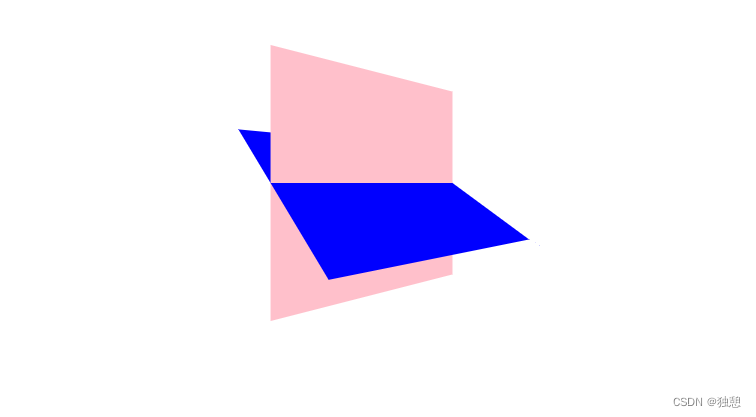
最后给大盒子增加旋转:
        .box{
            position: relative;
            width: 200px;height: 200px;
            margin: 100px auto;
            transform: rotateY(40deg);

        }
没有出现想要的效果,那是因为在给大盒子增加3d动作时,会自动将子元素的3d状态给取消,使用需要增加 transform-style,注意是要给父盒子增加这个属性:
        .box{
            position: relative;
            width: 200px;height: 200px;
            margin: 100px auto;
            transform: rotateY(40deg);
            transform-style: preserve-3d;

        }
完成:


 9652
9652


 被折叠的 条评论
为什么被折叠?
被折叠的 条评论
为什么被折叠?
 到【灌水乐园】发言


