


教学视频来自25分钟彻底弄懂CSS Flex基础布局 / CSS Flex 入门教程_哔哩哔哩_bilibili
目录
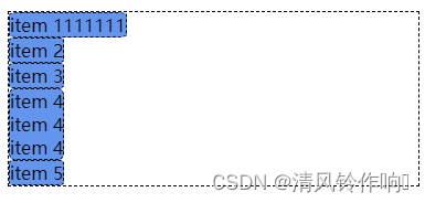
一、前置代码
<!DOCTYPE html>
<html lang="en">
<head>
    <meta charset="UTF-8">
    <meta name="viewport" content="width=device-width, initial-scale=1.0">
    <title>Document</title>
    <link rel="stylesheet" href="index.css">
</head>
<body>
    <div class="container">
        <div class="item">item 1111111</div>
        <div class="item">item 2</div>
        <div class="item">item 3</div>
        <div class="item">
            item 4<br />
            item 4<br />
            item 4<br />
        </div>
        <div class="item">item 5</div>
    </div>
</body>
</html>
.container {
border: 1px dashed black;
width: 500px;
}
.item{
background-color: cornflowerblue;
border: 1px dashed black;
border-radius: 10%;
}
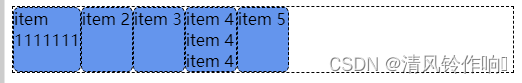
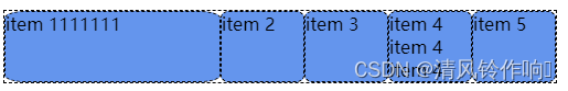
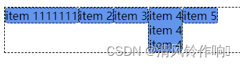
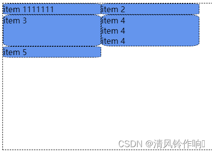
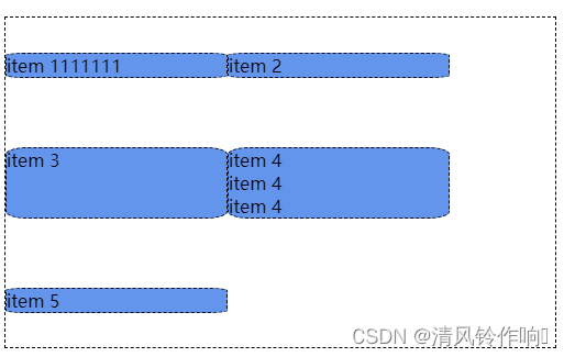
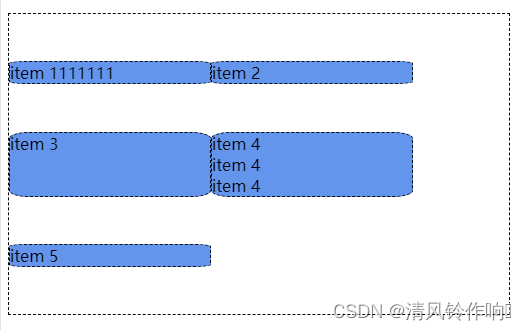
二、flex元素的自动宽度
(1)将container设置为flex布局
.container{
    display: flex;
}

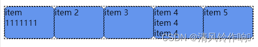
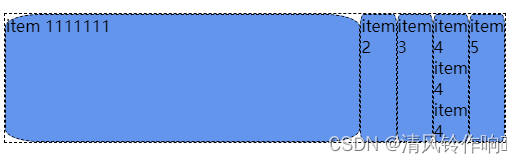
(2)取消flex布局,并将item设置为最大宽度(显示宽度元素的最大宽度为限)
.container{
    /* display: flex; */
}
.item{
    width: max-content;
}
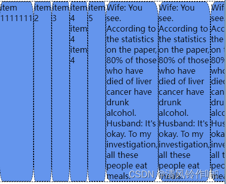
(3)增加代码。当元素宽度超过父元素的宽度时,子元素的宽度默认为min-content(以元素中最长的单词为限)
<div class="item">
        Wife: You see. According to the statistics on the paper, 80% of those
        who have died of liver cancer have drunk alcohol. Husband: It's okay. To
        my investigation, all these people eat meals.
</div>
<div class="item">
        Wife: You see. According to the statistics on the paper, 80% of those
        who have died of liver cancer have drunk alcohol. Husband: It's okay. To
        my investigation, all these people eat meals.
</div>
<div class="item">
        Wife: You see. According to the statistics on the paper, 80% of those
        who have died of liver cancer have drunk alcohol. Husband: It's okay. To
        my investigation, all these people eat meals.
</div>
<div class="item">
        Wife: You see. According to the statistics on the paper, 80% of those
        who have died of liver cancer have drunk alcohol. Husband: It's okay. To
        my investigation, all these people eat meals.
</div>
.container{
display: flex;
}
三、flex元素的增大逻辑
(1)flex-basis属性:设置元素的宽度为50px。
.container{
    display: flex;
}
.item{
flex-basis: 50px;
}
(2)flex-grow属性:每个元素都占了50px,剩余250px的空间,将这些空间平分为5份,每个元素再多占一份。
.container{
    display: flex;
}
.item{
    flex-basis: 50px;
    flex-grow: 1;
}
(3)使用nth-child()设置某个元素的宽度:这里将第一个元素的宽度设置为50px+6/10*剩余空间的大小,剩余空间元素1分到6份,其他元素各分到1份。
.container{
    display: flex;
}
.item{
    flex-basis: 50px;
    flex-grow: 1;
}
.item:nth-child(1){
    flex-grow: 6;
}
(4)使用nth-child()设置元素宽度:理论上将元素一设置为其他元素宽度的100倍,但是这里没有实现,因为要保证容器内元素可读,所以其他元素至少为最小宽度。
.container{
    display: flex;
}
.item{
    flex-basis: 0px;
    flex-grow: 1;
}
.item:nth-child(1){
    flex-grow: 100;
}
可通过手动设置将元素宽度设置为0px,从而达到目的。
.container{
    display: flex;
}
.item{
    flex-basis: 0px;
    width: 0px;
    flex-grow: 1;
}
.item:nth-child(1){
    flex-grow: 100;
}
四、flex元素的缩小逻辑
(1)flex-shrink属性:flex-shrink属性默认值为1,当子元素宽度超过父元素时,会自动缩小子元素,否则不会自动缩小子元素,导致子元素超过父元素宽度。
.container{
    display: flex;
}
.item{
    flex-shrink: 0;
    flex-basis: 200px;
}
(2)flex属性:flex中包含的值分别是grow shrink basis。默认值分别是0,1,auto。
简写:flex: 1=flex: 1 1 auto
flex: 1 100px=flex: 1 1 100px
flex: 1 1=flex: 1 1 auto
flex: initial=flex: 0 1 auto
flex: auto=flex: 0 1 auto
flex: none=flex: 0 0 auto
等分: flex: 1 0px=flex: 1 1 0px。0px是因为flex要保证元素可读性,每个元素的最小宽度为该元素中最大不可拆分的单词的宽度,为了保证等分,需要先将元素的宽度设置为0.
五、flex容器的交叉轴对齐
(1)align-items为行高属性,当值为stretch时,将元素设置为与最高的元素同高.
.container{
    display: flex;
    width: 500px;
    align-items: stretch;
}

(2)align-items:flex-start:将元素设置在起点对齐,flex-end设置为在终点对齐.flex-center在中间对齐.
.container{
    display: flex;
    width: 500px;
    align-items: flex-start;
}

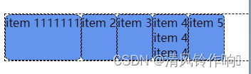
align-items: baselin设置将元素在文字基线处对齐
.container{
    display: flex;
    width: 500px;
    align-items: baseline;
}
.item:nth-child(1){
    font-size: 36px;
}
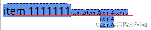
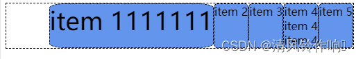
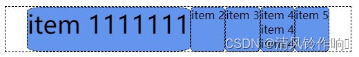
(3)justify-content属性:flex-start在主轴起点对齐.
flex-end在主轴终点对齐
center在主轴中间对齐
.container{
    display: flex;
    width: 500px;
    justify-content: flex-start;
}
.item:nth-child(1){
    font-size: 36px;
}
justify-content: space-between,收尾顶格,中间平分.
.container{
    display: flex;
    width: 500px;
    justify-content: space-between;
}
.item:nth-child(1){
    font-size: 36px;
}
justify-content: space-around;中间空间是两边空间的2倍
.container{
    display: flex;
    width: 500px;
    justify-content: space-around;
}
.item:nth-child(1){
    font-size: 36px;
}
justify-content: space-evenly;两边和中间的一致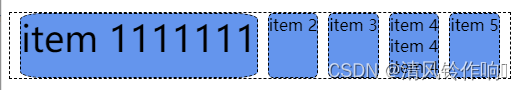
六、flex元素的换行
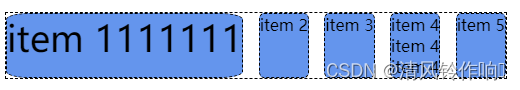
(1)使用flex-wrap属性进行设置.当属性值为nowrap时,不进行换行.
.container{
    display: flex;
    width: 500px;
    height: 300px;
    flex-wrap: nowrap;
}
.item{
    flex-basis: 200px;
}

当值为wrap时,自动换行

wrap-reverse,逆转排序并换行
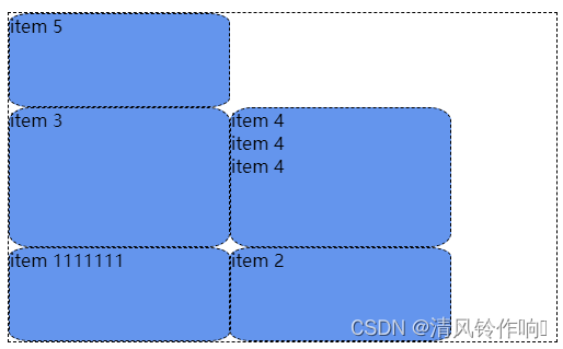
七、flex元素直接的多轴换行
align-content属性进行控制.默认值normal.
.container{
    display: flex;
    width: 500px;
    height: 300px;
    flex-wrap: wrap;
    align-content: normal ;
}
.item{
    flex-basis: 200px;
}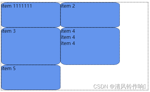
值为flex-start,从交叉轴开始对齐
值为flex-end,从交叉轴结束对齐

值为space-around,顶部和底部的距离为中间距离的一半
值为space-between,首尾无空隙 中间平分

值为space-evenly,首尾,中间平分
八、补充内容
(1)设置元素在盒子中按水平和垂直方式居中对齐:
将item设置为flex布局方式 ,从而使用flex布局实现item中的内容在横轴和纵轴上居中的效果。
主要作用代码为
align-items: center;
justify-content: center;
.container {
  width: 500px;
  display: flex;
}
.item {
    /* 将item设置为flex布局方式 ,从而使用flex布局实现item中的内容在横轴和纵轴上居中的效果*/
  display: flex;
  flex-basis: 120px;
  align-items: center;
  justify-content: center;
}


 160
160

 被折叠的 条评论
为什么被折叠?
被折叠的 条评论
为什么被折叠?
 到【灌水乐园】发言


