超级好看并且简洁自适应的html弹窗公告

本文介绍了如何使用HTML和CSS创建一个简洁且在手机和电脑上自适应的弹窗公告,包括样式设置和媒体查询以适应不同屏幕尺寸。
摘要由CSDN通过智能技术生成

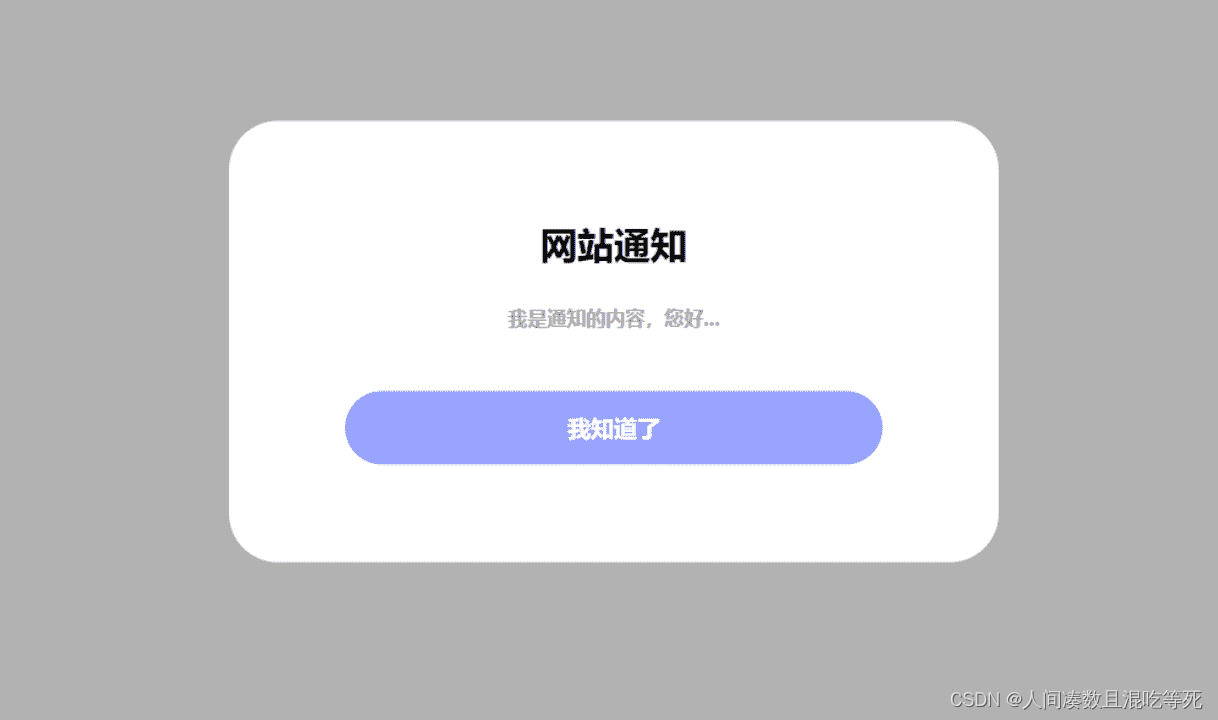
超级并且简洁的html弹窗公告,并且手机电脑自适应

<div class="web_notice">
    <div>
        <h3>网站通知</h3>
        <div style="text-align:center;color:#000;">这是一个公告</div>
        <a onclick="javascript:document.querySelector('.web_notice').remove()" style="color:#ffffff;">我知道了</a>
    </div>
</div>

<style>
.web_notice {
    position: fixed;
    top: 0;
    left: 0;
    width: 100%;
    height: 100%;
    background: rgba(0,0,0,0.3);
    z-index: 99999;
    display: flex;
    align-items: center;
    justify-content: center;
}

.web_notice > div {
    width: 550px;
    background: #FFF;
    border-radius: 40px;
    padding: 50px 40px;
}

.web_notice h3 {
    font-weight: bold;
    text-align: center;
    font-size: 30px;
}

.web_notice div {
    font-size: 16px;
    margin-top: 26px;
    line-height: 30px;
    color: #999;
}

.web_notice a {
    display: block;
    background: #98a3ff;
    color: #FFF;
    text-align: center;
    font-weight: bold;
    font-size: 19px;
    line-height: 60px;
    margin: 0 auto;
    margin-top: 45px;
    border-radius: 32px;
    width: 80%;
}

@media (max-width: 768px) {
    .web_notice > div {
        width: 80%;
    }
}
</style>

  • 12
    点赞
  • 6
    收藏
    觉得还不错? 一键收藏
  • 1
    评论
好的,以下是一个简单的自适应并且好看的文字模板示例。请注意,这只是一个示例,您可以根据自己的需求进行修改和定制。 ```html <!DOCTYPE html> <html lang="en"> <head> <meta charset="UTF-8"> <meta name="viewport" content="width=device-width, initial-scale=1.0"> <title>自适应文字模板</title> <style> body { margin: 0; padding: 0; font-family: Arial, sans-serif; background-color: #f7f7f7; } .container { max-width: 800px; margin: 0 auto; padding: 20px; background-color: #fff; box-shadow: 0px 0px 10px rgba(0, 0, 0, 0.2); } h1 { font-size: 2.5rem; font-weight: bold; color: #333; margin-top: 0; margin-bottom: 20px; } p { font-size: 1rem; line-height: 1.5; color: #777; margin-bottom: 10px; } @media screen and (max-width: 768px) { .container { padding: 10px; } h1 { font-size: 2rem; } p { font-size: 0.9rem; } } </style> </head> <body> <div class="container"> <h1>自适应文字模板</h1> <p>这是一个简单的自适应文字模板示例,可以根据不同的屏幕大小自动调整布局和样式。</p> <p>该模板使用了 HTMLCSS 和 JavaScript 技术,可以轻松修改和定制。</p> <p>如果您有任何疑问或建议,请随时联系我们,我们将竭诚为您服务。</p> </div> </body> </html> ``` 以上代码中,我们使用了一个容器 div 元素来包含所有的内容,并设置了最大宽度和居中对齐。在样式方面,我们使用了简单的字体、颜色和间距设置,并使用了媒体查询来适应不同的屏幕大小。在 HTML 部分,我们只需要在容器 div 元素中添加需要的内容即可。 这个示例模板可以在大部分现代浏览器中正常显示,并且可以自动适应不同的屏幕大小。您可以根据自己的需求进行修改和定制,例如添加更多的内容、修改颜色和字体等。

“相关推荐”对你有帮助么?

  • 非常没帮助
  • 没帮助
  • 一般
  • 有帮助
  • 非常有帮助
提交
评论 1
添加红包

请填写红包祝福语或标题

红包个数最小为10个

红包金额最低5元

当前余额3.43前往充值 >
需支付:10.00
成就一亿技术人!
领取后你会自动成为博主和红包主的粉丝 规则
hope_wisdom
发出的红包
实付
使用余额支付
点击重新获取
扫码支付
钱包余额 0

抵扣说明:

1.余额是钱包充值的虚拟货币,按照1:1的比例进行支付金额的抵扣。
2.余额无法直接购买下载,可以购买VIP、付费专栏及课程。

余额充值