原生 复选框 input[type=“checkbox“] 样式修改

样式:

input[type="checkbox"] {
    position: relative;
    width: 25px;
    height: 25px;
    /* 用于控制 UI 控件的基于操作系统主题的原生外观。none 隐藏部件的某些特性 */
    appearance: none;
}

input[type="checkbox"]::before {
    content: "";
    position: absolute;
    top: 0;
    left: 0;
    width: 100%;
    height: 100%;
    border: 1px solid #d9d9d9;
    background-color: #fff;
    border-radius: 50%;
}

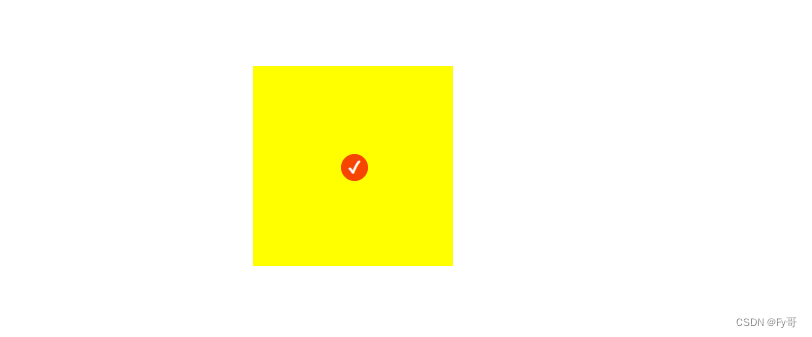
input[type="checkbox"]:checked::before {
    content: "\2713";
    position: absolute;
    top: 0;
    left: 0;
    width: 100%;
    height: 100%;
    border: 1px solid #f54500;
    background-color: #f54500;
    /* 对勾样式 */
    color: #fff;
    font-size: 16px;
    font-weight: bold;
    text-align: center;
    line-height: 25px;
}

主要注意点:appearance: none;


在这里插入图片描述

  • 3
    点赞
  • 10
    收藏
    觉得还不错? 一键收藏
  • 打赏
    打赏
  • 0
    评论
可以使用 CSS 伪类和伪元素来实现框的样式,以下是一个简单的示例代码,实现全、半、不三种状态: ```html <!DOCTYPE html> <html> <head> <title>样式示例</title> <style> input[type="checkbox"] { display: none; /* 隐藏原生框 */ } label.checkbox { position: relative; display: inline-block; width: 20px; height: 20px; margin-right: 10px; border: 1px solid #ccc; border-radius: 3px; cursor: pointer; } label.checkbox::before { content: ""; position: absolute; top: 2px; left: 2px; width: 16px; height: 16px; background-color: #fff; border-radius: 2px; box-shadow: inset 0 1px 3px rgba(0,0,0,.1); transition: all .2s; } input[type="checkbox"]:checked + label.checkbox::before { background-color: #007bff; } input[type="checkbox"]:checked + label.checkbox::after { content: "\2713"; position: absolute; top: 1px; left: 4px; font-size: 14px; color: #fff; } input[type="checkbox"]:indeterminate + label.checkbox::before { background-color: #ffc107; } input[type="checkbox"]:indeterminate + label.checkbox::after { content: "\2212"; position: absolute; top: 1px; left: 5px; font-size: 14px; color: #fff; } </style> </head> <body> <input type="checkbox" id="checkAll"> <label class="checkbox" for="checkAll"></label> <input type="checkbox" id="check1"> <label class="checkbox" for="check1"></label> <input type="checkbox" id="check2"> <label class="checkbox" for="check2"></label> <script> const checkAll = document.getElementById("checkAll"); const checkboxes = document.querySelectorAll("input[type='checkbox']"); checkAll.addEventListener("click", function() { for (let i = 0; i < checkboxes.length; i++) { checkboxes[i].checked = checkAll.checked; } }); checkboxes.forEach(function(checkbox) { checkbox.addEventListener("click", function() { let checkedCount = document.querySelectorAll("input[type='checkbox']:checked").length; if (checkedCount === 0) { checkAll.checked = false; checkAll.indeterminate = false; } else if (checkedCount === checkboxes.length) { checkAll.checked = true; checkAll.indeterminate = false; } else { checkAll.checked = false; checkAll.indeterminate = true; } }); }); </script> </body> </html> ``` 在这个示例中,我们首先使用 CSS 样式来定义了框的样式,包括未中、中和半中三种状态。我们使用了 `::before` 和 `::after` 伪元素来实现框的外观,并使用了 `:checked` 和 `:indeterminate` 伪类来控制中和半中状态下框的样式。 在 HTML 中,我们定义了三个框和一个全框,并使用了 `label` 元素来包裹框。我们在 JavaScript 中添加了点击事件监听器,当全框被中或取消中时,我们遍历所有的框,并将它们的 `checked` 属性设置为全框的状态。当任意一个框被中或取消中时,我们计算当前被中的框数量,并根据数量来设置全框的状态。这样就可以实现框的全、半和不三种样式了。

“相关推荐”对你有帮助么?

  • 非常没帮助
  • 没帮助
  • 一般
  • 有帮助
  • 非常有帮助
提交
评论
添加红包

请填写红包祝福语或标题

红包个数最小为10个

红包金额最低5元

当前余额3.43前往充值 >
需支付:10.00
成就一亿技术人!
领取后你会自动成为博主和红包主的粉丝 规则
hope_wisdom
发出的红包

打赏作者

Fy哥

你的鼓励将是我创作的最大动力

¥1 ¥2 ¥4 ¥6 ¥10 ¥20
扫码支付:¥1
获取中
扫码支付

您的余额不足,请更换扫码支付或充值

打赏作者

实付
使用余额支付
点击重新获取
扫码支付
钱包余额 0

抵扣说明:

1.余额是钱包充值的虚拟货币,按照1:1的比例进行支付金额的抵扣。
2.余额无法直接购买下载,可以购买VIP、付费专栏及课程。

余额充值