


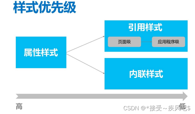
- 样式
属性样式:直接通过UI元素的属性设置的样式。
内联样式:通过在UI元素中嵌入style节点来设置样式。
引用样式:定义在资源字典中的样式。
- 样式优先级
- 属性样式
- 类似于在HTML中直接通过HTML元素属性设置的样式
- 适用于复用度不高的一些属性;
xmlns="http://schemas.microsoft.com/winfx/2006/xaml/presentation"
xmlns:x="http://schemas.microsoft.com/winfx/2006/xaml"
Title="Window1" Height="300" Width="300">
<!--属性样式-->
<TextBox Text="textbox" Width="200" Height="100"
Margin="40,40,40,40" HorizontalAlignment="Center"
VerticalAlignment="Top" Background="SkyBlue" FontSize="36"/>

- 内联样式
内联样式和模板的限制
在中 可扩展应用程序标记语言 (XAML) ,样式和模板属性在技术上可以通过以下两种方 式之一进行设置。 您可以使用特性语法(属性语法)来引用资源中定义的样式,例如 < 对 象 Style="{StaticResource myResourceKey }" .../> 。 或者,可以使用属性元素语法来 定义内联样式。
<对象>
<对象.Style>
< Style .../>
</对象.Style>
</对象>
内联样式
- 实际上是设置元素的Style属性
- 若内联样式与属性样式对同一属性进行设置,以属性设置的样式为准
- 引用样式
资源字典可在多处定义,因此引用样式也可以在多处定义
引用样式可以分为:
a. 页面级样式
b. 应用程序级样式
- 页面级样式
页面级样式定义在页面的资源字典中,作用范围为整个页面
<Window x:Class="niuma.Window1"
xmlns="http://schemas.microsoft.com/winfx/2006/xaml/presentation"
xmlns:x="http://schemas.microsoft.com/winfx/2006/xaml"
Title="Window1" Height="300" Width="300">
<!--页面级样式:多个样式-->
<Window.Resources>
效果当前页面:如下:
<!--操作控件:PasswordBox密码框-->
<!--带有key标签的样式-->
<Style x:Key="pbStyle" TargetType="PasswordBox">
<Setter Property="FontSize" Value="40"/><!--字体大小-->
<Setter Property="Background" Value="Transparent"/><!--背景
透明-->
<Setter Property="HorizontalContentAlignment"
Value="Center"/><!--内容水平居中-->
</Style>
<Style TargetType="PasswordBox">
<Setter Property="FontSize" Value="40"/><!--字体大小-->
<Setter Property="Foreground" Value="Red"/><!--前景色蓝色-->
<Setter Property="Background" Value="LightBlue"/><!--背景蓝
色-->
</Style>
</Window.Resources>
<Grid>
<!--指定应用的是第一种样式-->
<PasswordBox Style="{StaticResource pbStyle}" Password="12345"
Height="60"/>
<!--引用的是页面级公共样式:第二种-->
<PasswordBox Password="23456" Height="60"
Margin="0,200,-0.4,10.4"/>
</Grid>
</Window>

- 应用程序级样式
定义位置不同,作用范围不同。
<Application.Resources>
<!--定义按钮公共样式-->
<Style x:Key="gBut" TargetType="{x:Type Button}">
<!--手型-->
<Setter Property="Cursor" Value="Hand"/>
<!--宽度-->
<Setter Property="Width" Value="150"/>
<!--长度-->
<Setter Property="Height" Value="80"/>
</Style>
<!--定义按钮样式1-->
<!--BasedOn继承公共样式-->
<Style x:Key="cBtn1" TargetType="{x:Type Button}" BasedOn="
{StaticResource gBut}">
<!--背景色-->
<Setter Property="Background" Value="Black"/>
<!--字号-->
<Setter Property="FontSize" Value="24"/>
<!--字颜色-->
<Setter Property="Foreground" Value="Blue"/>
<!--字间距-->
<Setter Property="Margin" Value="20"/>
</Style>
<!--定义按钮样式2-->
<Style x:Key="cBtn2" TargetType="{x:Type Button}" BasedOn="
{StaticResource gBut}">
<!--背景色-->
<Setter Property="Background" Value="White"/>
<!--字号-->
<Setter Property="FontSize" Value="24"/>
<!--字颜色-->
<Setter Property="Foreground" Value="Red"/>
<!--字间距-->
样式优先级测试
MainWindow.xaml
<Setter Property="Margin" Value="10"/>
</Style>
</Application.Resources>


 273
273


 被折叠的 条评论
为什么被折叠?
被折叠的 条评论
为什么被折叠?
 到【灌水乐园】发言


