


<template>
<el-drawer v-model="showDrawer"
:title='title'
:size="size"
:close-on-click-modal="false"
:destroy-on-close="destoryOnClose">
<div class="formDrawer">
<div class="body">
<slot></slot>
</div>
<div class="actions">
<el-button type="primary" @click="submit" :loading="loading">{{ confireText }}</el-button>
<el-button type="default" @click="closeDrawer">取消</el-button>
</div>
</div>
</el-drawer>
</template>
<script setup>
import {ref} from 'vue'
const showDrawer = ref(false)
//按钮loading效果
const loading = ref(false)
const showLoding = ()=> loading.value = true
const hideLoding = ()=> loading.value = false
//父组件需要自己设置的值
const props = defineProps({
title: {
type: String,
},
size: {
type: String,
default: '45%'
},
//控制是否在关闭 Drawer 之后将子元素全部销毁
destoryOnClose: {
type: Boolean,
default: false
},
confireText: {
type: String,
default: '提交'
}
})
//打开抽屉方法
const openDrawer = () => {
showDrawer.value = true
}
//关闭抽屉方法
const closeDrawer = () => {
showDrawer.value = false
}
//提交
const emit = defineEmits(['submit'])
const submit = ()=>{
emit('submit')
}
//向父组件暴露以下方法
defineExpose({
openDrawer,
closeDrawer,
showLoding,
hideLoding
})
</script>
<style>
.formDrawer {
display: flex;
position: relative;
flex-direction:column;
width: 100%;
height: 100%;
}
.formDrawer .body {
flex: 1;
overflow-y: auto;
position: absolute;
top: 0;
left: 0;
right: 0;
bottom: 50px;
}
.formDrawer .actions{
display: flex;
align-items: center;
height: 50px;
margin-top: auto;
/* background-color: skyblue; */
}
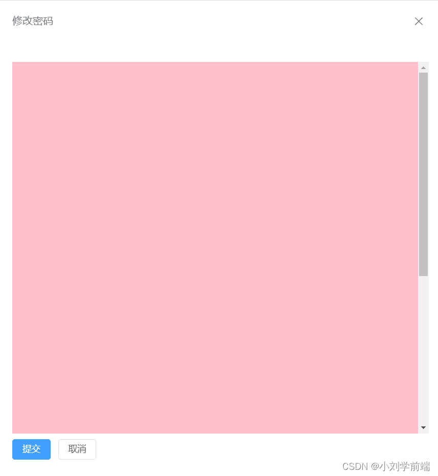
</style>效果:底部按钮固定,中间内容超出可以滚动
父组件引入使用,中间部分插槽可以写很多内容,比如表单等:


 3779
3779


 被折叠的 条评论
为什么被折叠?
被折叠的 条评论
为什么被折叠?
 到【灌水乐园】发言


