


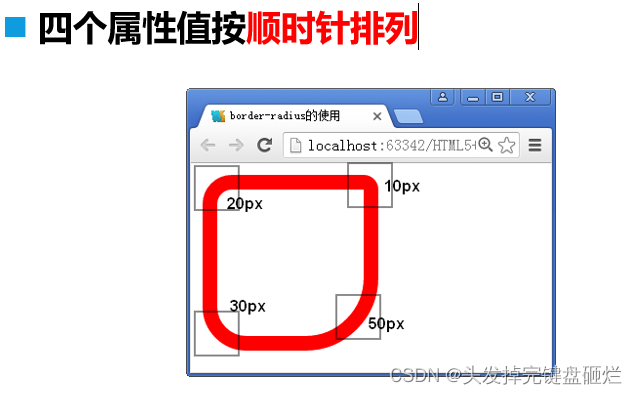
圆角边框(改变盒子四个角的弧度)border-radius:
border-radius: 20px 10px 50px 30px;
使用border-radius画圆:
.div22{
    width: 100px;
    height: 100px;
    border: 4px solid red;
    border-radius: 50%;
}
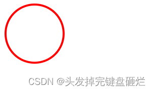
一般 border-radius设置为宽的一半就能把一个角变成圆型。
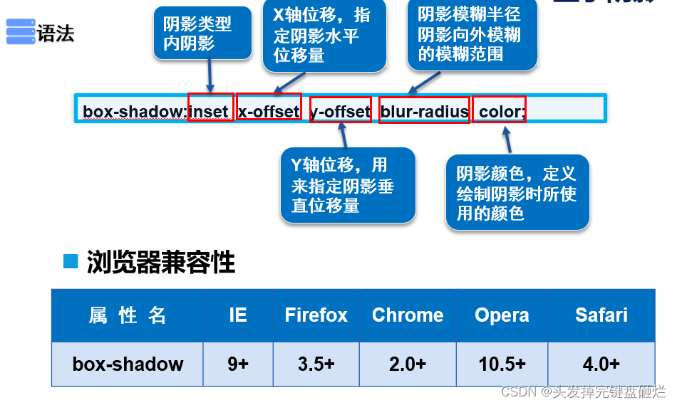
盒子阴影 box-shadow:
box-shadow:inset x-offset y-offset blur-radius color;
代码示例:
.div22{
    width: 100px;
    height: 100px;
    border: 4px solid red;
    box-shadow: 0 0 5px red;
}
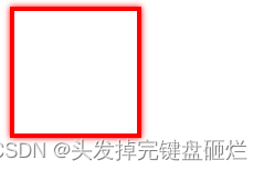
一般配合E:hover来使用可以体现出鼠标移动到盒子上时,盒子体现出凸出的效果。
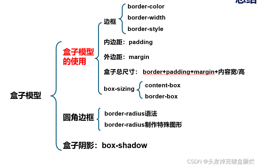
小结:


 扫一扫
扫一扫


 939
939

 被折叠的 条评论
为什么被折叠?
被折叠的 条评论
为什么被折叠?
 到【灌水乐园】发言


