


场景:为了方便样式统一,封装了一个盒子,其中包含echarts,option是从父组件传来的
问题: 多个父级页面使用这个盒子后,发现只有第一个盒子展示图表,但展示的是最后一个图片的样式,其他都空白
解决方法: 将原本id或class选择器改为ref方式,代码如下
// 原来
var myChart = echarts.getInstanceByDom(document.getElementById('myChart'));
// 改成
var myChart = echarts.getInstanceByDom(this.$refs.myChart);
整体代码如下:
<!--
 * @Description: 图表
-->
<template>
  <div class="Chart">
    <div class="titleBox">
      <div class="text">
        {{ formData.label }}
        <span>{{ formData.value }}</span>
        <svg-icon icon-class="lock" />
        <svg-icon
          icon-class="download"
          @click="downloadImg"
        />
      </div>
    </div>
    <div
      ref="myChart"
      id="myChart"
    />
    <slot />
  </div>
</template>

<script>
import * as echarts from 'echarts';
import { downloadEchartsImg } from "@/utils/tools";

export default {
  name: 'StackedLine',
  props: {
    formData: {
      type: Object,
      required: true
    },
    option: {
      type: Object,
      default: () => {}
    }
  },
  data() {
    return {
      open: false,
    }
  },
  mounted() {
    var myChart = echarts.init(this.$refs.myChart);
    window.addEventListener('resize', myChart.resize)
    setTimeout(() => {
      myChart.resize()
      myChart.setOption(this.option, true)
    });
  },
  methods: {
    /**
     * 下载图片
     */
    downloadImg() {
      var myChart = echarts.getInstanceByDom(this.$refs.myChart);
      downloadEchartsImg(myChart)
    }
  }
}
</script>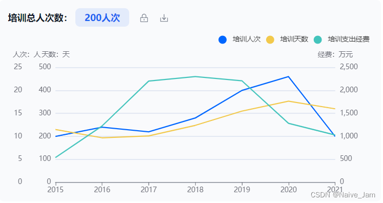


 2234
2234


 被折叠的 条评论
为什么被折叠?
被折叠的 条评论
为什么被折叠?
 到【灌水乐园】发言


