


一、CSS盒子模型(box model)
css盒模型本质上是一个盒子,封装周围的HTML元素,它包含:
外边距(margin):透明的,是除了边框内边框和实际内容的区域,用来隔开相邻盒子。
margin-right、margin-left、margin-top、margin-bottom
边框(border):围绕内边距和内容的部分
内边距(padding):清除内容周围的区域,padding-right、paddng-left、padding-top、padding-bottom
实际内容(content):显示文本和图像
二、弹性盒模型(flex box)
由弹性容器和弹性子元素组成。通过设置display属性的值为flex将其定义为弹性容器。弹性容器内包含了一个或多个弹性子元素。
(一)父元素上的属性
1.diplay:flex
2.flex-direction属性,指定了弹性子元素在父容器中的位置
语法:fex-direction:row|row-reverse|column|column-reverse
1.row:横向从左到右排列(左对齐),默认的排列方式
2.row-reverse:反转横向排列(右对齐,从后往前排,最后一项排在最前面)
3.column:纵向排列
4.column-reverse:反转纵向排列,从后往前排,最后一项排在最上面
3.justify-content属性:内容对齐属性应用在弹性容器上,把弹性项沿着弹性容器的主轴线对齐。
语法:justify-content:flex-start|flex-end|center
1.flex-start:居上
2.flex-end:居下
3.center:居中
4.align-items属性:水平方向对齐方式
语法:align-items:flex-start|flex-end|center
1.flex-start:居左
2.flex-end:居右
3.center:居中
(二)子元素上的属性
flex:根据弹性盒子元素所设置的扩展因子作为比例来分配剩余空间。默认为0。
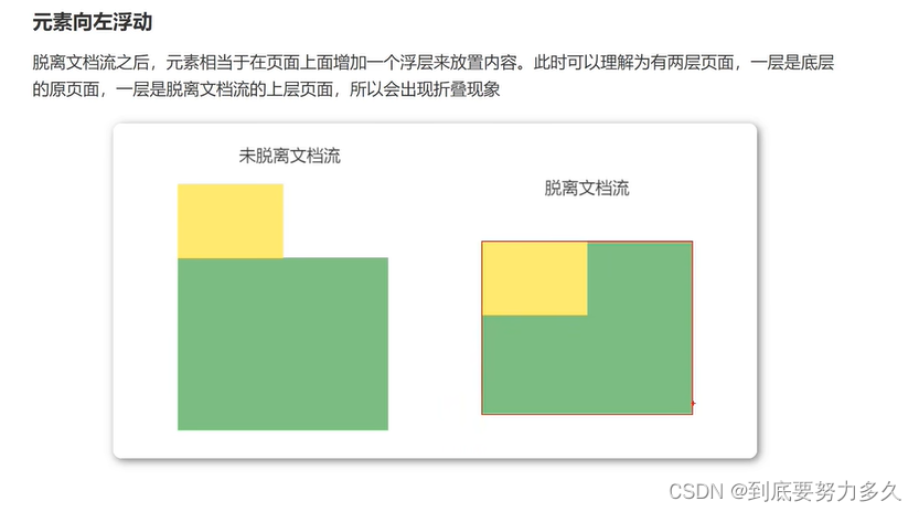
三、脱离文档流
1.页面问题:
- 高矮不齐,底部对齐
- 空白折叠现象
- 无论多少个空格、换行、tab,都会折叠为一个空格
- 如果想要img标签之间没有空隙,必须紧密连接
2.浮动
定义:float属性定义元素在哪个方向浮动,任何元素都可以浮动。
float:left 元素向左浮动
float:right 元素向右浮动
<!DOCTYPE html>
<html lang="en">
<head>
<meta charset="UTF-8">
<title>浮动</title>
<style>
.box3{
width:100px;
height:100px;
background-color:burlywood;
float: left;
}
.box4{
width:400px;
height:400px;
background-color:aquamarine;
}
img{
width:200px;
height:200px;
float: left;
}
</style>
</head>
<body>
<div class="box3"></div>
<div class="box4"></div>
<div>
<img src="bg.jpg">
<img src="bg.jpg">
</div>
</body>
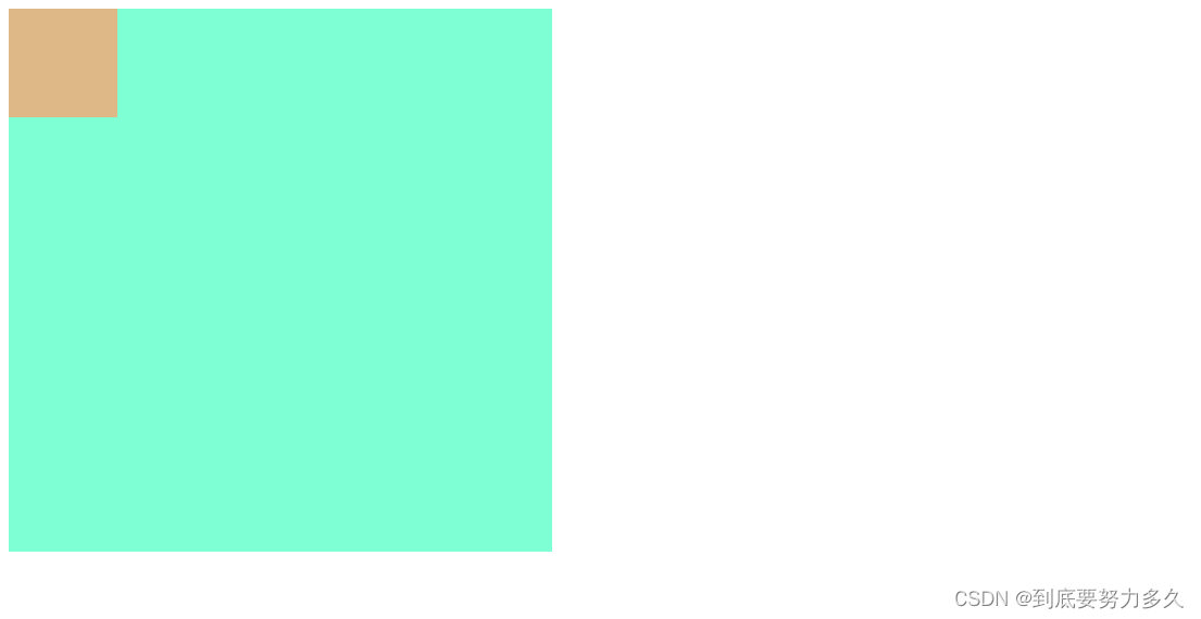
</html>例一没加浮动之前

例一加了浮动之后
例二没加浮动之前

例二加了浮动之后

3.清除浮动:
浮动副作用:
- 浮动元素会造成父元素高度塌陷
- 后续元素会受到影响
解决方案
- 父元素设置高度
- 受影响的元素增加clear属性。clear:both
- overflow清除浮动。在父级标签样式中增加:overflow:hidden;clear:both;
- 伪对象方式。为父标签添加伪类after,设置空的内容,并使用clear:both;这种情况下,父布局不能设置高度
.container::after{
    content:"";
    display:block;
    clear:both;
}
四、定位
1.定义:position属性指定了元素的定位类型
| 值 | 描述 |
| relative | 相对定位 |
| absolute | 绝对定位(会脱离文档流) |
| fixed | 固定定位(会脱离文档流) |
设置定位之后:可以使用四个方向值进行调整位置:left,top,right,bottom
2.相对定位:
<!DOCTYPE html>
<html lang="en">
<head>
    <meta charset="UTF-8">
    <title>相对定位</title>
    <style>
        .content{
            width: 300px;
            height:300px;
            background-color: hotpink;
        }
        .box{
            width:100px;
            height:100px;
            background-color:burlywood;
            position: relative;
            left:10px;
            top:10px;
        }
    </style>
</head>
<body>
    <div class="content"></div>
    <div class="box"></div>
</body>
</html> 
3.绝对定位:
<!DOCTYPE html>
<html lang="en">
<head>
    <meta charset="UTF-8">
    <title>绝对定位</title>
    <style>
        .content{
            width: 300px;
            height:300px;
            background-color: hotpink;
        }
        .box{
            width:100px;
            height:100px;
            background-color:burlywood;
            position: absolute;
            left:10px;
            top:10px;
        }
    </style>
</head>
<body>
    <div class="content"></div>
    <div class="box"></div>
</body>
</html> 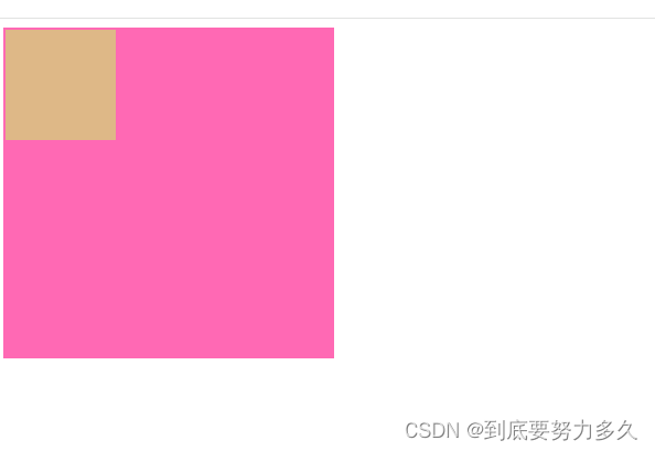
4.z-index:图层z轴上的位置。
五、CSS3新特性
1.圆角:border-radius
使用 CSS3 border-radius 属性,你可以给任何元素制作 " 圆角 "border-radius 属性,可以使用以下规则:
- 四个值: 第一个值为左上角,第二个值为右上角,第三个值为右下角,第四个值为左下角
- 三个值: 第一个值为左上角, 第二个值为右上角和左下角,第三个值为右下角
- 两个值: 第一个值为左上角与右下角,第二个值为右上角与左下角
- 一个值: 四个圆角值相同
2.阴影:box-shadow
box-shadow:h-shadow(必选,水平阴影) v-shadow(必选,垂直阴影) blur(可选,模糊距离) color(阴影颜色);
<!DOCTYPE html>
<html lang="en">
<head>
    <meta charset="UTF-8">
    <title>阴影</title>
    <style>
        .box{
            width:100px;
            height:100px;
            margin:0 auto;
            background-color:yellowgreen;
            border-radius:50% 5% 50% 5%;
            box-shadow: 10px 10px 10px rgba(0, 0, 0, 0.5);
        }
    </style>
</head>
<body>
    <div class="box"></div>
</body>
</html>
六、总结
CSS学完,后续有动画、媒体查询、雪碧图、字体图标等使用方法会单独写笔记整理,这些需要运用到项目中才能体现它们的作用。


 1479
1479

 被折叠的 条评论
为什么被折叠?
被折叠的 条评论
为什么被折叠?
 到【灌水乐园】发言


