


-
text--文本,用于呈现一段信息
text组件说明:不支持text内同时存在文本内容和span组件,同时存在的话只显示span内的内容
| 名称 | 类型 | 描述 |
| color | <color> | 设置文本的颜色 |
| font-size | <length> | 设置文本的尺寸 |
| allow-scale | boolean | 文本尺寸是否跟随系统设置字体缩放尺寸进行放大缩小 |
| letter-spacing | <length> | 设置文本的字符间距 |
| font-weight | number|string | 设置文本的字体粗细,默认为400,取值越大字体越粗 |
| font-family | string | 设置文本的字体列表,用逗号分隔,每个字体用字体名或者字体族名设置 |
| text-decoration | string | 设置文本的文本修饰,underline--文字下划线;line-through--穿过文本的修饰线;none--标准文本 |
| text-align | string | 设置文本的文本对齐方式,left--左对齐;right--右对齐;center--居中对齐;start--根据文字书写相同的方向对齐;end--根据文字书写相反的方向对齐 |
| max-lines | number|string | 设置文本的最大行数 |
| text-overflow | string | 设置了最大行数下生效,clip--将文本根据父容器大小进行裁剪显示;ellipsis--根据父容器大小显示,显示不下的文本用省略号代替 |
- 示例--隐藏文本内容
<div class="container">
    <text class="text1">
        Good luck to u!
    </text>
    <text class="text2">
        Good luck to u!
    </text>
</div>
.container {
display: flex;
flex-direction: column;
justify-content: center;
align-items: center;
width: 100%;
height: 100%;
}
.text1{
font-size:30px;
}
.text2{
width:200px;
max-lines:1;
text-overflow:ellipsis;
}
-
button--提供按钮组件
属性:
| 名称 | 类型 | 描述 |
| type | string | capsule--胶囊型按钮,带圆角按钮,有背景色和文本;cicle--圆形按钮,支持放置图标;text--文本按钮,仅包含文本显示;download--下载按钮,额外增加下载进度条功能 |
| value | string | button的文本值 |
| icon | string | button的图标路径,图标格式为jpg,png和svg |
方法:
类型为download时,支持如下方法:
| 名称 | 参数 | 描述 |
| setProgress | { progress:percent } | 设定下载按钮进度条进度,取值位于0-100区间内,当设置的值大于0时,下载按钮展现进度条,当设置的值大于等于100时,取消进度条显示。 浮在进度条上的文字通过value值进行变更 |
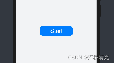
- 示例--显示下载进度
<div class="container">
    <button class="button-d" type="download" id="download-btn" onclick="setProgress">
        {{download}}
    </button>
</div>
.container {
    width: 100%;
    height: 100%;
    background-color: #F1F3F5;
    flex-direction: column;
    align-items: center;
    justify-content: center;
}
.button-d{
    font-size:26px;
    height:45px;
    width:150px;
    background-color:#007dff;
    text-color:white;
    align-items:center;
}
// xxx.js
import prompt from '@system.prompt';
export default {
    data: {
        percent: 0,
        download: "Start",
        isPaused: true,
        intervalId : null,
    },
    star(){
        this.intervalId = setInterval(()=>{
            if(this.percent <100){
                this.percent += 1;
                this.download = this.percent+ "%";
            } else{
                prompt.showToast({
                    message: "Download succeeded."
                })
                this.paused()
                this.download = "Start";
                this.percent = 0;
                this.isPaused = true;
            }
        },100)
    },
    paused(){
        clearInterval(this.intervalId);
        this.intervalId = null;
    },
    setProgress(e) {
        if(this.isPaused){
            prompt.showToast({
                message: "Started Downloading"
            })
            this.star();
            this.isPaused = false;
        }else{
            prompt.showToast({
                message: "Paused."
            })
            this.paused();
            this.isPaused = true;
        }
    }
}
实现效果:

-
rating-评分条,表示用户使用感受的衡量标准条
属性:
| 名称 | 类型 | 默认值 | 描述 |
| numstarts | number | 5 | 设置评分条的星级总数 |
| rating | number | 0 | 设置评分条当前评星数 |
| stepsize | number | 0.5 | 设置评分条的评星步长 |
| indicator | boolean | false | 设置评分条是否作为一个指示器,此时用户不可操作 |
样式:
| 名称 | 类型 | 描述 |
| star-background | string | 设置单个星级未选中的背景图片 |
| star-foreground | string | 设置单个星级选中的前景图片 |
| strar-secondary | string | 设置单个星级部分选中的次级背景图片,该图片会覆盖背景图片 |
注: star-background、star-secondary、star-foreground属性的星级图源必须全部设置,否则默认的星级颜色为灰色
事件:
| 名称 | 参数 | 描述 |
| change | { rating:number } | 评分条的评星发生改变时触发该回调 |
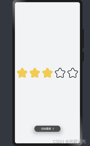
- 示例--绑定事件
<div class="container">
    <div style="width:500px;height:500px;align-items:center;justify-content:center;flex-direction:column;">
        <rating class="my-rating" numstars="5" rating="1" onchange="show" stepsize="1"
            style="star-background:{{backstar}};star-secondary:{{secstar}};star-foreground:{{forestar}};rtl-flip:true;">
        </rating>

    </div>
</div>
.container {
    width: 100%;
    height: 100%;
    background-color: #F1F3F5;
    flex-direction: column;
    align-items: center;
    justify-content: center;
}

.my-rating{
    width:350px;
    height:70px;
}
import prompt from '@system.prompt';
export default{
data:{
backstar:"common/images/backstar.png",
secstar:"common/images/backstar.png",
forestar:"common/images/secstar.png",
},
onInit(){
},
show(e) {
prompt.showToast({
message: '当前星数 ' + e.rating
})
}
}


 扫一扫
扫一扫


 被折叠的 条评论
为什么被折叠?
被折叠的 条评论
为什么被折叠?
 到【灌水乐园】发言


