


快速入门
让我们从一个简单示例开始,解释不同的语法:
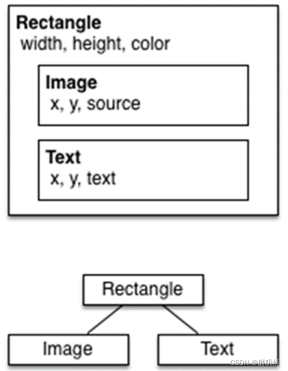
import QtQuick

// The root element is the Rectangle
Rectangle {
// name this element root
id: root

// properties: <name>: <value>
width: 220; height: 260

// color property
color: "#4A4A4A"

// Declare a nested element (child of root)
Image {
id: image

// reference the parent
x: (parent.width - width)/2; y: 40
source: '../images/pinwheel.png'
}

// Another child of root
Text {
// un-named element

// reference element by id
y: image.y + image.height + 20

// reference root element
width: root.width

color: 'white’
horizontalAlignment: Text.AlignHCenter
text: ‘大风车’
}
}
代码注释:
属性
Text {
// (1) identifier
id: thisLabel

// (2) set x- and y-position
x: 24; y: 16

// (3) bind height to 2 * width
height: 2 * width

// (4) custom property
property int times: 24

// (5) property alias
property alias anotherTimes: thisLabel.times

// (6) set text appended by value
text: "thisLable " + anotherTimes

// (7) font is a grouped property
font.family: "Ubuntu"
font.pixelSize: 24

// (8) KeyNavigation is an attached property
KeyNavigation.tab: thatLabel

// (9) signal handler for property changes
onHeightChanged: console.log('height:', height)

// focus is need to receive key events
focus: true

// change color based on focus value
color: focus ? "red" : "black"
}
脚本
Text {
id: thatLabel
color: 'white'
x:24 ; y: 124

// custom counter property for space presses
property int spacePresses: 0

//:持续性关联
text: "thatLable " + spacePresses + "times"

// (1) handler for text changes. Need to use function to capture parameters
onTextChanged: function(text) { console.log("text changed to:", text) }

// need focus to receive key events
focus: true

// (2) handler with some JS
Keys.onSpacePressed: { increment() }

// clear the text on escape //一次性赋值
Keys.onEscapePressed: { thatLabel.text = ‘’ }

// (3) a JS function
function increment() {
spacePresses = spacePresses + 1
}

KeyNavigation.tab: thisLabel

}
核心元素
Item是所有视觉元素的基础元素,因此所有其他视觉元素都从Item继承。它本身并不绘制任何东西,但定义了所有视觉元素的共同属性:
Rectangle
•Rectangle扩展了Item,为其添加填充颜色。此外,还支持border.color和border.width。要创建圆角矩形,可以使用radius属性。
Rectangle {
id: rect1
x: 12; y: 12
width: 76; height: 96
color: "lightsteelblue"
}

Rectangle {
id: rect2
x: 112; y: 12
width: 76; height: 96
border.color: "lightsteelblue"
border.width: 4
radius: 8
}
除了填充颜色和边框,矩形还支持自定义渐变:
Rectangle {
id: rect3
x: 212; y: 12
width: 76;
height: 96
gradient: Gradient {
GradientStop { position: 0.0; color: "lightsteelblue" }
GradientStop { position: 1.0; color: "slategray" }
}
border.color: "slategray"
Text
Text {
text: "The quick brown fox"
color: "#303030"
font.family: "Ubuntu"
font.pixelSize: 28
}
Text {
width: 40; height: 120
text: 'A very long text’
// '...' shall appear in the middle
elide: Text.ElideMiddle
// red sunken text styling
style: Text.Sunken
styleColor: '#FF4444’
// align text to the top
verticalAlignment: Text.AlignTop
// only sensible when no elide mode
// wrapMode: Text.WordWrap
}
Image
Image元素能够以各种格式(例如PNG、JPG、GIF、BMP、WEBP)显示图像。有关支持的图像格式的完整列表,请参阅Qt文档。除了提供图像URL的source属性外,它还包含一个控制大小调整行为的fillMode。
Image {
x: 12; y: 12
// width: 64
// height: 72
source: "assets/triangle_red.png"
}

Image {
x: 12+64+12;
y: 12
// width: 72
height: 72/2
source: "assets/triangle_red.png"
fillMode: Image.PreserveAspectCrop
clip: true
}
注释:
使用PreserveApectCrop的图像元素还应启用clip,以避免在图像边界之外渲染图像数据。
可以在C++中使用QQuickImageProvider创建自己的图像提供程序。动态创建图像,并利用线程加载图像。
MouseArea
MouseArea这是一个矩形的不可见项,可以在其中捕获鼠标事件。
Rectangle {
id: rect1
x: 12; y: 12
width: 76; height: 96
color: "lightsteelblue"
MouseArea {
id: area
width: parent.width
height: parent.height
onClicked: rect2.visible = !rect2.visible
}
}

Rectangle {
id: rect2
x: 112; y: 12
width: 76; height: 96
border.color: "lightsteelblue"
border.width: 4
radius: 8
}
Component(组件)
创建一个包含文本组件和鼠标区域的矩形。模拟一个简单的按钮:
Rectangle {
// our inlined button ui
id: button
x: 12; y: 12
width: 116; height: 26
color: "lightsteelblue"
border.color: "slategrey"
Text {
anchors.centerIn: parent
text: "Start"
}
MouseArea {
anchors.fill: parent
onClicked: {
status.text = "Button clicked!"
}
}
}

Text { // text changes when button was clicked
id: status x: 12;
y: 76 width: 116;
height: 26
text: "waiting ..."
horizontalAlignment: Text.AlignHCenter

// 组件的使用场景
//minimal API for a button
Button {
text: "Click Me"
onClicked: { /* do something */ }
}
创建一个Button.qml文件并在其中复制我们的按钮UI。此外,我们需要导出用户可能希望在根级别更改的属性。
// Button.qml
import QtQuick
Rectangle {
id: root
// export button properties
property alias text: label.text
signal clicked
width: 116; height: 26
color: "lightsteelblue"
border.color: "slategrey"
Text {
id: label
anchors.centerIn: parent
text: "Start"
}
MouseArea {
anchors.fill: parent
onClicked: {
root.clicked()
}
}
}

在根级别导出了text属性和clicked信号。
将根元素命名为root,以便于引用。
使用QML的alias功能,将嵌套QML元素中的属性导出到根级别(外部只能访问根本的属性)。


//-----------------------------------------------------------------------------
// 要使用新的按钮元素,只需在文件中声明即可。
Button {
// our Button component
id: button x: 12;
y: 12 text: "Start"
onClicked: {
	status.text = "Button clicked!"
}
}

Text { // text changes when button was clicked
id: status
x: 12; y: 76
width: 116; height: 26
text: "waiting ..."
horizontalAlignment: Text.AlignHCenter
}

//-----------------------------------------------------------------------------
Item {
id: root
width: 116; height: 26
property alias text: label.text
signal clicked

Rectangle {
anchors.fill parent
color: "lightsteelblue"
border.color: "slategrey"
}
...
}
可以进一步使用Item作为根元素。这防止了用户更改我们设计的按钮的颜色。只需要把Rectangle嵌入到Item中。
简单变换
// ClickableImage.qml
// Simple image which can be clicked
import QtQuick

Image {
id: root
signal clicked
MouseArea {
anchors.fill: parent
onClicked: root.clicked()
}
}
使用可点击的图像显示三个对象(圆形、方形、三角形)。单击时,每个对象都执行一个简单的变换。单击背景将重置场景。
// TransformationExample.qml
import QtQuick

MouseArea {
id: backgroundClicker
// 需要放置在图片前面
anchors.fill: parent
onClicked: {
// reset our little scene
circle.x = 84
box.rotation = 0
triangle.rotation = 0
triangle.scale = 1.0
}
}
ClickableImage {
Id: circle
x: 84; y: 68
source: "assets/circle_blue.png"
antialiasing: true
onClicked: {
// increase the x-position on click
x += 20
}
}

ClickableImage {
id: box x: 164; y: 68
source: "assets/box_green.png"
antialiasing: true
onClicked: {
// increase the rotation on click
rotation += 15
}
}

ClickableImage {
id: triangle
x: 248; y: 68
source: "assets/triangle_red.png"
antialiasing: true
onClicked: {
// several transformations
rotation += 15
scale += 0.05
}
}
定位器
QML中有许多用于定位的元素。这些称为定位器,其中Qt Quick模块提供以下功能:Row、Column、Grid和Flow。
在详细讨论之前,先介绍一些辅助元素:红色、蓝色、绿色、浅色和深色正方形。每个组件都包含一个48x48像素的彩色矩形。作为参考,这里是红方的源代码。
// RedSquare.qml

import QtQuick

Rectangle {
width: 48
height: 48
color: "#ea7025"
border.color: Qt.lighter(color)
}
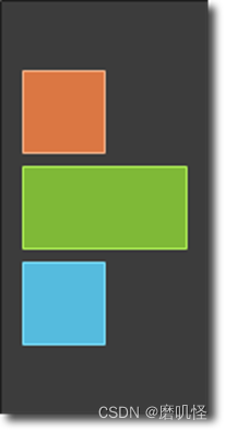
Column元素通过将子项排列成一列。spacing属性可用于将每个子元素彼此隔开。
// ColumnExample.qml

import QtQuick

DarkSquare {
id: root
width: 120
height: 240

Column {
id: column
anchors.centerIn: parent
spacing: 8
RedSquare { }
GreenSquare { width: 96 }
BlueSquare { }
}
}
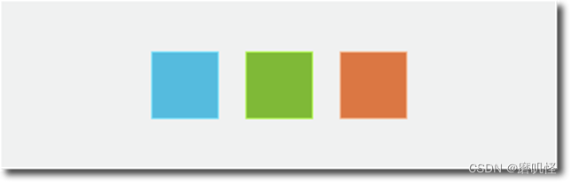
Row元素将其子项彼此相邻放置,从左到右或从右到左,具体取决于layoutDirection属性。同样,spacing用于分隔子项
import QtQuick

BrightSquare {
id: root
width: 400; height: 120

Row {
id: row
anchors.centerIn: parent
spacing: 20
BlueSquare { }
GreenSquare { }
RedSquare { }
}
}
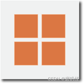
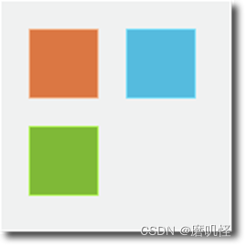
Grid元素在网格中排列其子元素。通过设置rows和columns属性,可以约束行或列的数量。属性flow和layoutDirection用于控制项添加到网格的顺序,而spacing控制分隔子项的空间量
import QtQuick

BrightSquare {
id: root
width: 160
height: 160

Grid {
id: grid
rows: 2
columns: 2
anchors.centerIn: parent
spacing: 8
RedSquare { }
RedSquare { }
RedSquare { }
RedSquare { }
}
}
Flow定位器将其子项添加到流中。
import QtQuick

BrightSquare {
id: root
width: 160
height: 160

Flow {
anchors.fill: parent
anchors.margins: 20
spacing: 20
RedSquare { }
BlueSquare { }
GreenSquare { }
}
} 
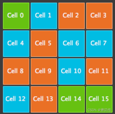
常与定位器一起使用的是Repeater。它的工作方式类似于for循环。
import QtQuick

DarkSquare {
id: root
width: 252
height: 252
property variant colorArray: ["#00bde3", "#67c111", "#ea7025"]

Grid{
anchors.fill: parent
anchors.margins: 8
spacing: 4
Repeater {
model: 16
delegate: Rectangle {
required property int index
property int colorIndex: Math.floor(Math.random()*3)
width: 56; height: 56
color: root.colorArray[colorIndex]
border.color: Qt.lighter(color)
Text {
anchors.centerIn: parent
color: "#f0f0f0"
text: "Cell " + parent.index
}
}
}
}
}
布局
写不动了,直接想死


 209
209


 被折叠的 条评论
为什么被折叠?
被折叠的 条评论
为什么被折叠?
 到【灌水乐园】发言


