- 利用动画去尝试制作相应的动画效果
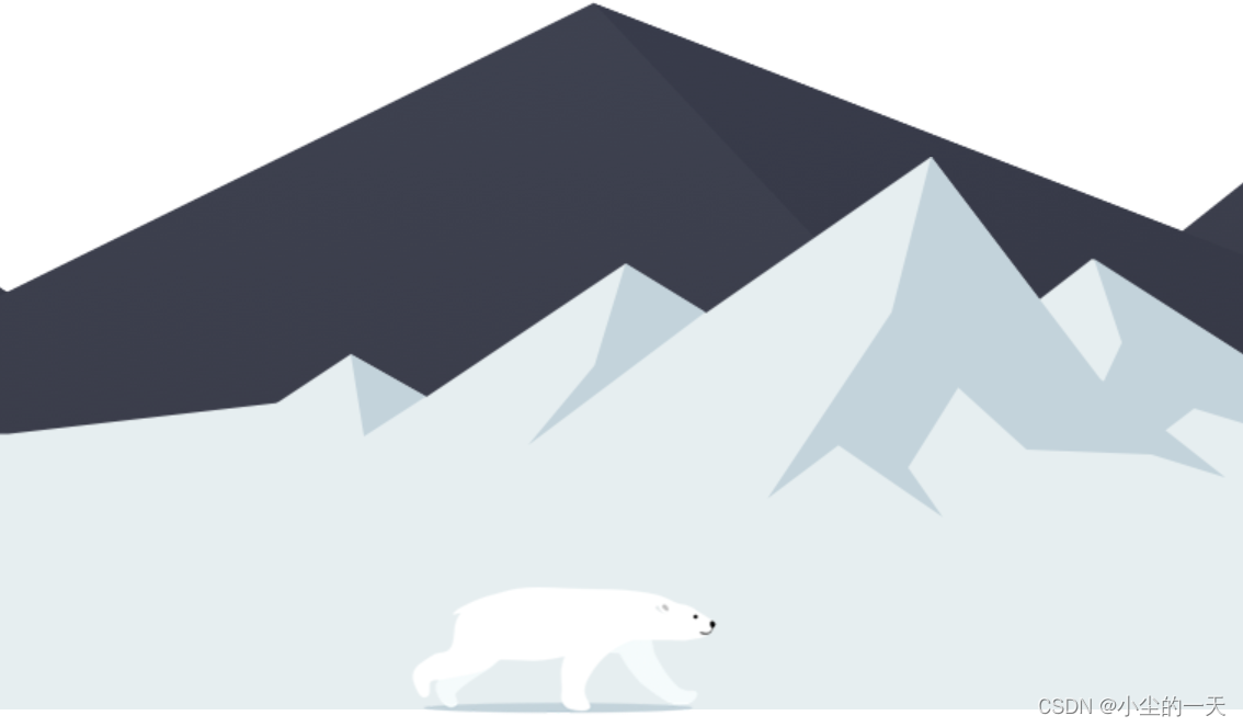
- 熊的制作思路在于:图片添加了动画效果,在时间范围内渐动改变,关键帧一直在改变,图片被往前拉熊展现奔跑的效果
- 熊奔跑的制作思路:基础效果盒子移动到水平居中的位置,瞬间视觉欺骗达到预期效果
- 背面大山制作:一个盒子水平布满,利用动画去改变background-position的位置,设置一个循环播放让后面持续动起来
<!DOCTYPE html>
<html lang="en">
<head>
    <meta charset="UTF-8">
    <meta http-equiv="X-UA-Compatible" content="IE=edge">
    <meta name="viewport" content="width=device-width, initial-scale=1.0">
    <title>Document</title>
    <style>
        body{
            background-color:white;
        }
        *{
            padding: 0;
            margin: 0;
        }
        div{
            float: left;
            display: inline-block;
        }
        .bear{
            position: absolute;
            top: 430px;
            width: 200px;
            height: 100px;
            background-color: pink;
            background: url(../images/bear.png);
            animation:b .4s steps(8) infinite,w 3s  forwards;
        }

        @keyframes w{
            0%{
                left: 0px;
            }
            100%{
                left: 50%;
                transform: translateX(-50%);
            }
        }
        @keyframes b{
            0%{
               background-position: 0 0;
            }
            100%{
                background-position:-1600px 0;
            }
        }
        .mountain1{
            position: absolute;
            top: 187px;
            width: 1272px;
            height: 336px;
            background:url(../images/bg1.png);
            animation:t 10s steps(384) infinite;
        }
        @keyframes t{
            0%{
                background-position: 0 0;
            }
            100%{
                background-position: -3840px 0;
            }
        }
        .mountain2{
            position: absolute;
            left: 0;
            width: 1272px;
            height: 569px;
            background-color: skyblue;
            background:url(../images/bg2.png);
            animation:t2 10s steps(384) infinite;
        }
        @keyframes t2{
            0%{
                background-position: 0 0;
            }
            100%{
                background-position: -3840px 0;
            }
        }
    </style>
</head>
<body>

    <div class="mountain2"></div>
    <div class="mountain1"></div>
    <div class="bear"></div>

</body>
</html>


 扫一扫
扫一扫


 被折叠的 条评论
为什么被折叠?
被折叠的 条评论
为什么被折叠?
 到【灌水乐园】发言


