


在 CSS 中,可以使用以下几种方法来实现文字渐变效果:
- 使用
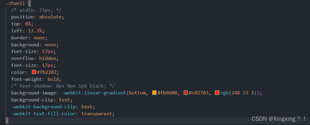
background-image、-webkit-background-clip和-webkit-text-fill-color属性:这是一种比较常见的方法,适用于大多数浏览器。首先,使用background-image属性设置一个渐变背景,然后使用-webkit-background-clip属性将背景裁剪为文字区域,最后使用-webkit-text-fill-color属性将文字颜色设置为透明,即可实现文字渐变效果。示例代码如下:
span {
  font-size: 24px;
  font-weight: bold;
  color: transparent;
  background-image: -webkit-linear-gradient(to right, red, orange, yellow, green, blue, indigo, violet);
  -webkit-background-clip: text;
}
- 使用
mask-image属性:该方法也适用于大多数浏览器。通过mask-image属性为文字设置一个渐变遮罩,从而实现文字渐变效果。示例代码如下:
span {
  font-size: 24px;
  font-weight: bold;
  color: red;
  mask-image: -webkit-linear-gradient(to right, rgba(0, 0, 0, 1), rgba(0, 0, 0, 0));
}
- 使用
SVG图像:这种方法需要先创建一个包含渐变效果的SVG图像,然后在 CSS 中通过fill属性将其应用到文字上。该方法兼容性较好,但可能会增加页面的加载时间。示例代码如下:
.gradient-text-three {
  fill: url(#SVGID_1_);
  font-size: 40px;
  font-weight: bold;
}
<svg viewBox="0 0 500 300" class="svgBox">
  <defs>
    <linearGradient id="SVGID_1_" gradientUnits="userSpaceOnUse" x1="0" y1="10" x2="0" y2="50">
      <stop offset="0" stop-color="red" />
      <stop offset="0.33" stop-color="orange" />
      <stop offset="0.66" stop-color="yellow" />
      <stop offset="1" stop-color="green" />
    </linearGradient>
  </defs>
</svg>
- 使用
linearGradient和fill属性:该方法适用于支持CSS3的浏览器。通过linearGradient和fill属性直接在文字上应用渐变效果。示例代码如下:
.gradient-text {
fill: linear-gradient(to bottom, red, yellow, green);
font-size: 40px;
font-weight: bold;
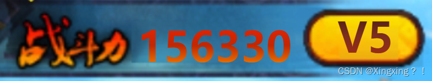
}熟练使用之后便可以:


 1611
1611


 被折叠的 条评论
为什么被折叠?
被折叠的 条评论
为什么被折叠?
 到【灌水乐园】发言


