<!--
* @Author: Aimee~
* @Date: 2023-10-09 08:50:27
* @LastEditTime: 2024-04-22 11:11:25
* @LastEditors: Aimee
* @FilePath: /水波纹效果/水波纹样式.html
* @Description:
-->
<!DOCTYPE html>
<html lang="en">
<head>
<meta charset="UTF-8">
<meta name="viewport" content="width=device-width, initial-scale=1.0">
<title>Document</title>
</head>
<body>
<div class="quan">
<div class="shui"></div>
</div>
</body>
</html>
<style>
*{
padding: 0;
margin: 0;
box-sizing: border-box;
}
body{
height: 100vh;
display: flex;
justify-content: center;
align-items: center;
background-color: rgb(240, 228, 228);
}
.quan{
position: relative;
width: 160px;
height: 180px;
}
.shui{
position: absolute;
top: 0;
left: 0;
width: 100%;
height: 100%;
background-color: rgb(76, 152, 239);
overflow: hidden;
z-index: 2;
}
img{
width: 100%;
height: 100%;
position: absolute;
z-index: 3;
top: 0;
left: 0;
}
.shui::after{
content: '';
position: absolute;
top: 0;
left: 50%;
width: 150%;
height: 150%;
border-radius: 40%;
background-color: rgb(240, 228, 228);
animation: start 5s linear infinite;
}
@keyframes start{
0%{
transform: translate(-50%,-65%) rotate(0deg);
}
100%{
transform: translate(-50%,-65%) rotate(360deg);
}
}
.shui::before{
content: '';
position: absolute;
top: 0;
left: 50%;
width: 150%;
height: 150%;
border-radius: 42%;
background-color: rgb(240, 228, 228,0.2);
animation: end 7s linear infinite;
}
@keyframes end{
0%{
transform: translate(-50%,-60%) rotate(0deg);
}
100%{
transform: translate(-50%,-60%) rotate(360deg);
}
}
</style>


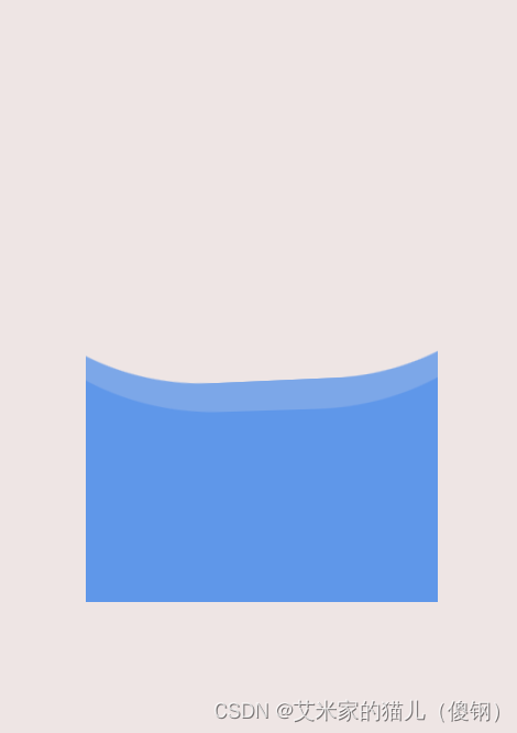
 本文详细描述了一个HTML页面中使用CSS创建的水波纹效果,包括绝对定位、伪元素、动画和关键帧的使用,展示了如何为元素添加平滑的旋转波纹样式。


 328
328

 被折叠的 条评论
为什么被折叠?
被折叠的 条评论
为什么被折叠?
 到【灌水乐园】发言


