


CSS 浮动与定位以及定位中z-index的堆叠问题
一、浮动布局的特点与应用
1. 浮动核心特性
- 脱离标准流:浮动元素会脱离文档流。
- 环绕特性:后续内容会环绕浮动元素排列
- 自动换行:多个浮动元素在容器宽度不足时自动换行
.float-box {
  float: left; /* 或 right */
  width: 200px;
  margin: 10px;
}
2. 浮动典型应用场景
- 图文混排:实现文字环绕图片效果
- 多栏布局:创建水平排列的导航菜单(水平显示加浮动)
3. 清除浮动技巧
/* 方法1:clearfix hack */
.clearfix::after {
  content: "";
  display: block;
  height: 0;
  clear: both;
  visibility: hidden;
}

/* 方法2:创建BFC */
.container {
  overflow: hidden;
}
二、定位布局的特点与应用
1. 定位类型对比
| 定位方式 | 参照基准 | 是否脱离文档流 | 典型应用场景 |
|---|---|---|---|
static(默认) | 正常流 | 否 | 常规布局 |
relative | 自身原始位置 | 否 | 正常调整元素位置 |
absolute | 最近非static定位祖先 | 是 | 绝对定位 |
fixed | 浏览器视窗 | 是 | 固定导航/悬浮按钮 |
sticky | 浏览器视窗 | 否 | 实现粘性效果 |
2. 定位布局
/* 相对定位示例 */
.tooltip {
  position: relative;
}
.tooltip::after {
  position: absolute;
  top: 100%;
  left: 50%;
  transform: translateX(-50%);
}

/* 固定定位示例 */
.header {
  position: fixed;
  top: 0;
  width: 100%;
  z-index: 100;
}

/* 粘性定位示例 */
.section-title {
  position: sticky;
  top: 20px;
}
在显示布局页面中,常常使用相对和绝对定位,在嵌套过程中也常常是父盒子为相对定位,子盒子绝对定位即子绝父相。
3.固定定位的使用, 绝对,相对定位的结合
网页设置中要先设置网页的版心,这里实现一个固定定位跟随版心,以及一个绝对定位居中
<!DOCTYPE html>
<html lang="en">

<head>
  <meta charset="UTF-8">
  <meta name="viewport" content="width=device-width, initial-scale=1.0">
  <title>Document</title>
  <style>
    .w {
      width: 800px;
      height: 2000px;
      background-color: pink;
      /*版心的盒子居中*/
      margin: 0 auto;
    }

    /* 绝对定位的盒子不能通过margin: 0 auto 实现居中 */
    .fixed {
      position: fixed;
      /* 固定的盒子先走 浏览器界面的一半 */
      left: 50%;
      /* right: 50; */
      /* 之后走版心的盒子的一半 */
      margin-left: 405px;
      top: 200px;
      width: 50px;
      height: 150px;
      background-color: skyblue;
    }

    .cen {
      position: absolute;
      left: 50%;
      top: 50%;
      width: 200px;
      height: 200px;
      transform: translate(-50%, 0);
      /* transform(0,-50%);与下面这一属性设置的等同都实现了向上移动自身高度的一半 */
      margin-top: -100px;
      background-color: purple;
    }
  </style>
</head>

<body>
  <div class="fixed"></div>
  <div class="w">
    <div class="cen">
    </div>
  </div>
</body>

</html>
渲染效果如下:
三、z-index与层叠上下文
1. z-index核心规则
- 仅对定位元素生效:position值非static时才有效
- 数值越大越靠前:可正可负,默认auto(相当于0),如果有嵌套现象但并没对子盒子设置,那么子盒子与父盒子在同一堆叠上下文中。
- 同层级比较:比较相同堆叠上下文中的z-index值,子元素的z-index值只在父元素范围内有效。子堆叠上下文被看做是父堆叠上下文中一个独立的模块,相邻的堆叠上下文完全没关系。
2. 层叠上下文创建条件
- 根元素(HTML)
- position非static且z-index非auto
- opacity < 1
- transform/filter非none
- flex/grid容器的子项且z-index非auto
3. 嵌套元素的z-index陷阱
<div class="parent" style="position: relative; z-index: 1;">
  <div class="child" style="position: absolute; z-index: 100;">
    <!-- 无法突破父级的层叠上下文 -->
  </div>
</div>
<div class="sibling" style="position: relative; z-index: 2;">
  <!-- 会覆盖整个parent层叠上下文 -->
</div>
关键结论:
子元素的z-index只在当前层叠上下文中有效,无法超越父级上下文与其他上下文的比较结果
下述例子取自z-index堆叠规则-starof
<!DOCTYPE html>
<html>
<head>
    <meta charset="UTF-8">
    <title>Stacking without z-index</title>
    <style type="text/css">

    div {
        font: 12px Arial;
        text-align: center;
        opacity: 0.7;
    }

    .bold { font-weight: bold; }

    #normdiv {
        z-index: 8;
        height: 70px;
        border: 1px dashed #999966;
        background-color: #ffffcc;
        margin: 0px 50px 0px 50px;
    }

    #reldiv1 {
        z-index: 3;
        height: 100px;
        position: relative;
        top: 30px;
        border: 1px dashed #669966;
        background-color: #ccffcc;
        margin: 0px 50px 0px 50px;
    }

    #reldiv2 {
        z-index: 2;
        height: 100px;
        position: relative;
        top: 15px;
        left: 20px;
        border: 1px dashed #669966;
        background-color: #ccffcc;
        margin: 0px 50px 0px 50px;
    }

    #absdiv1 {
        z-index: 5;
        position: absolute;
        width: 150px;
        height: 350px;
        top: 10px;
        left: 10px;
        border: 1px dashed #990000;
        background-color: #ffdddd;
    }

    #absdiv2 {
        z-index: 1;
        position: absolute;
        width: 150px;
        height: 350px;
        top: 10px;
        right: 10px;
        border: 1px dashed #990000;
        background-color: #ffdddd;
    }

</style>
</head>

<body>

    <br /><br />

    <div id="absdiv1">
        <br /><span class="bold">DIV #1</span>
        <br />position: absolute;
        <br />z-index: 5;
    </div>

    <div id="reldiv1">
        <br /><span class="bold">DIV #2</span>
        <br />position: relative;
        <br />z-index: 3;
    </div>

    <div id="reldiv2">
        <br /><span class="bold">DIV #3</span>
        <br />position: relative;
        <br />z-index: 2;
    </div>

    <div id="absdiv2">
        <br /><span class="bold">DIV #4</span>
        <br />position: absolute;
        <br />z-index: 1;
    </div>

    <div id="normdiv">
        <br /><span class="bold">DIV #5</span>
        <br />no positioning
        <br />z-index: 8;
    </div>

</body>
</html>
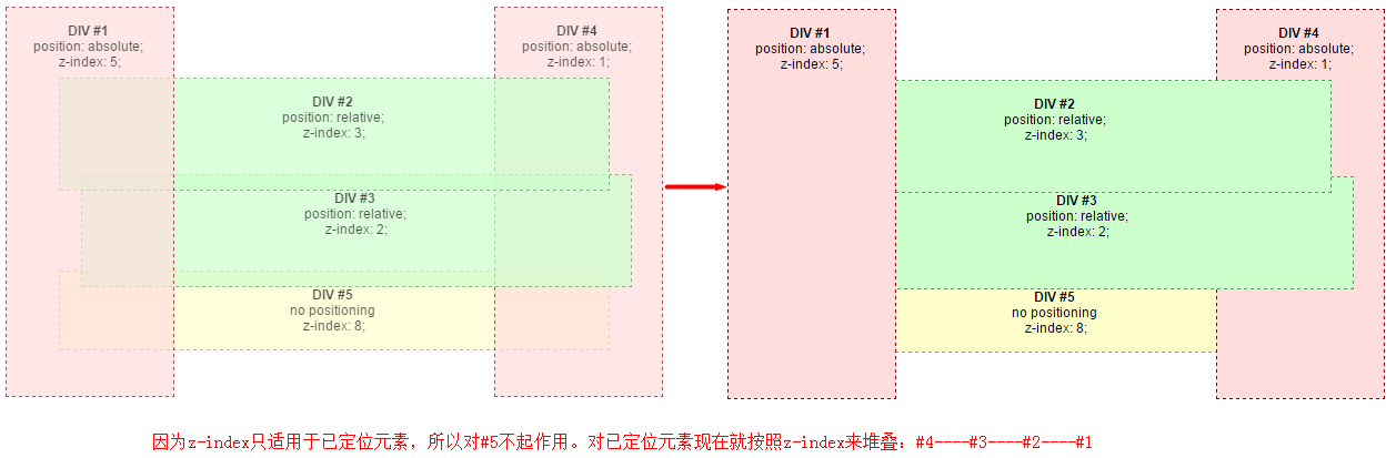
相应的渲染效果:
4.z-index设置
- 存在多个堆叠层时,每个层设置时可以以100为间隔,设置的大一点会更容易确定渲染顺序,比如第一个的z-index为0,第二个的z-index为100,设置第三个的z-index为200。后期如果需要添加一些层的话,以10为间隔,设置z-index为10,20,再需要添加的话以5为间隔,这样的写法可以方便后期扩展添加内容。
- 在做图文替换的时候可以使用负值。
5. z-index失效排查步骤
- 检查position是否为static
- 检查是否处于低优先级的堆叠上下文中
- 检查祖先元素是否创建了新的堆叠上下文
四、浮动与定位的对比选择
| 特性 | 浮动布局 | 定位布局 |
|---|---|---|
| 文档流影响 | 半脱离(保留位置) | 完全脱离(不占位) |
| 主要用途 | 文字环绕 | 精准定位/复杂层叠 |
使用建议:
- 优先考虑Flex/Grid实现整体布局
- 浮动用于传统浏览器支持或文字环绕
- 定位布局用于需要精确控制层叠关系的场景
五、常见问题解决方案
1. 浮动布局的容器塌陷
/* 现代解决方案 */
.container {
  display: flow-root;
}
2. 定位元素的居中问题
.center {
  position: absolute;
  top: 50%;
  left: 50%;
  transform: translate(-50%, -50%);
}
3. z-index失效排查步骤
- 检查position是否为static
- 检查是否处于低优先级的层叠上下文中
- 检查祖先元素是否创建了新的层叠上下文


 扫一扫
扫一扫


 被折叠的 条评论
为什么被折叠?
被折叠的 条评论
为什么被折叠?
 到【灌水乐园】发言


