


1.
利用 calc计算
<html lang="en">
<head>
    <meta charset="UTF-8">
    <meta name="viewport" content="width=device-width, initial-scale=1.0">
    <title>Document</title>
    <style>
        .box{
            width: 80%;
            margin: 0 auto;
            background-color: rgb(144,144,144);
            /* display: flex; */
        }
        .left{
            width: 200px;
            height: 800px;
            background-color: red;
            float: left;
        }
        .right{
            width: calc(100% - 200px);
            height: 800px;
            background-color: pink;
            float: left;
        }
    </style>
</head>
<body>
    <div class="all">
        <div class="box">
            <div class="left">left</div>
            <div class="right">right</div>
        </div>
    </div>
</body>
</html>
2.弹性盒子
display:flex;
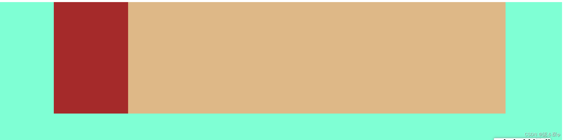
<!DOCTYPE html>
<html lang="en">
<head>
    <meta charset="UTF-8">
    <meta name="viewport" content="width=device-width, initial-scale=1.0">
    <title>Document</title>
    <style>
        .v1{
            width: 100%;
            height: 400px;
            background-color: aquamarine;
        }
        .h1{
            width:80%;
            height: 200px;
            margin: 0 auto;
            background-color: blueviolet;
            /* 弹性盒子 */
             display: flex;

           /* position: relative; */

        }
        .h2{
            width: 200px;
            background-color: brown;
            height: 300px;
            /* float: left; */
            /* position: absolute;
            left: 0;
            top: 0; */
        }
        .h3{
            /* overflow: hidden; */
            margin-left: 200px;
           flex: 1;
            background-color: burlywood;
          height: 300px;

        }
    </style>
</head>
<body>
    <div class="v1">
        <div class="h1">
            <div class="h2"></div>
            <div class="h3"></div>
        </div>
    </div>
</body>
</html>
3.用position 定位
<!DOCTYPE html>
<html lang="en">
<head>
    <meta charset="UTF-8">
    <meta name="viewport" content="width=device-width, initial-scale=1.0">
    <title>Document</title>
    <style>
        .v1{
            width: 100%;
            height: 400px;
            background-color: aquamarine;
        }
        .h1{
            width:80%;
            height: 200px;
            margin: 0 auto;
            background-color: blueviolet;
            /* 弹性盒子 */
             /* display: flex;
          */
          /* 定位 */
           position: relative;

        }
        .h2{
            width: 200px;
            background-color: brown;
            height: 300px;
            /* float: left; */
            position: absolute;
            left: 0;
            top: 0;
        }
        .h3{
            overflow: hidden;
            margin-left: 200px;
           flex: 1;
            background-color: burlywood;
          height: 300px;

        }
    </style>
</head>
<body>
    <div class="v1">
        <div class="h1">
            <div class="h2"></div>
            <div class="h3"></div>
        </div>
    </div>
</body>
</html>
4.用 浮动 float
<!DOCTYPE html>
<html lang="en">
<head>
    <meta charset="UTF-8">
    <meta name="viewport" content="width=device-width, initial-scale=1.0">
    <title>Document</title>
    <style>
        .v1{
            width: 100%;
            height: 400px;
            background-color: aquamarine;
        }
        .h1{
            width:80%;
            height: 200px;
            margin: 0 auto;
            background-color: blueviolet;
            /* 弹性盒子 */
             /* display: flex;
          */
          /* 定位 */
           /* position: relative; */

        }
        .h2{
            width: 200px;
            background-color: brown;
            height: 300px;
            float: left;
            /* position: absolute;
            left: 0;
            top: 0; */
        }
        .h3{
            overflow: hidden;
            /* 超出隐藏 */
            /* margin-left: 200px;
           flex: 1; */
            background-color: burlywood;
          height: 300px;

        }
    </style>
</head>
<body>
    <div class="v1">
        <div class="h1">
            <div class="h2"></div>
            <div class="h3"></div>
        </div>
    </div>
</body>
</html>


 1481
1481


 被折叠的 条评论
为什么被折叠?
被折叠的 条评论
为什么被折叠?
 到【灌水乐园】发言


