


今天用学会了用css画动态太极图,现在和小伙伴们分享一下,供大家参考学习。
一.先画一个太极图
1.代码:
<!DOCTYPE html>
<html lang="en">
<head>
<meta charset="UTF-8">
<meta http-equiv="X-UA-Compatible" content="IE=edge">
<meta name="viewport" content="width=device-width, initial-scale=1.0">
<title>Document</title>
<style>
/*类选择器,父元素*/
.fu{
width:500px;
height: 500px;
border:1px solid black;
background-color: blanchedalmond;
position: relative;/*相对定位*/
}
.fu>div{
position: absolute;/*绝对定位*/
}
/*类选择器,子元素*/
.z1{
width: 250px;
height:500px;
background-color:white;
border-radius: 250px 0px 0px 250px;
}
.z2{
width: 250px;
height:500px;
background-color:black;
border-radius: 0px 250px 250px 0px;
left:250px;
}
.z3{
width: 250px;
height:250px;
background-color:black;
border-radius: 50%;
left:125px;
}
.z4{
width: 250px;
height:250px;
background-color:white;
border-radius: 50%;
left:125px;
top: 250px;
}
.z5{
width: 60px;
height:60px;
background-color:white;
border-radius: 50%;
left:200px;
top: 100px;
}
.z6{
width: 60px;
height:60px;
background-color:black;
border-radius: 50%;
left:250px;
top: 350px;
}
</style>
</head>
<body>
<div class="fu">
<div class="z1"></div>
<div class="z2"></div>
<div class="z3"></div>
<div class="z4"></div>
<div class="z5"></div>
<div class="z6"></div>
</div>
</body>
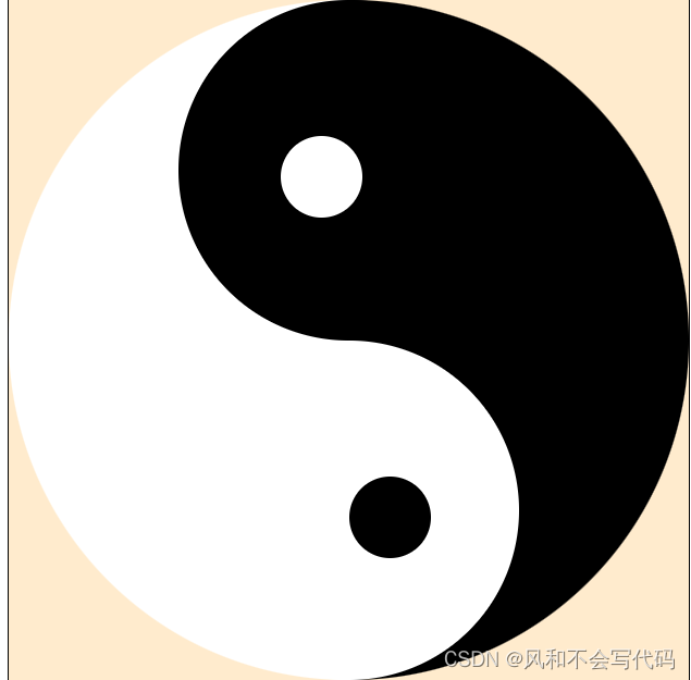
</html>2.效果图:
二.将太极图转动起来
1.动画声明需要使用@keyframes name,后面的name是人为定义的动画名称
2.动画属性有很多种
动画的名称(必须要有)
animation-name: move;
动画的运动曲线(linear是匀速stept()是分步)
animation-timing-function: linear;
动画的运动时间
animation-duration: 3s;
动画的运动次数(infinite是无限循环)
animation-iteration-count: infinite;
动画的开始时间
animation-delay: 1s;
动画是否逆序播放
animation-direction: alternate;
动画播放期间触碰暂停
animation-play-state: paused;
动画播放完毕是否回到初始位置
animation-fill-mode: forwards;(不回到初始位置)
backwards(回到初始位置)
3.代码:
<!DOCTYPE html>
<html lang="en">
<head>
    <meta charset="UTF-8">
    <meta http-equiv="X-UA-Compatible" content="IE=edge">
    <meta name="viewport" content="width=device-width, initial-scale=1.0">
    <title>Document</title>
    <style>
        body{
            background-color: wheat;
        }


        .fu{
            width:500px;
            height: 500px;
            position: relative;
            animation: circles 4s linear  infinite;
        }
        .fu>div{
            position: absolute;
        }
        .z1{
            width: 250px;
            height:500px;
            background-color:white;
            border-radius: 250px 0px 0px 250px;
        }
        .z2{
            width: 250px;
            height:500px;
            background-color:black;
            border-radius: 0px 250px 250px 0px;
            left:250px;

        }
        .z3{
            width: 250px;
            height:250px;
            background-color:black;
            border-radius: 50%;
            left:125px;
        }
        .z4{

            width: 250px;
            height:250px;
            background-color:white;
            border-radius: 50%;
            left:125px;
            top: 250px;
        }
        .z5{
            width: 60px;
            height:60px;
            background-color:white;
            border-radius: 50%;
            left:200px;
            top: 100px;
        }
        .z6{
            width: 60px;
            height:60px;
            background-color:black;
            border-radius: 50%;
            left:250px;
            top: 350px;
        }
        @keyframes circles {
            form{
                transform:rotate(0deg);
            }to{
                transform:rotate(360deg);
            }

        }
    </style>
</head>
<body>
    <div class="fu">
        <div class="z1"></div>
        <div class="z2"></div>
        <div class="z3"></div>
        <div class="z4"></div>
        <div class="z5"></div>
        <div class="z6"></div>

    </div>
</body>
</html>


 扫一扫
扫一扫


 1567
1567

 被折叠的 条评论
为什么被折叠?
被折叠的 条评论
为什么被折叠?
 到【灌水乐园】发言


