


Notifications(API Guides)
Notification Design://通知设计
Notifications, as an important part of the Android UI, have their own design guidelines. To learn how to design notifications and their interactions, read the Android Design Guide Notifications topic.
//
Note://注意
Except where noted, this guide refers to the NotificationCompat.Builder class in the version 4 Support Library. The class Notification.Builder was added in Android 3.0.
Notification Display Elements://通知显示的元素
Notifications in the notification drawer can appear in one of two visual styles, depending on the version and the state of the drawer:
-
Normal view
- The standard view of the notifications in the notification drawer. Big view
- A large view that's visible when the notification is expanded. Big view is part of the expanded notification feature available as of Android 4.1.
These styles are described in the following sections.//这些样式在以下部分被描述
Normal view//标准视图
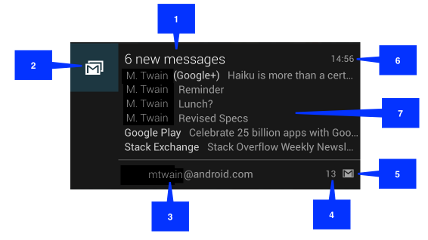
A notification in normal view appears in an area that's up to 64 dp tall. Even if you create a notification with a big view style, it will appear in normal view until it's expanded. This is an example of a normal view:

Figure 3. Notification in normal view.//图形3.标准视图的通知
The callouts in the illustration refer to the following://插图中的插图的编号请参考下面:
- Content title//内容标题
- Large icon//大图标
- Content text//内容文本
- Content info//内容信息
- Small icon//小图标
- Time that the notification was issued. You can set an explicit value with
setWhen(); if you don't it defaults to the time that the system received the notification.//通知发布的时间。你可以通过setWhen()设置一个明确的值;如果你不设置的话,默认的时间是系统收到通知的时间。
Big view//大视图


 5376
5376


 被折叠的 条评论
为什么被折叠?
被折叠的 条评论
为什么被折叠?
 到【灌水乐园】发言


