


一、标题
1.1、样式
bootstrap可以传统的标题元素设计得更漂亮,以迎合你的网页内容。
效果:

源代码:
<body class="container">
    <h1 class="display-1">Display 1</h1>
    <h1 class="display-2">Display 2</h1>
    <h1 class="display-3">Display 3</h1>
    <h1 class="display-4">Display 4</h1>
</body>
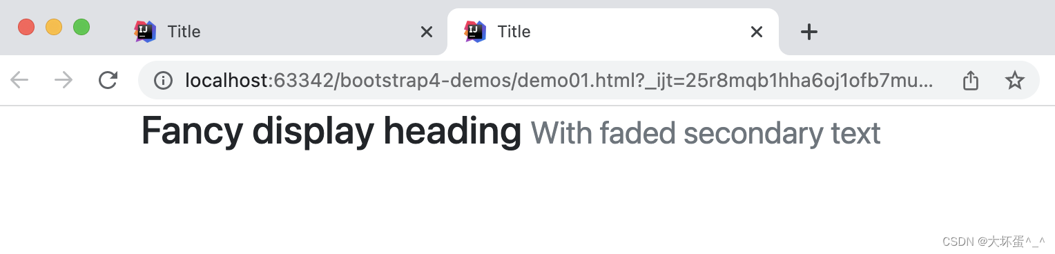
1.2、辅助标题文本
使用附带的实用类从Bootstrap 重新创建小的辅助标题文本。
效果:
源代码:
<body>
    <div class="container">
        <h3>
            Fancy display heading
            <small class="text-muted">
                With faded secondary text
            </small>
        </h3>
    </div>
</body>
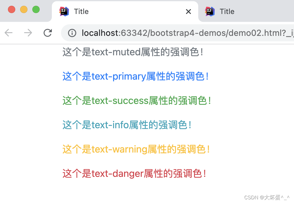
扩展:文本强调色
效果:
源代码:
<body class="container">
    <p class="text-muted">这个是text-muted属性的强调色!</p>
    <p class="text-primary">这个是text-primary属性的强调色!</p>
    <p class="text-success">这个是text-success属性的强调色!</p>
    <p class="text-info"> 这个是text-info属性的强调色!</p>
    <p class="text-warning">这个是text-warning属性的强调色!</p>
    <p class="text-danger">这个是text-danger属性的强调色!</p>
</body>
二、段落
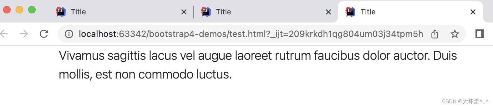
通过应用 .lead样式,可以定义一个中心段落,用于提示这是中心内容或重要内容。
样式效果:
源代码:
<body class="container">
    <p class="lead">
        Vivamus sagittis lacus vel augue laoreet rutrum faucibus dolor auctor. Duis mollis, est non commodo luctus.
    </p>
</body>
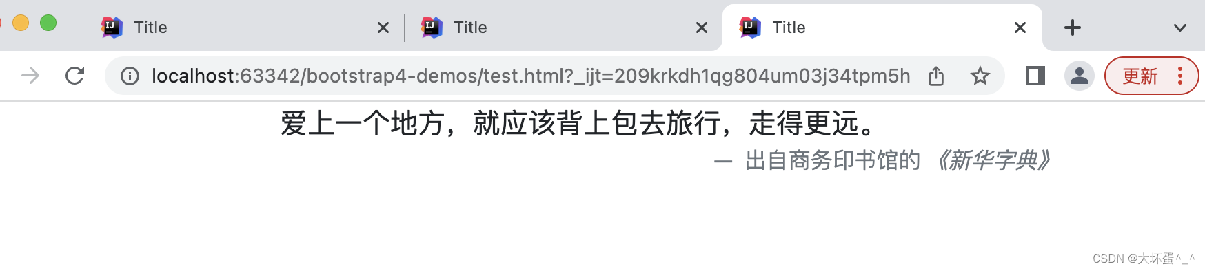
三、对齐
- .text-center:文本居中对齐
- .text-right:文本右对齐
样式效果:
源代码:
<body class="container">
    <blockquote class="blockquote">
        <p class="mb-0 text-center">爱上一个地方,就应该背上包去旅行,走得更远。</p>
        <footer class="blockquote-footer text-right">
            出自商务印书馆的 <cite title="Source Title">《新华字典》</cite>
        </footer>
    </blockquote>
</body>
四、列表
4.1、无样式列表
在ul(或ol)上使用.list-unstyled可以删除列表项目上默认的list-style以及左外边距,这只生效于在直接子列表项目上,不影响你嵌套的子列表。
样式效果:
源代码:
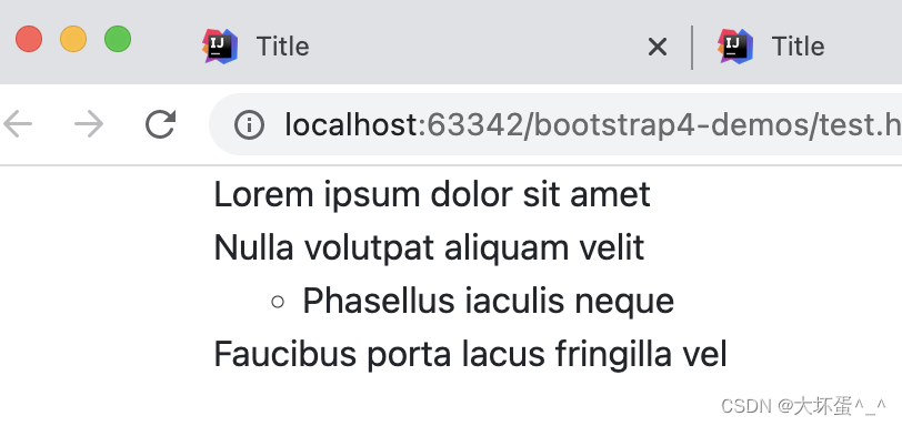
<body class="container">
    <ul class="list-unstyled">
        <li>Lorem ipsum dolor sit amet</li>
        <li>Nulla volutpat aliquam velit
            <ul>
                <li>Phasellus iaculis neque</li>
            </ul>
        </li>
        <li>Faucibus porta lacus fringilla vel</li>
    </ul>
</body>
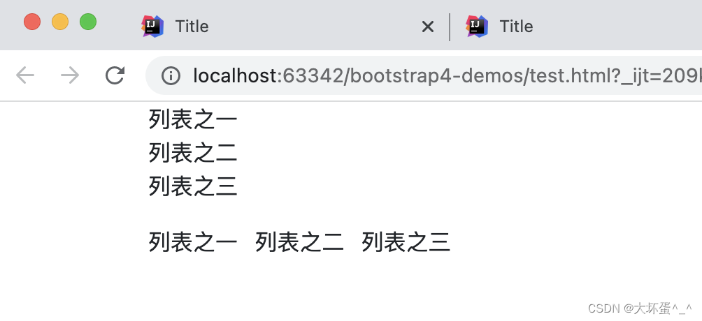
4.2、逐行式或多列并排式布局
- .list-inline:多行
- .list-inline-item:多列
样式效果:
源代码:
<body class="container">
	<ul class="list-inline">
	    <li class="list-inline">列表之一</li>
	    <li class="list-inline">列表之二</li>
	    <li class="list-inline">列表之三</li>
	</ul>
	<ul class="list-inline">
	    <li class="list-inline-item">列表之一</li>
	    <li class="list-inline-item">列表之二</li>
	    <li class="list-inline-item">列表之三</li>
	</ul>
</body>
五、图片
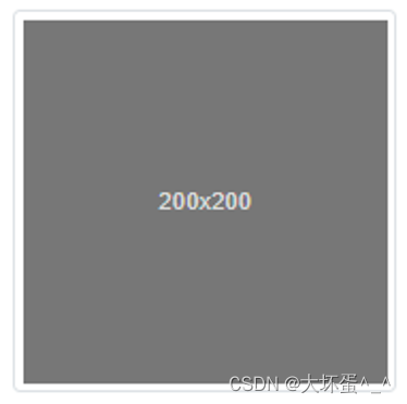
5.1、响应式图片
给图片添加.img-fluid样式,或定义max-width: 100%、height:auto;样式,即可赋得响应式特性,图片大小会随着父元素大小同步缩放。
样式效果:
源代码:
<img src="1.jpg" class="img-fluid" alt="Responsive image" >
5.2、缩略图处理
使用.img-thumbnail属性来使图片自动被加上一个带圆角且1px边界的外框缩略图样式
样式效果:
源代码:
<img src="..." alt="..." class="img-thumbnail">
5.3、图像对齐处理
对于.block属性的块状图片,我们也可以使用 浮动定义规范 或 文字对齐规范,来实现对图像的对齐、浮动控制,带.block块属性的图片,可以自动获得 .mx-auto 的位置对齐属性。
样式效果:
源代码:
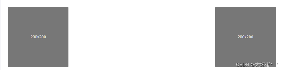
<img src="..." class="rounded float-left" alt="...">
<img src="..." class="rounded float-right" alt="...">
样式效果:

源代码:
<img src="..." class="rounded mx-auto d-block" alt="...">
六、表格
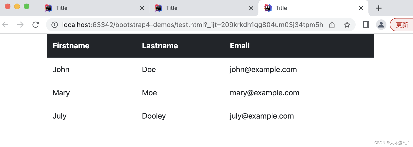
6.1、Head表头处理
- .thead-light:浅色(灰色)表头
- .thead-dark:深色(黑色)表头
样式效果:
源代码:
<body class="container">
    <table class="table">
        <thead class="thead-dark">
        <tr> <th>Firstname</th> <th>Lastname</th><th>Email</th></tr>
        </thead>
        <tbody>
        <tr> <td>John</td> <td>Doe</td> <td>john@example.com</td>   </tr>
        <tr> <td>Mary</td> <td>Moe</td> <td>mary@example.com</td> </tr>
        <tr> <td>July</td> <td>Dooley</td><td>july@example.com</td> </tr>
        </tbody>
    </table>
</body>
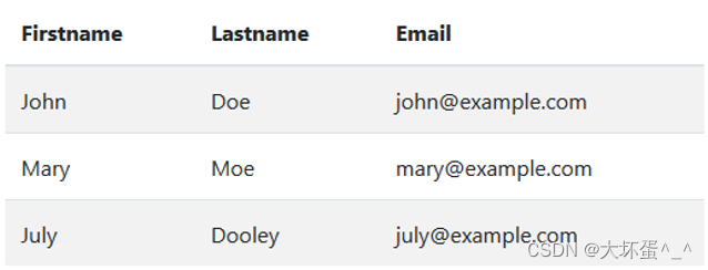
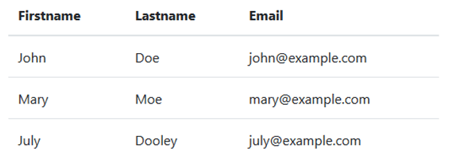
6.2、条纹表格
使用 .table-striped 样式定义 ,可以产生逐行颜色强烈对比的表格样式(以及增加反转)。
样式效果:
源代码:
<table class="table table-striped">
      <thead >
             <tr> <th>Firstname</th> <th>Lastname</th><th>Email</th></tr>
      </thead>
      <tbody>
             <tr> <td>John</td> <td>Doe</td> <td>john@example.com</td>   </tr>
             <tr> <td>Mary</td> <td>Moe</td> <td>mary@example.com</td> </tr>
             <tr> <td>July</td> <td>Dooley</td><td>july@example.com</td> </tr>
      </tbody>
</table>
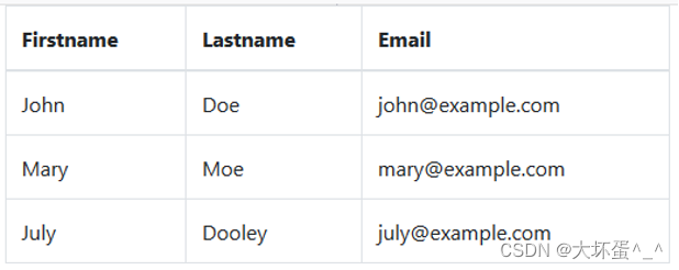
6.3、边框表格
添加 .table-bordered 类可以产生表格边框与间隙系统。
样式效果:
源代码:
<table class="table table-bordered">
      <thead >
             <tr> <th>Firstname</th> <th>Lastname</th><th>Email</th></tr>
      </thead>
      <tbody>
             <tr> <td>John</td> <td>Doe</td> <td>john@example.com</td>   </tr>
             <tr> <td>Mary</td> <td>Moe</td> <td>mary@example.com</td> </tr>
             <tr> <td>July</td> <td>Dooley</td><td>july@example.com</td> </tr>
      </tbody>
</table>
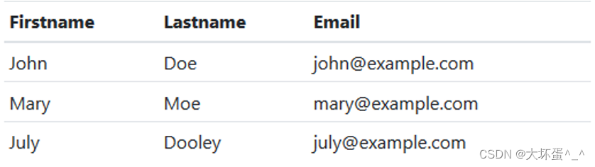
6.4、悬停效果表格
将 .table-hover 定义到 上,可以产生行悬停效果(鼠标移到行上会出现状态提示)。
效果样式:
源代码:
<table class="table table-hover">
      <thead >
             <tr> <th>Firstname</th> <th>Lastname</th><th>Email</th></tr>
      </thead>
      <tbody>
             <tr> <td>John</td> <td>Doe</td> <td>john@example.com</td>   </tr>
             <tr> <td>Mary</td> <td>Moe</td> <td>mary@example.com</td> </tr>
             <tr> <td>July</td> <td>Dooley</td><td>july@example.com</td> </tr>
      </tbody>
</table>
6.5、紧缩表格
添加 .table-sm 可以将表格的padding值缩减一半,使表格更加紧凑。
样式效果:
源代码:
<table class="table table-sm">
      <thead >
             <tr> <th>Firstname</th> <th>Lastname</th><th>Email</th></tr>
      </thead>
      <tbody>
             <tr> <td>John</td> <td>Doe</td> <td>john@example.com</td>   </tr>
             <tr> <td>Mary</td> <td>Moe</td> <td>mary@example.com</td> </tr>
             <tr> <td>July</td> <td>Dooley</td><td>july@example.com</td> </tr>
      </tbody>
</table>
6.6、响应式表格
可在.table上加入.table-responsive获得响应式表现。
样式效果:
源代码:
<div class="table-responsive">
     <table class="table">
           ...
     </table>
</div>


 1310
1310


 被折叠的 条评论
为什么被折叠?
被折叠的 条评论
为什么被折叠?
 到【灌水乐园】发言


