


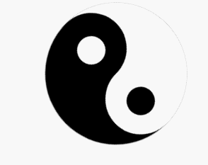
先上图观看效果:
本次只要是通过css3的border-radius属性实现。分析!
主要分为四个部分:
第一就是画出大圆作为容器,
第二就是画出左右两个半圆,
第三就是画出突出来的中等的圆,通过绝对定位来定位置,
最后就是画出小圆,也是通过绝对定位来定位置,ps:小圆需要z-index来悬浮在顶层。
话不多说,先上html结构:
<!-- 圆容器 -->
	<div class="circle">
		<div class="left"> <!-- 左半圆 -->
			<div class="left_middle"><!-- 左半中圆 -->
				<div class="left_small"></div> <!-- 左半小圆 -->
			</div>
		</div>
		<div class="right"><!-- 右半圆 -->
			<div class="right_middle"><!-- 右半中圆 -->
				<div class="right_small"></div><!-- 右半小圆 -->
			</div>
		</div>
	</div>
再上css样式:
/*画出一个圆当做容器*/
		.circle{
			margin: 100px auto;
			width: 200px;
			height: 200px;
			border-radius: 50%;
			border: 1px solid #ccc;
			animation:run 4s linear 0s infinite ; /*添加上动画*/
		}
		/*左半边*/
		.left{
			width: 100%;
			height: 50%;
			border-radius:100px 100px 0 0;
			background-color: black;
			position: relative;
		}
		.left_middle{
			width: 100px;
			height: 100px;
			border-radius: 50%;
			background-color: white;
			position: absolute;
			top: 50px;
		}
		.left_small{
			width: 40px;
			height: 40px;
			border-radius: 50%;
			background-color: black;
			position: absolute;
			left: 28px;
			top: 28px;
			z-index: 999;
		}
		/*右半边*/
		.right{
			width: 100%;
			height: 50%;
			border-radius:0 0 100px 100px;
			background-color:white;
			position: relative;
		}

		.right_middle{
			width: 100px;
			height: 100px;
			border-radius: 50%;
			background-color: black;
			position: absolute;
			top:-50px;
			left: 100px;
		}
		.right_small{
			width: 40px;
			height: 40px;
			border-radius: 50%;
			background-color: white;
			position: absolute;
			left: 28px;
			top: 28px;
			z-index: 999;
		}
到此为止太极图基本完成:
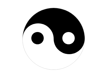
最后添上动画,变大功告成了
:
/*旋转动画*/
		@keyframes run{
			from{transform: rotate(0deg);}
			to{transform: rotate(-360deg);}
		}
最后来补习下CSS3动画的知识点:动画的详细资料
通过@keyframes来定义我们自定义的动画:
@keyframes myfirst
{
0%   {background: red;}
25%  {background: yellow;}
50%  {background: blue;}
100% {background: green;}
}
下面的表格列出了 @keyframes 规则和所有动画属性:
属性 描述 CSS @keyframes 规定动画。 3 animation 所有动画属性的简写属性,除了 animation-play-state 属性。 3 animation-name 规定 @keyframes 动画的名称。 3 animation-duration 规定动画完成一个周期所花费的秒或毫秒。默认是 0。 3 animation-timing-function 规定动画的速度曲线。默认是 "ease"。 3 animation-delay 规定动画何时开始。默认是 0。 3 animation-iteration-count 规定动画被播放的次数。默认是 1。 3 animation-direction 规定动画是否在下一周期逆向地播放。默认是 "normal"。 3 animation-play-state 规定动画是否正在运行或暂停。默认是 "running"。 3 animation-fill-mode 规定对象动画时间之外的状态。 3
animation 属性是简写属性,属性的顺序按照上图
开始,顺序到最后的书写方式。
animation-name
即@keyframes 定义的动画名;
animation-duration
动画的时间,默认是0;
animation-timing-function
animation-timing-function:value; value的值如下:
值 描述 测试 linear 动画从头到尾的速度是相同的。 测试 ease 默认。动画以低速开始,然后加快,在结束前变慢。 测试 ease-in 动画以低速开始。 测试 ease-out 动画以低速结束。 测试 ease-in-out 动画以低速开始和结束。 测试 cubic-bezier(n,n,n,n) 在 cubic-bezier 函数中自己的值。可能的值是从 0 到 1 的数值。
animation-direction
animation-direction: normal|alternate;
值 描述 测试 normal 默认值。动画应该正常播放。 测试 alternate 动画应该轮流反向播放。
animation-play-state语法
animation-play-state: paused|running;
值 描述 测试 paused 规定动画已暂停。 测试 running 规定动画正在播放。
animation-fill-mode语法
animation-fill-mode : none | forwards | backwards | both;
值 描述 none 不改变默认行为。 forwards 当动画完成后,保持最后一个属性值(在最后一个关键帧中定义)。 backwards 在 animation-delay 所指定的一段时间内,在动画显示之前,应用开始属性值(在第一个关键帧中定义)。 both 向前和向后填充模式都被应用。


 扫一扫
扫一扫
 2555
2555

 被折叠的 条评论
为什么被折叠?
被折叠的 条评论
为什么被折叠?
 到【灌水乐园】发言


