


1.float+margin
效果如下:
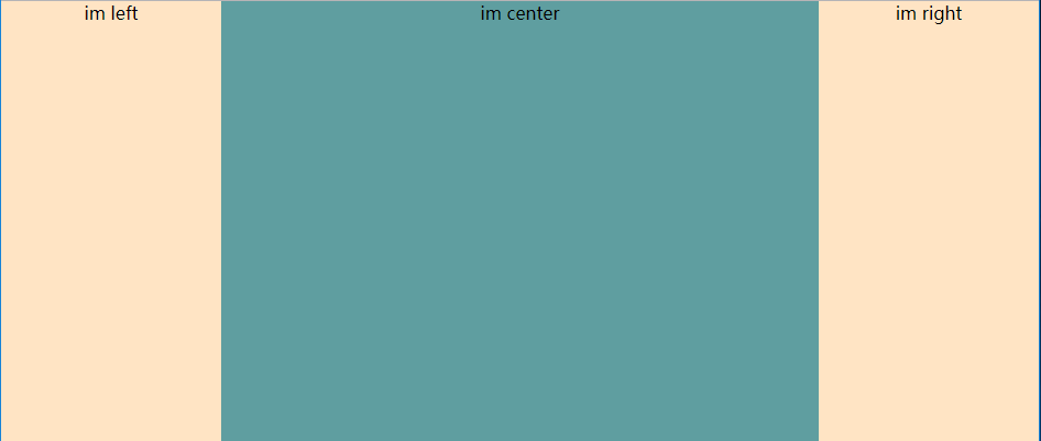
html代码如下:
 <div class="main">im center</div>
 <div class="left">im left</div>
 <div class="right"> im right</div>
css代码如下:
 *{
        padding: 0px;
        margin:0px;
    }
    .left{
        width:200px;
        height: 400px;
        background-color: bisque;
        float:left;
        margin-left: -100%;
        text-align: center;
    }
    .right{
        width:200px;
        height: 400px;
        background-color: bisque;
        float:left;
        margin-left: -200px;
        text-align: center;
    }
    .main{
        width: 100%;
        height: 400px;
        float: left;
        box-sizing: border-box;
        padding: 0 200px;//文字不被覆盖
        background-color: cadetblue;
        text-align: center;
    }
2.flex(woo~so easy right?)
html代码:
 <div class="content">
    <div class="left">im left</div>
    <div class="main">im center</div>
    <div class="right"> im right</div>
  </div>
css代码:
 *{
        padding: 0px;
        margin:0px;
    }
    .content{
        width: 100%;
        height:300px;
        display: flex;
    }
   .left{
        background-color: bisque;
        width: 200px;
   }
   .right{
       background-color:bisque;
       width: 200px;
   }
   .main{
       flex: 1;
       background-color: cadetblue;
   }
3.position:absolute+z-index
html代码:
 <div class="content">
    <div class="left">im left</div>
    <div class="main">im center</div>
    <div class="right"> im right</div>
 </div>
css代码:
 *{
        padding: 0px;
        margin:0px;
    }
    .content{
        width: 100%;
        height:300px;
    }
    .left{
        width: 200px;
        height: inherit;
        position: absolute;
        z-index: 1;
        background: bisque;
    }
    .main{
        width: 100%;
        height: inherit;
        background: cadetblue;
        position: relative;
        box-sizing: border-box;
        padding: 0 200px;
    }
    .right{
        width: 200px;
        height: inherit;
        background: bisque;
        position: absolute;
        top:0;
        right:0;
        z-index: 1;
    }
综合而言主要是这三种形式,当然也有更多的方法,主要是在div的排列顺序和position与float的变化。
好啦,赶快动手去试试吧~~


 5894
5894


 被折叠的 条评论
为什么被折叠?
被折叠的 条评论
为什么被折叠?
 到【灌水乐园】发言


