


1、CSS3 2D transform 属性
l transform属性向元素应用 2D 或 3D 转换。该属性允许我们对元素进行旋转、缩放、移动或倾斜。
transform的属性包括:rotate( ) 旋转/ skew( ) 倾斜/ scale( ) 缩放/ translate( ) 平移,分别还有x、y之分,比如:rotatex( ) 和 rotatey( ) ,以此类推。
l 2D transform常用的功能:
Ø rotate() 旋转,用法:transform: rotate(45deg);
共一个参数“角度”,单位deg为度的意思,正数为顺时针旋转,负数为逆时针旋转,上述代码作用是顺时针旋转45度。
例:rotate(30deg)把元素顺时针旋转 30 度。
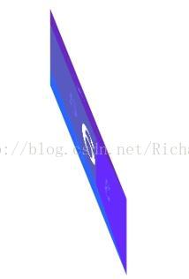
Ø 缩放 scale,scale():用来缩小或放大元素,可以使用元素尺寸发生变化。在此基础上有两个扩展函数:scaleX()和scaleY()。
用法:transform: scale(0.5) 或者transform: scale(0.5, 2);
参数表示缩放倍数;
1)一个参数时:表示水平和垂直同时缩放该倍率
2)两个参数时:第一个参数指定水平方向的缩放倍率,第二个参数指定垂直方向的缩放倍率。
例:scale(2,4) 把宽度转换为原始尺寸的 2 倍,把高度转换为原始高度的 4 倍。
Ø 倾斜 skew,用法:transform: skew(30deg) 或者 transform: skew(30deg, 30deg);
参数表示倾斜角度,单位deg
1)一个参数时:表示水平方向的倾斜角度;
2)两个参数时:第一个参数表示水平方向的倾斜角度,第二个参数表示垂直方向的倾斜角度。
例:skew(30deg,20deg)围绕X 轴把元素翻转 30 度,围绕 Y 轴翻转 20 度。
X轴和Y轴角度总数加起来不能大于90deg;这个值可以为负数。
Ø translate():用来移动元素,可以根据X轴和Y轴坐标重新定位元素位置。在此基础上有两个扩展函数:translateX()和translateY()。
用法:transform: translate(45px) 或者 transform: translate(45px, 150px);
参数表示移动距离,单位px,
1)一个参数时:表示水平方向的移动距离;
2)两个参数时:第一个参数表示水平方向的移动距离,第二个参数表示垂直方向的移动距离。
例:translate(50px,100px) 把元素从左侧移动 50 像素,从顶端移动 100 像素。
Ø 简单了解matrix():定义矩阵变形,基于X轴和Y轴坐标重新定位元素位置。
matrix() 方法把所有 2D 转换方法组合在一起。matrix() 方法需要六个参数,包含数学函数,允许:旋转、缩放、移动以及倾斜元素。
Matrix是transform的一个子集,基本语法transform: matrix(a, c, b, d, tx, ty);
a, c, b, d是一个二维矩阵:
┌ ┐
│ a b │
│ c d │
└ ┘
tx, ty就是就是基于X和Y 坐标重新定位元素。
tx, ty参数值在各个浏览器下有差异:
firefox浏览器下tx, ty除了0值之外必须只用长度单位值(“px”,“em”等)或者使用百分数。
l 基准点 transform-origin(了解)
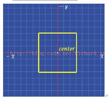
在使用transform方法进行文字或图像的变形时,是以元素的中心点为基准点进行的。使用transform-origin属性,可以改变变形的基准点。
用法:transform-origin: 10px 10px;
共两个参数,表示相对左上角原点的距离,单位px,第一个参数表示相对左上角原点水平方向的距离,第二个参数表示相对左上角原点垂直方向的距离;
两个参数除了可以设置为具体的像素值,其中第一个参数可以指定为left、center、right,第二个参数可以指定为top、center、bottom。
2、CSS3 3D 转换
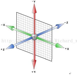
CSS3中的3D坐标系如下图:
l CSS3 允许您使用 3D 转换来对元素进行格式化。
l transform--style属性指定嵌套元素是怎样在三维空间中呈现。语法:transform-style:flat|preserve-3d;
参数:flat 子元素将不保留其 3D 位置。
preserve-3d 子元素将保留其 3D 位置。
3D transform中有下面这三个方法:
Ø rotateX(angle ) 旋转X轴
Ø rotateY(angle ) 旋转Y轴
Ø rotateZ(angle ) 旋转Z轴
l 3D transform常用的功能:
Ø translate3d():移元素元素,用来指定一个3D变形移动位移量
Ø translate():指定3D位移在Z轴的位移量。
Ø scale3d():用来缩放一个元素。
Ø scaleZ():指定Z轴的缩放向量。
Ø rotate3d():指定元素具有一个三维旋转的角度。
Ø rotateX()、rotateY()和rotateZ():让元素具有一个旋转角度。
Ø perspective():指定一个透视投影矩阵。
Ø matrix3d():定义《》矩阵变形。
l perspective(length)为一个元素设置三维透视的距离。仅作用于元素的后代,而不是其元素本身。当perspective:none/0;时,相当于没有设perspective(length)。比如你要建立一个小立方体,长宽高都是200px。如果你的perspective < 200px ,那就相当于站在盒子里面看的结果,如果perspective 非常大(大于立方体尺寸2倍以上)那就是站在非常远的地方看(立方体已经成了小正方形了)。
当元素没有设置perspective(length)时,所有后代元素被压缩在同一个二维平面上,不存在景深的效果。如果设置perspective(length)后,将会看到三维的效果。默认的透视视角中心在容器(是perspective所在的元素,不是他的后代元素)的 中点,也就是 perspective-origin: 50% 50%。当然你也可以自己设置,比如:左上角perspective-origin: 0px 0px;。
l 综合以上两点,我们可以通过几个实例,来深入了解下perspective(length); 和 transform-style:preserve-3d;
(1)当设置perspective(length);不设置transform-style:preserve-3d;当元素静止时,会有立体的效果:
(2)当设置perspective(length);不设置transform-style:preserve-3d;当元素旋转时的效果:
(3)当设置transform-style:preserve-3d;不设置perspective(length);当元素静止时,不会有立体的效果。
(4)当设置perspective(length);不设置transform-style:preserve-3d;当元素旋转时的效果:
(5)只有当两个值都设置,不管是静止还是旋转,都会看到立体的效果。
3:动画
动画是CSS3中具有颠覆性的特征之一,可通过设置多个节点来精确控制一个或一组动画,常用来实现复杂的动画效果。
1、必要元素:
a、通过@keyframes指定动画序列;
b、通过百分比将动画序列分割成多个节点;
c、在各节点中分别定义各属性
d、通过animation将动画应用于相应元素;
2、关键属性
a、animation-name设置动画序列名称
b、animation-duration动画持续时间
c、animation-delay动画延时时间
width: 30px;
height: 30px;
animation: change 5s infinite;
}
/*动画相比过渡可以控制更多细节,可以将一个动画拆成多个步骤*/
@keyframes change {
0% {
width: 30px;
height: 30px;
background-color: yellow;
}
25% {
width: 300px;
background-color: blue;
}
50% {
width: 30px;
height: 300px;
background-color: green;
}
100% {
width: 300px;
height: 300px;
background-color: pink;
}
}
<body>
<div class="animation"></div>
</body>
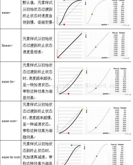
animation-timing-function动画执行速度,linear、ease等
e、animation-play-state动画播放状态,running(默认)、paused(暂停)等
f、animation-direction动画逆播,alternate等
其主要有两个值:normal、alternate
1、normal是默认值,如果设置为normal时,动画的每次循环都是向前播放;
2、另一个值是alternate,他的作用是,动画播放在第偶数次向前播放,第奇数次向反方向播放。
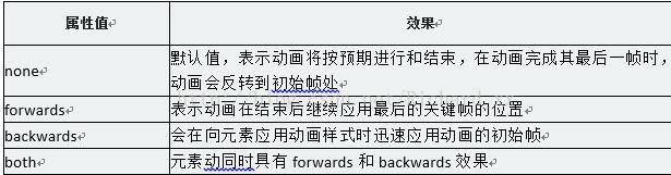
g、animation-fill-mode动画执行完毕后状态,forwards、backwards等
h、animation-iteration-count动画执行次数,inifinate(无限次数)等,默认是1
参数值的顺序:
关于几个值,除了名字,动画时间,延时有严格顺序要求其它随意
width: 30px;
height: 30px;
background-color: blue;
/*动画名称*/
animation-name: change;
/*动画持续时间*/
animation-duration: 1s;
/*动画结束后的状态*/
animation-fill-mode: none;
/*无限次播放*/
animation-iteration-count: infinite;
/*动画延时*/
animation-delay: 1s;
/*动画暂停*/
animation-play-state: running;
/*动画反方向*/
animation-direction: alternate;
/*动画速度*/
animation-timing-function: linear;
}
@keyframes change {
0% {
width: 40px;
height: 40px;
}
100% {
width: 200px;
height: 200px;
}
}
<div class="animation"></div>
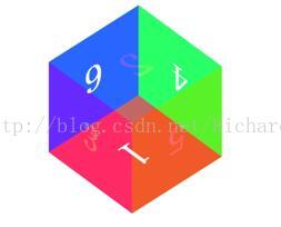
<!doctype html>
<html>
<head>
<meta charset="utf-8">
<title>无标题文档</title>
<style>
*{ margin:0; padding:0;}
.vi{ perspective:600px;}

.cu{ width:250px; height:250px;
   perspective:50% 50%;
   transform-style:preserve-3d;
   margin:200px auto;
   animation:ait01 3s linear 20s infinite;}
@keyframes ait01{ 100%{ transform:rotate3d(1, 1, 1, 360deg)}}

.it1{ width:250px; height:250px;
   position:absolute; opacity:0.8;
   font-size:32px; color:#000; text-align:center; line-height:250px;
   border:1px #0000CC solid;
    background-color:#F96; z-index: 6;
    transform-origin:left;
    animation:ait1 2s linear 1s both;}
@keyframes ait1{ 100%{ transform:rotateY(-90deg)}}


.it2{ width:250px; height:250px;
   position:absolute; opacity:0.8;
   font-size:32px; color:#000; text-align:center; line-height:250px;
   border:1px #0000CC solid;
    background-color:#F96; z-index: 5;
    transform-origin: right;
    animation:ait2 2s linear 5s both;}
@keyframes ait2{ 100%{ transform:rotateY(90deg)}}


.it3{ width:250px; height:250px;
   position:absolute; opacity:0.8;
   font-size:32px; color:#000; text-align:center; line-height:250px;
   border:1px #0000CC solid;
    background-color:#F96; z-index: 4;
    transform-origin: top;
    animation:ait3 2s linear 8s both;}
@keyframes ait3{ 100%{ transform:rotateX(90deg)}}


.it4{ width:250px; height:250px;
   position:absolute; opacity:0.8;
   font-size:32px; color:#000; text-align:center; line-height:250px;
   border:1px #0000CC solid;
    background-color:#F96; z-index: 3;
    transform-origin: bottom;
    animation:ait4 2s linear 12s both;}
@keyframes ait4{ 100%{ transform:rotateX(-90deg)}}


.it5{ width:250px; height:250px;
   position:absolute; opacity:0.8;
   font-size:32px; color:#000; text-align:center; line-height:250px;
   border:1px #0000CC solid;
    background-color:#F96; z-index: 2;
    animation:ait5 2s linear 15s both;}
@keyframes ait5{ 100%{ transform:translateZ(250px)}}


.it6{ width:250px; height:250px;
   position:absolute; opacity:0.8;
   font-size:32px; color:#000; text-align:center; line-height:250px;
   border:1px #0000CC solid;
    background-color:#F96;z-index: 1;
    animation:ait6 2s linear 18s both;}
@keyframes ait6{ 100%{ transform:rotateY(180deg)}}


</style>
</head>

<body>

   <div class="vi">
      <div class="cu">
           <div class="it1">左</div>
            <div class="it2">右</div>
            <div class="it3">上</div>
            <div class="it4">下</div>
            <div class="it5">前</div>
            <div class="it6">后</div>
        </div>
   </div>
</body>
</html>


 2万+
2万+


 被折叠的 条评论
为什么被折叠?
被折叠的 条评论
为什么被折叠?
 到【灌水乐园】发言


