


<!DOCTYPE html>
<html lang="en">
<head>
<meta charset="UTF-8">
<meta http-equiv="X-UA-Compatible" content="IE=edge">
<meta name="viewport" content="width=device-width, initial-scale=1.0">
<title>Document</title>
<style>
#box1{
font-size: 20px;
height: 50px;
width: 500px;
border:0.5px solid rgba(0, 0, 0, 0.3);
margin: auto;
/* display: none; */
visibility: visible;
text-align: center;
line-height: 50px;
}
#box2{
height: 450px;
width: 500px;
border:0.5px solid rgba(0, 0, 0, 0.3);
margin: auto;
/* display: none; */
visibility: visible;
position: relative;
}
#box3{
width: 450px;
height: 330px;
position: relative;
left: 20px;
top: 30px;
border:0.5px solid rgba(0, 0, 0, 0.3);
}
#img1{
width: 450px;
height: 250px;
}
#img2{
width: 45px;
height: 25px;
position:absolute;
left: 380px;
top:20px;
z-index: 1;
}
#p1{
line-height: 0px;
font-size: 25px;
position: relative;
left: 10px;
bottom: 10px;
}
#p2{
font-size: 20px;
color: rgb(198, 90, 40);
}
#p3{
font-size: 18px;
color: white;
position:absolute;
left: 382px;
top:3px;
z-index: 1;
}
</style>
</head>
<body>
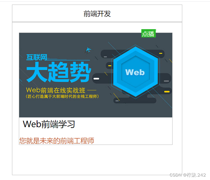
<div id="box1">前端开发</div>
<div id="box2">
<img id="img2" src="./images/label.png" >
<p id="p3">点播</p>
<div id="box3">
<img id="img1" src="./images/01.jpg" >
<p id="p1">Web前端学习</p>
<p id="p2">您就是未来的前端工程师</p>
</div></div>
</body>
</html>
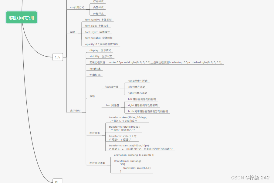
transform:skew(10deg,10deg) ;
/* 倾斜x,y deg角度*/
transform: rotate(10deg);
/* 旋转:默认中心 */
transform: scale(1.5,2);
/* 缩放x,y 倍速*/
transform: translate(100px,10px);
/* 移动 x,y,可以是百分比,自身大小的百分比移动 */
<!DOCTYPE html>
<html lang="en">
<head>
<meta charset="UTF-8">
<meta http-equiv="X-UA-Compatible" content="IE=edge">
<meta name="viewport" content="width=device-width, initial-scale=1.0">
<title>猫和老鼠</title>
</head>
<style>
#box{
margin-top: 20%;
width: 100%;
height: 10%;
display: flex;/*设置盒子横向排列 */
justify-content: space-around;/*设置盒子水平间隔排列 */
}
#box1{
width: 300px;
height: 200px;
border-radius: 20px;
background-image: url(./图片排列/m1.jpg);
background-size: 100% 100%;
}
#box1:hover{
animation: suofang 1s ease 0s 1;
}
@keyframes suofang{
5%{
transform: scale(1,1.5);
}
20%{
transform: scale(1.5,0.5);
}
50%{
transform: scale(0.8,1.5);
}
60%{
transform: scale(1.3,0.8);
}
70%{
transform: scale(0.9,1.1);
}
80%{
transform: scale(1,0.9);
}
}
#box2{
width: 300px;
height: 200px;
border-radius:20px;
background-image: url(./图片排列/m2.jpg);
background-size: 100% 100%;
}
#box2:hover{
animation: suofang 1s ease 0s 1;
}
#box3{
width: 300px;
height: 200px;
border-radius:20px;
background-image: url(./图片排列/m3.jpg);
background-size: 100% 100%;
}
#box3:hover{
animation: suofang 1s ease 0s 1;
}
#box4{
width: 300px;
height: 200px;
border-radius:20px;
background-image: url(./图片排列/m4.jpg);
background-size: 100% 100%;
}
#box4:hover{
animation: suofang 1s ease 0s 1;
}
</style>
<body>
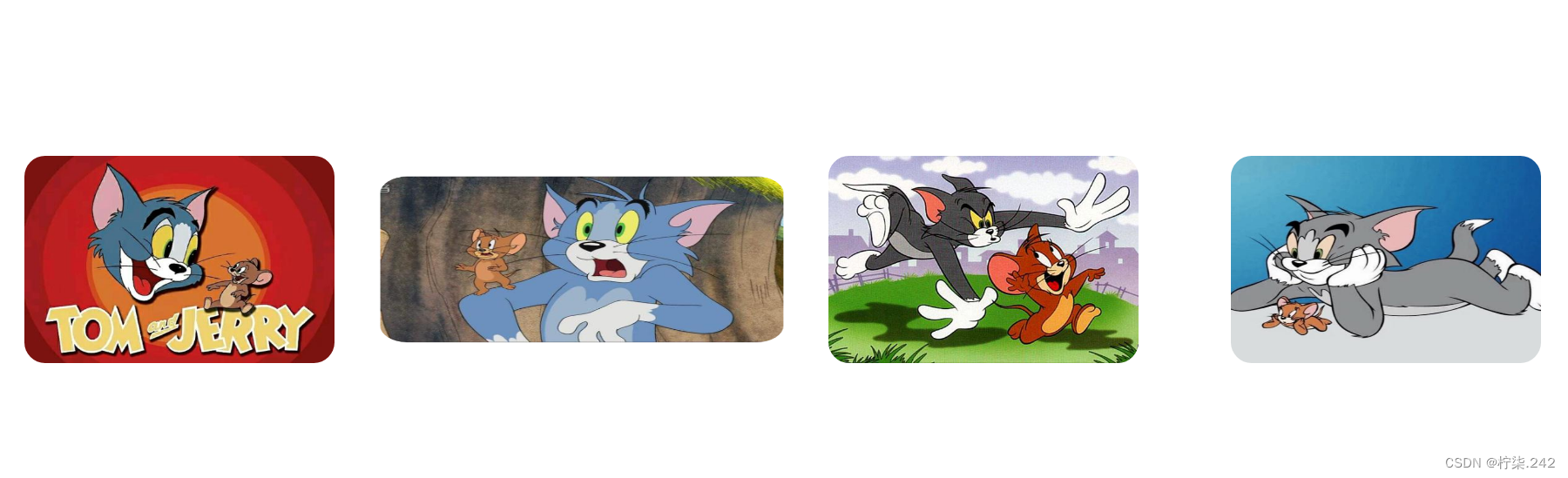
<div id="box">
<div id="box1"></div>
<div id="box2"></div>
<div id="box3"></div>
<div id="box4"></div>
</div>
</body>
</html>


 3227
3227


 被折叠的 条评论
为什么被折叠?
被折叠的 条评论
为什么被折叠?
 到【灌水乐园】发言


