


其他基础控件
1.Window
2.Button
3.CheckBox
4.ComboBox
5.DataGrid
6.DatePicker
7.Expander
8.GroupBox
9.ListBox
10.ListView
11.Menu
12.PasswordBox
13.TextBox
14.RadioButton
ToggleButton 实现下面的效果
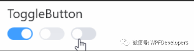
1)ToggleButton来实现动画;
Border嵌套Ellipse并设置TranslateTransform,当选中Checked将TranslateTransform.X值To = 20将Ellipse从左侧移动到右侧。动画完成时将
Border.Background背景色更改为深色PrimaryNormalSolidColorBrush
<ResourceDictionary.MergedDictionaries>
        <ResourceDictionary Source="../Themes/Basic/ControlBasic.xaml"/>
        <ResourceDictionary Source="../Themes/Basic/Animations.xaml"/>
    </ResourceDictionary.MergedDictionaries>

    <Style TargetType="{x:Type ToggleButton}" BasedOn="{StaticResource ControlBasicStyle}">
        <Setter Property="Focusable" Value="False" />
        <Setter Property="Cursor" Value="Hand"/>
        <Setter Property="Template">
            <Setter.Value>
                <ControlTemplate TargetType="{x:Type ToggleButton}">

                    <Border x:Name="PART_Border"
                            Width="40"
                            Height="20"
                            Background="{DynamicResource BaseSolidColorBrush}"
                            CornerRadius="10">

                        <Ellipse x:Name="PART_Ellipse" Width="16" Height="16"
                                 Margin="2,0"
                                 VerticalAlignment="Center" HorizontalAlignment="Left"
                                 Fill="{DynamicResource WindowForegroundColorBrush}">
                            <Ellipse.RenderTransform>
                                <TranslateTransform/>
                            </Ellipse.RenderTransform>
                        </Ellipse>
                        <VisualStateManager.VisualStateGroups>
                            <VisualStateGroup x:Name="CheckStates">
                                <VisualState x:Name="Checked">
                                    <Storyboard>
                                        <DoubleAnimation Storyboard.TargetName="PART_Ellipse"
                                                         Storyboard.TargetProperty="(Ellipse.RenderTransform).(TranslateTransform.X)"
                                                         To="20"
                                                         Duration="00:00:.3"
                                                         EasingFunction="{StaticResource CubicEaseInOut}"/>


                                    </Storyboard>
                                </VisualState>
                                <VisualState x:Name="Unchecked">
                                    <Storyboard>
                                        <DoubleAnimation Storyboard.TargetName="PART_Ellipse"
                                                         Storyboard.TargetProperty="(Ellipse.RenderTransform).(TranslateTransform.X)"
                                                         To="0"
                                                         Duration="00:00:.3"
                                                         EasingFunction="{StaticResource CubicEaseInOut}"/>

                                    </Storyboard>
                                </VisualState>
                                <VisualState x:Name="Indeterminate" />
                            </VisualStateGroup>
                        </VisualStateManager.VisualStateGroups>
                    </Border>
                    <ControlTemplate.Triggers>

                        <Trigger Property="IsChecked" Value="True">
                            <Setter Property="Background" TargetName="PART_Border"
                                    Value="{DynamicResource PrimaryNormalSolidColorBrush}"/>
                        </Trigger>
                    </ControlTemplate.Triggers>
                </ControlTemplate>
            </Setter.Value>
        </Setter>
    </Style>
2)Styles.ToggleButton.xaml 代码如下;
<WrapPanel Margin="0,10">
           <ToggleButton/>
                    <ToggleButton Margin="10,0" IsEnabled="False"/>
                    <ToggleButton IsChecked="True"/>
 </WrapPanel>
Nuget Install-Package WPFDevelopers.Minimal

[1][2]
参考资料
[1]
GitHub: https://github.com/WPFDevelopersOrg
[2]Gitee: https://gitee.com/WPFDevelopersOrg


 1万+
1万+


 被折叠的 条评论
为什么被折叠?
被折叠的 条评论
为什么被折叠?
 到【灌水乐园】发言


