


一、点击状态切换
1. Iconbutton
包含两个Icon 分别用来显示不同点击和默认的状态
using System;
using System.Collections.Generic;
using System.Linq;
using System.Text;
using System.Threading.Tasks;
using System.Windows;
using System.Windows.Controls;
using System.Windows.Media;
using System.Windows.Shapes;

namespace lyrics.ui.Controls.ButtonCustom
{
    public class IconButton:Button
    {
        static IconButton()
        {
           DefaultStyleKeyProperty.OverrideMetadata(typeof(IconButton), new FrameworkPropertyMetadata(typeof(IconButton)));
        }

        #region Icon
        public static readonly DependencyProperty IconProperty =
            DependencyProperty.Register("Icon", typeof(Geometry), typeof(IconButton), new PropertyMetadata(default(Geometry)));

        public Geometry Icon
        {
            get => (Geometry)GetValue(IconProperty);
            set => SetValue(IconProperty, value);
        }
        public static readonly DependencyProperty Icon2Property =
    DependencyProperty.Register("Icon2", typeof(Geometry), typeof(IconButton), new PropertyMetadata(default(Geometry)));

        public Geometry Icon2
        {
            get => (Geometry)GetValue(Icon2Property);
            set => SetValue(Icon2Property, value);
        }
        public static readonly DependencyProperty IconWidthProperty =
    DependencyProperty.Register("IconWidth", typeof(double), typeof(IconButton), new PropertyMetadata(default(double)));

        public double IconWidth
        {
            get => (double)GetValue(IconWidthProperty);
            set => SetValue(IconWidthProperty, value);
        }

        public static readonly DependencyProperty IconHeightProperty =
DependencyProperty.Register("IconHeight", typeof(double), typeof(IconButton), new PropertyMetadata(default(double)));

        public double IconHeight
        {
            get => (double)GetValue(IconHeightProperty);
            set => SetValue(IconHeightProperty, value);
        }
        #endregion
    }
}
2. style
点击时切换 图标和文字显示状态
没有单独写第二个依赖属性来显示文字 用Name替代
    <Style x:Key="CheckBtn" TargetType="cbtn:IconButton">
        <Setter Property="Template">
            <Setter.Value>
                <ControlTemplate TargetType="cbtn:IconButton">
                    <Border Background="{TemplateBinding Background}" CornerRadius="10">
                        <StackPanel Orientation="Horizontal">
                            <Path x:Name="icon1" Data="{TemplateBinding Icon}" Width="{TemplateBinding IconWidth}" Height="{TemplateBinding IconHeight}" Fill="{TemplateBinding Foreground}" Stroke="{TemplateBinding Foreground}" StrokeThickness="1" SnapsToDevicePixels="True" Stretch="Uniform"/>
                            <Path x:Name="icon2" Data="{TemplateBinding Icon2}" Width="{TemplateBinding IconWidth}" Height="{TemplateBinding IconHeight}" Fill="{TemplateBinding Foreground}"  Stroke="{TemplateBinding Foreground}" StrokeThickness="1" SnapsToDevicePixels="True" Stretch="Uniform"/>
                            <TextBlock x:Name="tb" Text="{TemplateBinding Name}" Background="{TemplateBinding Background}" Foreground="{TemplateBinding Foreground}" VerticalAlignment="Center"/>
                            <ContentPresenter x:Name="contentPresenter" RecognizesAccessKey="True" VerticalAlignment="Center" SnapsToDevicePixels="{TemplateBinding SnapsToDevicePixels}"/>
                        </StackPanel>
                    </Border>
                    <ControlTemplate.Triggers>
                        <Trigger Property="IsPressed" Value="True">
                            <Setter TargetName="icon1" Property="Visibility" Value="Collapsed"/>
                            <Setter TargetName="icon2" Property="Visibility" Value="Visible"/>
                            <Setter TargetName="tb" Property="Visibility" Value="Collapsed"/>
                            <Setter TargetName="contentPresenter" Property="Visibility" Value="Visible"/>
                        </Trigger>
                        <Trigger Property="IsPressed" Value="False">
                            <Setter TargetName="icon1" Property="Visibility" Value="Visible"/>
                            <Setter TargetName="icon2" Property="Visibility" Value="Collapsed"/>
                            <Setter TargetName="tb" Property="Visibility" Value="Visible"/>
                            <Setter TargetName="contentPresenter" Property="Visibility" Value="Collapsed"/>
                        </Trigger>
                    </ControlTemplate.Triggers>
                </ControlTemplate>

            </Setter.Value>
        </Setter>
    </Style>
3. icon
 <Geometry o:Freeze="True" x:Key="DownGeometry">M512 801.6896L5.12 282.0096l58.1632-59.5968L512 682.3936l448.7168-460.0832 58.1632 59.5968-506.88 519.7824z</Geometry>
    <Geometry o:Freeze="True" x:Key="UpGeometry">M50.000001,0 L100,51.262779 94.262627,57.141584 50.000001,11.767713 5.7373757,57.151686 0,51.27288 z</Geometry>
4. demo
 <cbtn:IconButton Content="checkBtn" x:Name="checkBtn2" Width="80" Height="30" Background="Black" Foreground="White" Style="{StaticResource CheckBtn}"
                                     Icon="{StaticResource UpGeometry}" Icon2="{StaticResource DownGeometry}" IconWidth="20" IconHeight="20"/>
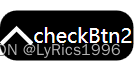
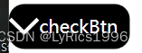
5. 效果
默认状态
点击状态
二、 选中状态切换
1. CheckButton
与IconButton 基本一样 继承ToggleButton 是为了获得check属性
using System;
using System.Collections.Generic;
using System.Linq;
using System.Text;
using System.Threading.Tasks;
using System.Windows;
using System.Windows.Controls.Primitives;
using System.Windows.Media;

namespace lyrics.ui.Controls.ButtonCustom
{
    public class CheckButton:ToggleButton
    {
        static CheckButton()
        {
            DefaultStyleKeyProperty.OverrideMetadata(typeof(CheckButton), new FrameworkPropertyMetadata(typeof(CheckButton)));
        }

        #region Icon
        public static readonly DependencyProperty IconProperty =
            DependencyProperty.Register("Icon", typeof(Geometry), typeof(CheckButton), new PropertyMetadata(default(Geometry)));

        public Geometry Icon
        {
            get => (Geometry)GetValue(IconProperty);
            set => SetValue(IconProperty, value);
        }
        public static readonly DependencyProperty Icon2Property =
    DependencyProperty.Register("Icon2", typeof(Geometry), typeof(CheckButton), new PropertyMetadata(default(Geometry)));

        public Geometry Icon2
        {
            get => (Geometry)GetValue(Icon2Property);
            set => SetValue(Icon2Property, value);
        }
        public static readonly DependencyProperty IconWidthProperty =
    DependencyProperty.Register("IconWidth", typeof(double), typeof(CheckButton), new PropertyMetadata(default(double)));

        public double IconWidth
        {
            get => (double)GetValue(IconWidthProperty);
            set => SetValue(IconWidthProperty, value);
        }

        public static readonly DependencyProperty IconHeightProperty =
DependencyProperty.Register("IconHeight", typeof(double), typeof(CheckButton), new PropertyMetadata(default(double)));

        public double IconHeight
        {
            get => (double)GetValue(IconHeightProperty);
            set => SetValue(IconHeightProperty, value);
        }
        #endregion
    }
}
2. style
    <Style x:Key="CheckBtn" TargetType="cbtn:CheckButton">
        <Setter Property="Template">
            <Setter.Value>
                <ControlTemplate TargetType="cbtn:CheckButton">
                    <Border Background="{TemplateBinding Background}" CornerRadius="10">
                        <StackPanel Orientation="Horizontal">
                            <Path x:Name="icon1" Data="{TemplateBinding Icon}" Width="{TemplateBinding IconWidth}" Height="{TemplateBinding IconHeight}" Fill="{TemplateBinding Foreground}" Stroke="{TemplateBinding Foreground}" StrokeThickness="1" SnapsToDevicePixels="True" Stretch="Uniform"/>
                            <Path x:Name="icon2" Data="{TemplateBinding Icon2}" Width="{TemplateBinding IconWidth}" Height="{TemplateBinding IconHeight}" Fill="{TemplateBinding Foreground}"  Stroke="{TemplateBinding Foreground}" StrokeThickness="1" SnapsToDevicePixels="True" Stretch="Uniform"/>
                            <TextBlock x:Name="tb" Text="{TemplateBinding Name}" Background="{TemplateBinding Background}" Foreground="{TemplateBinding Foreground}" VerticalAlignment="Center"/>
                            <ContentPresenter x:Name="contentPresenter" RecognizesAccessKey="True" VerticalAlignment="Center" SnapsToDevicePixels="{TemplateBinding SnapsToDevicePixels}"/>
                        </StackPanel>
                    </Border>
                    <ControlTemplate.Triggers>
                        <Trigger Property="IsChecked" Value="True">
                            <Setter TargetName="icon1" Property="Visibility" Value="Collapsed"/>
                            <Setter TargetName="icon2" Property="Visibility" Value="Visible"/>
                            <Setter TargetName="tb" Property="Visibility" Value="Collapsed"/>
                            <Setter TargetName="contentPresenter" Property="Visibility" Value="Visible"/>
                        </Trigger>
                        <Trigger Property="IsChecked" Value="False">
                            <Setter TargetName="icon1" Property="Visibility" Value="Visible"/>
                            <Setter TargetName="icon2" Property="Visibility" Value="Collapsed"/>
                            <Setter TargetName="tb" Property="Visibility" Value="Visible"/>
                            <Setter TargetName="contentPresenter" Property="Visibility" Value="Collapsed"/>
                        </Trigger>
                    </ControlTemplate.Triggers>
                </ControlTemplate>
            </Setter.Value>
        </Setter>
        <Style.Triggers>
            <Trigger Property="IsChecked" Value="True">
                <Setter Property="Opacity" Value="0.4"/>
            </Trigger>
        </Style.Triggers>
    </Style>
3. demo
<cbtn:CheckButton Content="checkBtn" x:Name="checkBtn2" Width="80" Height="30" Background="Black" Foreground="White" Style="{StaticResource CheckBtn}"
                                     Icon="{StaticResource UpGeometry}" Icon2="{StaticResource DownGeometry}" IconWidth="20" IconHeight="20"/>
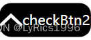
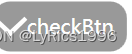
4. 效果
未选中
选中
三、带动画的切换
1.Style
<Style x:Key="CheckBtn2" TargetType="ToggleButton">
        <Setter Property="Template">
            <Setter.Value>
                <ControlTemplate TargetType="ToggleButton">
                    <Border x:Name="br" Background="{TemplateBinding Background}" Height="{TemplateBinding Height}" CornerRadius="20">
                        <StackPanel>
                            <Ellipse Name="ep" Width="{TemplateBinding Height}" Height="{TemplateBinding Height}" Fill="{TemplateBinding Foreground}" HorizontalAlignment="Left">
                                <Ellipse.RenderTransform>
                                    <TranslateTransform X="0"/>
                                </Ellipse.RenderTransform>
                            </Ellipse>
                            <ContentPresenter x:Name="contentPresenter" Visibility="Collapsed"/>
                        </StackPanel>
                    </Border>
                    <ControlTemplate.Triggers>
                        <Trigger Property="IsChecked" Value="True">
                            <Trigger.EnterActions>
                                <BeginStoryboard>
                                    <Storyboard >
                                        <DoubleAnimation To="50"  Duration="0:0:0:0.5" Storyboard.TargetName="ep" Storyboard.TargetProperty="(UIElement.RenderTransform).X"/>
                                    </Storyboard>
                                </BeginStoryboard>
                            </Trigger.EnterActions>
                            <Trigger.ExitActions>
                                <BeginStoryboard>
                                    <Storyboard >
                                        <DoubleAnimation  Duration="0:0:0:0.5" Storyboard.TargetName="ep" Storyboard.TargetProperty="(UIElement.RenderTransform).X"/>
                                    </Storyboard>
                                </BeginStoryboard>
                            </Trigger.ExitActions>
                        </Trigger>

                    </ControlTemplate.Triggers>
                </ControlTemplate>
            </Setter.Value>
        </Setter>
        <Style.Triggers>
            <Trigger Property="IsChecked" Value="True">
                <Setter Property="Opacity" Value="0.4"/>
            </Trigger>
        </Style.Triggers>
    </Style>
2. Demo
<ToggleButton x:Name="checkBtn3" Width="80" Height="30" Background="Black" Foreground="White" Style="{StaticResource CheckBtn2}"/>
3.效果
选中前
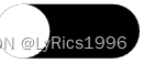
选中后 白色圆形慢慢滚动到右边

四、选中后切换颜色
1. style
    <Style x:Key="CheckBtn3" TargetType="ToggleButton">
        <Setter Property="Template">
            <Setter.Value>
                <ControlTemplate TargetType="ToggleButton">
                        <Grid>
                        <Ellipse Name="ep" Width="{TemplateBinding Height}" Height="{TemplateBinding Height}" Fill="{TemplateBinding Background }"/>

                        <Ellipse Name="ep2" Width="0" Height="{TemplateBinding Height}" Fill="{TemplateBinding Foreground }" />

                    </Grid>
                    <ControlTemplate.Triggers>
                        <Trigger Property="IsChecked" Value="True">

                            <Trigger.EnterActions>
                                <BeginStoryboard>
                                    <Storyboard >
                                        <DoubleAnimation To="0" Storyboard.TargetName="ep" Duration="0:0:0:0.5" Storyboard.TargetProperty="Width"/>
                                        <DoubleAnimation To="30" Storyboard.TargetName="ep2" Duration="0:0:0:0.5" Storyboard.TargetProperty="Width"/>
                                        <DoubleAnimation To="0" Storyboard.TargetName="ep" Duration="0:0:0:0.5" Storyboard.TargetProperty="Opacity"/>
                                        <DoubleAnimation To="1" Storyboard.TargetName="ep2" Duration="0:0:0:0.5" Storyboard.TargetProperty="Opacity"/>
                                        <ColorAnimation To="Black"  Storyboard.TargetName="ep" Duration="0:0:0:0.5" Storyboard.TargetProperty="Fill.(SolidColorBrush.Color)"/>
                                        <ColorAnimation To="Red"  Storyboard.TargetName="ep2" Duration="0:0:0:0.5" Storyboard.TargetProperty="Fill.(SolidColorBrush.Color)"/>
                                    </Storyboard>
                                </BeginStoryboard>
                            </Trigger.EnterActions>
                            <Trigger.ExitActions>
                                <BeginStoryboard>
                                    <Storyboard >
                                        <DoubleAnimation  Storyboard.TargetName="ep" Duration="0:0:0:0.5" Storyboard.TargetProperty="Width"/>
                                        <DoubleAnimation  Storyboard.TargetName="ep2" Duration="0:0:0:0.5" Storyboard.TargetProperty="Width"/>
                                        <DoubleAnimation  Storyboard.TargetName="ep" Duration="0:0:0:0.5" Storyboard.TargetProperty="Opacity"/>
                                        <DoubleAnimation  Storyboard.TargetName="ep2" Duration="0:0:0:0.5" Storyboard.TargetProperty="Opacity"/>
                                        <ColorAnimation  To="Black" Storyboard.TargetName="ep" Duration="0:0:0:0.5" Storyboard.TargetProperty="Fill.(SolidColorBrush.Color)"/>
                                        <ColorAnimation  Storyboard.TargetName="ep2" Duration="0:0:0:0.5" Storyboard.TargetProperty="Fill.(SolidColorBrush.Color)"/>
                                    </Storyboard>
                                </BeginStoryboard>
                            </Trigger.ExitActions>
                        </Trigger>

                    </ControlTemplate.Triggers>
                </ControlTemplate>
            </Setter.Value>
        </Setter>

    </Style>
2. demo
<ToggleButton x:Name="checkBtn3" Width="30" Height="30" Background="Black" Foreground="Red" Style="{StaticResource CheckBtn3}"/>
3. 效果
选中前

选中后


 2万+
2万+


 被折叠的 条评论
为什么被折叠?
被折叠的 条评论
为什么被折叠?
 到【灌水乐园】发言


