


在我们开发的时候常常需要更改原生控件的默认效果,有时候某些控件改起来挺费劲的,比如SeekBar的背景与其ProgressBar的进度粗细或者thumb居中现实与否如果弄错,都是个大麻烦,我曾经就为thumb的居中显示问题浪费了很多很多的时间,后来以别的笨拙的办法解决了,现在重新回来看,决定下决心整一下,看看到底是怎么回事。
我们知道,当我们在写一个xml布局的时候,只需要简单的为这个控件指定一个高宽便可以看到它的效果,就像这样:
<?xml version="1.0" encoding="utf-8"?>
<RelativeLayout
    xmlns:android="http://schemas.android.com/apk/res/android"
    xmlns:app="http://schemas.android.com/apk/res-auto"
    xmlns:tools="http://schemas.android.com/tools"
    android:layout_width="match_parent"
    android:layout_height="match_parent"
    android:paddingBottom="@dimen/activity_vertical_margin"
    android:paddingLeft="@dimen/activity_horizontal_margin"
    android:paddingRight="@dimen/activity_horizontal_margin"
    android:paddingTop="@dimen/activity_vertical_margin"
    app:layout_behavior="@string/appbar_scrolling_view_behavior"
    tools:context=".MainActivity"
    tools:showIn="@layout/activity_main">

    <SeekBar
        android:layout_width="match_parent"
        android:layout_height="wrap_content"
        android:progress="30"/>
</RelativeLayout>
预览效果图:
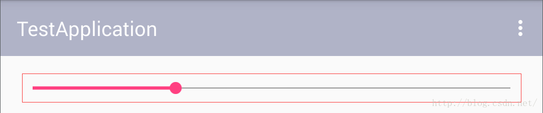
我们可以看到这个控件本身是带有一种风格的,那这个风格在哪里被定义了呢?我们一起来找找:
我们当然需要先去SeeBar的类里面找找有什么关键的信息:
我们在SeeBar的重载构造方法中看到一条有用的信息:
    public SeekBar(Context context, AttributeSet attrs) {
        this(context, attrs, com.android.internal.R.attr.seekBarStyle);
    }
原来奥秘就在com.android.internal.R.attr.seekBarStyle的里面,我们找找去,seekBarStyle位于platform_frameworks_base-master\core\res\res\values\themes.xml文件中,在该文件中可以发现它的定义:
<item name="seekBarStyle">@style/Widget.SeekBar</item>看来它是调用了位于style下的Widget.SeekBar风格,我们再去找找:
    <style name="Widget.SeekBar">
        <item name="indeterminateOnly">false</item>
        <item name="progressDrawable">@drawable/progress_horizontal</item>
        <item name="indeterminateDrawable">@drawable/progress_horizontal</item>
        <item name="minHeight">20dip</item>
        <item name="maxHeight">20dip</item>
        <item name="thumb">@drawable/seek_thumb</item>
        <item name="thumbOffset">8dip</item>
        <item name="focusable">true</item>
        <item name="mirrorForRtl">true</item>
    </style>
我们找到了它的默认风格配置文件,可以看到它的基本属性都在这里了,来一条一条解释一下这些属性是什么意思:
indeterminateOnly 是否只是用于指示功能,很显然SeekBar除了指示还有拖拽,所以这里是false
progressDrawable 用于progress进度的背景色
indeterminateDrawable 用于progress指示进度的背景色
minHeight,maxHeight 两者相等,用于指定进度条的高度
thumb 用于指定滑动按钮的配置
thumbOffset 用于指定滑动按钮的偏移量,默认是8dp
好,主要的属性解释完,我们贴一下progress_horizontal文件中的内容,看看如何给progressBar配置背景色:
<?xml version="1.0" encoding="utf-8"?>
<layer-list xmlns:android="http://schemas.android.com/apk/res/android">
    <item android:id="@id/background"
          android:gravity="center_vertical|fill_horizontal">
        <shape android:shape="rectangle"
               android:tint="?attr/colorControlNormal">
            <size android:height="@dimen/progress_bar_height_material" />
            <solid android:color="@color/white_disabled_material" />
        </shape>
    </item>
    <item android:id="@id/secondaryProgress"
          android:gravity="center_vertical|fill_horizontal">
        <scale android:scaleWidth="100%">
            <shape android:shape="rectangle"
                   android:tint="?attr/colorControlActivated">
                <size android:height="@dimen/progress_bar_height_material" />
                <solid android:color="@color/white_disabled_material" />
            </shape>
        </scale>
    </item>
    <item android:id="@id/progress"
          android:gravity="center_vertical|fill_horizontal">
        <scale android:scaleWidth="100%">
            <shape android:shape="rectangle"
                   android:tint="?attr/colorControlActivated">
                <size android:height="@dimen/progress_bar_height_material" />
                <solid android:color="@color/white" />
            </shape>
        </scale>
    </item>
</layer-list>
这是个标准的布局文件,我们可以看到在它里面定义了这个属性android:gravity="center_vertical|fill_horizontal",在网上我们经常可以看到各种SeekBar的样式里面是没有填写这个属性的,我们如果直接使用就会遇到thumb与progress的中心不在同一水平位置。
最后再贴一下标准的seek_thumb文件:
<?xml version="1.0" encoding="utf-8"?>
<!-- Copyright (C) 2008 The Android Open Source Project

     Licensed under the Apache License, Version 2.0 (the "License");
     you may not use this file except in compliance with the License.
     You may obtain a copy of the License at

          http://www.apache.org/licenses/LICENSE-2.0

     Unless required by applicable law or agreed to in writing, software
     distributed under the License is distributed on an "AS IS" BASIS,
     WITHOUT WARRANTIES OR CONDITIONS OF ANY KIND, either express or implied.
     See the License for the specific language governing permissions and
     limitations under the License.
-->

<!-- This is the thumb on the seek bar. -->
<selector xmlns:android="http://schemas.android.com/apk/res/android">

    <item android:state_pressed="true"
          android:state_window_focused="true"
          android:drawable="@drawable/seek_thumb_pressed" />

    <item android:state_focused="true"
          android:state_window_focused="true"
          android:drawable="@drawable/seek_thumb_selected" />

    <item android:state_selected="true"
          android:state_window_focused="true"
          android:drawable="@drawable/seek_thumb_selected" />

    <item android:drawable="@drawable/seek_thumb_normal" />

</selector>


 1389
1389


 被折叠的 条评论
为什么被折叠?
被折叠的 条评论
为什么被折叠?
 到【灌水乐园】发言


