


闲来无事,下一步在平时中应该考虑如何让页面动起来,增加视觉效果
说一说呼吸灯效果吧,我觉得可以用到,就一个brightness滤镜,用动画动起来。
文字效果,在页面中系统名称处可以使用。让页面看起来更有活力一点。
CSS真是今非昔比了。唉 水一篇吧
视频:
录制视频
GIF图:
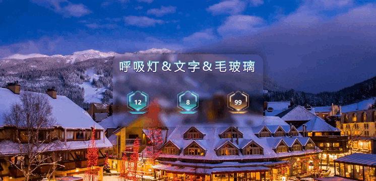
静态图:

<!DOCTYPE html>
<html lang="en">

<head>
    <meta charset="UTF-8">
    <meta http-equiv="X-UA-Compatible" content="IE=edge">
    <meta name="viewport" content="width=device-width, initial-scale=1.0">
    <title>Document</title>
    <style>
        html,
        body,
        #app {
            width: 100%;
            height: 100%;
            margin: 0px;
            padding: 0px;
            background-image: url(./bg.jpg);
            display: flex;
            flex-direction: column;
            justify-content: center;
            align-items: center;
        }

        .title {
            font-size: 60px;
            vertical-align: middle;
            letter-spacing: 0.2em;
            background: -webkit-linear-gradient(#30cfd0, #330867);
            background-clip: text;
            -webkit-background-clip: text;
            -webkit-text-fill-color: #fff;
            -webkit-text-stroke: 6px transparent;
            margin: 20px;
        }

        .container {
            width: 40%;
            height: 40%;
            display: flex;
            flex-direction: column;
            justify-content: center;
            align-items: center;
            border-radius: 40px;
            backdrop-filter: blur(10px);
            box-shadow: 0 0 30px 10px rgba(0, 0, 0, .3);
        }
        .content{
            width: 100%;
            height: 100%;
            display: flex;
            justify-content: space-around;
            align-items: center;
        }

        .item {
            width: 110px;
            height: 116px;
            background-repeat: no-repeat;
            background-size: 100% 100%;
            font-size: 30px;
            font-weight: bold;
            display: flex;
            justify-content: center;
            align-items: center;
            color: #FFF;
        }

        .one {
            background-image: url(./one.png);
            animation: breath_light 3s ease infinite;
        }

        .two {
            background-image: url(./two.png);
            animation: breath_light 3s ease infinite;
        }

        .three {
            background-image: url(./three.png);
            animation: breath_light 3s ease infinite;
        }

        @keyframes breath_light {
            0% {
                filter: brightness(90%);
            }

            50% {
                filter: brightness(220%);


            }

            100% {
                filter: brightness(90%);
            }
        }
    </style>
</head>

<body>
    <div id="app">

        <div class="container">
            <div class="title">呼吸灯&文字&毛玻璃</div>
            <div class="content">
                <div class="item one">12</div>
                <div class="item two">8</div>
                <div class="item three">99</div>
            </div>
        </div>
</body>

</html>
用到的图片资源:


 3904
3904


 被折叠的 条评论
为什么被折叠?
被折叠的 条评论
为什么被折叠?
 到【灌水乐园】发言


