<!DOCTYPE html>
<html lang="en">
<head>
<meta charset="UTF-8">
<meta name="viewport" content="width=device-width, initial-scale=1.0">
<title>Document</title>
</head>
<style>
:root {
--font-1: "Inter", sans-serif;
--font-2: "DM Serif Text", serif;
--font-3: "DM Serif Display", serif;
/* monospace
*/
--font-mono: Consolas, "Andale Mono", Courier, "Courier New", monospace;
}
/* -------------------------------------------------------------------
* ## colors
* ------------------------------------------------------------------- */
:root {
/* color-1(#0A369D)
* color-2(#C1292E)
*/
--color-1: hsla(222, 88%, 33%, 1);
--color-2: hsla(358, 65%, 46%, 1);
/* theme color variations
*/
--color-1-lighter: hsla(222, 88%, 53%, 1);
--color-1-light: hsla(222, 88%, 43%, 1);
--color-1-dark: hsla(222, 88%, 23%, 1);
--color-1-darker: hsla(222, 88%, 13%, 1);
--color-2-lighter: hsla(358, 65%, 66%, 1);
--color-2-light: hsla(358, 65%, 56%, 1);
--color-2-dark: hsla(358, 65%, 36%, 1);
--color-2-darker: hsla(358, 65%, 26%, 1);
/* feedback colors
* color-error(#ffd1d2), color-success(#c8e675),
* color-info(#d7ecfb), color-notice(#fff099)
*/
--color-error: hsla(359, 100%, 91%, 1);
--color-success: hsla(76, 69%, 68%, 1);
--color-info: hsla(205, 82%, 91%, 1);
--color-notice: hsla(51, 100%, 80%, 1);
--color-error-content: hsla(359, 50%, 50%, 1);
--color-success-content: hsla(76, 29%, 28%, 1);
--color-info-content: hsla(205, 32%, 31%, 1);
--color-notice-content: hsla(51, 30%, 30%, 1);
/* shades
* generated using
* Tint & Shade Generator
* (https://maketintsandshades.com/)
*/
--color-black: #000000;
--color-gray-19: #0a0a0a;
--color-gray-18: #141414;
--color-gray-17: #1e1e1e;
--color-gray-16: #282828;
--color-gray-15: #323333;
--color-gray-14: #3b3d3d;
--color-gray-13: #454747;
--color-gray-12: #4f5151;
--color-gray-11: #595b5b;
--color-gray-10: #636565;
--color-gray-9: #737474;
--color-gray-8: #828484;
--color-gray-7: #929393;
--color-gray-6: #a1a3a3;
--color-gray-5: #b1b2b2;
--color-gray-4: #c1c1c1;
--color-gray-3: #d0d1d1;
--color-gray-2: #e0e0e0;
--color-gray-1: #eff0f0;
--color-white: #ffffff;
/* text
*/
--color-text: var(--color-gray-16);
--color-text-dark: var(--color-black);
--color-text-light: var(--color-gray-7);
--color-placeholder: var(--color-gray-7);
/* buttons
*/
--color-btn: var(--color-gray-3);
--color-btn-text: var(--color-black);
--color-btn-hover: var(--color-black);
--color-btn-hover-text: var(--color-white);
--color-btn-primary: var(--color-black);
--color-btn-primary-text: var(--color-white);
--color-btn-primary-hover: var(--color-gray-16);
--color-btn-primary-hover-text: var(--color-white);
--color-btn-stroke: var(--color-black);
--color-btn-stroke-text: var(--color-black);
--color-btn-stroke-hover: var(--color-black);
--color-btn-stroke-hover-text: var(--color-white);
/* others
*/
--color-bg: var(--color-gray-1);
--color-border: #eeeeee;
}
/* -------------------------------------------------------------------
* ## vertical spacing and typescale
* ------------------------------------------------------------------- */
:root {
/* spacing
* base font size: 18px
* vertical space unit : 32px
*/
--base-size: 62.5%;
--base-font-size: 1.8rem;
--space: 3.2rem;
/* vertical spacing
*/
--vspace-0_125: calc(0.125 * var(--space));
--vspace-0_25: calc(0.25 * var(--space));
--vspace-0_5: calc(0.5 * var(--space));
--vspace-0_75: calc(0.75 * var(--space));
--vspace-0_875: calc(0.875 * var(--space));
--vspace-1: calc(var(--space));
--vspace-1_25: calc(1.25 * var(--space));
--vspace-1_5: calc(1.5 * var(--space));
--vspace-1_75: calc(1.75 * var(--space));
--vspace-2: calc(2 * var(--space));
--vspace-2_5: calc(2.5 * var(--space));
--vspace-3: calc(3 * var(--space));
--vspace-3_5: calc(3.5 * var(--space));
--vspace-4: calc(4 * var(--space));
--vspace-4_5: calc(4.5 * var(--space));
--vspace-5: calc(5 * var(--space));
/* type scale
* ratio 1:2 | base: 18px
* -------------------------------------------------------
*
* --text-display-3 = (77.40px)
* --text-display-2 = (64.50px)
* --text-display-1 = (53.75px)
* --text-xxxl = (44.79px)
* --text-xxl = (37.32px)
* --text-xl = (31.10px)
* --text-lg = (25.92px)
* --text-md = (21.60px)
* --text-size = (18.00px) BASE
* --text-sm = (15.00px)
* --text-xs = (12.50px)
*
* -------------------------------------------------------
*/
--text-scale-ratio: 1.2;
--text-size: var(--base-font-size);
--text-xs: calc((var(--text-size) / var(--text-scale-ratio)) / var(--text-scale-ratio));
--text-sm: calc(var(--text-xs) * var(--text-scale-ratio));
--text-md: calc(var(--text-sm) * var(--text-scale-ratio) * var(--text-scale-ratio));
--text-lg: calc(var(--text-md) * var(--text-scale-ratio));
--text-xl: calc(var(--text-lg) * var(--text-scale-ratio));
--text-xxl: calc(var(--text-xl) * var(--text-scale-ratio));
--text-xxxl: calc(var(--text-xxl) * var(--text-scale-ratio));
--text-display-1: calc(var(--text-xxxl) * var(--text-scale-ratio));
--text-display-2: calc(var(--text-display-1) * var(--text-scale-ratio));
--text-display-3: calc(var(--text-display-2) * var(--text-scale-ratio));
/* default button height
*/
--vspace-btn: var(--vspace-2);
}
/* on mobile devices below 600px
*/
@media screen and (max-width: 600px) {
:root {
--base-font-size: 20px;
--space: 2.8rem;
}
}
a {
text-decoration: none;
}
/* -------------------------------------------------------------------
* ## grid variables
* ------------------------------------------------------------------- */
:root {
/* widths for rows and containers
*/
--width-full: 100%;
--width-max: 1200px;
--width-wide: 1400px;
--width-wider: 1600px;
--width-widest: 1800px;
--width-narrow: 1000px;
--width-narrower: 800px;
--width-grid-max: var(--width-max);
/* gutters
*/
--gutter-lg: 2.4rem;
--gutter-md: 2rem;
--gutter-mob: 1rem;
}
.s-header__overlay-close {
font: 0/0 a;
text-shadow: none;
color: transparent;
display: block;
width: 50px;
height: 50px;
margin-left: -25px;
-webkit-transform: scale(0.85);
transform: scale(0.85);
position: absolute;
top: var(--vspace-1);
left: 50%;
}
.s-header__overlay-close:hover {
-webkit-transform: scale(1);
transform: scale(1);
}
.s-header__overlay-close::before,
.s-header__overlay-close::after {
content: '';
display: inline-block;
width: 2px;
height: 24px;
top: 13px;
left: 24px;
background-color: white;
position: absolute;
}
.s-header__overlay-close::before {
-webkit-transform: rotate(45deg);
transform: rotate(45deg);
}
.s-header__overlay-close::after {
-webkit-transform: rotate(-45deg);
transform: rotate(-45deg);
}
/* ===================================================================
* # site header
*
* ------------------------------------------------------------------- */
.s-header {
--header-height: 60px;
--logo-width: 96px;
--logo-height: 24px;
z-index: 100;
background-color: rgba(0, 0, 0, 0.1);
width: 100%;
height: var(--header-height);
border-bottom: 1px solid rgba(255, 255, 255, 0.05);
display: -ms-flexbox;
-ms-flex-align: center;
-webkit-box-align: center;
align-items: center;
position: absolute;
top: 0;
left: 0;
}
.s-header--opaque {
background-color: black;
}
/* -------------------------------------------------------------------
* ## main navigation
* ------------------------------------------------------------------- */
.s-header__navigation {
max-width: 100%;
height: auto;
/* padding: var(--gutter-lg); */
-ms-flex-align: center;
-webkit-box-align: center;
align-items: center;
position: relative;
}
.s-header__nav-wrap {
margin-right: auto;
}
.s-header__nav-wrap .s-header__nav-heading {
font-family: var(--font-1);
font-weight: 400;
font-size: calc(var(--text-size) * 0.7778);
letter-spacing: .4em;
margin-top: var(--vspace-3);
color: rgba(255, 255, 255, 0.5);
text-align: center;
}
.s-header__nav-wrap .s-header__nav-heading,
.s-header__nav-wrap .close-mobile-menu {
display: none;
}
.s-header--opaque .s-header__nav-wrap {
margin: 0 auto;
}
.s-header__nav {
list-style: none;
margin: 0;
padding: 0;
font-family: var(--font-1);
font-weight: 600;
font-size: 1.5rem;
display: flex;
/* 让子元素平均分配宽度 */
justify-content: space-around;
}
.s-header__nav li {
width: 100%;
display: inline-block;
position: relative;
/* padding: 0 1rem; */
text-align: center;
}
/* .s-header__nav li.has-children {
padding-right: 2rem;
} */
.s-header__nav li a {
/* width: 100%; */
display: block;
color: white;
line-height: var(--header-height);
position: relative;
}
.s-header__nav li:hover {
background-color: #000000;
}
/* 下拉箭头 */
/* .s-header__nav li.has-children>a::after {
border-bottom: 1px solid white;
border-right: 1px solid white;
content: '';
display: block;
height: 5px;
width: 5px;
margin-top: -4px;
pointer-events: none;
-webkit-transform-origin: 66% 66%;
transform-origin: 66% 66%;
-webkit-transform: rotate(45deg);
transform: rotate(45deg);
-webkit-transition: all .3s;
transition: all .3s;
position: absolute;
right: -1.2rem;
top: calc(50% + 2px);
} */
.s-header__nav li:hover>a,
.s-header__nav li:focus>a {
color: white;
}
.s-header__nav li:hover li,
.s-header__nav li:focus li {
background: transparent;
}
.s-header__nav li.current>a {
color: white;
font-weight: 300;
}
.s-header__nav li ul {
width: 100%;
z-index: 200;
font-size: 1.4rem;
font-weight: 400;
margin: 0;
padding: 1.8rem 0;
background: #222222;
border-radius: 0 0 4px 4px;
/* 让盒子先沿着y轴缩放到0 也就是隐藏了 */
transform: scaleY(0);
/* 我们需要将盒子从上面滑动下来 设置一下缩放的中心点即可 设置到最上面的中间位置 */
transform-origin: 50% 0;
/* 设置过渡 */
transition: all 0.6s;
/* -webkit-transform: translate3d(0, 15px, 0);
transform: translate3d(0, 15px, 0);
opacity: 0;
visibility: hidden;
-webkit-transition: all .5s;
transition: all .5s; */
position: absolute;
top: calc(100% - 1px);
left: 0;
}
.s-header__nav li ul ul {
position: absolute;
top: 0;
left: 100%;
left: calc(100% + 1px);
border-radius: 0 0 4px 4px;
padding-top: 1.2rem;
}
.s-header__nav li ul li {
display: block;
text-align: left;
padding: 0;
margin: 0;
min-height: 3.2rem;
width: 100%;
}
.s-header__nav li ul li a {
display: block;
white-space: nowrap;
padding: .7rem 3rem .7rem 2rem;
font-family: var(--font-1);
line-height: 1.8rem;
color: rgba(255, 255, 255, 0.7);
}
.s-header__nav li ul li a:hover,
.s-header__nav li ul li a:focus {
color: white;
background: bisque;
}
.s-header__nav li:hover>ul {
transform: scaleY(1);
}
/* -------------------------------------------------------------------
* ## header-toggle
* ------------------------------------------------------------------- */
.s-header__toggle-menu {
display: none;
width: 48px;
height: 48px;
-webkit-transform: translateY(-50%);
transform: translateY(-50%);
position: absolute;
right: 4rem;
top: 50%;
}
.s-header__toggle-menu span {
display: block;
background-color: white;
font: 0/0 a;
text-shadow: none;
color: transparent;
width: 28px;
height: 2px;
margin-top: -1px;
position: absolute;
right: 10px;
top: 50%;
bottom: auto;
left: auto;
}
.s-header__toggle-menu span::before,
.s-header__toggle-menu span::after {
content: '';
width: 100%;
height: 100%;
position: absolute;
background-color: inherit;
left: 0;
}
.s-header__toggle-menu span::before {
top: -10px;
}
.s-header__toggle-menu span::after {
bottom: -10px;
}
@media screen and (max-width: 900px) {
.s-header__nav-wrap {
--color-border: var(--color-gray-1);
z-index: 300;
background-color: black;
opacity: 0;
visibility: hidden;
position: fixed;
top: 0;
left: 0;
right: 0;
bottom: 0;
width: 100%;
height: 100%;
margin: 0;
border: none;
overflow-y: auto;
}
.s-header__nav-wrap .s-header__nav-heading,
.s-header__nav-wrap .close-mobile-menu {
display: block;
}
.s-header__nav {
counter-reset: ctr;
font-family: var(--font-1);
font-weight: 600;
font-size: var(--text-md);
margin: var(--vspace-2_5) 6rem var(--vspace-1);
border-bottom: 1px dotted rgba(255, 255, 255, 0.05);
display: block;
}
/* 下拉箭头 */
.s-header__nav li.has-children>a::after {
border-bottom: 1px solid white;
border-right: 1px solid white;
content: '';
display: block;
height: 5px;
width: 5px;
margin-top: -4px;
pointer-events: none;
-webkit-transform-origin: 66% 66%;
transform-origin: 66% 66%;
-webkit-transform: rotate(45deg);
transform: rotate(45deg);
-webkit-transition: all .3s;
transition: all .3s;
position: absolute;
right: -1.2rem;
top: calc(50% + 2px);
}
.s-header__nav>li::before {
content: counter(ctr, decimal-leading-zero);
counter-increment: ctr;
display: inline;
font-family: var(--font-1);
font-weight: 300;
font-size: var(--text-xs);
color: rgba(255, 255, 255, 0.25);
position: absolute;
left: 0;
top: 18px;
}
.s-header__nav li {
display: block;
padding: 0;
text-align: left;
position: relative;
}
.s-header__nav li ul {
display: none;
position: static;
-webkit-box-shadow: none;
box-shadow: none;
-webkit-transform: translate3d(0, 0, 0);
transform: translate3d(0, 0, 0);
opacity: 1;
visibility: visible;
background-color: transparent;
padding: 0 0 2rem 0;
-webkit-transition: none !important;
transition: none !important;
}
.s-header__nav li.has-children>a::after {
top: 25px;
}
.s-header__nav li.has-children>a.sub-menu-is-open::after {
-webkit-transform: rotate(225deg);
transform: rotate(225deg);
}
.s-header__nav li ul li a {
padding: .8rem 1.6rem .8rem 2.8rem;
}
.s-header__nav li.current a {
font-weight: 600;
}
.s-header__nav>li {
border-top: 1px dotted rgba(255, 255, 255, 0.05);
}
.s-header__nav>li a {
line-height: 50px;
padding-left: 2.6rem;
}
.s-header__toggle-menu {
display: block;
}
body.nav-wrap-is-visible {
overflow: hidden;
}
.nav-wrap-is-visible .s-header__nav-wrap {
opacity: 1;
visibility: visible;
}
}
@media screen and (max-width: 600px) {
.s-header__toggle-menu {
right: 2.8rem;
}
}
@media screen and (max-width: 500px) {
.s-header__nav {
margin: var(--vspace-2_5) 4rem var(--vspace-1);
}
}
@media screen and (max-width: 400px) {
.s-header__nav-wrap .s-header__nav-heading {
font-size: calc(var(--text-size) * 0.7778);
}
.s-header__nav>li::before {
top: 1.4em;
}
.s-header__nav li.has-children>a::after {
top: var(--vspace-1);
}
.s-header__nav>li a {
line-height: calc(var(--vspace-2) + var(--vspace-0_125));
}
.s-header__toggle-menu {
right: 2rem;
}
}
@media screen and (max-width: 360px) {
.s-header__nav {
margin: var(--vspace-2_5) 2.8rem var(--vspace-1);
}
}
</style>
<body>
<script src="/lib/jquery-3.4.1/jquery-3.4.1.min.js"></script>
<div class="s-header">
<div class="row s-header__navigation">
<nav class="s-header__nav-wrap">
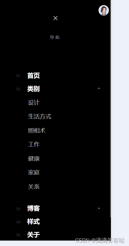
<h3 class="s-header__nav-heading h6">导航</h3>
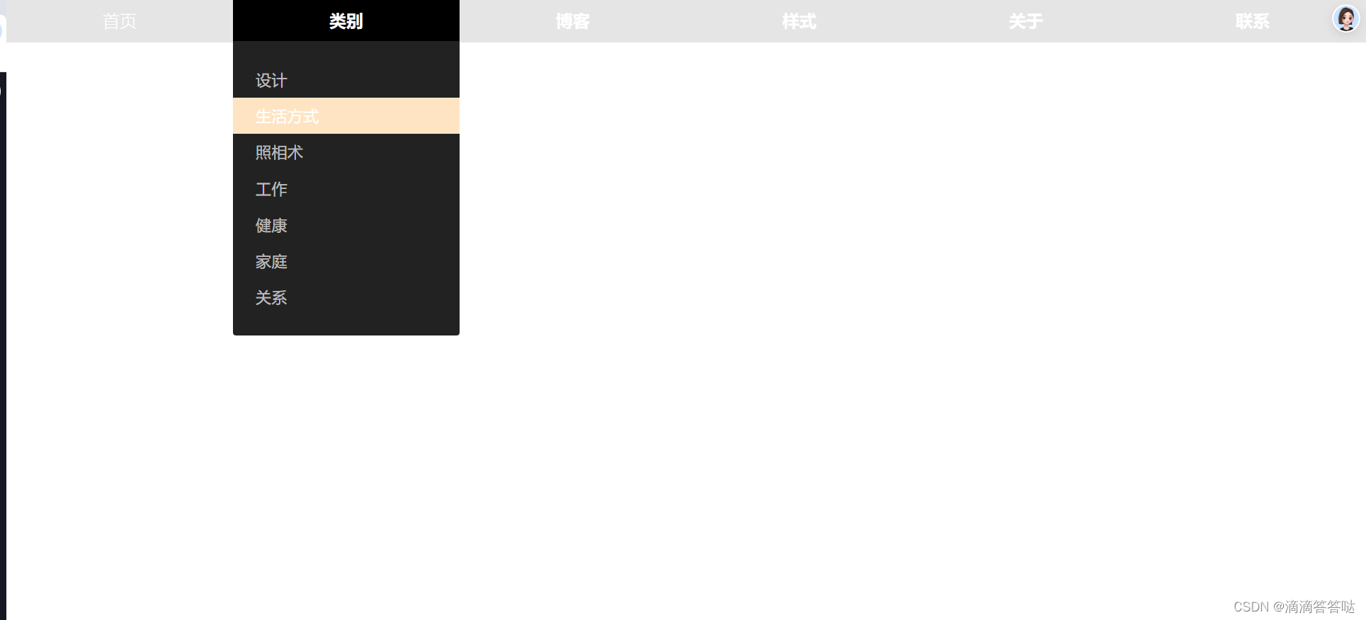
<ul class="s-header__nav">
<li class="current"><a href="index.html" title="">首页</a></li>
<li class="has-children">
<a href="#0" title="">类别</a>
<ul class="sub-menu">
<li><a href="styles.html">设计</a></li>
<li><a href="category.html">生活方式</a></li>
<li><a href="category.html">照相术</a></li>
<li><a href="category.html">工作</a></li>
<li><a href="category.html">健康</a></li>
<li><a href="category.html">家庭</a></li>
<li><a href="category.html">关系</a></li>
</ul>
</li>
<li class="has-children">
<a href="#0" title="">博客</a>
<ul class="sub-menu">
<li><a href="single-video.html">视频帖子</a></li>
<li><a href="single-audio.html">音频帖子</a></li>
<li><a href="single-standard.html">标准岗位</a></li>
</ul>
</li>
<li><a href="styles.html" title="">样式</a></li>
<li><a href="about.html" title="">关于</a></li>
<li><a href="contact.html" title="">联系</a></li>
</ul>
<a href="#0" title="Close Menu" class="s-header__overlay-close close-mobile-menu">Close</a>
</nav>
</div>
<a class="s-header__toggle-menu" href="#0" title="Menu"><span>Menu</span></a>
<script>
const $navWrap = $('.s-header__nav-wrap');
const $closeNavWrap = $navWrap.find('.s-header__overlay-close');
const $menuToggle = $('.s-header__toggle-menu');
const $siteBody = $('body');
$menuToggle.on('click', function (e) {
e.preventDefault();
e.stopPropagation();
$siteBody.addClass('nav-wrap-is-visible');
});
$closeNavWrap.on('click', function (e) {
e.preventDefault();
e.stopPropagation();
if ($siteBody.hasClass('nav-wrap-is-visible')) {
$siteBody.removeClass('nav-wrap-is-visible');
}
});
$('.s-header__nav .has-children').children('a').on('click', function (e) {
e.preventDefault();
if ($(".close-mobile-menu").is(":visible") == true) {
$(this).toggleClass('sub-menu-is-open')
.next('ul')
.slideToggle(200)
.end()
.parent('.has-children')
.siblings('.has-children')
.children('a')
.removeClass('sub-menu-is-open')
.next('ul')
.slideUp(200);
}
});
</script>
</div>
</body>
</html>


 扫一扫
扫一扫


 被折叠的 条评论
为什么被折叠?
被折叠的 条评论
为什么被折叠?
 到【灌水乐园】发言


