


众所周知,如果id重复的话 echarts调用会只渲染一个,所以就需要用父组件传参进入,多穿穿参就能少写几个重复的
调用-记得父组件给宽高
<sankeyEcharts echartsId="cptppSankeyLeft" />
import sankeyEcharts from "./components/sankeytemplate";
 components: {
    sankeyEcharts,
  },
子组件-
屏幕发生变化后resize(),占满整个div
<template>
  <div class="sankeyEcharts" :id="echartsId"></div>
</template>
<script>
export default {
  name: "",
  components: {},
  mixins: [],
  props: ["echartsId"],
  data() {
    return {
      chart: "",
    };
  },
  computed: {},
  watch: {},
  mounted() {
    this.getEcharts();
    window.addEventListener("resize", () => {
      this.chart.resize();//监测浏览器的分辨率变化,重新加载echarts
    });
  },
  methods: {
    getEcharts() {
      console.log(this.echartsId);
      // console.log(this.$echarts);
      // 指定 echarts 图表初始化的容器
      this.chart = this.$echarts.init(
        document.querySelector(`#${this.echartsId}`)
      );
      var options = {
      tooltip: {
          trigger: "item",
          triggerOn: "mousemove",//鼠标悬浮
          confine: true,//是否将 tooltip 框限制在图表的区域内。当图表外层的 dom 被设置为 'overflow: hidden',或者移动端窄屏,导致 tooltip 超出外界被截断时,此配置比较有用。
          formatter: function (params) {
          return value
			}
        },
        series: {
          type: "sankey",
          top: "10",
          bottom: "10",
          left: "0",
          right: '20',
          layout: "none",
          // nodeGap: 8,//每个数据项的间距
          // nodeWidth: 15,
          // orient: "horizontal",//数据走向,从上到下和从左到右
          focusNodeAdjacency: "allEdges",//不知道干啥用,没搜到
          emphasis: {
            focus: "adjacency",//不知道干啥用,没搜到
          },
          layoutIterations: 32,//布局的迭代次数,目的是不断迭代优化图中节点和边的位置,以减少节点和边之间的相互遮盖,默认值是 32。如果希望图中节点的顺序是按照原始 data 中的顺序排列的,可设该值为 0。
          //这个可以试一试,效果很不一样
          data: [
            {
              name: "a",
            },
            {
              name: "b",
            },
            {
              name: "a1",
            },
            {
              name: "a2",
            },
            {
              name: "b1",
            },
            {
              name: "c",
              label: {
          		normal: {
            	position: 'left',//这里可以设某项的显示是在左边还是右边,默认右边
            	// textBorderWidth: 1,
            	}
              },
              itemStyle: {
           	 normal: {
              color: 'red',//给单独一个节点设置颜色
          	  },
         	 },
          	},
        },
        itemStyle: {
          normal: {
            color: '设置颜色的',
          },
        },
            },
          ],
          links: [
            {
              source: "a",
              target: "a1",
              value: 5,
            },
            {
              source: "a",
              target: "a2",
              value: 3,
            },
            {
              source: "b",
              target: "b1",
              value: 8,
            },
            {
              source: "a",
              target: "b1",
              value: 3,
            },
            {
              source: "b1",
              target: "a1",
              value: 1,
            },
            {
              source: "b1",
              target: "c",
              value: 2,
            },
          ],
          itemStyle: {
          //边框的样式,下面是不显示边框
            normal: {
              borderWidth: 1,
              borderColor: "transparent",
            },
          },
        },
      };
      // 渲染 echarts
      this.chart.setOption(options, true);
    },
  },
};
</script>
<style lang="scss" scoped>
.sankeyEcharts {
  width: 100%;
  height: 100%;
  // background: red;
}
</style>
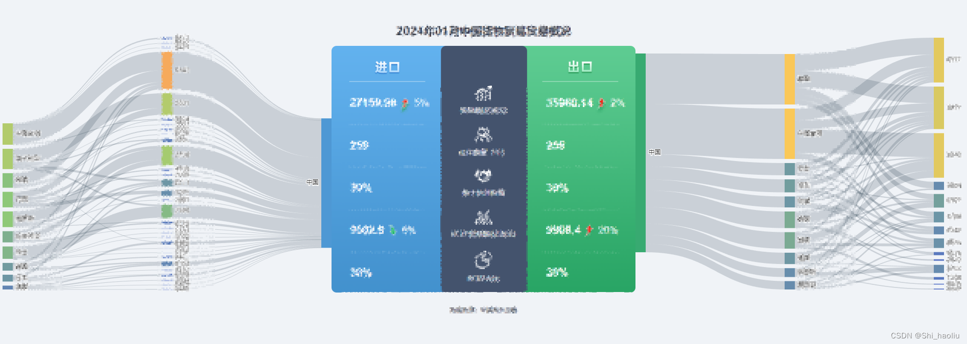
最终实现了是左右各一个桑基图,这段代码有个特殊处理的地方就是,如果在左边,那么左边的那个中国的label就是在左边显示的。颜色同理


 被折叠的 条评论
为什么被折叠?
被折叠的 条评论
为什么被折叠?
 到【灌水乐园】发言


