React Native 控件之 Modal 详解 - Android/iOS 双平台通用

今天我们来看一下React Native控件Modal具体介绍以及实际使用方法,该适配Android、iOS双平台。

刚创建的React Native技术交流4群( 458982758 ),欢迎各位大牛,React Native技术爱好者加入交流!同时博客右侧欢迎微信扫描关注订阅号,移动技术干货,精彩文章技术推送!

Modal视图在iOS原生开发中熟称:"模态视图",Modal进行封装之后,可以弹出来覆盖包含React Native跟视图的原生界面(例如:UiViewControllView,Activity)。在使用React Native开发的混合应用中使用Modal组件,该可以让你使用RN开发的内功呈现在原生视图的上面。

如果你使用React Native开发的应用,从跟视图就开始开发起来了,那么你应该是Navigator导航器进行控制页面弹出,而不是使用Modal模态视图。通过顶层的Navigator,你可以使用configureScene属性进行控制如何在你开发的App中呈现一个Modal视图。

(二)属性方法

1.animated bool  控制是否带有动画效果

2.onRequestClose  Platform.OS==='android'? PropTypes.func.isRequired : PropTypes.func

3.onShow function方法

4.transparent bool  控制是否带有透明效果

5.visible  bool 控制是否显示

(三)实例

上面我们已经对于Modal组件做了相关介绍,下面我们使用一个实例具体来演示一下Modal组件的基本用法。首先来看一下具体代码:

/**
 * Sample React Native App
 * https://github.com/facebook/react-native
 * @flow
 */

import React, {
  AppRegistry,
  Component,
  StyleSheet,
  Text,
  View,
  TouchableHighlight,
  Modal,
  Switch,
} from 'react-native';

class Button extends React.Component {
  constructor(props){
    super(props);
    this.state={
      active: false,
    };
    this._onHighlight = this.onHighlight.bind(this);
    this._onUnhighlight = this.onUnhighlight.bind(this);
  }

  onHighlight() {
    this.setState({active: true,});
  }

  onUnhighlight() {
    this.setState({active: false,});
  }

  render() {
    var colorStyle = {
      color: this.state.active ? '#fff' : '#000',
    };
    return (
      <TouchableHighlight
        onHideUnderlay={this._onUnhighlight}
        onPress={this.props.onPress}
        onShowUnderlay={this._onHighlight}
        style={[styles.button, this.props.style]}
        underlayColor="#a9d9d4">
          <Text style={[styles.buttonText, colorStyle]}>{this.props.children}</Text>
      </TouchableHighlight>
    );
  }
}

class ModalDemo extends Component {
  constructor(props){
    super(props);
    this.state={
      animationType: false,
      modalVisible: false,
      transparent: false,

    };
    this._toggleTransparent = this.toggleTransparent.bind(this);
  }

  _setModalVisible(visible) {
    this.setState({modalVisible: visible});
  }

  _setAnimationType(type) {
    this.setState({animationType: type});
  }

  toggleTransparent() {
    this.setState({transparent: !this.state.transparent});
  }

  render() {
     const modalBackgroundStyle = {
      backgroundColor: this.state.transparent ? 'rgba(0, 0, 0, 0.5)' : '#f5fcff',
     }
     const innerContainerTransparentStyle = this.state.transparent
      ? {backgroundColor: 'red', padding: 20}
      : null

   return (
      <View style={{paddingTop:20,paddingLeft:10,paddingRight:10}}>
        <Text style={{color:'red'}}>Modal实例演示</Text>
        <Modal
          animated={this.state.animationType}
          transparent={this.state.transparent}
          visible={this.state.modalVisible}
          onRequestClose={() => {this._setModalVisible(false)}}
          >
          <View style={[styles.container, modalBackgroundStyle]}>
            <View style={[styles.innerContainer, innerContainerTransparentStyle]}>
              <Text>Modal视图被显示:{this.state.animationType === false ? '没有' : '有',this.state.animationType}动画效果.</Text>
              <Button
                onPress={this._setModalVisible.bind(this, false)}
                style={styles.modalButton}>
                  关闭Modal
              </Button>
            </View>
          </View>
        </Modal>
        <View style={styles.row}>
          <Text style={styles.rowTitle}>动画类型</Text>
          <Button onPress={this._setAnimationType.bind(this,false)} style={this.state.animationType === false ? {backgroundColor:'red'}: {}}>
            无动画
          </Button>
          <Button onPress={this._setAnimationType.bind(this, true)} style={this.state.animationType === true ? {backgroundColor:'yellow'} : {}}>
            滑动效果
          </Button>
        </View>

        <View style={styles.row}>
          <Text style={styles.rowTitle}>透明</Text>
          <Switch value={this.state.transparent} onValueChange={this._toggleTransparent} />
        </View>

        <Button onPress={this._setModalVisible.bind(this, true)}>
            显示Modal
        </Button>
      </View>
    )}
  }

const styles = StyleSheet.create({
  container: {
    flex: 1,
    justifyContent: 'center',
    padding: 20,
  },
  innerContainer: {
    borderRadius: 10,
    alignItems: 'center',
  },
  row: {
    alignItems: 'center',
    flex: 1,
    flexDirection: 'row',
    marginBottom: 20,
  },
  rowTitle: {
    flex: 1,
    fontWeight: 'bold',
  },
  button: {
    borderRadius: 5,
    flex: 1,
    height: 44,
    alignSelf: 'stretch',
    justifyContent: 'center',
    overflow: 'hidden',
  },
  buttonText: {
    fontSize: 18,
    margin: 5,
    textAlign: 'center',
  },
  modalButton: {
    marginTop: 10,
  },
});

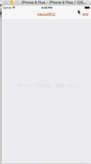
AppRegistry.registerComponent('ModalDemo', () => ModalDemo);

运行效果如下:

iOS平台运行效果

Android平台运行效果:


React Native学习之Modal控件自定义弹出View

RN学习,好多知识都懒得写,趁今天有空,来一发吧,Modal控件的一个小demo;参考文章地址:http://reactnative.cn/docs/0.27/modal.html#content

Modal组件可以用来覆盖包含React Native根视图的原生视图(如UIViewController,Activity)。

在嵌入React Native的混合应用中可以使用Modal。Modal可以使你应用中RN编写的那部分内容覆盖在原生视图上显示。
下面是代码:

[html]  view plain  copy
  在CODE上查看代码片 派生到我的代码片
  1. //  HomePage  
  2. //  功能: 该类的作用  
  3. //  Created by 小广 on  2016-06-12 上午.  
  4. //  Copyright © 2016年  All rights reserved.  
  5.   
  6. 'use strict';  
  7. import React, { Component } from 'react';  
  8. import {  
  9.   View,  
  10.   Text,  
  11.   Image,  
  12.   Modal,  
  13.   Navigator,  
  14.   TextInput,  
  15.   ScrollView,  
  16.   StyleSheet,  
  17.   Dimensions,  
  18.   TouchableHighlight,  
  19. } from 'react-native';  
  20. import NavigatorBar from '../tools/navigator'  
  21. var { width, height, scale } = Dimensions.get('window');  
  22. // 类  
  23. export default class HomePage extends Component {  
  24.   // 构造函数  
  25.   constructor(props) {  
  26.     super(props);  
  27.     this.state = {  
  28.       show:false,  
  29.     };  
  30.   }  
  31.   
  32.   // 加载完成  
  33.   componentDidMount(){  
  34.     //  
  35.   }  
  36.   
  37.   // view卸载  
  38.   componentWillUnmount(){  
  39.     //  
  40.   }  
  41.   
  42.   // 自定义方法区域  
  43.   // your method  
  44.   _leftButtonClick() {  
  45.   
  46.   }  
  47.   _rightButtonClick() {  
  48.     //  
  49.     console.log('右侧按钮点击了');  
  50.     this._setModalVisible();  
  51.   }  
  52.   
  53.   // 显示/隐藏 modal  
  54.   _setModalVisible() {  
  55.     let isShow = this.state.show;  
  56.     this.setState({  
  57.       show:!isShow,  
  58.     });  
  59.   }  
  60.   
  61.   // 绘制View  
  62.   render() {  
  63.      return (  
  64.        <View style={styles.container}>  
  65.          <NavigatorBar  
  66.            title='Modal测试'  
  67.            titleTextColor='#F2380A'  
  68.            rightItemTitle='按钮'  
  69.            rightTextColor='#F2380A'  
  70.            rightItemFunc={this._rightButtonClick.bind(this)} />  
  71.          <Modal  
  72.            animationType='slide'  
  73.            transparent={true}  
  74.            visible={this.state.show}  
  75.            onShow={() => {}}  
  76.            onRequestClose={() => {}} >  
  77.            <View style={styles.modalStyle}>  
  78.              <View style={styles.subView}>  
  79.                <Text style={styles.titleText}>  
  80.                  提示  
  81.                </Text>  
  82.                <Text style={styles.contentText}>  
  83.                  Modal显示的View 多行了超出一行了会怎么显示,就像这样显示了很多内容该怎么显示,看看效果  
  84.                </Text>  
  85.                <View style={styles.horizontalLine} />  
  86.                <View style={styles.buttonView}>  
  87.                  <TouchableHighlight underlayColor='transparent'  
  88.                    style={styles.buttonStyle}  
  89.                    onPress={this._setModalVisible.bind(this)}>  
  90.                    <Text style={styles.buttonText}>  
  91.                      取消  
  92.                    </Text>  
  93.                  </TouchableHighlight>  
  94.                  <View style={styles.verticalLine} />  
  95.                  <TouchableHighlight underlayColor='transparent'  
  96.                    style={styles.buttonStyle}  
  97.                    onPress={this._setModalVisible.bind(this)}>  
  98.                    <Text style={styles.buttonText}>  
  99.                      确定  
  100.                    </Text>  
  101.                  </TouchableHighlight>  
  102.                </View>  
  103.              </View>  
  104.            </View>  
  105.         </Modal>  
  106.        </View>  
  107.      );  
  108.   }  
  109.   
  110. }  
  111. // Modal属性  
  112. // 1.animationType bool  控制是否带有动画效果  
  113. // 2.onRequestClose  Platform.OS==='android'? PropTypes.func.isRequired : PropTypes.func  
  114. // 3.onShow function方法  
  115. // 4.transparent bool  控制是否带有透明效果  
  116. // 5.visible  bool 控制是否显示  
  117.   
  118. // css样式  
  119. var styles = StyleSheet.create({  
  120.   container:{  
  121.     flex:1,  
  122.     backgroundColor: '#ECECF0',  
  123.   },  
  124.   // modal的样式  
  125.   modalStyle: {  
  126.     // backgroundColor:'#ccc',  
  127.     alignItems: 'center',  
  128.     justifyContent:'center',  
  129.     flex:1,  
  130.   },  
  131.   // modal上子View的样式  
  132.   subView:{  
  133.     marginLeft:60,  
  134.     marginRight:60,  
  135.     backgroundColor:'#fff',  
  136.     alignSelf: 'stretch',  
  137.     justifyContent:'center',  
  138.     borderRadius: 10,  
  139.     borderWidth: 0.5,  
  140.     borderColor:'#ccc',  
  141.   },  
  142.   // 标题  
  143.   titleText:{  
  144.     marginTop:10,  
  145.     marginBottom:5,  
  146.     fontSize:16,  
  147.     fontWeight:'bold',  
  148.     textAlign:'center',  
  149.   },  
  150.   // 内容  
  151.   contentText:{  
  152.     margin:8,  
  153.     fontSize:14,  
  154.     textAlign:'center',  
  155.   },  
  156.   // 水平的分割线  
  157.   horizontalLine:{  
  158.     marginTop:5,  
  159.     height:0.5,  
  160.     backgroundColor:'#ccc',  
  161.   },  
  162.   // 按钮  
  163.   buttonView:{  
  164.     flexDirection: 'row',  
  165.     alignItems: 'center',  
  166.   },  
  167.   buttonStyle:{  
  168.     flex:1,  
  169.     height:44,  
  170.     alignItems: 'center',  
  171.     justifyContent:'center',  
  172.   },  
  173.   // 竖直的分割线  
  174.   verticalLine:{  
  175.     width:0.5,  
  176.     height:44,  
  177.     backgroundColor:'#ccc',  
  178.   },  
  179.   buttonText:{  
  180.     fontSize:16,  
  181.     color:'#3393F2',  
  182.     textAlign:'center',  
  183.   },  
  184. });  


注意:NavigatorBar是我自定义的一个View,充当导航条,你可以将其换成一个按钮就行了;
效果如图:


评论
添加红包

请填写红包祝福语或标题

红包个数最小为10个

红包金额最低5元

当前余额3.43前往充值 >
需支付:10.00
成就一亿技术人!
领取后你会自动成为博主和红包主的粉丝 规则
hope_wisdom
发出的红包
实付
使用余额支付
点击重新获取
扫码支付
钱包余额 0

抵扣说明:

1.余额是钱包充值的虚拟货币,按照1:1的比例进行支付金额的抵扣。
2.余额无法直接购买下载,可以购买VIP、付费专栏及课程。

余额充值