


之前的文章# 手把手,如何搭建一个通用组件库,并发布到npm?搭建了一个简单的组件库框架,并发布到了npm。
在文章结果也留了几个个坑,
1.没有样式
2.文档系统也没有
3.组件也不能按需加载
我们今天来一一解决。
样式系统
搭建之前,先来看看element-plus的样式。
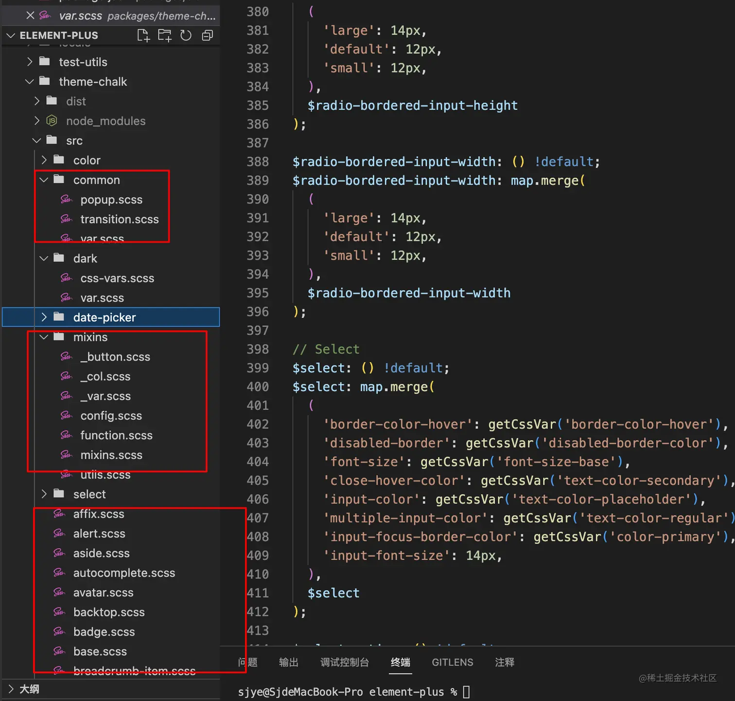
主要分为几个部分,公共样式,混入函数,每个组件对应的样式。
我看了其他几个库,也大概是这种模式。
先看一下var_scss文件。

通过map定义选项,然后通过map.get来获取对应的值,具体的样式,通过各种函数来进行计算。

大概思路有了,就来搭建我们自己的样式。
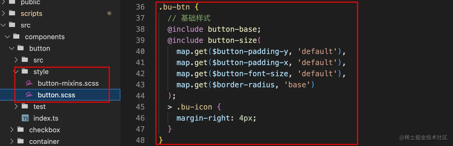
首先是全局样式,以及公用样式。
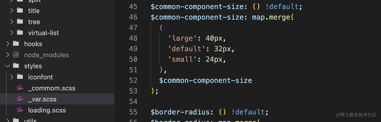
具体的组件样式跟函数,我放在组件同级目录中。
文档系统
文档系统用的是vitepress。
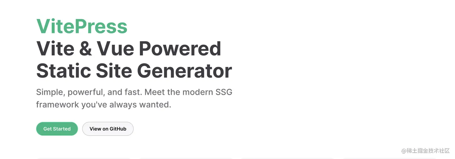
相比于老大哥vuepress。
vitepress跟vite兼容会更好一些,更轻量一些,但是毕竟比较新,可能坑也会多一些。大家可自行选择。
快速上手,我就不介绍了,官方有详细的说明。
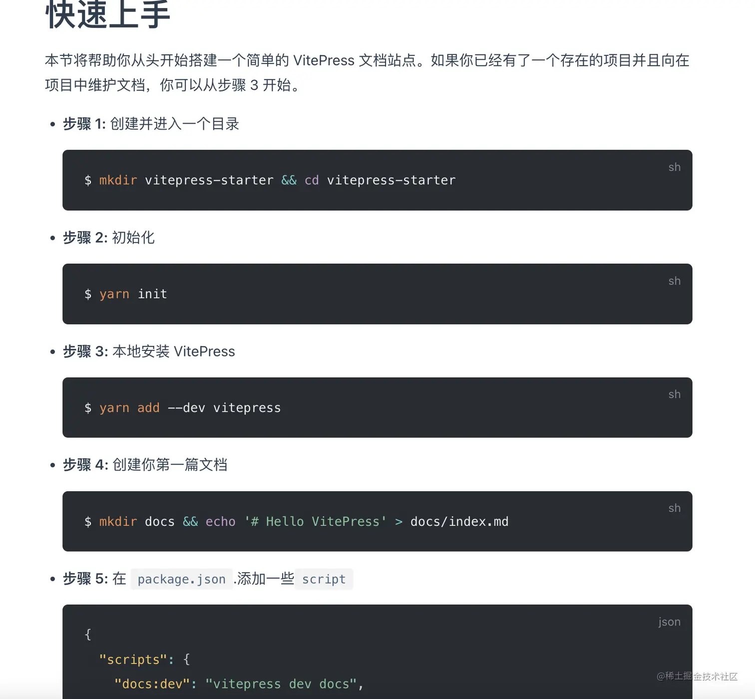
安装好了之后,项目跑起来,就能看到一个简单的文档了。
现在我们就可以直接md在上面写vue语法了。
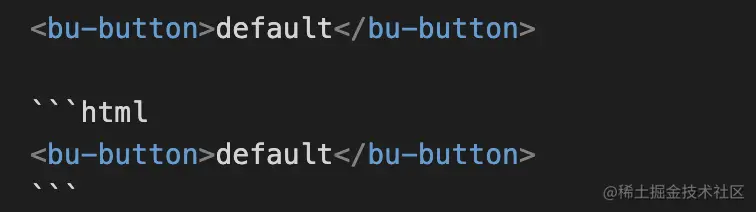
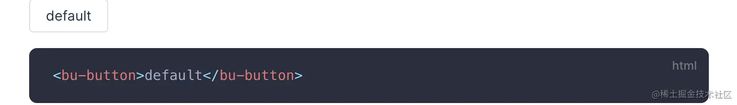
并不是很方便,对吧——button需要写两次
我们希望的是写一次,既有效果,又能展示代码片段。

所以,引入一个插件——vitepress-theme-demoblock。
  markdown: {
    config(md) {
      // 这里可以使用markdown-it插件
      md.use(demoBlockPlugin, {
        scriptImports: ["import * as bubuUI from '@/index'"],
        scriptReplaces: [
          {
            searchValue: /import ({.*}) from 'bubu-ui'/g,
            replaceValue: (s, s1) => `const ${s1} = bubuUI`,
          },
        ],
      });
    },
  },
复制代码
scriptImports里面的配置是将doc文档中的import引入替换成本地文件,这样打包之后就不需要做修改了。开发时请求本地文件,打包后使用npm版本。
注意:vitepress-theme-demoblock插件暂不支持vue3.2.44以后得setup写法。需要使用defineComponent写法,且引入库需要使用单引号。
参考如下。
<template>
  <bu-checkbox v-model="val" label="A"></bu-checkbox>
</template>
<script lang="ts">
import { defineComponent, ref } from 'vue';
export default defineComponent({
  setup() {
    const val = ref(false);
    return {
      val,
    };
  },
});
</script>
复制代码
docs的详细请求,大家可以看一下官方文档。
我当时是直接拷贝了vitepress官网上的配置,然后修改侧边栏菜单。
配置好的文档长这样。

按需打包
我们使用ui库一般有2种方式。
一种是全局引入。
import BuBuUI from "bubu-ui"

app.use(BuBuUI)

复制代码
另一种是按需引入。
我们就只管用,不需要管引入的问题,比如我用bu-button,就自动到对应的包中去拿组件。
import BuButton from "bubu-ui/components/button"

app.use(BuButton)

复制代码
所以我们需要,把组件单独打包出来。
我们自己写一个脚本,通过vite的buid方法来构建。
import { defineConfig, build } from 'vite';

build({
   build: {
       // 配置跟vite.config.ts文件基本相同
   }
})

复制代码
这个只是全局打包,还需要多走一步,就是遍历components文件夹的组件,找到index.ts入口文件,重新执行一遍build打包。
打包出来的文件如下,components中的就是单独打出来的组件包。

到这里,还有个问题,ts文件在src/components中,而打包出来的子组件,在components中。(如果打包的时候指定一样的目录,会相互覆盖)
我的解决方案就是写了个拷贝函数,直接把components下的组件,直接拷贝到src/components中。如果哪位大佬有比较优雅的方式,欢迎指正留言,感谢感谢。
  // 如果目标文件夹不存在,创建目标文件夹
  if (!fse.existsSync(destPath)) {
    fse.mkdirSync(destPath);
  }

  let files;
  // 读取源文件夹下的所有文件和子文件夹
  try {
    files = fse.readdirSync(srcPath);
  } catch (err) {
    return;
  }

  // 遍历所有文件和子文件夹
  files.forEach((file) => {
    // 拼接文件路径
    const srcFilePath = join(srcPath, file);
    const destFilePath = join(destPath, file);

    // 如果是文件夹,递归复制文件夹
    if (fse.statSync(srcFilePath).isDirectory()) {
      copyFolder(srcFilePath, destFilePath);
    } else {
      // 如果是文件,复制文件
      fse.copyFileSync(srcFilePath, destFilePath);
    }
  });
复制代码
现在单独的组件包也有了,还差最后一步。
按需引入
安装unplugin-vue-components,这也是element-plus用的方案。
配置替换规则。
    Components({
      dts: true,
      resolvers: [
        (componentName) => {
          if (componentName.startsWith('Bu')) {
            return { name: componentName, from: `bubu-ui/src/components/${componentName.slice(2)}` }
          }
        }
      ]
    })

复制代码
作用就是,如果有组件是以Bu开头的,就从ui库的src/components下引入组件。然后通过vue的components方法注册组件。
<template>
  <BuButton type="primary">nihao</BuButton>
</template>
复制代码
以上的组件使用方式,就相当于如下写法
<template>
  <BuButton type="primary">nihao</BuButton>
</template>
<script lang="ts">
import { defineComponent } from "vue"
import { BuButton } from "bubu-ui/src/components/button"
defineComponent({
  components: {
    BuButton
  }
})
</script>
复制代码
总结
到这里,一个通用的组件库基本算是搭建完成了,也能发布上线使用了。
但是要真正封装出一个好用的ui组件库,还是有很多细节需要实现。
举几个例子
1.element-plus支持手动按需导入
<template>
  <ElButton type="primary">nihao</ElButton>
</template>
<script lang="ts">
import { ElButton } from "element-plus"
</script>
复制代码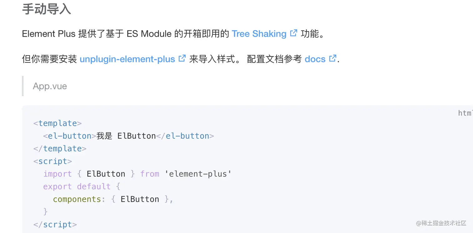
他的入口文件,并没有把每个组件都打包进去。
这个有大佬知道怎么弄的,也欢迎联系我,感谢。
2.组件开发过程中的相互引用
在组件开发过程中,如果存在组件相互引用,那么我们最好的方式是开发的时候引用本地,打包上线的时候引用的是对应的模块。
这个就涉及到包模块管理了。
3.element-plus的类型封装
element支持如下2种使用方式,又能当插件,又能当组件。
// 1
import { ElButton } from "element-plus"
app.use(ElButton)

// 2
import { ElButton } from "element-plus"
app.component(ElButton)
复制代码
在element-plus中,在组件上添加了一个install方法,导出的均为组件本身。

先到这吧。
后续如果有新的感悟,或者对架构有新的思考再分享。


 432
432


 被折叠的 条评论
为什么被折叠?
被折叠的 条评论
为什么被折叠?
 到【灌水乐园】发言


