


介绍:http://www.jianshu.com/p/076ca28f7012
这是一款结合了alert弹出框与confirm弹出框综合的一款组件,可以定义参数改变弹出框的样式以及点击事件等
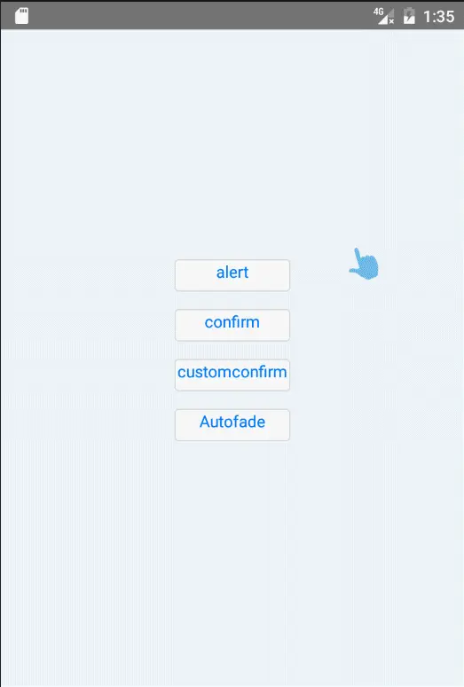
展示:
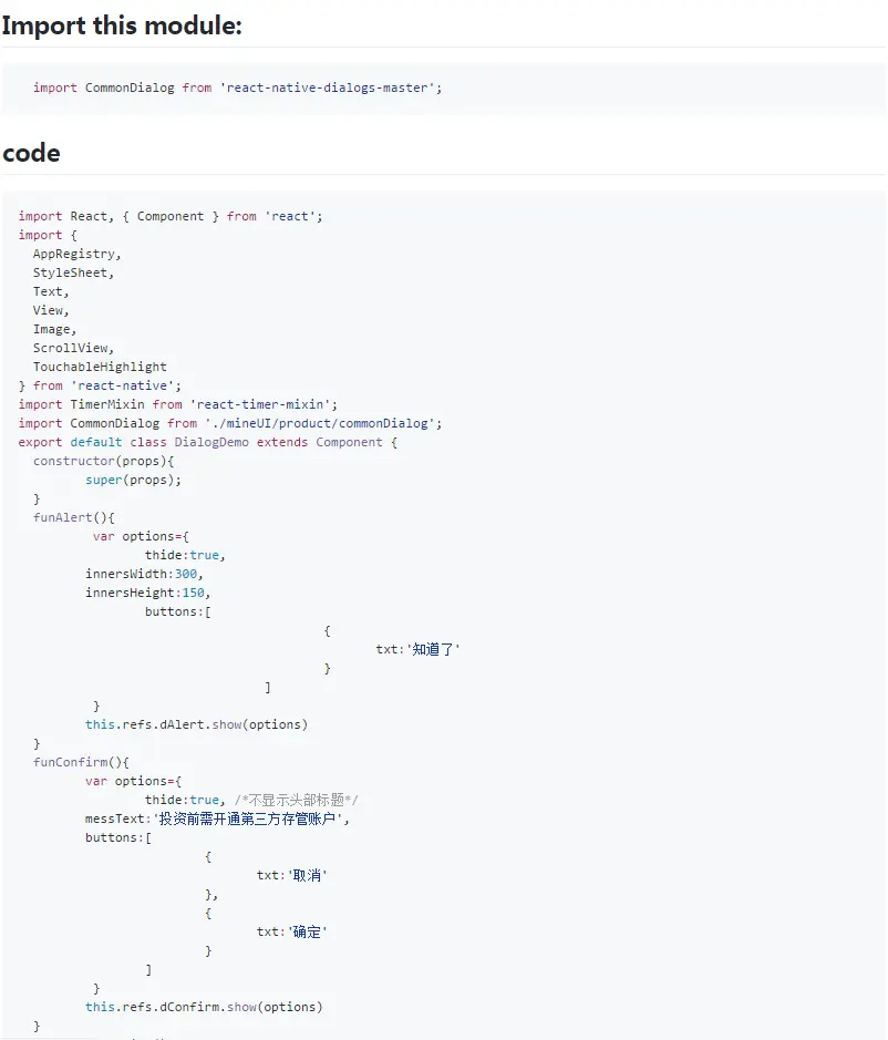
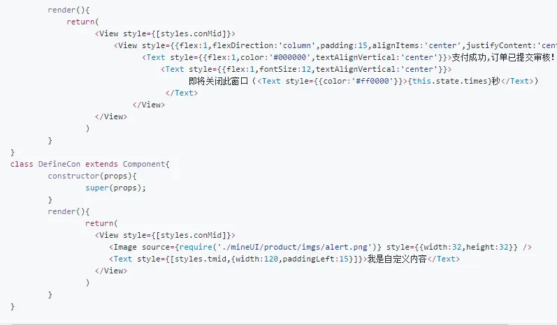
使用代码:


自定义参数:
/**
* animationType:动画类型 使用Modal组件 ’none,fade,slide‘ ---string
* title:头部标题文字 ---string
* thide:true|false 是否隐藏头部 ---boolean
* headStyle:头部样式 ---object
* messText:中间提示文字 ---string
* clickScreen:点击屏幕是否隐藏弹出框 ---boolean
* innersWidth:弹出框的宽度 ---number
* innersHeight:弹出框的高度 ---number
* buttons:按钮数组 ---array
* buttons:[
* {
* txt:'按钮文字', ---string
* btnStyle:{backgroundColor:'transparent'}, 按钮的样式对象---object
* txtStyle:{color:'#ff6600'}, 按钮的文字样式 ---object
* onpress:this.cancels.bind(this) 按钮的点击事件 ---function
* }
* ...
* ]
*/
事件:
show(options):显示
hide(): 隐藏


 835
835

 被折叠的 条评论
为什么被折叠?
被折叠的 条评论
为什么被折叠?
 到【灌水乐园】发言


