


1.第一种
利用margin,div1的宽减去div2的宽就是div2margin-left的数值:(100-40)/2=30
div1的高减去div2的高就是div2margin-top的数值:(100-40)/2=30
按 Ctrl+C 复制代码
<!DOCTYPE html>
<html>
    <head>
        <meta charset="UTF-8">
        <title>demo</title>
    </head>
    <body>
        <style type="text/css">
            .div1{  width: 100px; height: 100px; border: 1px solid #000000;}
            .div2{ width:40px ; height: 40px; background-color: green;}
            .div22{
                margin-left: 30px;margin-top: 30px;
            }
        </style>
        <div class="div1">
            <div class="div2 div22">
            </div>
        </div>
    </body>
</html>
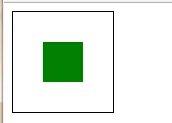
第一种
第2种
利用css的 position属性,把div2相对于div1的top、left都设置为50%,然后再用margin-top设置为div2的高度的负一半拉回来,用marg-left设置为宽度的负一半拉回来,css如下设置
<!DOCTYPE html>
<html>
    <head>
        <meta charset="UTF-8">
        <title>demo</title>
    </head>
    <body>
        <style type="text/css">
            .div1{  width: 100px; height: 100px; border: 1px solid #000000;}
            .div2{ width:40px ; height: 40px; background-color: green;}

            .div11{
                position: relative;
            }
            .div22{
                position: absolute;top:50%;left: 50%;margin-top: -20px;margin-left: -20px;
            }
        </style>

        <div class="div1 div11">
            <div class="div2 div22">

            </div>
        </div>

    </body>
</html>
第二种
第三种
还是用css的position属性,如下的html
<!DOCTYPE html>
<html>
    <head>
        <meta charset="UTF-8">
        <title>demo</title>
    </head>
    <body>
        <style type="text/css">
            .div1{  width: 100px; height: 100px; border: 1px solid #000000;}
            .div2{ width:40px ; height: 40px; background-color: green;}

            .div11{
                position: relative;
            }
            .div22{
                position: absolute;margin:auto; top: 0;left: 0;right: 0;bottom: 0;
            }
        </style>

        <div class="div1 div11">
            <div class="div2 div22">

            </div>
        </div>

    </body>
</html>
第三种
第四种
利用css3的新增属性table-cell, vertical-align:middle;
<!DOCTYPE html>
<html>
    <head>
        <meta charset="UTF-8">
        <title>demo</title>
    </head>
    <body>
        <style type="text/css">
            .div1{  width: 100px; height: 100px; border: 1px solid #000000;}
            .div2{ width:40px ; height: 40px; background-color: green;}

            .div11{
                display: table-cell;vertical-align: middle;
            }
            .div22{
                margin: auto;
            }
        </style>

        <div class="div1 div11">
            <div class="div2 div22">
            </div>
        </div>

    </body>
</html>
第四种
第五种方法
<!DOCTYPE html>
<html>
    <head>
        <meta charset="UTF-8">
        <title>demo</title>
    </head>
    <body>
        <style type="text/css">
            .div1{  width: 100px; height: 100px; border: 1px solid #000000;}
            .div2{ width:40px ; background-color: green;}

            .div11{
                display: table-cell;vertical-align: middle;
            }
            .div22{
                margin: auto;
            }
        </style>

        <div class="div1 div11">
            <div class="div2 div22">
               div居中方法
            </div>
        </div>

    </body>
</html>
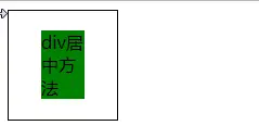
第五种方法
第六种方法
利用flexbox布局
直接在父元素上使用flexbox的布局
 <!DOCTYPE html>
<html>
<head>
    <meta charset="UTF-8">
    <title>demo</title>
    <style type="text/css">
        .div1 {
            width: 100px;
            height: 100px;
            border: 1px solid #000000;
        }

        .div2 {
            height: 40px;
            width: 40px;
            background-color: green;
        }

        .div11 {
            display: flex;
            /*!*flex-direction: column;*!可写可不写*/
            justify-content: center;
            align-items: center;
        }

    </style>
</head>
<body>


<div class="div1 div11">
    <div class="div2 div22">

    </div>
</div>

</body>
</html>
第六种方法
第七种方法
利用transform的属性,注意子绝父相定位
缺点:需要支持Html5
<!DOCTYPE html>
<html>
<head>
    <meta charset="UTF-8">
    <title>demo</title>
    <style type="text/css">
        body {
            margin: 100px auto;
            position: relative;
        }

        .div1 {
            width: 100px;
            height: 100px;
            border: 1px solid #000000;
            background-color: red;
        }

        .div2 {
            height: 40px;
            width: 40px;
            background-color: green;
        }

        .center {
            position: absolute;
            top: 50%;
            left: 50%;
            -ms-transform: translate(-50%, -50%);
            -moz-transform: translate(-50%, -50%);
            -o-transform: translate(-50%, -50%);
            transform: translate(-50%, -50%);
        }

    </style>
</head>
<body>


<div class="div1 center">
    我是外部盒子
    <div class="div2 center">
        我要居中
    </div>
</div>
</body>
</html>
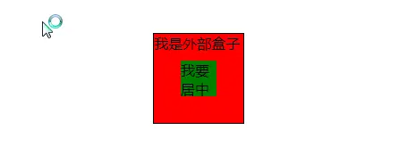
第七种
第八种
两者都要固定定位,不常用
缺点:需要设置position属性,网页复杂时容易扰乱页面布局,而且只是元素的起始位置居中
<html>
<head>
    <meta charset="UTF-8">
    <title>demo</title>
    <style type="text/css">


        .div1 {
            width: 100px;
            height: 100px;
            border: 1px solid #000000;
            background-color: red;
            position: relative;
        }

        .div2 {
            height: 40px;
            width: 40px;
            background-color: green;
            margin:30px 30px;

        }

        .center{
            position: fixed;
            left: 50%;
        }

    </style>
</head>
<body>


<div class="div1 center">

    <div class="div2 center">
        我要居中
    </div>
</div>
</body>
</html>

第八种方法


 扫一扫
扫一扫

 被折叠的 条评论
为什么被折叠?
被折叠的 条评论
为什么被折叠?
 到【灌水乐园】发言


