


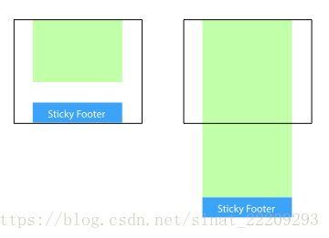
当内容不超过一屏时,footer在屏幕底部,内容超过一屏时,和主体内容有固定距离。也就是内容少的时候吸底,内容多的时候文档流排版。我尝试了几种实现方法。
1.flex
- 思路:给body设置flex,然后flex的方向设置column,主体内容flex:1于是会自适应高度。
<div class="content">...</div>
<div class="footer">footer</div>
body {
      display: flex;
      -webkit-box-orient: vertical;
      flex-direction: column;
}
.content {
      margin-bottom: 20px;
      -webkit-box-flex: 1;
      -ms-flex: 1;
      flex: 1;
}
.footer {
      height: 100px;
}
2.主体设置margin-bottom为负数
<div class="content">
...
<div class="flag"></div>
</div>
<div class="footer">footer</div>
html,body{
	height:100%
}
.content{
	min-height: 100%;
    margin-bottom: -50px;
}
.footer,.flag{
	height:50px
}


 扫一扫
扫一扫


 被折叠的 条评论
为什么被折叠?
被折叠的 条评论
为什么被折叠?
 到【灌水乐园】发言


