


 本文介绍PyEcharts的安装及使用方法,涵盖多种图表类型,如柱状图、折线图、散点图等,并提供了丰富的示例代码,帮助读者快速掌握PyEcharts的基本操作。
pyecharts 是一个用于生成 Echarts 图表的类库。Echarts 是百度开源的一个数据可视化 JS 库。用 Echarts 生成的图可视化效果非常棒,为了与 Python 进行对接,方便在 Python 中直接使用数据生成图。以下是最新版echart的靓图。当然,pyecharts貌似没有这么齐全。

- 官方文档:http://pyecharts.herokuapp.com/
- pyecharts 图表配置:http://pyecharts.org/#/zh-cn/prepare
- github:https://github.com/pyecharts/pyecharts
- 中文文档:http://pyecharts.org/#/zh-cn/
安装:
pip install pyecharts
还有很多已经打包好的中国地图、世界地图包:
$ pip install echarts-countries-pypkg
$ pip install echarts-china-provinces-pypkg
$ pip install echarts-china-cities-pypkg
$ pip install echarts-china-counties-pypkg
$ pip install echarts-china-misc-pypkg
$ pip install echarts-united-kingdom-pypkg
文章目录
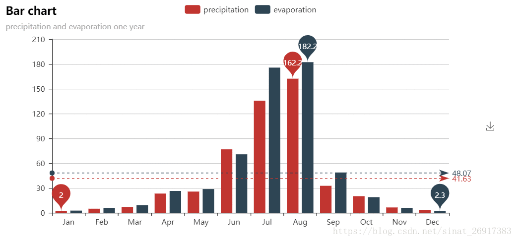
一、简单示例
from pyecharts import Bar

attr = ["Jan", "Feb", "Mar", "Apr", "May", "Jun", "Jul", "Aug", "Sep", "Oct", "Nov", "Dec"]
v1 = [2.0, 4.9, 7.0, 23.2, 25.6, 76.7, 135.6, 162.2, 32.6, 20.0, 6.4, 3.3]
v2 = [2.6, 5.9, 9.0, 26.4, 28.7, 70.7, 175.6, 182.2, 48.7, 18.8, 6.0, 2.3]
bar = Bar("Bar chart", "precipitation and evaporation one year")
bar.add("precipitation", attr, v1, mark_line=["average"], mark_point=["max", "min"])
bar.add("evaporation", attr, v2, mark_line=["average"], mark_point=["max", "min"])
bar.render()
#bar
其中,bar.render(),是以html形式保存在本地文件中;
bar,是在当前环境下,输出图表。
输出方式还有PDF:
bar.render(path="render.png")
同时也可以使用flask/Django进行封装,

二、笔者关注的几个图表
2.1 画出花样的散点图
from pyecharts import EffectScatter
es = EffectScatter("动态散点图各种图形示例")
es.add("", [10], [10], symbol_size=20, effect_scale=3.5,
       effect_period=3, symbol="pin")
es.add("", [20], [20], symbol_size=12, effect_scale=4.5,
       effect_period=4,symbol="rect")
es.add("", [30], [30], symbol_size=30, effect_scale=5.5,
       effect_period=5,symbol="roundRect")
es.add("", [40], [40], symbol_size=10, effect_scale=6.5,
       effect_brushtype='fill',symbol="diamond")
es.add("", [50], [50], symbol_size=16, effect_scale=5.5,
       effect_period=3,symbol="arrow")
es.add("", [60], [60], symbol_size=6, effect_scale=2.5,
       effect_period=3,symbol="triangle")
es

2.2 关系图 + NetworkX
2.2.1 常规关系图
from pyecharts.charts import Graph

nodes = [{"name": "结点1", "symbolSize": 10},
         {"name": "结点2", "symbolSize": 20},
         {"name": "结点3", "symbolSize": 30},
         {"name": "结点4", "symbolSize": 40},
         {"name": "结点5", "symbolSize": 50},
         {"name": "结点6", "symbolSize": 40},
         {"name": "结点7", "symbolSize": 30},
         {"name": "结点8", "symbolSize": 20}]
links = []
for i in nodes:
    for j in nodes:
        links.append({"source": i.get('name'), "target": j.get('name')})
graph = Graph("关系图-力引导布局示例")
graph.add("", nodes, links, is_label_show=True,
          graph_repulsion=8000, graph_layout='circular',
          label_text_color=None)
graph

其中,pyecharts处理不了太复杂的关系图,可以借用: networkx 库(可参考笔者的博文:关系图︱python 关系网络的可视化NetworkX(与Apple.Turicreate深度契合))
from __future__ import unicode_literals

import networkx as nx
from networkx.readwrite import json_graph
from pyecharts import Graph

g = nx.Graph()
categories = ['网关', '节点']
g.add_node('FF12C904', name='Gateway 1', symbolSize=40, category=0)
g.add_node('FF12CA02', name='Node 11', category=1)
g.add_node('FF12C326', name='Node 12', category=1)
g.add_node('FF45C023', name='Node 111', category=1)
g.add_node('FF230933', name='Node 1111', category=1)

g.add_edge('FF12C904', 'FF12CA02')
g.add_edge('FF12C904', 'FF12C326')
g.add_edge('FF12CA02', 'FF45C023')
g.add_edge('FF45C023', 'FF230933')

g_data = json_graph.node_link_data(g)
eg = Graph('设备最新拓扑图')
eg.add('Devices', nodes=g_data['nodes'], links=g_data['links'], categories=categories)
# eg.show_config()
eg

2.2.2 关系图-案例2
案例来源:
https://github.com/pyecharts/pyecharts-gallery/tree/master/Graph
代码:
https://github.com/pyecharts/pyecharts-gallery/blob/master/Graph/npm_dependencies.py
当然这个图比较难画,因为这个图每个节点的X/Y 坐标都是需要固定的

import asyncio
from aiohttp import TCPConnector, ClientSession

import pyecharts.options as opts
from pyecharts.charts import Graph

"""
Gallery 使用 pyecharts 1.1.0
参考地址: https://echarts.apache.org/examples/editor.html?c=graph-npm

目前无法实现的功能:

1、暂无
"""
import pandas as pd
import json
async def get_json_data(url: str) -> dict:
    async with ClientSession(connector=TCPConnector(ssl=False)) as session:
        async with session.get(url=url) as response:
            return await response.json()


# 获取官方的数据
data = asyncio.run(
    get_json_data(
        url="https://echarts.apache.org/examples/data/asset/data/npmdepgraph.min10.json"
    )
)

#data = open("npmdepgraph.min10.json", "r", encoding="utf8").read()
#data = eval(data)

nodes = [
    {
        "x": node["x"],
        "y": node["y"],
        "id": node["id"],
        "name": node["label"],
        "symbolSize": node["size"],
        "itemStyle": {"normal": {"color": node["color"]}},
    }
    for node in data["nodes"]
]

#data_2 = pd.DataFrame(nodes)

edges = [
    {"source": edge["sourceID"], "target": edge["targetID"]} for edge in data["edges"]
]
#edges_2 = pd.DataFrame(edges)


(
    Graph()
    .add(
        series_name="",
        nodes=nodes,
        links=edges,
        layout="none",
        is_roam=True,
        is_focusnode=True,
        label_opts=opts.LabelOpts(is_show=False),
        linestyle_opts=opts.LineStyleOpts(width=0.5, curve=0.3, opacity=0.7),
    )
    .set_global_opts(title_opts=opts.TitleOpts(title="NPM Dependencies"))
    .render("npm_dependencies.html")
)
这里来看一下输入格式:
节点:

边:

2.2.3 关系图:微博关系图
import json

from pyecharts import options as opts
from pyecharts.charts import Graph

with open("weibo.json", "r", encoding="utf-8") as f:
    j = json.load(f)
    nodes, links, categories, cont, mid, userl = j

c = (
    Graph()
    .add(
        "",
        nodes,
        links,
        categories,
        repulsion=50,
        linestyle_opts=opts.LineStyleOpts(curve=0.2),
        label_opts=opts.LabelOpts(is_show=False),
    )
    .set_global_opts(
        legend_opts=opts.LegendOpts(is_show=False),
        title_opts=opts.TitleOpts(title="Graph-微博转发关系图"),
    )
    .render("graph_weibo.html")
)
其中node节点示例:
[
{'name': '服务',
  'value': 22688,
  'category': '应用',
  'symbolSize': 22,
  'draggable': False,
  'label': {'normal': {'show': 'True'}}},
 {'name': '实体经济',
  'value': 7482,
  'category': '政策',
  'symbolSize': 7,
  'draggable': False,
  'label': {'normal': {'show': 'True'}}}
  ]
其中,category是分类,value是这个节点的大小,label的标签中文字是否战术出来
link信息示例:
[
{'source': '电信', 'target': '浪潮'},
 {'source': '中国电信', 'target': '浪潮'}
]
只有source和target
categories信息包括:
[{'name': '应用'},
 {'name': '品牌'},
 {'name': '集群'},
 {'name': '政策'},
 {'name': '部委'}]
笔者遇到最大的bug,就是一直白板,无法自己画出来;
后面检查是发现,link里面的source和target,要与node里面的数量对齐,
如果node里面多了一个节点,就都是白板,无法出图

如何让显示的图变大可以设置opts.InitOpts(width="3000px", height="1800px"):
c = (
    Graph(init_opts=opts.InitOpts(width="3000px", height="1800px"))
    .add(
        "",
        nodes,
        links,
        categories,
        repulsion=100,
        linestyle_opts=opts.LineStyleOpts(curve=0.2),
        label_opts=opts.LabelOpts(is_show=False),
    )
    .set_global_opts(
        legend_opts=opts.LegendOpts(is_show=False),
        title_opts=opts.TitleOpts(title="Graph-关系图"),
    )
    .render("graph_dsxs.html")
)
其中repulsion 代表点间间距,可以适当放大。
2.3 WordCloud(词云图)
from pyecharts import options as opts
from pyecharts.charts import Page, WordCloud
from pyecharts.globals import SymbolType


words = [
    ("Sam S Club", 10000),
    ("Macys", 6181),
    ("Amy Schumer", 4386),
    ("Jurassic World", 4055),
    ("Charter Communications", 2467),
    ("Chick Fil A", 2244),
    ("Planet Fitness", 1868),
    ("Pitch Perfect", 1484),
    ("Express", 1112),
    ("Home", 865),
    ("Johnny Depp", 847),
    ("Lena Dunham", 582),
    ("Lewis Hamilton", 555),
    ("KXAN", 550),
    ("Mary Ellen Mark", 462),
    ("Farrah Abraham", 366),
    ("Rita Ora", 360),
    ("Serena Williams", 282),
    ("NCAA baseball tournament", 273),
    ("Point Break", 265),
]


def wordcloud_base() -> WordCloud:
    c = (
        WordCloud()
        .add("", words, word_size_range=[20, 100])
        .set_global_opts(title_opts=opts.TitleOpts(title=""))
    )
    return c

wordcloud_base().render_notebook()
支持中文。

2.4 TreeMap(矩形树图)
矩形树图是一种常见的表达『层级数据』『树状数据』的可视化形式。它主要用面积的方式,便于突出展现出『树』的各层级中重要的节点。
from pyecharts import TreeMap

treemap = TreeMap("矩形树图示例", width=1200, height=600)
import os
import json
with open(os.path.join("..", "json", "treemap.json"), "r", encoding="utf-8") as f:
        data = json.load(f)
treemap.add("演示数据", data, is_label_show=True, label_pos='inside')
treemap.render()

三 相关组件
3.1 Grid:并行显示多张图
3.2 Overlap:结合不同类型图表叠加画在同张图上

3.3 Page:同一网页按顺序展示多图

3.4 Timeline:提供时间线轮播多张图

4 相关案例与实践
4.1 柱状图
from pyecharts.charts import Bar
from pyecharts import options as opts

index_res = ['favoriteCount', 'likeCount','sharecount', 'commentCount']
index_res_ch = ['收藏数', '喜欢数','分享数', '评论数']

# V1 版本开始支持链式调用
bar = (
    Bar()
    .add_xaxis(list(research_data.index))
    .add_yaxis('收藏数',list(research_data['favoriteCount'])  )
    #.add_yaxis("没有视频",  list(research_data[index_res].ix[0,:])  )
    .set_global_opts(title_opts=opts.TitleOpts(title="收藏/喜欢/分享/评论数"))
)
bar.render_notebook()
- add_xaxis ,增加x列信息
- add_yaxis,增加y列信息
- set_global_opts,设置变量环节
- render_notebook(),可以直接在jupyter notebook之中进行选择

4.2 折线图
import pyecharts.options as opts
from pyecharts.charts import Line


x_data = list(research_data.index)
y_data = list(research_data['favoriteCount'])

line = (
    Line()
    .set_global_opts(
        tooltip_opts=opts.TooltipOpts(is_show=False),
        xaxis_opts=opts.AxisOpts(type_="category"),
        yaxis_opts=opts.AxisOpts(
            type_="value",
            axistick_opts=opts.AxisTickOpts(is_show=True),
            splitline_opts=opts.SplitLineOpts(is_show=True),
        ),
    )
    .add_xaxis(xaxis_data=x_data)
    .add_yaxis(
        series_name="收藏数",
        y_axis=y_data,
        symbol="emptyCircle",
        is_symbol_show=True,
        label_opts=opts.LabelOpts(is_show=False),
    )
    #.render("basic_line_chart.html")
)
line.render_notebook()
x_data , y_data 都是list
.render(“basic_line_chart.html”),直接存储为html格式
直接打印在jupyter notebook之中

4.3 pandas 绘制相关性热力图
corr_data = xiaohongshu_kol[['favoritecount','likecount', 'sharecount']].corr()  # viewcount

values = []
for x in range(corr_data.shape[0]):
    for y in range(corr_data.shape[1]):
        values.append([x,y,corr_data.ix[x,y]])

x_colnames = corr_data.index.to_list()
y_colnames = corr_data.columns.to_list()

# 绘图
c = (
    HeatMap()
    .add_xaxis(x_colnames)
    .add_yaxis("corr", y_colnames, values)
    .set_global_opts(
        title_opts=opts.TitleOpts(title="相关矩阵热力图"),
        visualmap_opts=opts.VisualMapOpts(max_=1, is_piecewise=True),
    )
)
c.render_notebook()
pandas求相关性为一张关联表:

其中,values 是一个【位置x,位置y,相关性】:
[[0, 0, 1.0],
 [0, 1, 0.7771863236775227],
 [0, 2, 0.727424900237336],
 [0, 3, 0.09334192707534165],
 [0, 4, 0.004296439662247044],
 [1, 1, 1.0],
 [1, 2, 0.7287852426205351],
 [1, 3, 0.14173048773739305]]
其中,opts.VisualMapOpts(max_=1, is_piecewise=True)代表左下角的比例尺,max_ = 1 代表最大值为1

4.4 画出双Y坐标的图
def double_y_plot(a,y1,y2):
    import numpy as np
    import matplotlib.pyplot as plt

    # a=np.linspace(0,5,100)

    # y1 = np.sin(2 * np.pi * a)
    # y2 = np.cos(2 * np.pi * a)

    fig, ax1 = plt.subplots()

    ax1.set_xlabel('time (s)')
    ax1.set_ylabel('sin', color='red')
    ax1.plot(a, y1, color='red')
    ax1.tick_params(axis='y', labelcolor='red')

    ax2 = ax1.twinx()
    ax2.set_ylabel('cos', color='green')
    ax2.plot(a, y2, color='green')
    ax2.tick_params(axis='y', labelcolor='green')

    fig.tight_layout()
    plt.show()
其中a是X轴,
其他y1/y2都是两个分开的轴


 4321
4321

 被折叠的 条评论
为什么被折叠?
被折叠的 条评论
为什么被折叠?
 到【灌水乐园】发言


