


<?xml version="1.0" encoding="utf-8"?>
<shape
    xmlns:android="http://schemas.android.com/apk/res/android"
    android:shape=["rectangle" | "oval" | "line" | "ring"] >
    <corners
        android:radius="integer"
        android:topLeftRadius="integer"
        android:topRightRadius="integer"
        android:bottomLeftRadius="integer"
        android:bottomRightRadius="integer" />
    <gradient
        android:angle="integer"
        android:centerX="integer"
        android:centerY="integer"
        android:centerColor="integer"
        android:endColor="color"
        android:gradientRadius="integer"
        android:startColor="color"
        android:type=["linear" | "radial" | "sweep"]
        android:useLevel=["true" | "false"] />
    <padding
        android:left="integer"
        android:top="integer"
        android:right="integer"
        android:bottom="integer" />
    <size
        android:width="integer"
        android:height="integer" />
    <solid
        android:color="color" />
    <stroke
        android:width="integer"
        android:color="color"
        android:dashWidth="integer"
        android:dashGap="integer" />
</shape>
一、使用
1、定义shape文件
首先在res/drawable文件夹下,新建一个文件,自定义命名,比如:shape_radius.xml。
<?xml version="1.0" encoding="utf-8"?>
<shape xmlns:android="http://schemas.android.com/apk/res/android" >
    <corners android:radius="20dip"/>
    <solid android:color="#ff00ff"/>
</shape>
2、设置背景
2.1 直接使用:
<RelativeLayout xmlns:android="http://schemas.android.com/apk/res/android"
    xmlns:tools="http://schemas.android.com/tools"
    android:layout_width="match_parent"
    android:layout_height="match_parent"
    tools:context="com.harvic.tryshape.MainActivity" >

    <TextView
        android:layout_width="wrap_content"
        android:layout_height="wrap_content"
        android:layout_margin="50dip"
        android:text="@string/hello_world"
        android:background="@drawable/shape_radius"/>

</RelativeLayout>
2.2 先在res/drawable下设置selector后,如:button.xml
<?xml version="1.0" encoding="utf-8"?>
<selector xmlns:android="http://schemas.android.com/apk/res/android">

    <item android:drawable="@drawable/button_pressed_bg" android:state_pressed="true"></item>
    <item android:drawable="@drawable/button_bg"></item>

</selector>
再设置背景
<RelativeLayout xmlns:android="http://schemas.android.com/apk/res/android"
    xmlns:tools="http://schemas.android.com/tools"
    android:layout_width="match_parent"
    android:layout_height="match_parent" >

    <Button
        android:layout_width="wrap_content"
        android:layout_height="wrap_content"
        android:background="@drawable/button"
        android:text="TestShapeButton" />

</RelativeLayout>
二、shape形状的定义
取值有四种:rectangle(长方形),oval(椭圆),line(线条),ring(圆环),默认是长方形,
只有当我们要画的图形是ring的时候,下面这几个属性才会生效:
android:innerRadius:
内环的半径。

android:innerRadiusRatio:
内环的比例,比如这个值为2,那么内环的半径就为环半径除以2,如果设置了第一个属性,则这个属性不起作用。

android:thickness:
环的厚度。

android:thicknessRatio:
环的厚度比例,比如这个值为2,那么环的厚度就为环半径除以2,如果设置了第三个属性,则这个属性不起作用。

android:useLevel:
只有当我们的shape使用在LevelListDrawable中的时候,这个值为true,否则为false。
示例:
ring:
<?xml version="1.0" encoding="utf-8"?>
<shape xmlns:android="http://schemas.android.com/apk/res/android"
    android:shape="ring"
    android:thickness="10dp"
    android:useLevel="false">
    <!--useLevel需要设置为false-->

    <solid android:color="@color/colorAccent"></solid>

    <gradient
        android:endColor="@color/colorPrimary"
        android:startColor="@color/colorAccent"
        android:type="sweep"></gradient>

</shape>
line
<?xml version="1.0" encoding="utf-8"?>
<shape xmlns:android="http://schemas.android.com/apk/res/android"
    android:shape="line">

    <stroke
        android:width="1dp"
        android:color="@color/colorAccent"
        android:dashGap="3dp"
        android:dashWidth="4dp" />

    <size android:height="3dp" />
</shape>

三、设置的效果
基本属性(corners、gradient、padding、size、solid、stroke)
1、solid:实心,就是填充的意思
定义内部填充色。
<?xml version="1.0" encoding="utf-8"?>
<shape xmlns:android="http://schemas.android.com/apk/res/android">
    <!-- 设置填充色 -->
    <solid android:color="#ff0000" />
</shape>
2、gradient:渐变
<gradient
    android:type=["linear" | "radial" | "sweep"]
    //共有3中渐变类型,线性渐变(默认)/放射渐变/扫描式渐变

    android:angle="integer"     //渐变角度,必须为45的倍数,0为从左到右,90为从上到下

    android:centerX="float"     //渐变中心X的相当位置,范围为0~1
    android:centerY="float"     //渐变中心Y的相当位置,范围为0~1

    android:startColor="color"   //渐变开始点的颜色
    android:centerColor="color"  //渐变中间点的颜色,在开始与结束点之间
    android:endColor="color"    //渐变结束点的颜色

    android:gradientRadius="float"  //渐变的半径,只有当渐变类型为radial时才能使用

    android:useLevel=["true" | "false"] />
//使用LevelListDrawable时就要设置为true。设为false时才有渐变效果。默认值为false 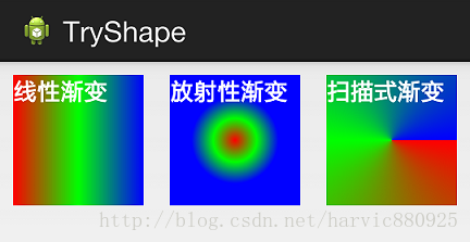
需要注意的一点是,在构造放射性渐变时,要加上android:gradientRadius属性(渐变半径),即必须指定渐变半径的大小才会起作用.
android:angle=”90”表示渐变的起始位置,这个值必须为45的倍数,包括0,0表示从左往右渐变,逆时针旋转,依次是45,90,135…..,90表示从下往上渐变,270表示从上往下渐变,剩下的大家依次去推理。
android:angle:渐变角度:0:左到右;90:下到上;180:右到左;270:上到下。
默认0,从左往右。仅对线性有用。
示例:
渐变:
<?xml version="1.0" encoding="utf-8"?>
<shape xmlns:android="http://schemas.android.com/apk/res/android">
    <gradient
        android:angle="0"
        android:centerColor="#00ff00"
        android:endColor="#0000ff"
        android:startColor="#ff0000"
        android:type="linear" />
</shape>
<?xml version="1.0" encoding="utf-8"?>
<shape xmlns:android="http://schemas.android.com/apk/res/android">
    <gradient
        android:angle="45"
        android:centerColor="#00ff00"
        android:endColor="#0000ff"
        android:startColor="#ff0000"
        android:type="linear" />
</shape>
<?xml version="1.0" encoding="utf-8"?>
<shape xmlns:android="http://schemas.android.com/apk/res/android">
    <gradient
        android:angle="90"
        android:centerColor="#00ff00"
        android:endColor="#0000ff"
        android:startColor="#ff0000"
        android:type="linear" />
</shape>
扫描:
<?xml version="1.0" encoding="utf-8"?>
<shape xmlns:android="http://schemas.android.com/apk/res/android">
    <gradient
        android:centerColor="#00ff00"
        android:endColor="#0000ff"
        android:startColor="#ff0000"
        android:type="sweep" />
</shape>
放射:
<?xml version="1.0" encoding="utf-8"?>
<shape xmlns:android="http://schemas.android.com/apk/res/android">
    <gradient
        android:centerColor="#00ff00"
        android:endColor="#0000ff"
        android:gradientRadius="500"
        android:startColor="#ff0000"
        android:type="radial" />
</shape>
3、stroke:描边
android:width=”2dp” 描边的宽度(线的粗细),
android:color 描边的颜色。
我们还可以把描边弄成虚线的形式,设置方式为:
android:dashWidth=”5dp”
android:dashGap=”3dp”
其中android:dashWidth表示’-‘这样一个横线的宽度,
android:dashGap表示之间隔开的距离。
<?xml version="1.0" encoding="utf-8"?>
<shape xmlns:android="http://schemas.android.com/apk/res/android">

    <stroke
        android:width="1dp"
        android:color="#ff0000"
        android:dashGap="5dp"
        android:dashWidth="100dp" />
</shape>
4、corners:圆角
android:radius为角的弧度,值越大角越圆。
示例一:
<?xml version="1.0" encoding="utf-8"?>
<shape xmlns:android="http://schemas.android.com/apk/res/android">
    <!-- 设置圆角半径,四个角一起设定 -->
    <corners android:radius="20dp" />
    <!-- 设置填充色 -->
    <solid android:color="#ff0000" />
</shape>
示例二:
<?xml version="1.0" encoding="utf-8"?>
<shape xmlns:android="http://schemas.android.com/apk/res/android">
    <!-- 设置圆角半径,针对四个角一个一个的设定 -->
    <corners
        android:bottomLeftRadius="0dp"
        android:bottomRightRadius="50dp"
        android:topLeftRadius="100dp"
        android:topRightRadius="150dp" />
    <!-- 设置填充色 -->
    <solid android:color="#ff0000" />
</shape>
5、size和padding
这两个基本上不怎么用,因为他们所具有的功能,控件本身也能实现。
size:是用来定义图形的大小的,常用来将矩形或者椭圆设置成圆形。
纯色的圆:
<?xml version="1.0" encoding="utf-8"?>
<shape xmlns:android="http://schemas.android.com/apk/res/android"
    android:shape="oval">

    <solid android:color="@color/colorPrimary" />

    <size
        android:width="100dp"
        android:height="100dp" />
</shape>
size的height和width设置为一样大小就是一个圆了。
然后直接使用solid填充颜色即可。

渐变的圆:
<?xml version="1.0" encoding="utf-8"?>
<shape xmlns:android="http://schemas.android.com/apk/res/android"
    android:shape="oval">

    <size
        android:width="100dp"
        android:height="100dp" />

    <gradient
        android:centerX="0.5"
        android:centerY="0.5"
        android:endColor="@color/colorAccent"
        android:startColor="@color/colorPrimary"
        android:type="sweep" />
</shape>
带有环的圆:
1、①矩形的圆角设置为半径的一半、②设置size的宽高相等。
<?xml version="1.0" encoding="UTF-8"?>
<shape xmlns:android="http://schemas.android.com/apk/res/android"
    android:shape="rectangle"
    android:useLevel="false">

    <corners android:radius="50dp" />

    <stroke
        android:width="1dp"
        android:color="#0000ff" />

    <solid android:color="@color/colorAccent" />

    <size
        android:width="100dp"
        android:height="100dp" />
</shape>
或者
2、设置椭圆的宽高相等即可。
<?xml version="1.0" encoding="UTF-8"?>
<shape xmlns:android="http://schemas.android.com/apk/res/android"
    android:shape="oval"
    android:useLevel="false">

    <stroke
        android:width="1dp"
        android:color="#0000ff" />

    <solid android:color="@color/colorAccent" />

    <size
        android:width="100dp"
        android:height="100dp" />
</shape>
参考:
项目曾经遇到:
<LinearLayout xmlns:android="http://schemas.android.com/apk/res/android"
    android:layout_width="match_parent"
    android:layout_height="match_parent"
    android:orientation="vertical">

    <LinearLayout
        android:layout_width="match_parent"
        android:layout_height="45dp"
        android:background="#00ff00"
        android:baselineAligned="false"
        android:orientation="horizontal"
        android:paddingTop="5dp">

        <RelativeLayout
            android:id="@+id/rv_project"
            android:layout_width="0dp"
            android:layout_height="match_parent"
            android:layout_weight="1"
            android:gravity="right">

            <TextView
                android:id="@+id/tv_office"
                android:layout_width="wrap_content"
                android:layout_height="wrap_content"
                android:layout_marginRight="15dp"
                android:gravity="center_vertical"
                android:paddingRight="8dp"
                android:text="官方公告"
                android:textColor="#ffffff"
                android:textSize="25sp" />

            <View
                android:layout_width="8dp"
                android:layout_height="8dp"
                android:layout_alignRight="@+id/tv_office"
                android:background="@drawable/bg_red_point"
                android:visibility="visible" />

            <View
                android:id="@+id/line_office"
                android:layout_width="wrap_content"
                android:layout_height="5px"
                android:layout_alignLeft="@+id/tv_office"
                android:layout_alignParentBottom="true"
                android:layout_alignRight="@+id/tv_office"
                android:background="#ff0000" />
        </RelativeLayout>

        <View
            android:layout_width="1px"
            android:layout_height="match_parent"
            android:background="@color/colorPrimary" />

        <RelativeLayout
            android:id="@+id/rv_plan"
            android:layout_width="0dp"
            android:layout_height="match_parent"
            android:layout_weight="1"
            android:gravity="left">

            <TextView
                android:id="@+id/tv_personal"
                android:layout_width="wrap_content"
                android:layout_height="wrap_content"
                android:layout_marginLeft="15dp"
                android:gravity="center_vertical"
                android:paddingRight="8dp"
                android:text="个人消息"
                android:textColor="#ffb47e"
                android:textSize="25sp" />

            <View
                android:layout_width="8dp"
                android:layout_height="8dp"
                android:layout_alignRight="@+id/tv_personal"
                android:background="@drawable/bg_red_point"
                android:visibility="visible" />

            <View
                android:id="@+id/line_personal"
                android:layout_width="wrap_content"
                android:layout_height="5px"
                android:layout_alignLeft="@+id/tv_personal"
                android:layout_alignParentBottom="true"
                android:layout_alignRight="@+id/tv_personal"
                android:background="#ff0000"
                android:visibility="gone" />
        </RelativeLayout>
    </LinearLayout>

    <android.support.v4.view.ViewPager
        android:id="@+id/vp_msg"
        android:layout_width="match_parent"
        android:layout_height="0dp"
        android:layout_weight="1" />

</LinearLayout>
drawable/bg_red_point:小红点
<?xml version="1.0" encoding="utf-8"?>
<shape xmlns:android="http://schemas.android.com/apk/res/android"
    android:shape="oval" >

    <corners android:radius="2dp" />

    <solid android:color="@color/colorAccent" />

</shape>
效果图:


 2424
2424


 被折叠的 条评论
为什么被折叠?
被折叠的 条评论
为什么被折叠?
 到【灌水乐园】发言


